之前开发移动端常用的rem布局,或使用媒体查询,本文研究一下postcss-px-to-viewport的使用
现在有了更好用的vw vh
vw 视口的最大宽度,1vw等于视口宽度的百分之一
vh 视口的最大高度,1vh等于视口高度的百分之一
1、创建vue项目
npm init vue@latest
2、安装postcss-px-to-viewport 依赖
npm install postcss-px-to-viewport -D
3、因为vite中已经内联了postcss,所以并不需要额外的创建 postcss.config.js文件
只需要在vite.config.ts配置postcss即可
vite.config.ts
import { fileURLToPath, URL } from 'url'

import { defineConfig } from 'vite'
import vue from '@vitejs/plugin-vue'
import vueJsx from '@vitejs/plugin-vue-jsx'
//直接引用会报提示 ts类型检测报错 需要配置
import pxtoViewPort from 'postcss-px-to-viewport'

// https://vitejs.dev/config/
export default defineConfig({
  plugins: [vue(), vueJsx()],
  // 配置css 配置postcss 设置px转换
  css: {
    postcss: {
      plugins: [
        pxtoViewPort({
          unitToConvert: 'px', // 要转化的单位
          viewportWidth: 750, // UI设计稿的宽度
          unitPrecision: 6, // 转换后的精度,即小数点位数
          propList: ['*'], // 指定转换的css属性的单位,*代表全部css属性的单位都进行转换
          viewportUnit: 'vw', // 指定需要转换成的视窗单位,默认vw
          fontViewportUnit: 'vw', // 指定字体需要转换成的视窗单位,默认vw
          selectorBlackList: ['ignore-'], // 指定不转换为视窗单位的类名,
          minPixelValue: 1, // 默认值1,小于或等于1px则不进行转换
          mediaQuery: true, // 是否在媒体查询的css代码中也进行转换,默认false
          replace: true, // 是否转换后直接更换属性值
          landscape: false // 是否处理横屏情况
        })
      ]
    }
  },
  server: {
    host: '0.0.0.0',
    port: 8848
  },
  resolve: {
    alias: {
      '@': fileURLToPath(new URL('./src', import.meta.url))
    }
  }
})
4、因为项目使用ts所以需要我们自己写一个声明文件,在项目根目录下创建
postcss-px-to-viewport.d.ts
declare module 'postcss-px-to-viewport' {

  type Options = {
    unitToConvert: 'px' | 'rem' | 'cm' | 'em',
    viewportWidth: number,
    viewportHeight: number, // not now used; TODO: need for different units and math for different properties
    unitPrecision: number,
    viewportUnit: string,
    fontViewportUnit: string,  // vmin is more suitable.
    selectorBlackList: string[],
    propList: string[],
    minPixelValue: number,
    mediaQuery: boolean,
    replace: boolean,
    landscape: boolean,
    landscapeUnit: string,
    landscapeWidth: number
  }

  export default (options: Partial<Options>) => any
}
5、在tsconfig.config.json文件中配置 postcss-px-to-viewport ,配置后vite.config.ts文件中的报错就会消失
{
  "extends": "@vue/tsconfig/tsconfig.node.json",
  "include": ["vite.config.*", "vitest.config.*", "cypress.config.*","postcss-px-to-viewport.*"],
  "compilerOptions": {
    "composite": true,
    "types": ["node"]
  }
}
6、使用
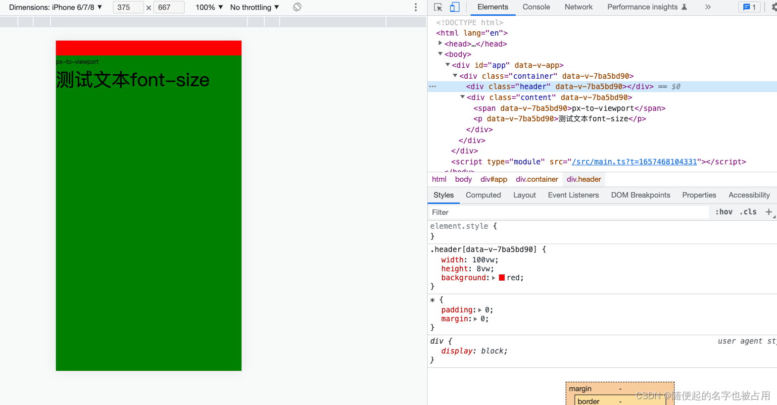
<template>
  <div class="container">
    <div class="header"></div>
    <div class="content">
      <span>px-to-viewport</span>
      <p>测试文本font-size</p>
    </div>
  </div>
</template>

<script setup lang="ts">

</script>

<style scoped lang="scss">
:global(*) {
  padding: 0;
  margin: 0;
}

:global(body),
:global(html),
:global(#app) {
  height: 100%;
  overflow: hidden;
}

.container {
  height: inherit;

}

.header {
  width: 750px;
  height: 60px;
  background: red;
}

.content {
  width: 100%;
  height: calc(100% - 60px);
  background: green;

  span {
    font-size: 24px;
  }

  p {
    font-size: 75px;
  }
}
</style>
效果:
本文内容由网友自发贡献,版权归原作者所有,本站不承担相应法律责任。如您发现有涉嫌抄袭侵权的内容,请联系:hwhale#tublm.com(使用前将#替换为@)