Seaborn 可视化
1.简介
Seaborn是一个在Python中制作有吸引力和信息丰富的统计图形的库。它建立在matplotlib之上,并与PyData堆栈紧密集成,包括支持来自scipy和statsmodels的numpy和pandas数据结构和统计例程。 Seaborn旨在将可视化作为探索和理解数据的核心部分。绘图函数对包含整个数据集的数据框和数组进行操作,并在内部执行必要的聚合和统计模型拟合以生成信息图。如果matplotlib“试图让事情变得简单容易和难以实现”,seaborn会试图使一套明确的方案让事情变得容易。 Seaborn可以认为是对matplotlib的补充,而不是它的替代品。在数据可视化方面能够很好的表现。
2. seaborn入门
2.1 单变量分布
%matplotlib inline
import numpy as np
import pandas as pd
from scipy import stats, integrate
import matplotlib.pyplot as plt
import seaborn as sns
sns.set(color_codes=True)
np.random.seed(sum(map(ord, "distributions")))
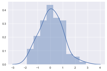
2.1.1 灰度图
最方便快捷的方式~
# kde表示生成核密度估计
x = np.random.normal(size=100)
sns.distplot(x, kde=True)
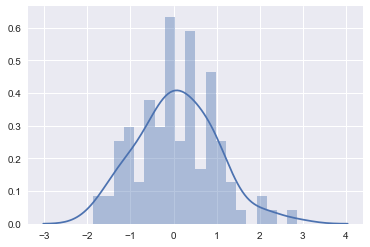
更精细的刻画,调节bins,对数据更具体的做分桶操作。
sns.distplot(x, kde=True, bins=20)
使用rug生成实例:
sns.distplot(x, kde=False, bins=20, rug=True)
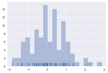
生成实例的好处:指导你设置合适的bins。
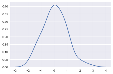
2.1.2 核密度估计
通过观测估计概率密度函数的形状。
有什么用呢?待定系数法求概率密度函数~
核密度估计的步骤:
* 每一个观测附近用一个正态分布曲线近似
* 叠加所有观测的正太分布曲线
* 归一化
在seaborn中怎么画呢?
sns.kdeplot(x)
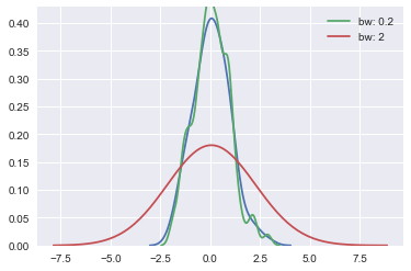
bandwidth的概念:用于近似的正态分布曲线的宽度。
sns.kdeplot(x)
sns.kdeplot(x, bw=.2, label="bw: 0.2")
sns.kdeplot(x, bw=2, label="bw: 2")
plt.legend()
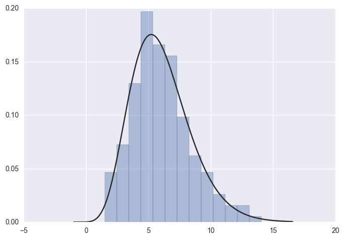
2.1.3模型参数拟合
x = np.random.gamma(6, size=200)
sns.distplot(x, kde=False, fit=stats.gamma)
2.2 双变量分布
mean, cov = [0, 1], [(1, .5), (.5, 1)]
data = np.random.multivariate_normal(mean, cov, 200)
df = pd.DataFrame(data, columns=["x", "y"])
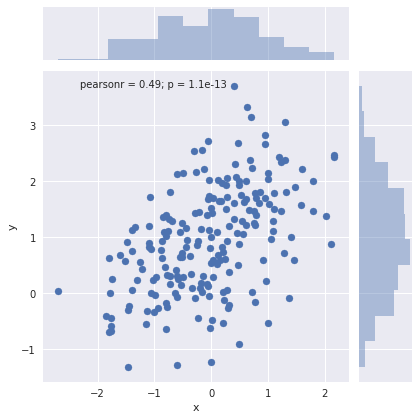
两个相关的正态分布~
2.2.1 散点图
sns.jointplot(x="x", y="y", data=df)
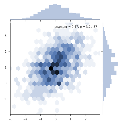
2.2.2 六角箱图
- 在数据量很大的时候,用散点图来做可视化的时候效果不是很好,所以引入六角箱图做可视化。
x, y = np.random.multivariate_normal(mean, cov, 1000).T
with sns.axes_style("ticks"):
    sns.jointplot(x=x, y=y, kind="hex")
2.2.3 核密度估计
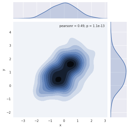
sns.jointplot(x="x", y="y", data=df, kind="kde")
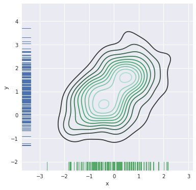
f, ax = plt.subplots(figsize=(6, 6))
sns.kdeplot(df.x, df.y, ax=ax)
sns.rugplot(df.x, color="g", ax=ax)
sns.rugplot(df.y, vertical=True, ax=ax)
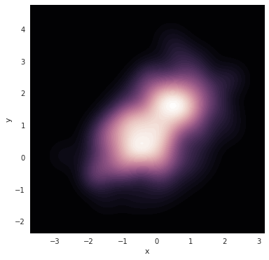
更炫酷的效果:
f, ax = plt.subplots(figsize=(6, 6))
cmap = sns.cubehelix_palette(as_cmap=True, dark=1, light=0)
sns.kdeplot(df.x, df.y, cmap=cmap, n_levels=60, shade=True)
先绘制图形图像,然后再往图中添加额外的效果。
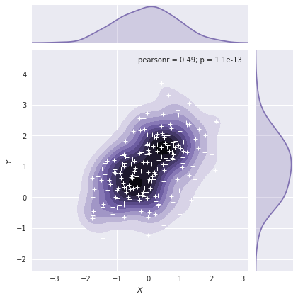
g = sns.jointplot(x="x", y="y", data=df, kind="kde", color="m")
g.plot_joint(plt.scatter, c="w", s=30, linewidth=1, marker="+")
g.ax_joint.collections[0].set_alpha(0)
g.set_axis_labels("$X$", "$Y$")
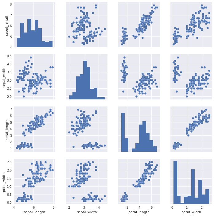
2.3 数据集中的两两关系
2.3.1 散点图表示
iris = sns.load_dataset("iris")
iris.head()
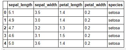
sns.pairplot(iris)
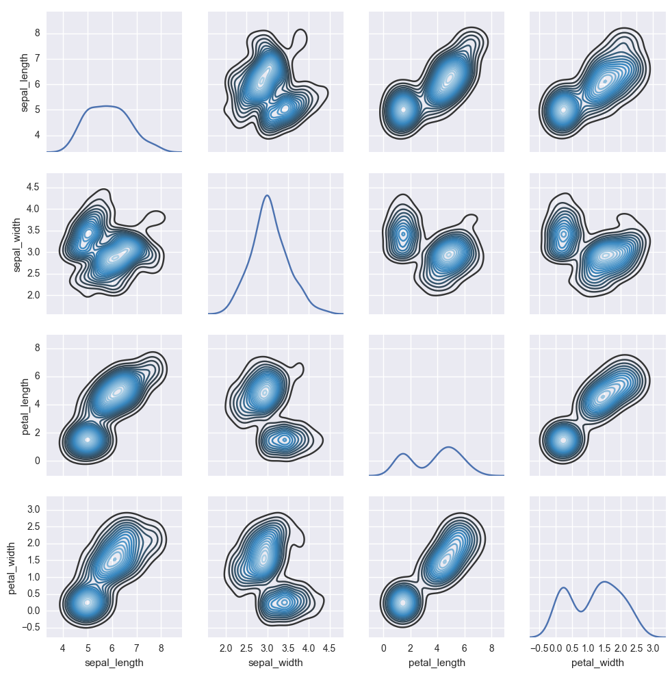
2.3.2 灰度图表示
g = sns.PairGrid(iris)
g.map_diag(sns.kdeplot)
g.map_offdiag(sns.kdeplot, cmap="Blues_d", n_levels=20)
3. 变量间的关系
%matplotlib inline
import numpy as np
import pandas as pd
import matplotlib as mpl
import matplotlib.pyplot as plt
import seaborn as sns
sns.set(color_codes=True)
np.random.seed(sum(map(ord, "regression")))
tips = sns.load_dataset("tips")
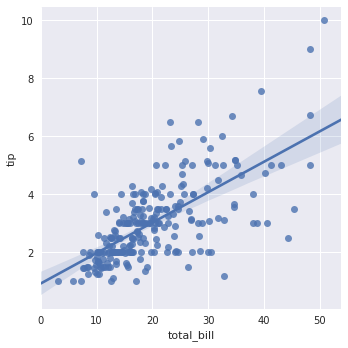
3.1 绘制线性回归模型
3.1.1 连续的取值
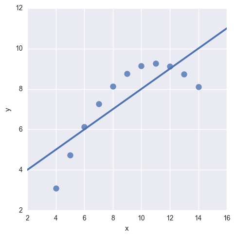
最简单的方式:散点图 + 线性回归 + 95%置信区间
sns.lmplot(x="total_bill", y="tip", data=tips)
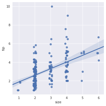
3.1.2 离散变量
- 对于变量离线取值,散点图绘制出来的效果并不好,很难看出各个数据的分布。为了看清数据的分布,一下有两种方式进行处理。
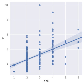
sns.lmplot(x="size", y="tip", data=tips)
方法1:加个小的抖动
sns.lmplot(x="size", y="tip", data=tips, x_jitter=.08)
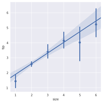
方法2:离散取值上用均值和置信区间代替散点,求出均值和方差并在图上表示
sns.lmplot(x="size", y="tip", data=tips, x_estimator=np.mean)
3.2 拟合不同模型
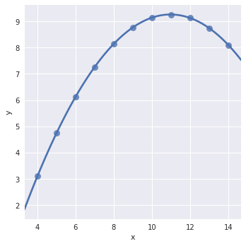
有些时候线性拟合效果不错,但有时数据的分布并不适合用线性方式拟合。
anscombe = sns.load_dataset("anscombe")
sns.lmplot(x="x", y="y", data=anscombe.query("dataset == 'I'"), ci=None, scatter_kws={"s": 80})
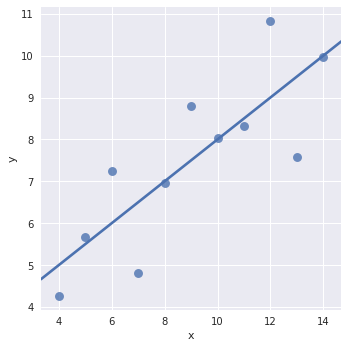
如图,用线性拟合的方式效果不是很好
sns.lmplot(x="x", y="y", data=anscombe.query("dataset == 'II'"), ci=None, scatter_kws={"s": 80})
3.2.1 高阶拟合
sns.lmplot(x="x", y="y", data=anscombe.query("dataset == 'II'"), order=2, ci=None, scatter_kws={"s": 80})
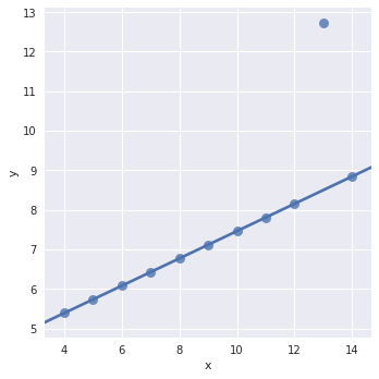
3.2.2 异常值处理:
sns.lmplot(x="x", y="y", data=anscombe.query("dataset == 'III'"), robust=True, ci=None, scatter_kws={"s": 80})
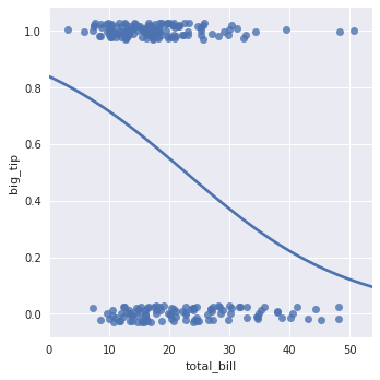
3.2.3 二值变量拟合
- 二值变量拟合:对于运用线性来拟合效果并不是很好,所以一下运用logistic的方式对二类进行分类。
tips["big_tip"] = (tips.tip / tips.total_bill) > .15
sns.lmplot(x="total_bill", y="big_tip", data=tips, y_jitter=.05)
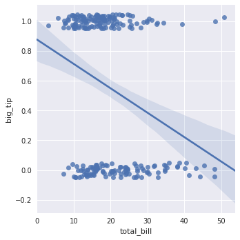
sns.lmplot(x="total_bill", y="big_tip", data=tips, logistic=True, y_jitter=.03, ci=None)
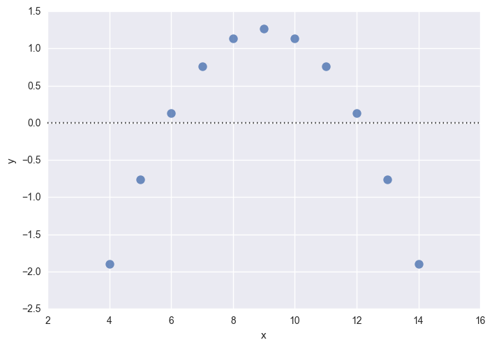
3.2.3 残差曲线
sns.residplot(x="x", y="y", data=anscombe.query("dataset == 'I'"), scatter_kws={"s": 80})
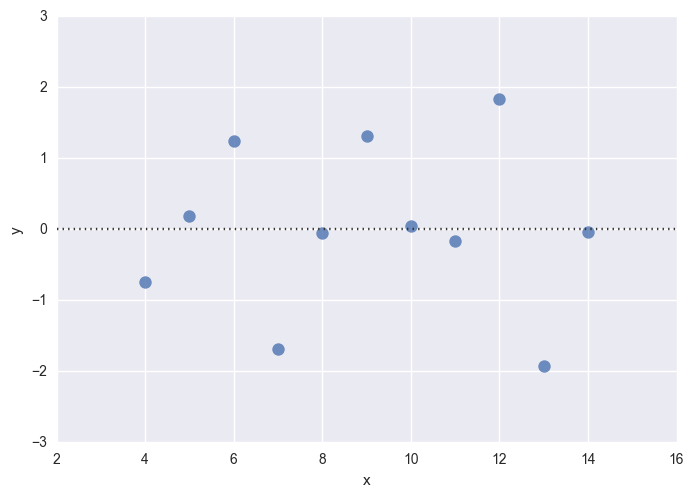
拟合的好,就是白噪声的分布
N(0,σ2)
N
(
0
,
σ
2
)
拟合的差,就能看出一些模式
sns.residplot(x="x", y="y", data=anscombe.query("dataset == 'II'"), scatter_kws={"s": 80})
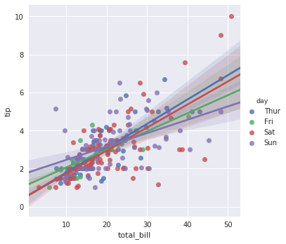
3.3 变量间的条件关系
# 指定hue参数
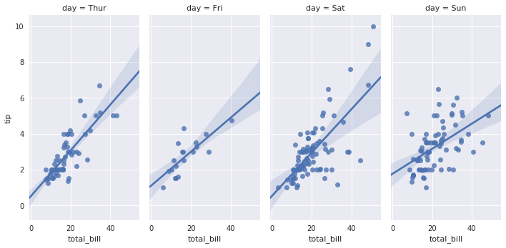
sns.lmplot(x="total_bill", y="tip", hue = "day", data=tips)
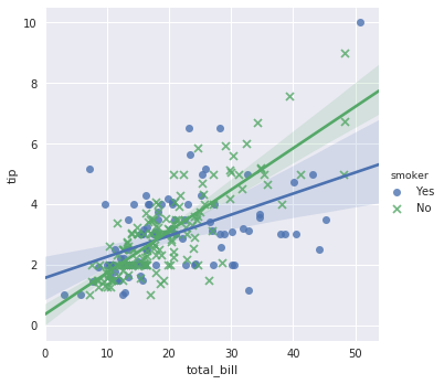
sns.lmplot(x="total_bill", y="tip", hue="smoker", data=tips, markers=["o", "x"])
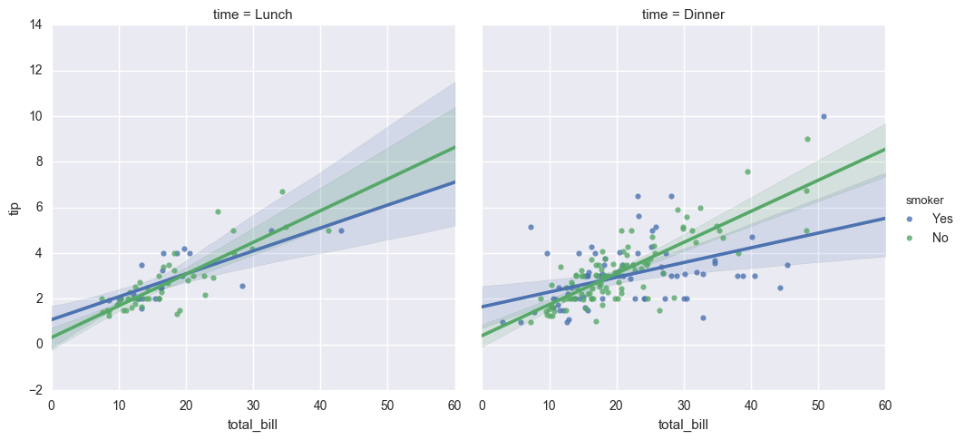
尝试增加更多的分类条件
# hue与col配合
sns.lmplot(x="total_bill", y="tip", hue="smoker", col="time", data=tips)
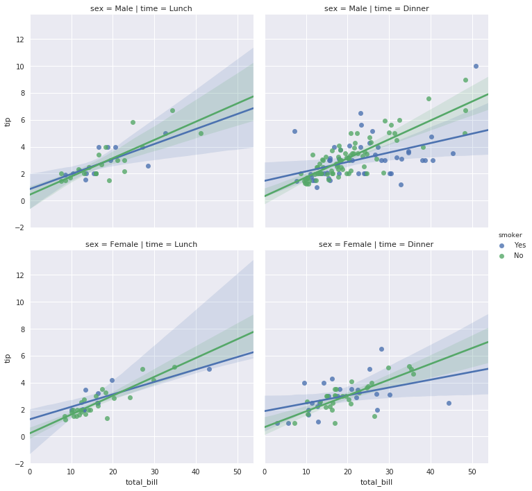
# hue、col与row一起使用
sns.lmplot(x="total_bill", y="tip", hue="smoker", col="time", row="sex", data=tips)
3.4 控制图片的大小和形状
- 多个图在同一个区域显示,默认的方式显示的图片可能会很小,所以需要对图片的大小进行控制。
sns.lmplot(x="total_bill", y="tip", col="day", data=tips, col_wrap=2, size=5)
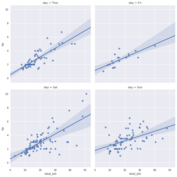
sns.lmplot(x="total_bill", y="tip", col="day", data=tips, aspect=0.5)
4. 分类数据的可视化分析
- 观测点的直接展示:swarmplot, stripplot
- 观测近似分布的展示:boxplot, violinplot
- 均值和置信区间的展示:barplot, pointplot
%matplotlib inline
import numpy as np
import pandas as pd
import matplotlib as mpl
import matplotlib.pyplot as plt
import seaborn as sns
sns.set(style="whitegrid", color_codes=True)
np.random.seed(2017)
titanic = sns.load_dataset("titanic")
tips = sns.load_dataset("tips")
iris = sns.load_dataset("iris")
titanic
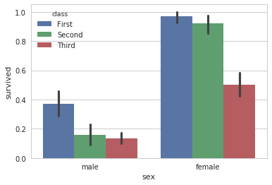
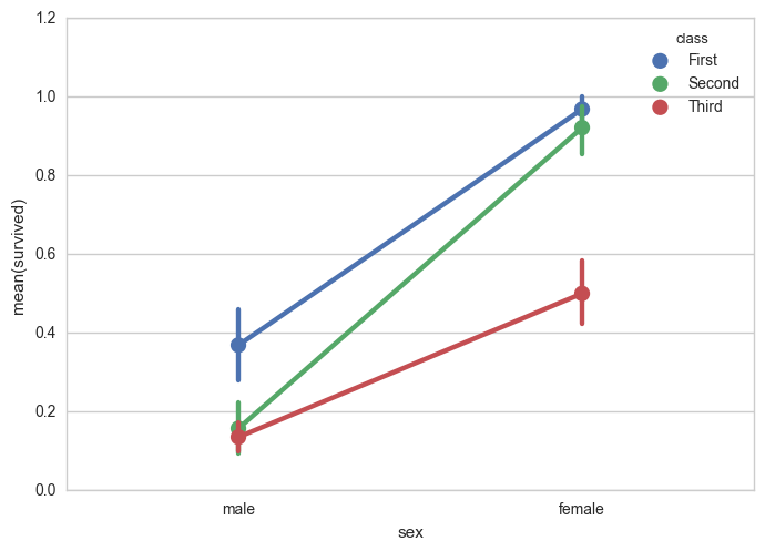
sns.barplot(x="sex", y="survived", hue="class", data=titanic)
4.1 分类散点图
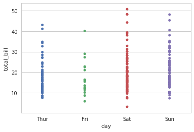
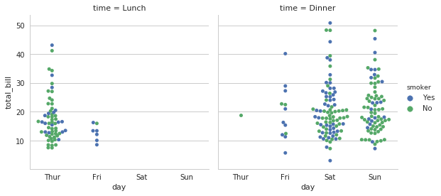
当有一维数据是分类数据时,散点图成为了条带形状。
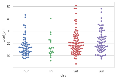
sns.stripplot(x="day", y="total_bill", data=tips)
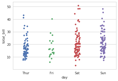
散点图绘制的时候很多点集中在一起,为了更清楚的表示,需要进行如下两种方法的操作。
法一:抖动。
sns.stripplot(x="day", y="total_bill", data=tips, jitter=True)
法二:生成蜂群图,避免散点重叠
sns.swarmplot(x="day", y="total_bill", data=tips)
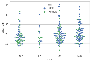
在每一个一级分类内部可能存在二级分类
sns.swarmplot(x="day", y="total_bill", hue="sex", data=tips)
4.2 分类分布图
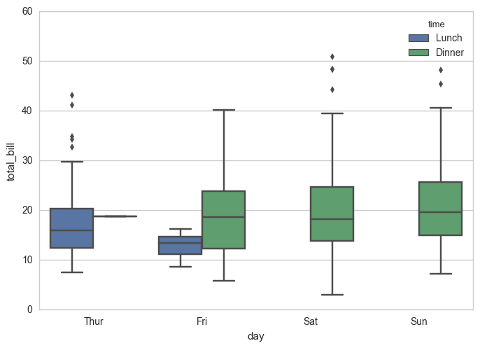
4.2.1 箱图
上边缘、上四分位数、中位数、下四分位数、下边缘
sns.boxplot(x="day", y="total_bill", hue="time", data=tips)
4.2.2 提琴图
箱图 + KDE(Kernel Distribution Estimation)
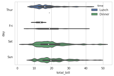
sns.violinplot(x="total_bill", y="day", hue="time", data=tips)
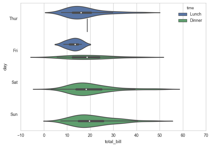
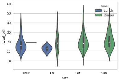
sns.violinplot(x="day", y="total_bill", hue="time", data=tips)
sns.violinplot(x="total_bill", y="day", hue="time", data=tips, bw=.1, scale="count", scale_hue=False)
sns.violinplot(x="total_bill", y="day", hue="time", data=tips, bw=.1, scale="count", scale_hue=False)

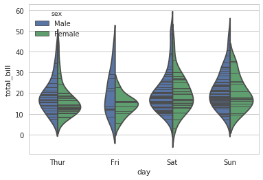
非对称提琴图
sns.violinplot(x="day", y="total_bill", hue="sex", data=tips, split=True, inner="stick")
4.3 分类统计估计图
4.3.1 统计柱状图
sns.barplot(x="sex", y="survived", hue="class", data=titanic)

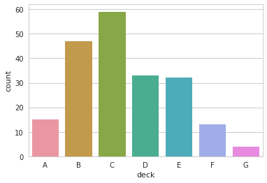
4.3.2 灰度柱状图
sns.countplot(x="deck", data=titanic)
4.3.3 点图
sns.pointplot(x="sex", y="survived", hue="class", data=titanic)
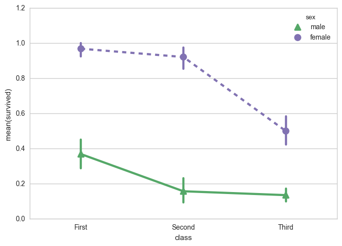
修改颜色、标记、线型
sns.pointplot(x="class", y="survived", hue="sex", data=titanic,
              palette={"male": "g", "female": "m"},
              markers=["^", "o"], linestyles=["-", "--"])
4.4 分类子图
- 通过调整factorplot的参数可以绘制出很多不同类型的图
sns.factorplot(x="day", y="total_bill", hue="smoker", col="time", data=tips, kind="swarm")
多分类标准的子图
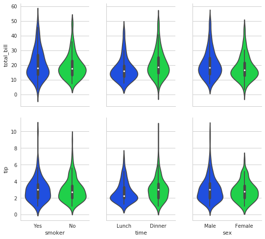
g = sns.PairGrid(tips,
                 x_vars=["smoker", "time", "sex"],
                 y_vars=["total_bill", "tip"],
                 aspect=.75, size=3.5)
# 对网格中的每一个图做violinplot
g.map(sns.violinplot, palette="bright");
总结
通过seaborn对数据可视化可以看出数据的分布等情况。
更具体的代码这里。
参考文献:
寒老师课件