圆角
设置某一个角的圆角,比如设置左上角的圆角:
border-top-left-radius:30px 60px;
同时分别设置四个角: border-radius:30px 60px 120px 150px;
设置四个圆角相同:
border-radius:50%;
效果图

html
<!DOCTYPE html>
<html lang="en">
<head>
	<meta charset="UTF-8">
	<title>Document</title>
	<style type="text/css">

		.box{
			width:300px;
			height:300px;
			border:3px solid #000;
			background-color:gold;
			margin:50px auto 0;
			border-top-left-radius:60px;
			border-top-right-radius:100px;
		}

		.box1{
			width:300px;
			height:300px;
			border:3px solid #000;
			background-color:gold;
			margin:50px auto 0;
			border-bottom-left-radius:150px;
			border-top-right-radius:150px;
		}

		.box2{
			width:300px;
			height:300px;
			border:3px solid #000;
			background-color:gold;
			margin:50px auto 0;
			/* border-radius:150px; */

			border-radius:50%;
		}


	</style>
</head>
<body>
	<div class="box"></div>

	<div class="box1"></div>

	<div class="box2"></div>
</body>
</html>
透明
rgba(新的颜色值表示法)
1、盒子透明度表示法:
.box
{
    opacity:0.1;
    /* 兼容IE */
    filter:alpha(opacity=10);
}
2、rgba(0,0,0,0.1) 前三个数值表示颜色,第四个数值表示颜色的透明度
效果

html
<!DOCTYPE html>
<html lang="en">
<head>
	<meta charset="UTF-8">
	<title>Document</title>
	<style type="text/css">

		body{
			background:url(images/banner01.jpg);
		}
		/*盒子整个透明*/
		.box{
			width:300px;
			height:100px;
			background-color:#000;
			color:#fff;
			font-size:30px;
			text-align:center;
			line-height:100px;
            /* 元素透明的完整写法 */
			opacity:0.3;
			filter:alpha(opacity=30);
		}
		/*背景元素透明*/
		.box2{
			width:300px;
			height:100px;
			background-color:rgba(0,0,0,0.3);
			color:#fff;
			font-size:30px;
			text-align:center;
			line-height:100px;
			margin-top:50px;
		}


	</style>
</head>
<body>
	<div class="box">这是一个div</div>

	<div class="box2">这是第二个div</div>
</body>
</html>
transition动画
- 1、transition-property 设置过渡的属性,比如:width height background-color
- 2、transition-duration 设置过渡的时间,比如:1s 500ms
- 3、transition-timing-function 设置过渡的运动方式,常用有 linear(匀速)|ease(缓冲运动)
- 4、transition-delay 设置动画的延迟
- 5、transition: property duration timing-function delay 同时设置四个属性
html
<!DOCTYPE html>
<html lang="en">
<head>
	<meta charset="UTF-8">
	<title>Document</title>
	<style type="text/css">

		.box{
			width:100px;
			height:100px;
			background-color:gold;
			/* transition:width 1s ease,height 1s ease 1s,background-color 1s ease 2s; */


			/*
			多个属性同时做动画,可以合并成下面一句
			transition:width 1s ease,height 1s ease,background-color 1s ease;

			*/

			transition:all 1s ease;
		}


		.box:hover{
			width:600px;
			height:500px;
			background-color:red;
		}


	</style>
</head>
<body>
	<div class="box"></div>
</body>
</html>
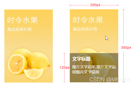
综合练习:
制作鼠标移入图片时,图片说明滑入的效果
示例图片
<!DOCTYPE html>
<html lang="en">
<head>
	<meta charset="UTF-8">
	<title>Document</title>
	<style type="text/css">
		.pic_con{
			width:200px;
			height:300px;
			margin:50px auto 0;
			position:relative;
			overflow:hidden;
		}
		.pic_info{
			position:absolute;
			left:0;
			top:300px;
			width:180px;
			height:100px;
			background-color:rgba(0,0,0,0.3);
			color:#fff;
			padding:10px;
			transition:all 500ms ease;
		}

		.pic_con:hover .pic_info{
			top:180px;
		}

	</style>
</head>
<body>
	<div class="pic_con">
		<img src="images/banner01.jpg" alt="banner">
		<div class="pic_info">
			<h3>文字说明标题</h3>
			<p>文字说明文字说明文字说明文字说明</p>
		</div>
	</div>
</body>
</html>
transform变换
1、translate(x,y) 设置盒子位移
2、scale(x,y) 设置盒子缩放
3、rotate(deg) 设置盒子旋转
4、skew(x-angle,y-angle) 设置盒子斜切
5、perspective 设置透视距离
6、transform-style flat | preserve-3d 设置盒子是否按3d空间显示
7、translateX、translateY、translateZ 设置三维移动
8、rotateX、rotateY、rotateZ 设置三维旋转
9、scaleX、scaleY、scaleZ 设置三维缩放
10、tranform-origin 设置变形的中心点
11、backface-visibility 设置盒子背面是否可见
<!DOCTYPE html>
<html lang="en">
<head>
	<meta charset="UTF-8">
	<title>transform</title>
	<style type="text/css">
		/*位移*/
		.box{

			width:200px;
			height:200px;
			border:3px solid #000;
			background-color:gold;
			margin:50px auto 0;

			/* translate位移比定位做的位移性能高,建议使用这种位移 */
			transform:translate(0px,0px);
			transition:all 500ms ease;
		}


		.box:hover{
			transform:translate(30px,30px);
		}

		/*缩放*/
		.box2{

			width:200px;
			height:200px;
			border:3px solid #000;
			background-color:gold;
			margin:50px auto 0;
			transform:scale(1,1);
			transition:all 500ms ease;
		}

		.box2:hover{
			transform:scale(2,2);
		}

		/*旋转*/
		.box3{
			width:200px;
			height:200px;
			border:3px solid #000;
			background-color:gold;
			margin:50px auto 0;
			transform:rotate(0deg);
			transition:all 500ms ease;
		}

		.box3:hover{
			transform:rotate(45deg);
		}

		/*斜切*/
		.box4{
			width:200px;
			height:200px;
			border:3px solid #000;
			background-color:gold;
			margin:50px auto 0;
			transform:skew(0,0);
			transition:all 500ms ease;
		}

		.box4:hover{
			transform:skew(0,45deg);
		}


	</style>
</head>
<body>
	<div class="box"></div>
	<div class="box2"></div>
	<div class="box3"></div>
	<div class="box4"></div>
</body>
</html>
transform-origin 旋转中心点
<!DOCTYPE html>
<html lang="en">
<head>
	<meta charset="UTF-8">
	<title>Document</title>
	<style type="text/css">

		.box01,.box02,.box03,.box04{
			width:200px;
			height:200px;
			border:3px solid #000;
			background:gold;
			margin:30px;
			float:left;
			transition:all 500ms ease;
		}
		.box02{
			transform-origin:left center;
		}
		.box03{
			transform-origin:left top;
		}
		.box04{
			transform-origin:50px 50px;
		}

		.box01:hover,.box02:hover,.box03:hover,.box04:hover{
			transform:rotate(90deg);
		}


	</style>
</head>
<body>
	<div class="box01"></div>
	<div class="box02"></div>
	<div class="box03"></div>
	<div class="box04"></div>
</body>
</html>
三维旋转
<!DOCTYPE html>
<html lang="en">
<head>
	<meta charset="UTF-8">
	<title>三维旋转</title>
	<style type="text/css">

		/*
			旋转的轴向:

			x轴:从左往右

			y轴:从上往下

			z轴:从屏幕内往外

			判断旋转的方向:让轴向对着自己,顺时针方向


		*/

		.box{
			width:300px;
			height:300px;
			background-color:gold;
			border:3px solid #000;
			margin:50px auto 0;
			transform-style:preserve-3d;

			/* 做变形动画需要设置初始值,不设置容易出现跳变的bug */
			/* 三维旋转要加上透视效果 800px 效果最好 */
			transform:perspective(800px) rotateY(0deg);
			transition:all 500ms ease;
		}

		.box:hover{
			transform:perspective(800px) rotateY(45deg);
		}


		.box2{
			width:300px;
			height:300px;
			background-color:gold;
			border:3px solid #000;
			margin:50px auto 0;
			transform-style:preserve-3d;

			/* 做变形动画需要设置初始值,不设置容易出现跳变的bug */
			transform:perspective(800px) rotateX(0deg);
			transition:all 500ms ease;
		}

		.box2:hover{
			transform:perspective(800px) rotateX(45deg);
		}


	</style>
</head>
<body>
	<div class="box"></div>

	<div class="box2"></div>
</body>
</html>
翻面动画
<!DOCTYPE html>
<html lang="en">
<head>
	<meta charset="UTF-8">
	<title>Document</title>
	<style type="text/css">
		.box{
			width:700px;
			height:272px;
			border:3px solid #000;
			margin:50px auto 0;
			position:relative;
			/* 让容器里面的元素按照3d空间显示(规范写法)  */
			transform-style:preserve-3d;
		}
		.box img{
			position:absolute;
			left:200px;
			top:0;
			transform:perspective(800px) rotateY(0deg);
			transition:all 500ms ease;
			backface-visibility:hidden;
		}
		.box:hover img{
			transform:perspective(800px) rotateY(180deg);
		}
		.box .back{
			width:300px;
			height:272px;
			background-color:pink;
			position:absolute;
			left:200px;
			top:0;
			font-size:20px;
			text-align:center;
			line-height:272px;
			transform:perspective(800px) rotateY(-180deg);
			transition:all 500ms ease;
			backface-visibility:hidden;
		}
		.box:hover .back{
			transform:perspective(800px) rotateY(0deg);
		}
	</style>
</head>
<body>
	<div class="box">
		<img src="images/location_bg.jpg" alt="背景图">
		<div class="back">
			图片的说明文字
		</div>
	</div>
</body>
</html>
animation动画
1、@keyframes 定义关键帧动画
2、animation-name 动画名称
3、animation-duration 动画时间
4、animation-timing-function 动画曲线 linear(匀速)|ease(缓冲)|steps(步数)
5、animation-delay 动画延迟
6、animation-iteration-count 动画播放次数 n|infinite
7、animation-direction 动画结束后是否反向还原 normal|alternate
8、animation-play-state 动画状态 paused(停止)|running(运动)
9、animation-fill-mode 动画前后的状态 none(缺省)|forwards(结束时停留在最后一帧)|backwards(开始时停留在定义的开始帧)|both(前后都应用)
10、animation:name duration timing-function delay iteration-count direction;同时设置多个属性
方块往复运动
<!DOCTYPE html>
<html lang="en">
<head>
	<meta charset="UTF-8">
	<title>Document</title>
	<style type="text/css">

		/*  定义动画  */

		@keyframes moving{
			from{
				width:100px;
			}
			to{
				width:500px;
			}
		}

		.box{
			width:100px;
			height:100px;
			background-color:gold;
			animation:moving 1s ease infinite alternate;

		}

		.box:hover{
			animation-play-state:paused;
		}


	</style>
</head>
<body>
	<div class="box"></div>
</body>
</html>
风车旋转
<!DOCTYPE html>
<html lang="en">
<head>
	<meta charset="UTF-8">
	<title>风车旋转</title>
	<style type="text/css">

		@keyframes rotating{
			from{
				transform:rotate(0deg);
			}
			to{
				transform:rotate(360deg);
			}
		}

		.zhuan{
			display:block;
			width:400px;
			height:400px;
			margin:50px auto 0;
			animation:rotating 2s linear infinite;
		}

	</style>
</head>
<body>
	<img src="images/fengche.png" alt="风车图片" class="zhuan">
</body>
</html>
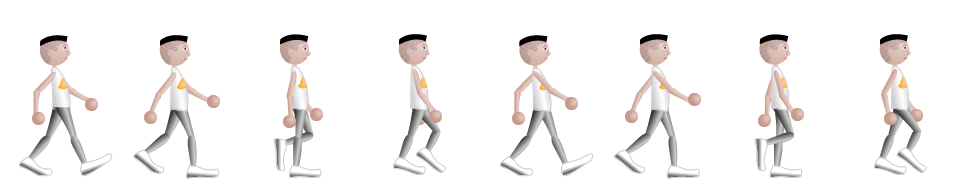
走路动画
<!DOCTYPE html>
<html lang="en">
<head>
    <meta charset="UTF-8">
    <title>走路动画</title>
    <style type="text/css">
        .box{
            width:120px;
            height:180px;
            border:1px solid #ccc;
            margin:50px auto 0;
            position:relative;
            overflow:hidden;
        }

        .box img{
            display:block;
            width:960px;
            height:182px;
            position: absolute;
            left:0;
            top:0;
            animation:walking 1.0s steps(8) infinite;
        }
        @keyframes walking{
            from{
                left:0px;
            }

            to{
                left:-960px;
            }
        }
    </style>
</head>
<body>
    <div class="box"><img src="images/walking.png"></div>
</body>
</html>
CSS3新增选择器
1、E:nth-child(n):匹配元素类型为E且是父元素的第n个子元素
<style type="text/css">
    .list div:nth-child(2){
        background-color:red;
    }
</style>
......
<div class="list">
    <h2>1</h2>
    <div>2</div>
    <div>3</div>
    <div>4</div>
    <div>5</div>
</div>
2、E:first-child:匹配元素类型为E且是父元素的第一个子元素
3、E:last-child:匹配元素类型为E且是父元素的最后一个子元素
4、E > F E元素下面第一层子集
5、E ~ F E元素后面的兄弟元素
6、E + F 紧挨着的后面的兄弟元素
属性选择器:
1、E[attr] 含有attr属性的元素
<style type="text/css">
    div[data-attr='ok']{
        color:red;
    }
</style>
......
<div data-attr="ok">这是一个div元素</div>
2、E[attr=‘ok’] 含有attr属性的元素且它的值为“ok”
3、E[attr^=‘ok’] 含有attr属性的元素且它的值的开头含有“ok”
4、E[attr$=‘ok’] 含有attr属性的元素且它的值的结尾含有“ok”
5、E[attr*=‘ok’] 含有attr属性的元素且它的值中含有“ok”
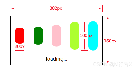
loading动画
<!DOCTYPE html>
<html lang="en">
<head>
	<meta charset="UTF-8">
	<title>Document</title>
	<style type="text/css">

		@keyframes loading{
			from{
				transform:scale(1,1);
			}
			to{
				transform:scale(1,0.5);
			}
		}
		.con{
			width:300px;
			height:158px;
			border:1px solid #000;
			margin:150px auto 0;
		}
		.con div{
			width:30px;
			height:100px;
			float:left;
			background-color:gold;
			margin:15px;
			border-radius:15px;
			animation:loading 500ms ease infinite alternate;
		}
		.con div:nth-child(1){
			background-color:red;
		}
		.con div:nth-child(2){
			background-color:green;
			animation-delay:100ms;
		}
		.con div:nth-child(3){
			background-color:pink;
			animation-delay:200ms;
		}

		.con div:nth-child(4){
			background-color:lightgreen;
			animation-delay:300ms;
		}

		.con div:nth-child(5){
			background-color:lightblue;
			animation-delay:400ms;
		}

		.con p{
			text-align:center;
		}


	</style>
</head>
<body>
	<div class="con">
		<div></div>
		<div></div>
		<div></div>
		<div></div>
		<div></div>
		<p>loading...</p>
	</div>
</body>
</html>
css3新增选择器
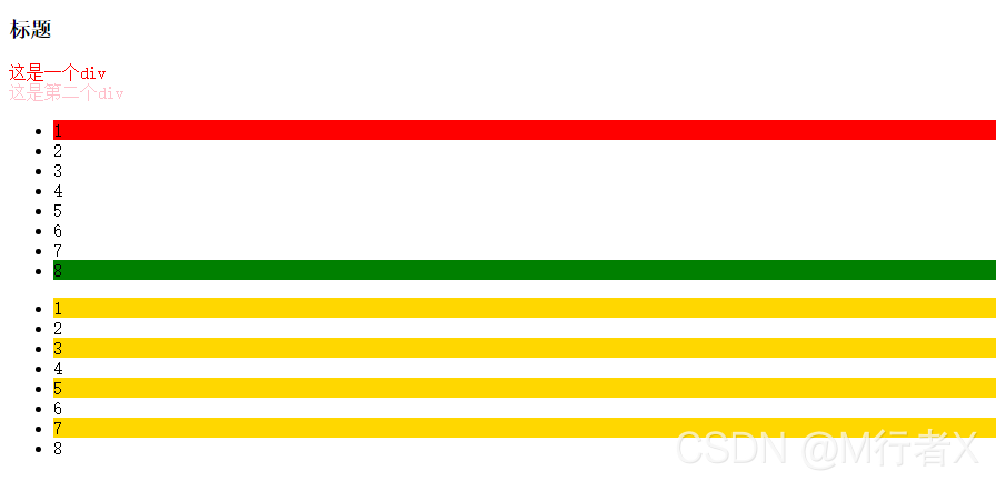
<!DOCTYPE html>
<html lang="en">
<head>
	<meta charset="UTF-8">
	<title>Document</title>
	<style type="text/css">

		/*  匹配第二个类型是div子元素  */

		.con div:nth-child(2){
			color:red;
		}

		.con div:nth-child(3){
			color:pink;
		}

		/*
		.list li:nth-child(1){
			background-color:red;
		}

		等同于下面的写法:

		*/

		.list li:first-child{
			background-color:red;
		}

		/* .list li:nth-child(8){
			background-color:green;
		}

		等同于下面的写法:

		*/


		.list li:last-child{
			background-color:green;
		}

		/*
		    2n:偶数行;
		    2n+1:奇数行;

		 */

		.list2 li:nth-child(2n+1){
			background-color:gold;
		}


	</style>
</head>
<body>

	<div class="con">
		<h3>标题</h3>
		<div>这是一个div</div>
		<div>这是第二个div</div>
	</div>


	<ul class="list">
		<li>1</li>
		<li>2</li>
		<li>3</li>
		<li>4</li>
		<li>5</li>
		<li>6</li>
		<li>7</li>
		<li>8</li>
	</ul>


	<ul class="list2">
		<li>1</li>
		<li>2</li>
		<li>3</li>
		<li>4</li>
		<li>5</li>
		<li>6</li>
		<li>7</li>
		<li>8</li>
	</ul>

</body>
</html>
<!DOCTYPE html>
<html lang="en">
<head>
<meta charset="UTF-8">
<title>Document</title>
<style type="text/css">
.box > div{
border:1px solid red;
padding:10px;
margin:10px;
}
.box2 .title2{
color:red;
}
.box2 .title2 ~ p{
color:pink
}
.box2 .title2 + p{
color:gold;
}
.box2 .title1 + p{
color:green;
}
</style>
</head>
<body>
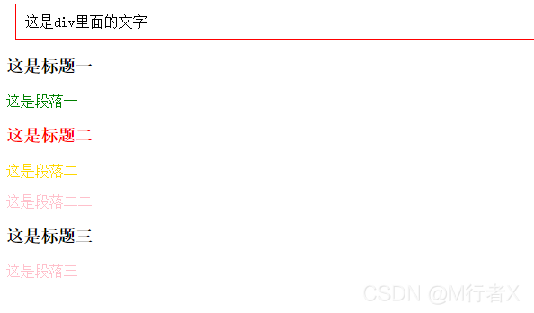
<div class="box">
<div>
<div>这是div里面的文字</div>
</div>
</div>
<div class="box2">
<h3 class="title1">这是标题一</h3>
<p>这是段落一</p>
<h3 class="title2">这是标题二</h3>
<p>这是段落二</p>
<p>这是段落二二</p>
<h3>这是标题三</h3>
<p>这是段落三</p>
</div>
</body>
</html>
<!DOCTYPE html>
<html lang="en">
<head>
<meta charset="UTF-8">
<title>Document</title>
<style type="text/css">
/* 匹配所有有class属性的div */
.con div[class]{
background-color:gold;
margin-bottom:10px;
}
/* 匹配class属性值是ok的div */
.con div[class="ok"]{
background-color:pink
}
/* 匹配class属性值是“ok”开头的div */
.con div[class^="ok"]{
text-indent:30px;
}
/* 匹配class属性值是“ok”结尾的div */
.con div[class$="ok"]{
font-size:30px;
}
/* 匹配class属性值含有“ok”的div */
.con div[class*="ok"]{
border-bottom:2px solid #000;
}
</style>
</head>
<body>
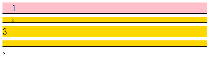
<div class="con">
<div class="ok">1</div>
<div class="okabc">2</div>
<div class="abcok">3</div>
<div class="abcok123">4</div>
<div>5</div>
</div>
</body>
</html>
权重
CSS权重指的是样式的优先级,有两条或多条样式作用于一个元素,权重高的那条样式对元素起作用,权重相同的,后写的样式会覆盖前面写的样式。
权重的等级
可以把样式的应用方式分为几个等级,按照等级来计算权重
1、!important,加在样式属性值后,权重值为 10000
2、内联样式,如:style=””,权重值为1000
3、ID选择器,如:#content,权重值为100
4、类,伪类和属性选择器,如: content、:hover 权重值为10
5、标签选择器和伪元素选择器,如:div、p、:before 权重值为1
6、通用选择器(*)、子选择器(>)、相邻选择器(+)、同胞选择器(~)、权重值为0
权重的计算实例
1、实例一:
<style type="text/css">
    div{
        color:red !important;
    }
</style>
......
<div style="color:blue">这是一个div元素</div>
<!--
两条样式同时作用一个div,上面的样式权重值为10000+1,下面的行间样式的权重值为1000,
所以文字的最终颜色为red
-->
2、实例二:
<style type="text/css">
    #content div.main_content h2{
        color:red;
    }
    #content .main_content h2{
        color:blue;
    }
</style>
......
<div id="content">
    <div class="main_content">
        <h2>这是一个h2标题</h2>
    </div>
</div>
<!--
第一条样式的权重计算: 100+1+10+1,结果为112;
第二条样式的权重计算: 100+10+1,结果为111;
h2标题的最终颜色为red
-->