放在前面的-----
浏览器支持问题:
Internet Explorer 10、Firefox 以及 Opera 支持 @keyframes 规则和 animation 属性。
而Chrome 和 Safari 需要前缀 -webkit-。
CSS3中动画是什么-----
动画是指从一种样式逐渐改变成另一种样式,可改变数次,改变多种样式,其中用百分比(0%至100%)或用关键词 ("from" 和 "to")来规定变化发生的时间。注:1.为了得到最佳的浏览器支持,我们应该始终定义 0% 和 100% 选择器。2.请使用动画属性来控制动画的外观,同时将动画与选择器绑定.
动画所需的属性------

接下来我们仔细看看这些属性------
1. @keyframes (keyframes被称为关键帧)
语法为:@keyframes animationname {
keyframes-selector {css-styles;}
}
animationname位置: 需填写动画的名字,而keyframes-selector是用来设定动画时长的百分比,如果省略某个状态,浏览器会自动推算中间状态。但是,为了获得最佳的浏览器支持,应该始终定义0%和100%的选择器,另外,可以将多个状态写在一行,如下例所示:
@keyframes nice{
  0%,100% { background: #f00; }
  50% { background: #0f0;
}
css-styles;位置: 指可填写一个或多个css样式属性,这些值都是必不可少的。注:其中的animationname需与之后介绍到的的animation属性中的animation-name部分填写一致。
**样例如下**:(测试;浏览器为谷歌,因此含-webkit-)
 @-webkit-keyframes nice {
            0%   {top:0px;left:0px;}
            25%  {top:0px;left:500px; width: 100px;background: darksalmon;}
            50%  {top:500px;width:150px;left:500px;background-color: blanchedalmond;}
            75%  {top:500px;width: 150px;left:0px;background: darksalmon;}
            100% {top:0px;width:100px;left:0px;background-color: blanchedalmond;}
        }
注意: 通过刚刚介绍的的 @keyframes 规则,我们能够创建动画,再通过在盒子里使用接下来说道的这些动画属性实现动画。
2. animation
语法为:animation : name duration timing-function delay iteration-count direction ;
其中,
1)name 规定需要绑定到选择器的 keyframe 名称。
2)duration 规定完成动画所花费的时间,以秒或毫秒计。一定要注意:它的默认值是 0,意味着没有动画效果,所以不能省略不写。
3)timing-function 规定动画的速度曲线,速度曲线定义动画从一套 CSS 样式变为另一套所用的时间,速度曲线可使变化更为平滑。其中可填值如下 :
| 值 |
描述 |
| ease |
动画以低速开始,然后加快,在结束前变慢(注:是默认值) |
| linear |
动画从头到尾的速度是相同的 |
| ease-in |
动画以低速开始 |
| ease-out |
动画以低速结束 |
| ease-in-out |
动画以低速开始和结束 |
| cubic-bezier(n,n,n,n) |
在 cubic-bezier 函数中填入自己的值(从 0 到 1 ) |
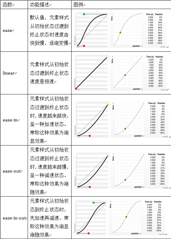 为了便于理解,这里配上一幅图
PS:cubic-bezier(n,n,n,n)中是用四个坐标来固定四个点的位置,来帮助绘制贝塞尔曲线(就是一条平滑的曲线啦-(*o*)-)这部分的详细内容请戳下方链接了解一下啦:
点击打开链接
4)delay 规定在动画开始之前的延迟。值以秒或毫秒计,表示多少秒或毫秒后动画开始播放,注意:负值是可以存在的,例如填入-2s后,-2s 使动画马上开始,但跳过 2 秒进入动画。如果还不太理解,可以戳下方看看负值的妙用吧:
点击打开链接
5)iteration-count 规定动画应该播放的次数。可填入的值有infinite(无限次循环)和任意数(包括小数,负数的效果和默认相同),注意:其属性的默认值是1,代表动画会从头到位执行1次。
6)direction 规定是否应该轮流反向播放动画。值可以填normal|alternate normal为默认值,动画将正常播放, alternate会使动画在奇数次数(1、3、5 等等)正常播放,而在偶数次数(2、4、6 等等)向后播放。注意:如果把动画设置为只播放一次,则该属性没有效果。
多种样例如下:
div {
  animation: changecolor 5s ease-out .2s;
}
div{
animation-name:myfirst;
animation-duration:5s;
animation-timing-function:linear;
animation-delay:1s;
animation-iteration-count:infinite;
animation-direction:alternate;
animation-play-state:running;
}
div{
animation:myfirst 5s linear 2s infinite alternate;
animation-play-state:running;
}
PS: 以上这六个值也可单独做属性使用------前面加上 animation- 即可,以下便不在赘述这六个属性。
另外,animation-iteration-count属性通常和值设置为alternate的animation-direction属性结合使用,这样可以使动画方向交替变换; 例如一个水平运动的小球,小球从起点运动到终点,然后从终点又运动会起点。、
你可以为animation-iteration-count属性提供多个值,各个值之间使用逗号来分隔。如果你设置了多个值,这些值通常和animation属性相关的其它动画属性值一一对应; 例如,如果你为animation-iteration-count属性提供了2个值,那么第一个值将决定animation-name中第一个动画的运行次数,第二个值将决定animation-name中第二个动画的运行次数。
3.animation-play-state
语法为: animation-play-state: paused|running;
分别是规定动画已暂停和正在播放
4.animation-fill-mode
语法为:animation-fill-mode : none | forwards | backwards | both;
该属性规定了动画在播放之前或之后,其动画效果是否可见。其中,
none 指不改变默认行为。
forwards 指当动画完成后,保持最后一个属性值(在最后一个关键帧中定义)。
backwards 指在 animation-delay 所指定的一段时间内,在动画显示之前,应用开始属性值(在第一个关键帧中定义)。
both 指向前和向后填充模式都被应用。
inherit 从父元素继承该属性
最后是一个完整样例:
    <!DOCTYPE html>
    <html lang="en">
    <head>
        <meta charset="UTF-8">
        <title>animation演示</title>
        <style>
        div
        {
        width:100px;
        height:100px;
        background:red;
        position:relative;
        animation-name:myfirst;
        animation-duration:5s;
        animation-timing-function:linear;
        animation-delay:1s;
        animation-iteration-count:infinite;
        animation-direction:alternate;
        animation-play-state:running;
        /* Safari and Chrome: */
        -webkit-animation-name:myfirst;
        -webkit-animation-duration:5s;
        -webkit-animation-timing-function:linear;
        -webkit-animation-delay:1s;
        -webkit-animation-iteration-count:infinite;
        -webkit-animation-direction:alternate;
        -webkit-animation-play-state:running;
        }

        @keyframes myfirst /*定义动画名*/
        {
        0%   {background:red; left:0px; top:0px;} /*定义起始帧样式,0%相当于from*/
        25%  {background:yellow; left:200px; top:0px;}
        50%  {background:blue; left:200px; top:200px;}
        75%  {background:green; left:0px; top:200px;}
        100% {background:red; left:0px; top:0px;} /*定义结束帧样式,100%相当于to*/
        }

        @-webkit-keyframes myfirst /* Safari and Chrome */
        {
        0%   {background:red; left:0px; top:0px;}
        25%  {background:yellow; left:200px; top:0px;}
        50%  {background:blue; left:200px; top:200px;}
        75%  {background:green; left:0px; top:200px;}
        100% {background:red; left:0px; top:0px;}
        }
        </style>
    </head>
    <body>
        <p>该实例在 Internet Explorer 9 及更早 IE 版本是无效的。</p>
        <div></div>
    </body>
    </html>