一、动画介绍
动画( animation)是CSS3中具有颠覆性的特征之ー,可通过设置多个节点来精确控制一个或一组动画常用来实现复杂的动画效果。
相比较过渡,动画可以实现更多变化,更多控制的效果。
二、动画组成
制作动画分为两个部分:
-
@keyframes定义动画
-
animation属性调用动画
三、@keyframes(关键帧) 定义动画
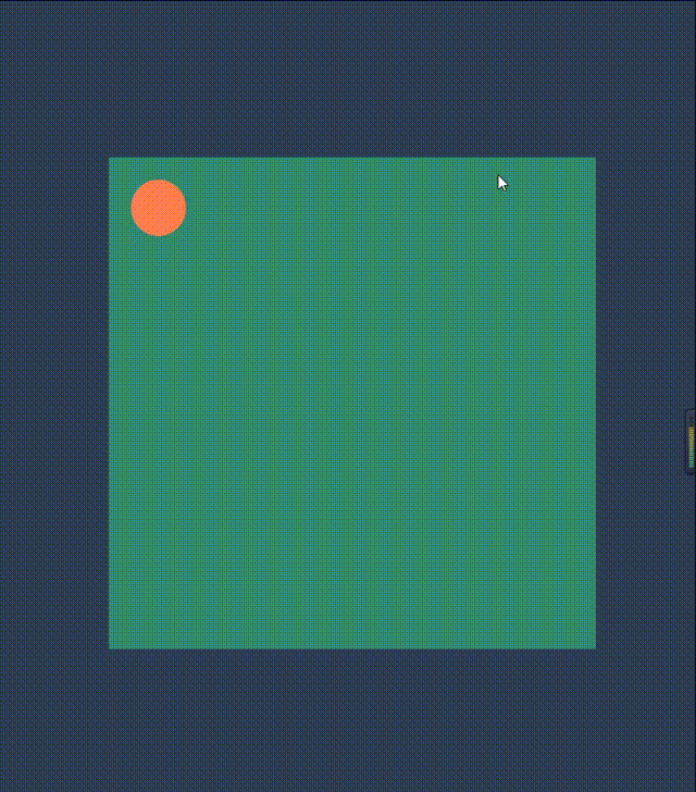
创建动画的原理是,将一套 CSS 样式逐渐变化为另一套样式。在动画过程中我们能够多次改变这套 CSS 样式。以百分比来规定改变发生的时间,或者通过关键词 from 和 to,等价于 0% 和 100%。
示例
<body>
    <main>
        <div></div>
    </main>
</body>
body {
    margin: 0;
    padding: 0;
    width: 100vw;
    height: 100vh;
    background-color: #2E3E54;
    display: grid;
}

main {
    width: 400px;
    height: 400px;
    background-color: rgb(51, 139, 109);
    padding: 20px;
    justify-self: center;
    align-self: center;
}

div {
    width: 50px;
    height: 50px;
    background-color: coral;
    border-radius: 50%;
    animation-name: move;
    animation-duration: 4s;
}

/* move为动画名 自定义 */
@keyframes move {
    0% {
        transform: translate(0, 0);
    }

    25% {
        transform: translate(350px, 0);
    }

    50% {
        transform: translate(350px, 350px);
    }

    75% {
        transform: translate(0, 350px);
    }

    100% {
        transform: translate(0, 0);
    }
}
四、动画属性 ★★★
| 属性 |
作用 |
| animation |
除了animation-play-state之外的所有属性简写 |
| animation-name |
需要使用的动画名(必须) |
| animation-duration |
规定动画完成一个周期所花费的时间 (必须) |
| animation-timing-function |
规定动画的速率曲线,默认是 ease
|
| aniamtion-delay |
规定动画延迟执行的时间,默认 0 |
| animation-iteration-count |
规定动画执行的次数,默认是1 |
| animation-direction |
规定动画是否在下一周期逆向播放,默认是 normal
|
| animation-play-state |
规定动画运行/暂停 默认是 running
|
| animation-fill-mode |
规定动画结束后状态,默认回到初始状态 |
1. animation-name
animation-name:就是需要绑定的@keyframes的名称
div {
  width: 50px;
  height: 50px;
  animation-name: move;
}

@keyframes move {
  to {
    transform: translateX(400px);
  }
}
这就是定义了一个名称为move的动画,被div元素调用
2. animation-duration
animation-duration: 规定动画完成一个周期所花费的时间
div {
  width: 50px;
  height: 50px;
  animation-name: move;
  animation-duration: 2s;
}

@keyframes move {
  to {
    transform: translateX(400px);
  }
}
意思是指定div元素2s的时间向右移动400px
3. animation-timing-function
animation-timing-function: 规定动画的速率曲线,也就是动画执行过程的速度变化,默认是 ease
属性
| 属性 |
说明 |
| ease |
默认。动画以低速开始,然后加快,在结束前变慢 |
| ease-in |
动画以低速开始 |
| ease-out |
动画以低速结束 |
| ease-in-out |
动画以低速开始和结束 |
| cubic-bezier(n,n,n,n) |
在 cubic-bezier 函数中自己的值 值是从 0 到 1 的数值 |
| step-start |
在变化过程中,都是以下一帧的显示效果来填充间隔动画 |
| step-end |
在变化过程中,都是以上一帧的显示效果来填充间隔动画 |
| steps() |
可以传入两个参数,第一个是一个大于0的整数,他是将间隔动画等分成指定数目的小间隔动画,也就是指定每个阶段分为几步来展示动画 ,然后根据第二个参数来决定显示效果。第二个参数设置后 其实和step-start,step-end同义,在分成的小间隔动画中判断显示效果。 |
| linear |
动画从头到尾的速度是相同的 |
示例
<!DOCTYPE html>
<html lang="en">

<head>
    <meta charset="UTF-8">
    <meta http-equiv="X-UA-Compatible" content="IE=edge">
    <meta name="viewport" content="width=device-width, initial-scale=1.0">
    <title>动画速率</title>
    <style>
        body {
            margin: 0;
            padding: 0 10px;
            width: 100vw;
            height: 100vh;
            overflow: hidden;
            background-color: #2E3E54;
            display: grid;
            grid-template: 1fr / 1fr;
        }

        .box {
            display: grid;
            grid-template: 1fr / repeat(6, 1fr);
            column-gap: 10px;
        }

        .box>div {
            background-color: chocolate;
            animation-name: move;
            animation-duration: 4s;
        }

        .box div:nth-child(1) {
            animation-timing-function: ease;
        }

        .box div:nth-child(2) {
            animation-timing-function: ease-in;
        }

        .box div:nth-child(3) {
            animation-timing-function: ease-out;
        }

        .box div:nth-child(4) {
            animation-timing-function: ease-in-out;
        }

        .box div:nth-child(5) {
            animation-timing-function: linear;
        }

        .box div:nth-child(6) {
            animation-timing-function: cubic-bezier(0.075, 0.82, 0.165, 1);
        }

        @keyframes move {
            to {
                transform: translateY(calc(100vh - 100px));
            }
        }
    </style>
</head>

<body>
    <div class="box">
        <div>ease(默认)</div>
        <div>ease-in</div>
        <div>ease-out</div>
        <div>ease-in-out</div>
        <div>linear</div>
        <div>bezier(自定义)</div>
    </div>
</body>

</html>

<!DOCTYPE html>
<html lang="en">

<head>
    <meta charset="UTF-8">
    <meta http-equiv="X-UA-Compatible" content="IE=edge">
    <meta name="viewport" content="width=device-width, initial-scale=1.0">
    <title>动画速率</title>
    <style>
        body {
            margin: 0;
            padding: 0 10px;
            width: 100vw;
            height: 100vh;
            overflow: hidden;
            background-color: #2E3E54;
            display: grid;
            grid-template: 1fr / 1fr;
        }

        .box {
            display: grid;
            grid-template: 1fr / repeat(3, 1fr);
            column-gap: 10px;
        }

        .box>div {
            background-color: chocolate;
            animation-name: move;
            animation-duration: 4s;
        }

        .box div:nth-child(1) {
            animation-timing-function: step-start;
        }

        .box div:nth-child(2) {
            animation-timing-function: step-end;
        }

        .box div:nth-child(3) {
            animation-timing-function: steps(2, start);
        }

        @keyframes move {
            25% {
                transform: translateY(20vh);
            }

            50% {
                transform: translateY(40vh);
            }

            75% {
                transform: translateY(70vh);
            }

            to {
                transform: translateY(90vh);
            }
        }
    </style>
</head>

<body>
    <div class="box">
        <div>step-start</div>
        <div>step-end</div>
        <div>steps(2, start)</div>
    </div>
</body>

</html>

4. aniamtion-delay
aniamtion-delay: 规定动画延迟执行的时间,默认 0s,即立刻执行
<!DOCTYPE html>
<html lang="en">

<head>
    <meta charset="UTF-8">
    <meta http-equiv="X-UA-Compatible" content="IE=edge">
    <meta name="viewport" content="width=device-width, initial-scale=1.0">
    <title>delay</title>
    <style>
        body {
            margin: 0;
            padding: 10px;
            width: 100vw;
            height: 100vh;
            overflow: hidden;
            background-color: #2E3E54;
            display: grid;
            grid-template: 1fr / 1fr;
        }

        div {
            width: 50px;
            height: 50px;
            background-color: aliceblue;
            border-radius: 50%;
            animation-name: move;
            animation-duration: 1s;
            animation-delay: 2s;
        }

        @keyframes move {
            to {
                transform: translateX(300px);
            }
        }
    </style>
</head>

<body>
    <div></div>
</body>

</html>
以上代码给div定义一个往右移动300px的动画,因为设置了animation-delay: 2s; 所以会延迟两秒再执行动画
5. animation-iteration-count
animation-iteration-count: 规定动画执行的次数,默认是 1
<!DOCTYPE html>
<html lang="en">

<head>
    <meta charset="UTF-8">
    <meta http-equiv="X-UA-Compatible" content="IE=edge">
    <meta name="viewport" content="width=device-width, initial-scale=1.0">
    <title>animation-iteration-count</title>
    <style>
        body {
            margin: 0;
            padding: 10px;
            width: 100vw;
            height: 100vh;
            overflow: hidden;
            background-color: #2E3E54;
            display: grid;
            grid-template: 1fr / 1fr;
        }

        .box {
            width: 400px;
            height: 400px;
            background-color: cornflowerblue;
            align-self: center;
            justify-self: center;
            display: grid;
            grid-template: repeat(3, 1fr) / 1fr;
            row-gap: 10px;
        }

        .box>div {
            width: 50px;
            background-color: rgb(220, 229, 94);
            text-align: center;
            line-height: calc(400px / 3 - 20px);
            animation: wq;
            animation-duration: 1s;
        }

        .box>div:nth-child(1) {
            animation-iteration-count: 1;
        }

        .box>div:nth-child(2) {
            animation-iteration-count: 3;
        }

        .box>div:nth-child(3) {
            animation-iteration-count: infinite;
        }

        @keyframes wq {
            to {
                width: 400px;
            }
        }
    </style>
</head>

<body>
    <div class="box">
        <div>1</div>
        <div>3</div>
        <div>infinite</div>
    </div>
</body>

</html>

6. animation-direction
animation-direction: 规定动画是否在下一周期逆向播放,默认是 normal
属性
-
normal 正序播放(播放结束立刻回到元素初始状态)
-
reverse 倒序播放
-
alternate 交替播放 (动画在奇数次(1、3、5…)正向播放,在偶数次(2、4、6…)反向播放)
-
alternate-reverse 反交替播放
-
inherit 从父元素继承该属性
如果动画只执行一次,那么animation-direction将无效
示例
<!DOCTYPE html>
<html lang="en">
<head>
    <meta charset="UTF-8">
    <meta http-equiv="X-UA-Compatible" content="IE=edge">
    <meta name="viewport" content="width=device-width, initial-scale=1.0">
    <title>animation-diraction</title>
    <link rel="stylesheet" href="https://cdnjs.cloudflare.com/ajax/libs/font-awesome/4.7.0/css/font-awesome.min.css" integrity="sha512-SfTiTlX6kk+qitfevl/7LibUOeJWlt9rbyDn92a1DqWOw9vWG2MFoays0sgObmWazO5BQPiFucnnEAjpAB+/Sw==" crossorigin="anonymous" referrerpolicy="no-referrer" />
    <style>
        .box {
            width: 100vw;
            height: 100vh;
            background-color: #2E3E54;
            display: flex;
            justify-content: center;
            align-items: center;
        }

        ul {
            list-style: none;
            width: 600px;
            height: 200px;
            display: flex;
        }

        li{
            flex: 1;
            color: #f3462c;
            display: flex;
            justify-content: center;
            align-items: center;
            position: relative;
        }

        li:nth-child(1) i {
            animation-direction: normal;
        }

        li:nth-child(2) i {
            animation-direction: reverse;
        }

        li:nth-child(3) i {
            animation-direction: alternate;
        }

        li:nth-child(4) i {
            animation-direction: alternate-reverse;
        }

        li .fa {
            animation-name: big;
            animation-duration: 2s;
            animation-iteration-count: infinite;
            font-size: 2em;
        }

        li span {
            position: absolute;
            bottom: 0;
        }

        @keyframes big {
            to {
                transform: scale(3);
            }
        }
    </style>
</head>
<body>
    <div class="box">
        <ul>
            <li>
                <i class="fa fa-heart"></i>
                <span>normal</span>
            </li>
            <li>
                <i class="fa fa-heart"></i>
                <span>reverse</span>
            </li>
            <li>
                <i class="fa fa-heart"></i>
                <span>alternate</span>
            </li>
            <li>
                <i class="fa fa-heart"></i>
                <span>alternate-reverse</span>
            </li>
        </ul>
    </div>
</body>
</html>

7. animation-play-state
animation-play-state: 规定动画运行/暂停 默认是 running
属性
running 运行
paused 暂停
示例
<!DOCTYPE html>
<html lang="en">

<head>
    <meta charset="UTF-8">
    <meta http-equiv="X-UA-Compatible" content="IE=edge">
    <meta name="viewport" content="width=device-width, initial-scale=1.0">
    <title>animation-iteration-count</title>
    <style>
        body {
            margin: 0;
            padding: 0;
            width: 100vw;
            height: 100vh;
            overflow: hidden;
            background-color: #2E3E54;
            display: grid;
            grid-template: 1fr / 1fr;
        }

        div {
            width: 100px;
            height: 100px;
            background-color: darkturquoise;
            justify-self: center;
            align-self: center;
            animation-name: rotate;
            animation-duration: 1s;
            animation-iteration-count: infinite;
            animation-timing-function: linear;
        }

        div:hover {
            animation-play-state: paused;
        }

        @keyframes rotate {
            to {
                transform: rotate(360deg);
            }
        }
    </style>
</head>

<body>
    <div></div>
</body>

</html>

8. animation-fill-mode
animation-fill-mode: 规定动画结束后展示的状态,默认回到初始状态
属性
| 属性 |
说明 |
| none |
动画执行前后不改变任何样式 |
| backwards |
保持目标动画第一帧的样式 |
| forwards |
保持目标动画最后一帧的样式 |
| both |
动画将遵循开始和结束后的帧动画进行停留,也就是说会从第一帧开始停留显示,动画执行之后会停留到动画结束时的状态;与上面两个值的差别是,如果元素使用 forwards、backwards 两个值会在没有添加动画之前的展示状态进行停留,执行动画的时候才会开始执行关键帧,有这么一些细小的差别。 |
示例
<!DOCTYPE html>
<html lang="en">

<head>
    <meta charset="UTF-8">
    <meta http-equiv="X-UA-Compatible" content="IE=edge">
    <meta name="viewport" content="width=device-width, initial-scale=1.0">
    <title>animation-iteration-count</title>
    <style>
        body {
            margin: 0;
            padding: 0;
            width: 100vw;
            height: 100vh;
            overflow: hidden;
            background-color: #2E3E54;
            display: grid;
            grid-template: 1fr / repeat(4, 1fr);
        }

        div {
            width: 100px;
            height: 50px;
            background-color: aquamarine;
            justify-self: center;
            align-self: flex-end;
            animation-name: wq;
            animation-duration: 2s;
            animation-delay: 2s;
        }

        div:nth-child(1) {
            animation-fill-mode: none;
        }

        div:nth-child(2) {
            animation-fill-mode: backwards;
        }

        div:nth-child(3) {
            animation-fill-mode: forwards;
        }

        div:nth-child(4) {
            animation-fill-mode: both;
        }

        @keyframes wq {
            0% {
                height: 100px;
            }

            50% {
                height: 60vh;
            }

            100% {
                height: 100vh;
            }
        }
    </style>
</head>

<body>
    <div>none</div>
    <div>backwards</div>
    <div>forwards</div>
    <div>both</div>
</body>

</html>

9. animation 简写
- 简写属性里面不包含 animation- play-state
animation: name duration timing-function delay iteration-count direction fill-mode;

/* 动画名称 */
/* animation-name: move; */
/* 持续时间 */
/* animation-duration: 2s; */
/* 速度曲线 */
/* animation-timing-function: ease-in; */
/* 何时开始 */
/* animation-delay: 1s; */
/* 重复次数 */
/* animation-iteration-count: 2; */
/* 是否逆向播放 */
/* animation-direction: alternate; */
/* 结束后状态 */
/* animation-fill-mode: forwards; */

animation: move 2s linear 0s infinite alternate forwards;
- 注意:先使用的时间一定是动画持续时间
animation-duration