绘制散点图

数据来源
http://lishi.tianqi.com/beijing/index.html
# coding=utf-8
from matplotlib import pyplot as plt
from matplotlib import font_manager

my_font = font_manager.FontProperties(fname="/System/Library/Fonts/Hiragino Sans GB.ttc")
y_3 = [11,17,16,11,12,11,12,6,6,7,8,9,12,15,14,17,18,21,16,17,20,14,15,15,15,19,21,22,22,22,23]
y_10 = [26,26,28,19,21,17,16,19,18,20,20,19,22,23,17,20,21,20,22,15,11,15,5,13,17,10,11,13,12,13,6]

x_3 = range(1,32)
x_10 = range(51,82)

#设置图形大小
plt.figure(figsize=(20,8),dpi=80)

#使用scatter方法绘制散点图,和之前绘制折线图的唯一区别
plt.scatter(x_3,y_3,label="3月份")
plt.scatter(x_10,y_10,label="10月份")

#调整x轴的刻度
_x = list(x_3)+list(x_10)
_xtick_labels = ["3月{}日".format(i) for i in x_3]
_xtick_labels += ["10月{}日".format(i-50) for i in x_10]
plt.xticks(_x[::3],_xtick_labels[::3],fontproperties=my_font,rotation=45)

#添加图例
plt.legend(loc="upper left",prop=my_font)

#添加描述信息
plt.xlabel("时间",fontproperties=my_font)
plt.ylabel("温度",fontproperties=my_font)
plt.title("标题",fontproperties=my_font)
#展示
plt.show()

技术要点:plt.scatter(x,y)
应用场景
- 不同条件(维度)之间的内在关联关系
- 观察数据的离散聚合程度
绘制条形图

数据来源:
http://58921.com/alltime/2017
# coding=utf-8
from matplotlib import pyplot as plt
from matplotlib import font_manager
my_font = font_manager.FontProperties(fname="/System/Library/Fonts/Hiragino Sans GB.ttc")


a = ["战狼2","速度与激情8","功夫瑜伽","西游伏妖篇","变形金刚5:最后的骑士","摔跤吧!爸爸","加勒比海盗5:死无对证","金刚:骷髅岛","极限特工:终极回归","生化危机6:终章","乘风破浪","神偷奶爸3","智取威虎山","大闹天竺","金刚狼3:殊死一战","蜘蛛侠:英雄归来","悟空传","银河护卫队2","情圣","新木乃伊",]

b=[56.01,26.94,17.53,16.49,15.45,12.96,11.8,11.61,11.28,11.12,10.49,10.3,8.75,7.55,7.32,6.99,6.88,6.86,6.58,6.23]


#设置图形大小
plt.figure(figsize=(20,15),dpi=80)
#绘制条形图
plt.bar(range(len(a)),b,width=0.3)
#设置字符串到x轴
plt.xticks(range(len(a)),a,fontproperties=my_font,rotation=90)

plt.savefig("./movie.png")

plt.show()


绘制横着的条形图
#绘制横着的条形图
from matplotlib import pyplot as plt
from matplotlib import font_manager
my_font = font_manager.FontProperties(fname="/System/Library/Fonts/Hiragino Sans GB.ttc")


a = ["战狼2","速度与激情8","功夫瑜伽","西游伏妖篇","变形金刚5:最后的骑士","摔跤吧!爸爸","加勒比海盗5:死无对证","金刚:骷髅岛","极限特工:终极回归","生化危机6:终章","乘风破浪","神偷奶爸3","智取威虎山","大闹天竺","金刚狼3:殊死一战","蜘蛛侠:英雄归来","悟空传","银河护卫队2","情圣","新木乃伊",]

b=[56.01,26.94,17.53,16.49,15.45,12.96,11.8,11.61,11.28,11.12,10.49,10.3,8.75,7.55,7.32,6.99,6.88,6.86,6.58,6.23]


#设置图形大小
plt.figure(figsize=(20,8),dpi=80)
#绘制条形图
plt.barh(range(len(a)),b,height=0.3,color="orange")
#设置字符串到x轴
plt.yticks(range(len(a)),a,fontproperties=my_font)

plt.grid(alpha=0.3)
# plt.savefig("./movie.png")

plt.show()

数据来源:
http://www.cbooo.cn/movieday
例子

# coding=utf-8
from matplotlib import pyplot as plt
from matplotlib import font_manager
my_font = font_manager.FontProperties(fname="/System/Library/Fonts/Hiragino Sans GB.ttc")


a = ["猩球崛起3:终极之战","敦刻尔克","蜘蛛侠:英雄归来","战狼2"]
b_16 = [15746,312,4497,319]
b_15 = [12357,156,2045,168]
b_14 = [2358,399,2358,362]

bar_width = 0.2

x_14 = list(range(len(a)))
x_15 =  [i+bar_width for i in x_14]
x_16 = [i+bar_width*2 for i in x_14]

#设置图形大小
plt.figure(figsize=(20,8),dpi=80)

plt.bar(range(len(a)),b_14,width=bar_width,label="9月14日")
plt.bar(x_15,b_15,width=bar_width,label="9月15日")
plt.bar(x_16,b_16,width=bar_width,label="9月16日")

#设置图例
plt.legend(prop=my_font)

#设置x轴的刻度
plt.xticks(x_15,a,fontproperties=my_font)

plt.show()

条形图应用场景
绘制直方图

# coding=utf-8
from matplotlib import pyplot as plt
from matplotlib import font_manager

a=[131,  98, 125, 131, 124, 139, 131, 117, 128, 108, 135, 138, 131, 102, 107, 114, 119, 128, 121, 142, 127, 130, 124, 101, 110, 116, 117, 110, 128, 128, 115,  99, 136, 126, 134,  95, 138, 117, 111,78, 132, 124, 113, 150, 110, 117,  86,  95, 144, 105, 126, 130,126, 130, 126, 116, 123, 106, 112, 138, 123,  86, 101,  99, 136,123, 117, 119, 105, 137, 123, 128, 125, 104, 109, 134, 125, 127,105, 120, 107, 129, 116, 108, 132, 103, 136, 118, 102, 120, 114,105, 115, 132, 145, 119, 121, 112, 139, 125, 138, 109, 132, 134,156, 106, 117, 127, 144, 139, 139, 119, 140,  83, 110, 102,123,107, 143, 115, 136, 118, 139, 123, 112, 118, 125, 109, 119, 133,112, 114, 122, 109, 106, 123, 116, 131, 127, 115, 118, 112, 135,115, 146, 137, 116, 103, 144,  83, 123, 111, 110, 111, 100, 154,136, 100, 118, 119, 133, 134, 106, 129, 126, 110, 111, 109, 141,120, 117, 106, 149, 122, 122, 110, 118, 127, 121, 114, 125, 126,114, 140, 103, 130, 141, 117, 106, 114, 121, 114, 133, 137,  92,121, 112, 146,  97, 137, 105,  98, 117, 112,  81,  97, 139, 113,134, 106, 144, 110, 137, 137, 111, 104, 117, 100, 111, 101, 110,105, 129, 137, 112, 120, 113, 133, 112,  83,  94, 146, 133, 101,131, 116, 111,  84, 137, 115, 122, 106, 144, 109, 123, 116, 111,111, 133, 150]

#计算组数
d = 3  #组距
num_bins = (max(a)-min(a))//d
print(max(a),min(a),max(a)-min(a))
print(num_bins)


#设置图形的大小
plt.figure(figsize=(20,8),dpi=80)
plt.hist(a,num_bins,normed=True)

#设置x轴的刻度
plt.xticks(range(min(a),max(a)+d,d))

plt.grid()

plt.show()


数据来源:
https://en.wikipedia.org/wiki/Histogram
普查报告地址:
https://www.census.gov/prod/2004pubs/c2kbr-33.pdf


# coding=utf-8
from matplotlib import pyplot as plt
from matplotlib import font_manager

interval = [0,5,10,15,20,25,30,35,40,45,60,90]
width = [5,5,5,5,5,5,5,5,5,15,30,60]
quantity = [836,2737,3723,3926,3596,1438,3273,642,824,613,215,47]


print(len(interval),len(width),len(quantity))

#设置图形大小
plt.figure(figsize=(20,8),dpi=80)


plt.bar(range(12),quantity,width=1)

#设置x轴的刻度
_x = [i-0.5 for i in range(13)]
_xtick_labels =  interval+[150]
plt.xticks(_x,_xtick_labels)

plt.grid(alpha=0.4)
plt.show()
# coding=utf-8
from matplotlib import pyplot as plt
from matplotlib import font_manager

interval = [0,5,10,15,20,25,30,35,40,45,60,90]
width = [5,5,5,5,5,5,5,5,5,15,30,60]
quantity = [836,2737,3723,3926,3596,1438,3273,642,824,613,215,47]


print(len(interval),len(width),len(quantity))

#设置图形大小
plt.figure(figsize=(20,8),dpi=80)


plt.bar(interval,quantity,width=width)

#设置x轴的刻度

temp_d = [5]+ width[:-1]
_x = [i-temp_d[interval.index(i)]*0.5 for i in interval]

clear
plt.xticks(_x,interval)

plt.grid(alpha=0.4)
plt.show()
直方图更多场景
- 用户的年龄分布状态
- 一段时间内用户点击次数的分布状态
- 用户活跃时间的分布状态
常见问题总结

matplotlib使用流程

matplotlib更多的图形样式
matplotlib支持的图形是非常多的,如果有其他的需求,我们
可以查看一下url地址:
http://matplotlib.org/gallery/index.html
更多绘图工具
plotly:可视化工具中的github,相比于matplotlib更加简单,图形更加漂亮,同时兼容matplotlib和pandas
使用用法:简单,照着文档写即可
文档地址: https://plot.ly/python/
百度echarts https://echarts.apache.org/zh/index.html
numpy
一个在Python中做科学计算的基础库,重在数值计算,也是大部分PYTHON科学计算库的基础库,多用于在大型、多维数组上执行数值运算
numpy创建数组(矩阵)

numpy中常见的更多数据类型

数据类型的操作


# coding=utf-8
import numpy as np
import random
#使用numpy生成数组,得到ndarray的类型
t1 = np.array([1,2,3,])
print(t1)
print(type(t1))
t2 = np.array(range(10))
print(t2)
print(type(t2))
t3 = np.arange(4,10,2)
print(t3)
print(type(t3))
print(t3.dtype)
print("*"*100)
#numpy中的数据类型
t4 = np.array(range(1,4),dtype="i1")
print(t4)
print(t4.dtype)
##numpy中的bool类型
t5 = np.array([1,1,0,1,0,0],dtype=bool)
print(t5)
print(t5.dtype)
#调整数据类型
t6 = t5.astype("int8")
print(t6)
print(t6.dtype)
#numpy中的小数
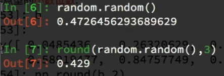
t7 = np.array([random.random() for i in range(10)])
print(t7)
print(t7.dtype)
t8 = np.round(t7,2)
print(t8)

#### 四种图形使用情况对比
  - 观察变化的时候使用 折线图,plot
  - 观察不同维度之间的关系 散点图 ,scatter
  - 统计离散的数据  条形图 bar,barh
  - 统计连续的数据  直方图 hist

#### scatter
  - plt.scatter(x,y)

#### bar,barh
  - plt.bar(x,y,width=0.3)
  - plt.bar(x,y,height=0.3)

#### hist
  - plt.hist([1,2,3],组数)
  - 组数=(最大值-最小值)/ 组距

#### numpy
  - 创建数组
  > import numpy as np
  np.array([])
  np.array(range())
  np.arange(3,10,2)  #生成从3到10,步长为2的一个一维数组

  - 数据类型
  > int, float, "int64" ,"int32","float32",bool
  > t1.dtype  #观察数据类型
  > t1.astype()