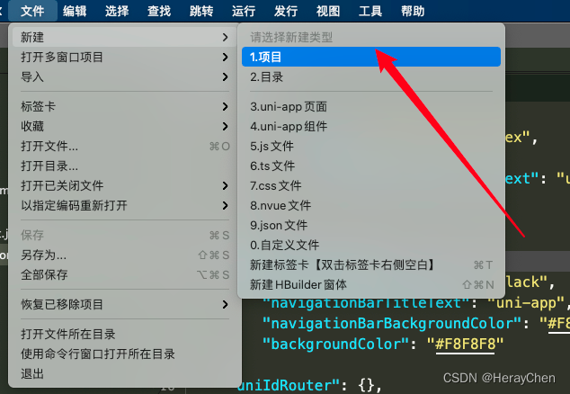
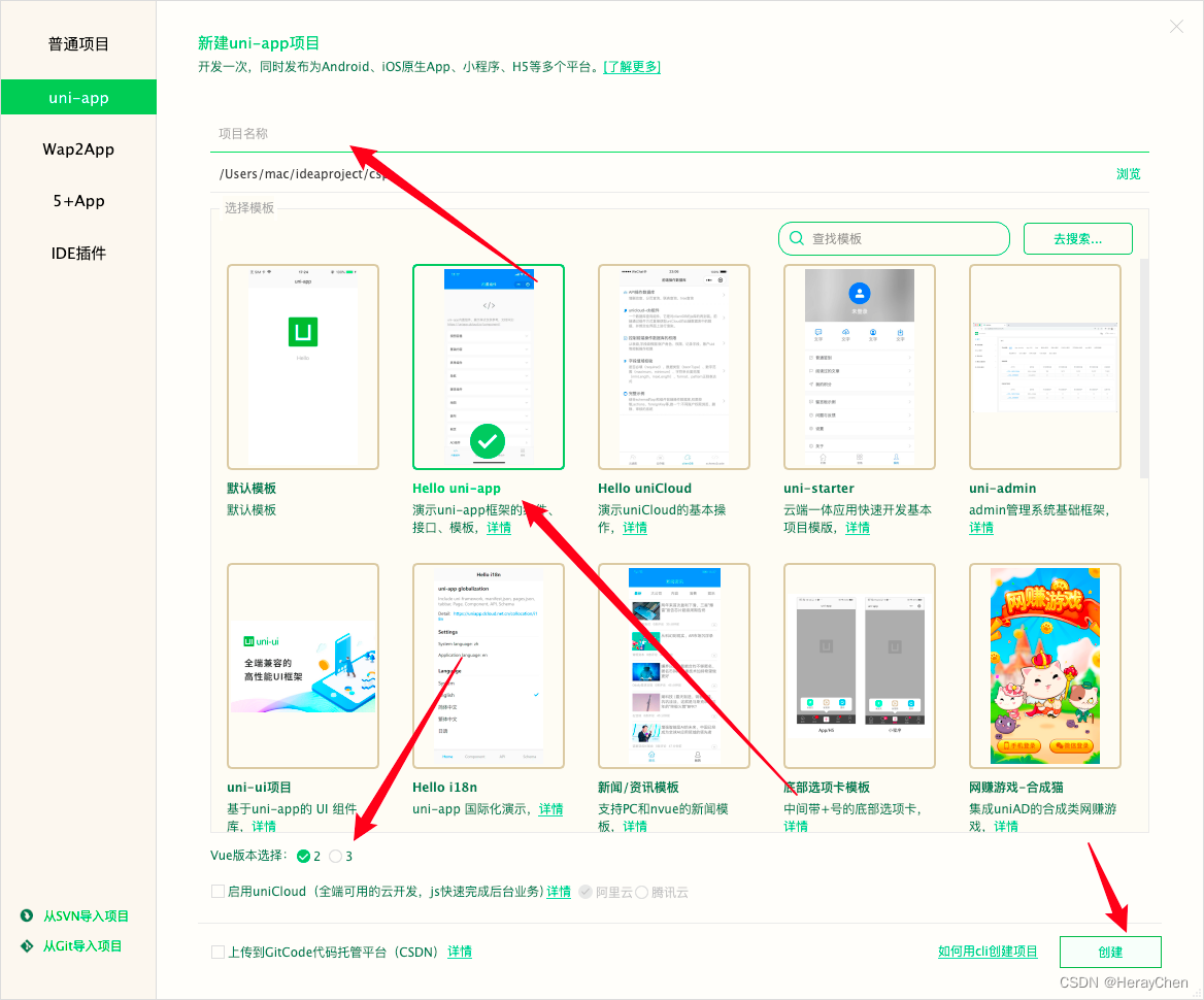
环境准备
下载 HBuilderX
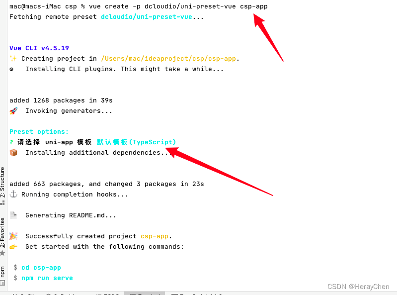
使用命令行创建项目:

webstorm环境准备
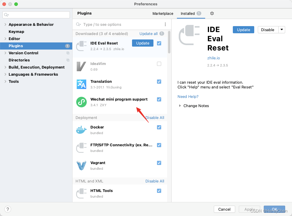
webstorm支持rpx:
1. 下载wechat mini program support插件
2. 在Preferences中搜索Wechat Mini Program,将小程序支持启用
3. 注意:每次重新导入之后要再次启用一下(这个插件只针对当前导入文件项生效)
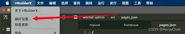
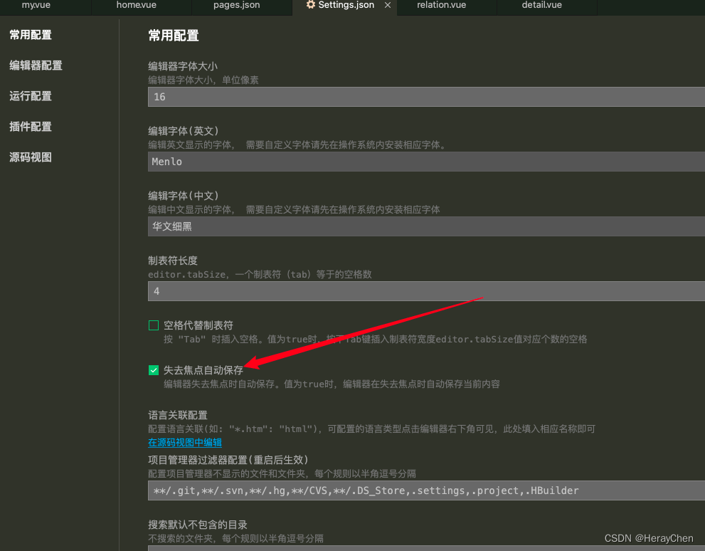
Hbuilder失去焦点自动保存处理
一些常识准备
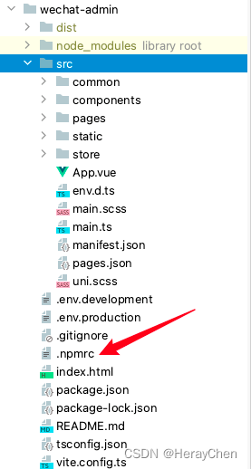
项目导入cnpm镜像
手动切换淘宝镜像还是比较麻烦的,直接将镜像文件放在项目中,下载依赖时自动使用cnpm下载。
创建一个.npmrc文件。
将以下内容放在文件中:
//electron_mirror=https://npm.taobao.org/mirrors/electron/
registry=https://registry.npm.taobao.org/
响应式单位rpx
当设计稿宽度为750px的时,1rpx=1px。
uniapp中vue文件style不用添加scoped
打包成h5端的时候自动添加上去,打包成 微信小程序端 不需要添加 scoped。
图片的使用
background: url(‘~@/static/bg.png’)
src=“~@/static/api.png”
小程序背景图片会默认转为base64格式的
使用动态文件的时候要用相对路径
不以/开头的都是相对路径
以/开头的都是绝对路径

项目文件树分析
小程序icon
大小144 * 144.
- 全局安装vue脚手架:
npm install -g @vue/cli
- 通过脚手架生成项目:
vue create -p dcloudio/uni-preset-vue my-project
碰到的问题及处理方法
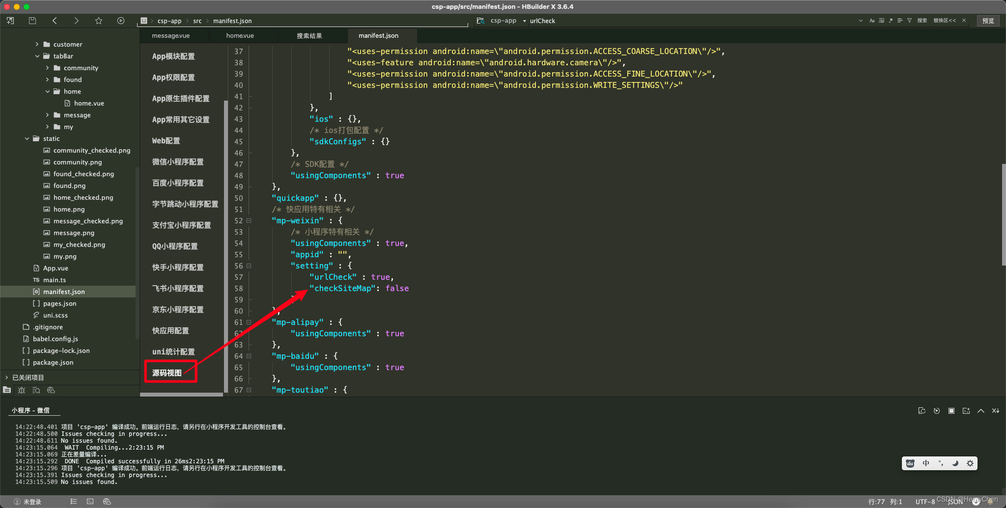
sitemap 索引情况提示] 根据 sitemap 的规则[0],当前页面 [pages/tabBar/component/component] 将不被索引
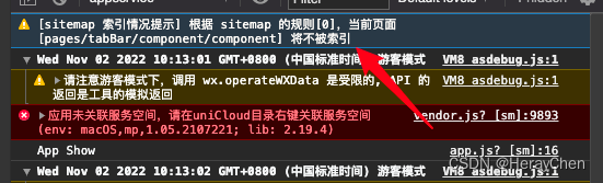
解决方法:
在manifest.json的setting中添加"checkSiteMap": false
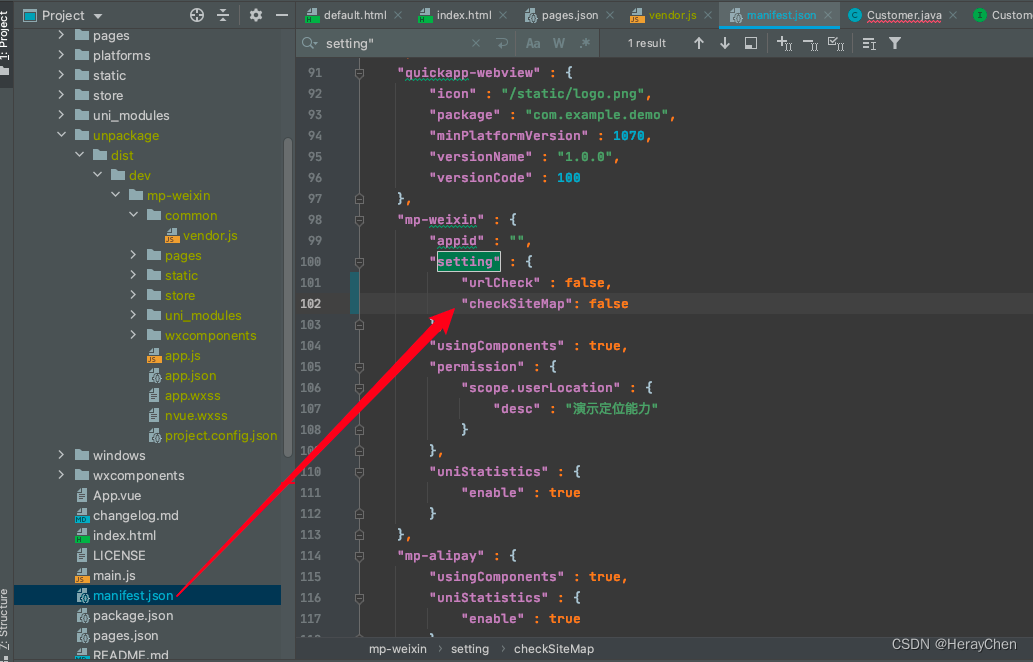
注意:这里要切换到源码视图修改才会生效
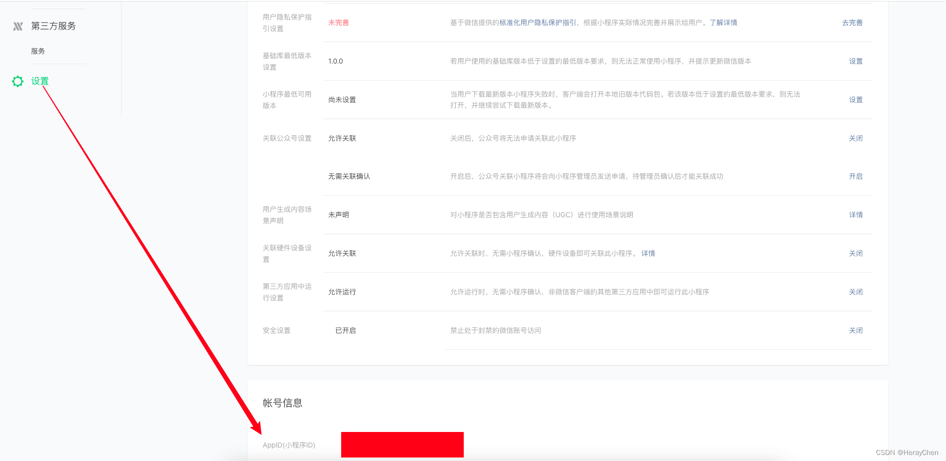
TypeError: Cannot read property ‘forceUpdate’ of undefined
这个报错的原因是appid失效了。
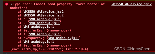
解决方法:
- 百度搜索 微信公众平台
- 微信公众平台 - 设置(左侧菜单) - 往下滑
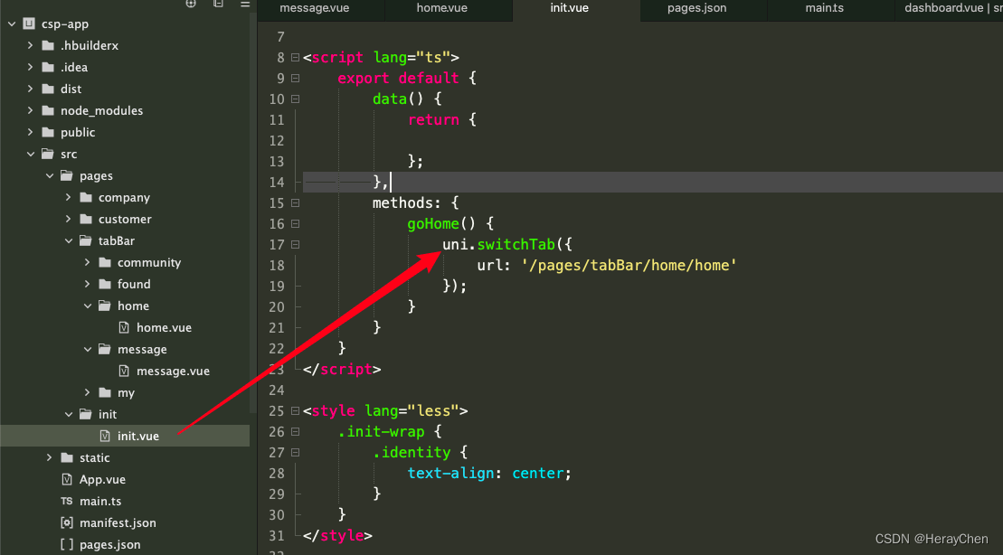
创建页面(初始页面)
引导页:
- 创建引导页
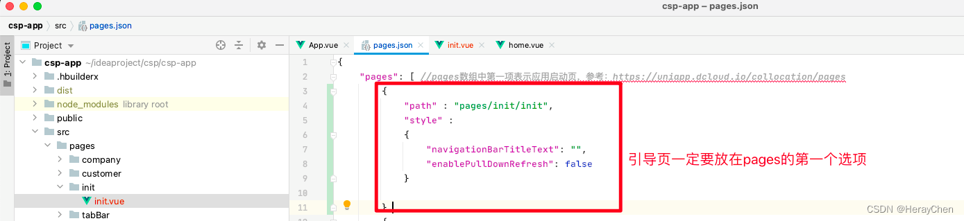
- 配置引导页跳转到tabBar页面
添加全局样式(Sass)
方法一
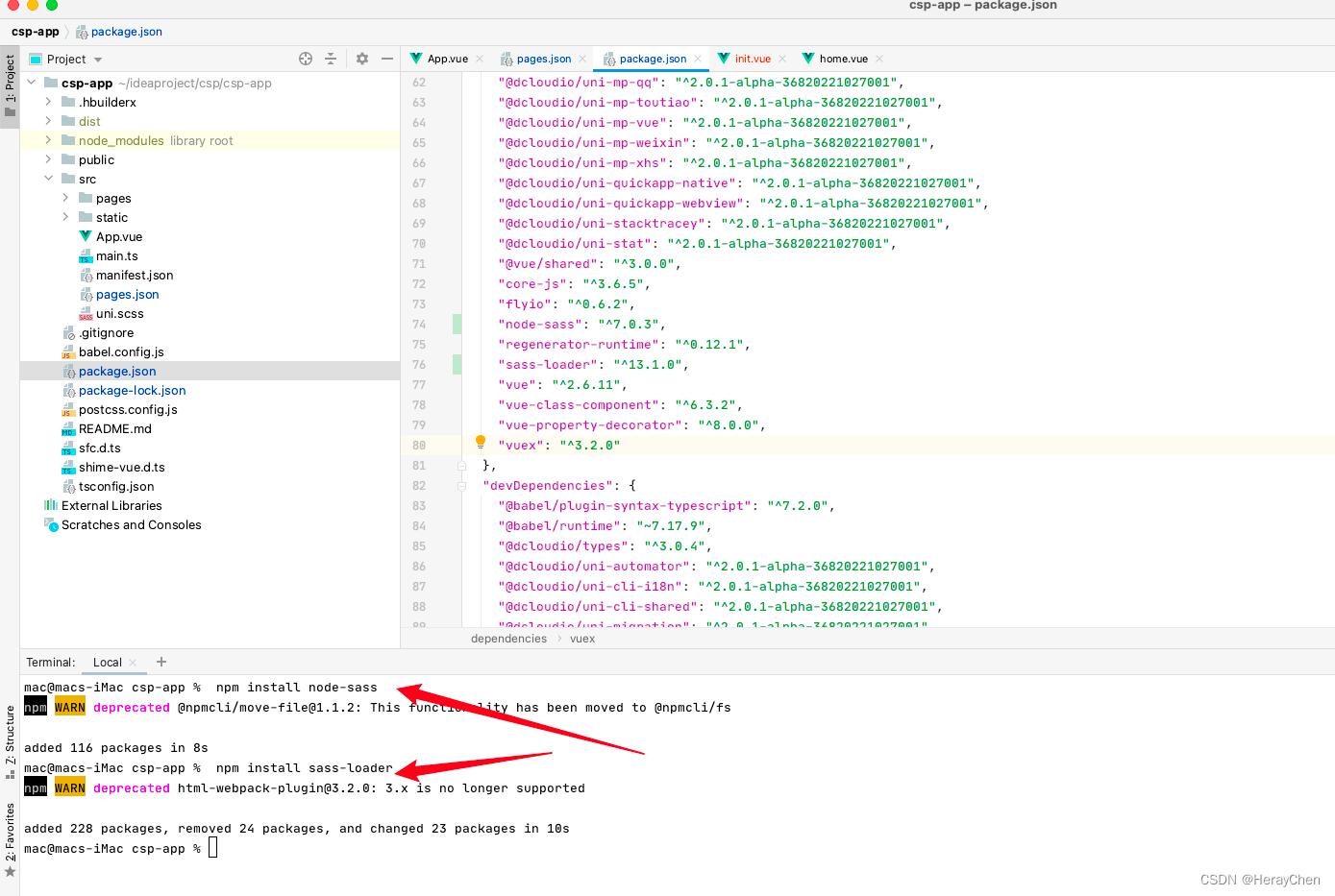
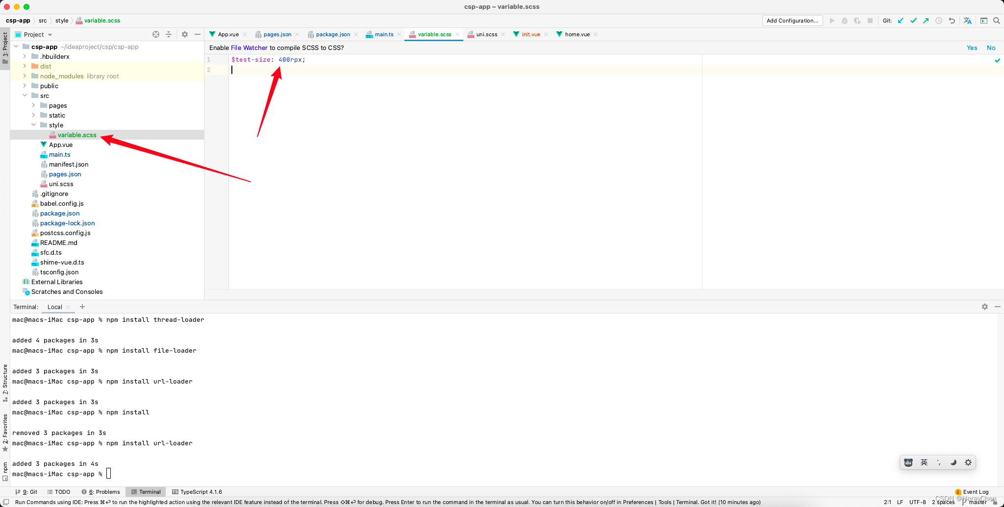
注意:重新运行项目的时候可能会报错
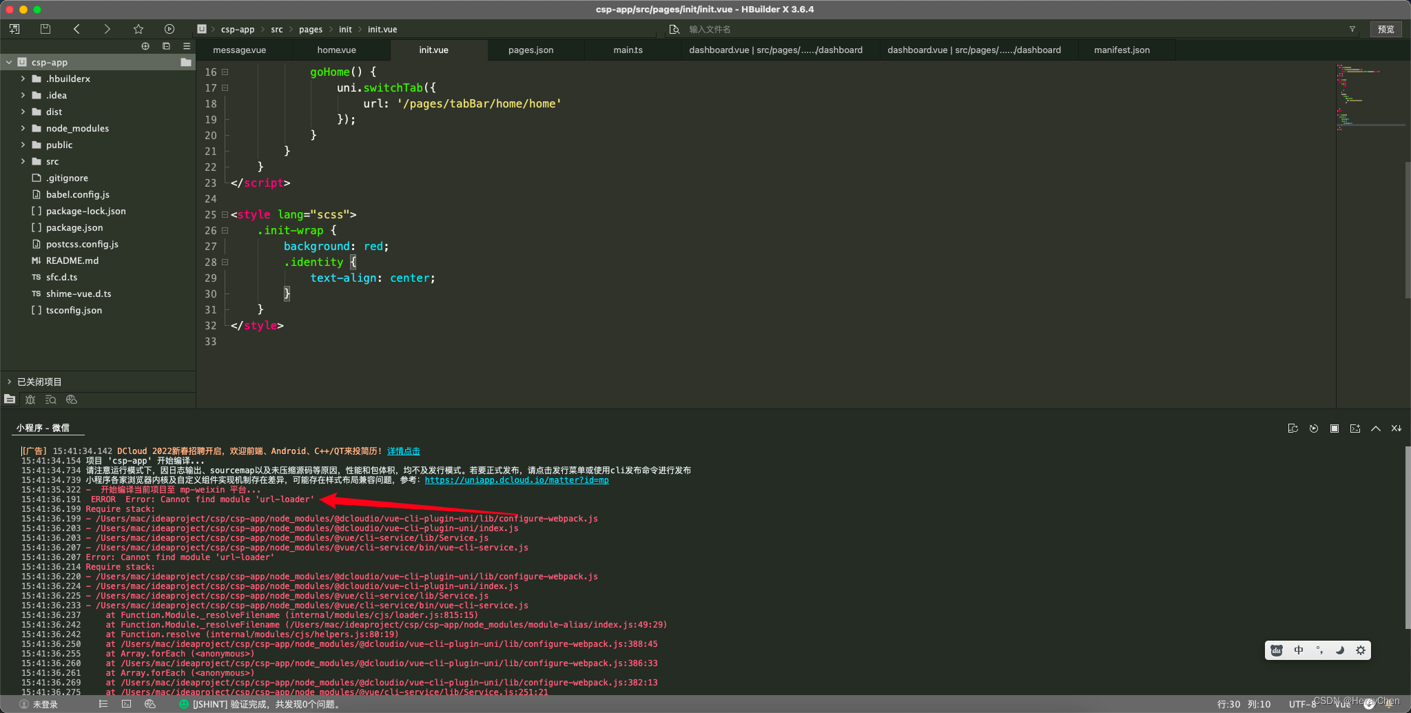
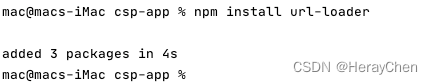
重新安装一下缺少的那个包就好了
创建全局样式表:
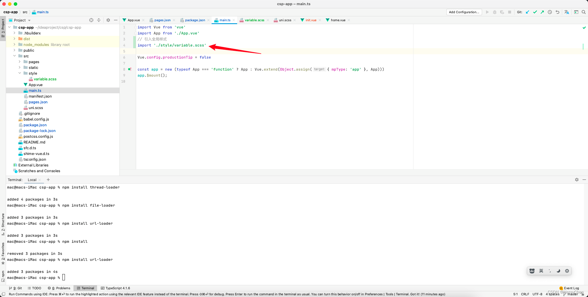
全局引入全局样式表:
使用: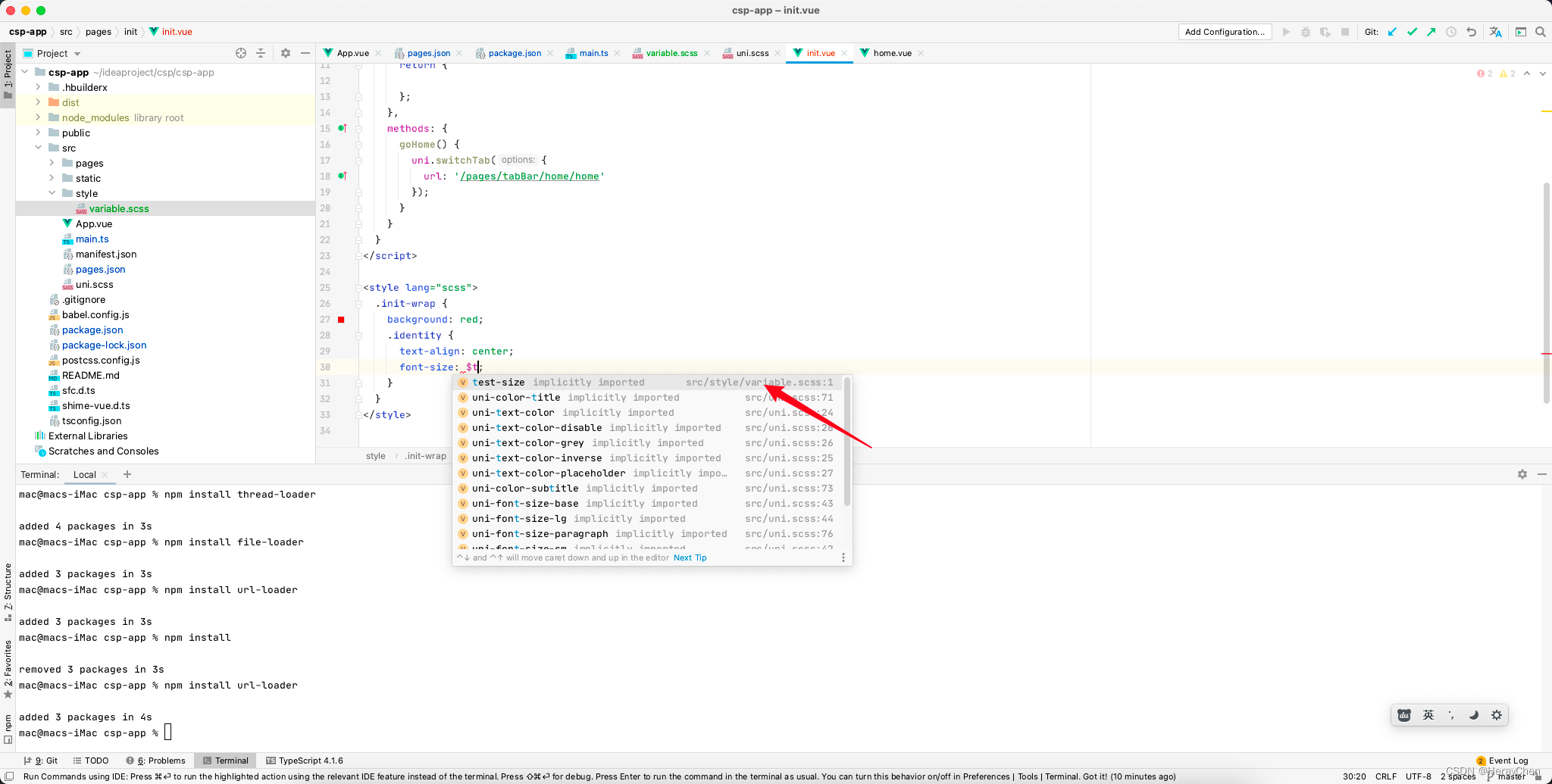
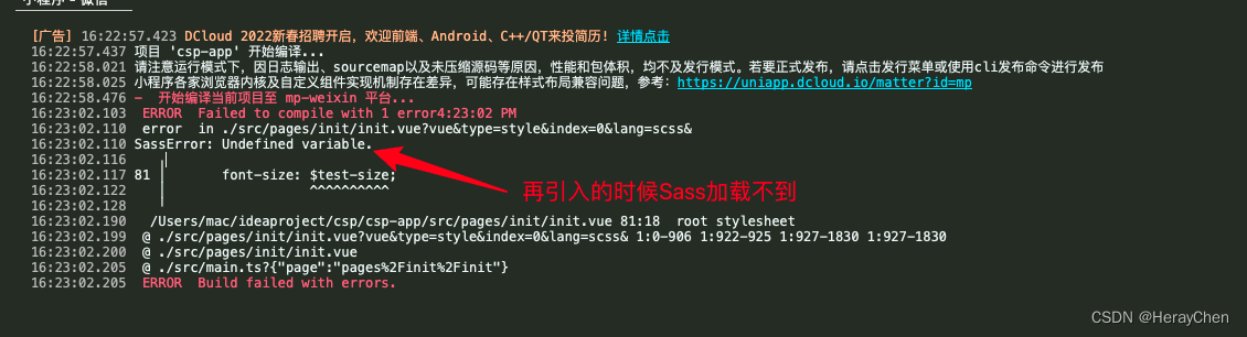
碰到的错误:SassError: Undefined variable.
不知道怎么解决~~~~
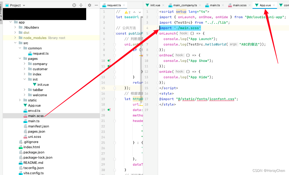
方法二(创建全局样式文件)
创建全局样式文件main.scss文件,然后在App.vue中引入全局样式文件文件。
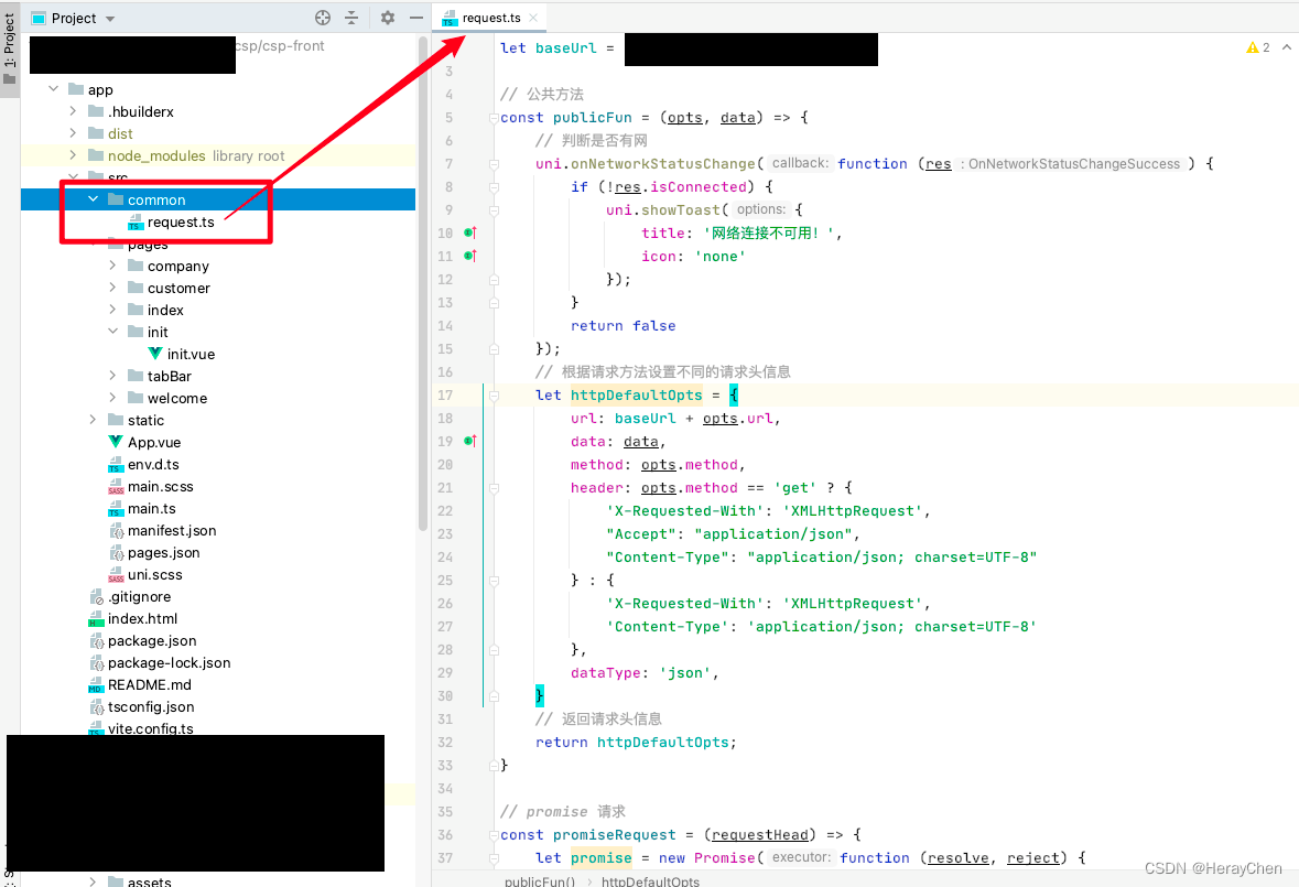
封装公共请求方法
在src下创建common文件夹,将公共求方法request.ts文件放在common文件夹中。
不带token的公共请求方法
// 根地址
let baseUrl = 'https://XXX.com';

// 公共方法
const publicFun = (opts, data) => {
    // 判断是否有网
    uni.onNetworkStatusChange(function (res) {
        if (!res.isConnected) {
            uni.showToast({
                title: '网络连接不可用!',
                icon: 'none'
            });
        }
        return false
    });
    // 根据请求方法设置不同的请求头信息
    let httpDefaultOpts = {
        url: baseUrl + opts.url,
        data: data,
        method: opts.method,
        header: opts.method == 'get' ? {
            'X-Requested-With': 'XMLHttpRequest',
            "Accept": "application/json",
            "Content-Type": "application/json; charset=UTF-8"
        } : {
            'X-Requested-With': 'XMLHttpRequest',
            'Content-Type': 'application/json; charset=UTF-8'
        },
        dataType: 'json',
    }
    // 返回请求头信息
    return httpDefaultOpts;
}

// promise 请求
const promiseRequest = (requestHead) => {
    let promise = new Promise(function (resolve, reject) {
        uni.request(requestHead).then(
            (res) => {
                resolve(res.data)
            }
        ).catch(
            (response) => {
                reject(response)
            }
        )
    })
    return promise
}


// 请求方法
const get = (url) => {
    const requestBody = {url, method: 'get'}
    const params = publicFun(requestBody);
    return promiseRequest(params);
}

const post = (url) => {
    const requestBody = {url, method: 'post'}
    const params = publicFun(requestBody);
    return promiseRequest(params);
}

export default {
    baseUrl,
    get,
    post
}
使用:
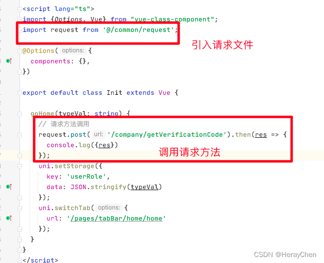
import request from '@/common/request';

// 请求方法调用
request.post('/company/getVerificationCode').then(res => {
  console.log({res})
});
带token的公共请求方法
// 根地址
let baseUrl = 'https://XXX.com';

// 公共方法
const publicFun = (opts, data) => {
    // 判断是否有网
    uni.onNetworkStatusChange(function (res) {
        if (!res.isConnected) {
            uni.showToast({
                title: '网络连接不可用!',
                icon: 'none'
            });
        }
        return false
    });
    // 获取token
    let token = uni.getStorageSync('token');
    // 处理token
    if (token == '' || token == undefined || token == null) {
        uni.showToast({
            title: '账号已过期,请重新登录',
            icon: 'none',
            complete: function() {
                uni.reLaunch({
                    url: '/pages/init/init'
                });
            }
        });
    } else {
        // 根据请求方法设置不同的请求头信息
        let httpDefaultOpts = {
            url: baseUrl + opts.url,
            data: data,
            method: opts.method,
            header: opts.method == 'get' ? {
                'X-Access-Token': token,
                'X-Requested-With': 'XMLHttpRequest',
                "Accept": "application/json",
                "Content-Type": "application/json; charset=UTF-8"
            } : {
                'X-Access-Token': token,
                'X-Requested-With': 'XMLHttpRequest',
                'Content-Type': 'application/json; charset=UTF-8'
            },
            dataType: 'json',
        }
        // 返回请求头信息
        return httpDefaultOpts;
    }
}

// promise 请求
const promiseRequest = (requestHead) => {
    let promise = new Promise(function (resolve, reject) {
        uni.request(requestHead).then(
            (res) => {
                resolve(res.data)
            }
        ).catch(
            (response) => {
                reject(response)
            }
        )
    })
    return promise
}


// 请求方法
const get = (url) => {
    const requestBody = {url, method: 'get'}
    const params = publicFun(requestBody);
    return promiseRequest(params);
}

const post = (url) => {
    const requestBody = {url, method: 'post'}
    const params = publicFun(requestBody);
    return promiseRequest(params);
}

export default {
    baseUrl,
    get,
    post
}
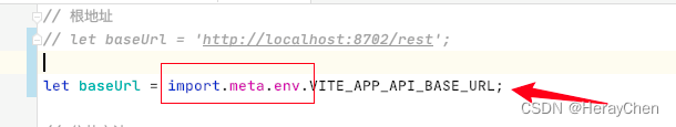
支持ts写法版本
// 根地址
let baseUrl = import.meta.env.VITE_APP_API_BASE_URL;

// 公共方法
const publicFun = (opts: any, data: any) => {
    // 判断是否有网
    uni.onNetworkStatusChange(function (res) {
        if (!res.isConnected) {
            uni.showToast({
                title: '网络连接不可用!',
                icon: 'none'
            });
        }
        return false
    });
    // 获取token
    let token = uni.getStorageSync('token');
    // 处理token
    if (token == '' || token == undefined || token == null) {
        uni.showToast({
            title: '账号已过期,请重新登录',
            icon: 'none',
            complete: function () {
                uni.reLaunch({
                    url: '/pages/init/init'
                });
            }
        });
    } else {
        // 根据请求方法设置不同的请求头信息
        let httpDefaultOpts = {
            url: baseUrl + opts.url,
            data: data,
            method: opts.method,
            header: opts.method == 'get' ? {
                'Authorization': 'Bearer ' + token,
                'X-Requested-With': 'XMLHttpRequest',
                "Accept": "application/json",
                "Content-Type": "application/json; charset=UTF-8"
            } : {
                'Authorization': 'Bearer ' + token,
                'X-Requested-With': 'XMLHttpRequest',
                'Content-Type': 'application/json; charset=UTF-8'
            },
            dataType: 'json',
        }
        // 返回请求头信息
        return httpDefaultOpts;
    }
}

// promise 请求
const promiseRequest = (requestHead: any) => {
    let promise = new Promise(function (resolve, reject) {
        uni.request({
            ...requestHead,
            success: (res) => {
                resolve(res);
            },
            fail: (err: any) => {
                reject(err)
            }
        });
    })
    return promise
}


// 请求方法
const get = (url: string) => {
    const requestBody = {url, method: 'get'}
    const params = publicFun(requestBody, '');
    return promiseRequest(params);
}

const post = (url: string, data: any) => {
    const requestBody = {url, method: 'post'};
    const params = publicFun(requestBody, data);
    return promiseRequest(params);
}

export default {
    baseUrl,
    get,
    post
}
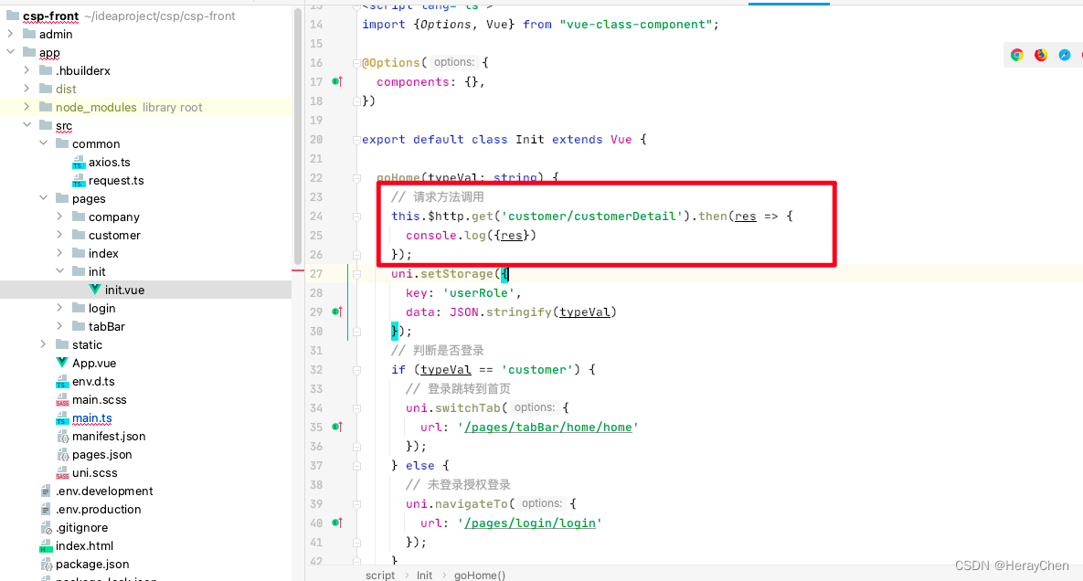
将封装的方法挂载在原型上
挂载:
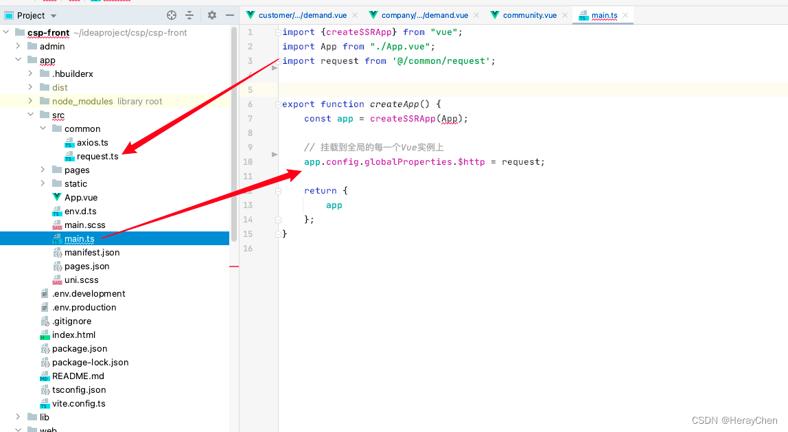
调用:
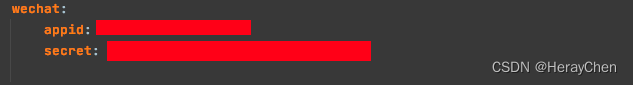
小程序登录
在微信公众平台注册测试号
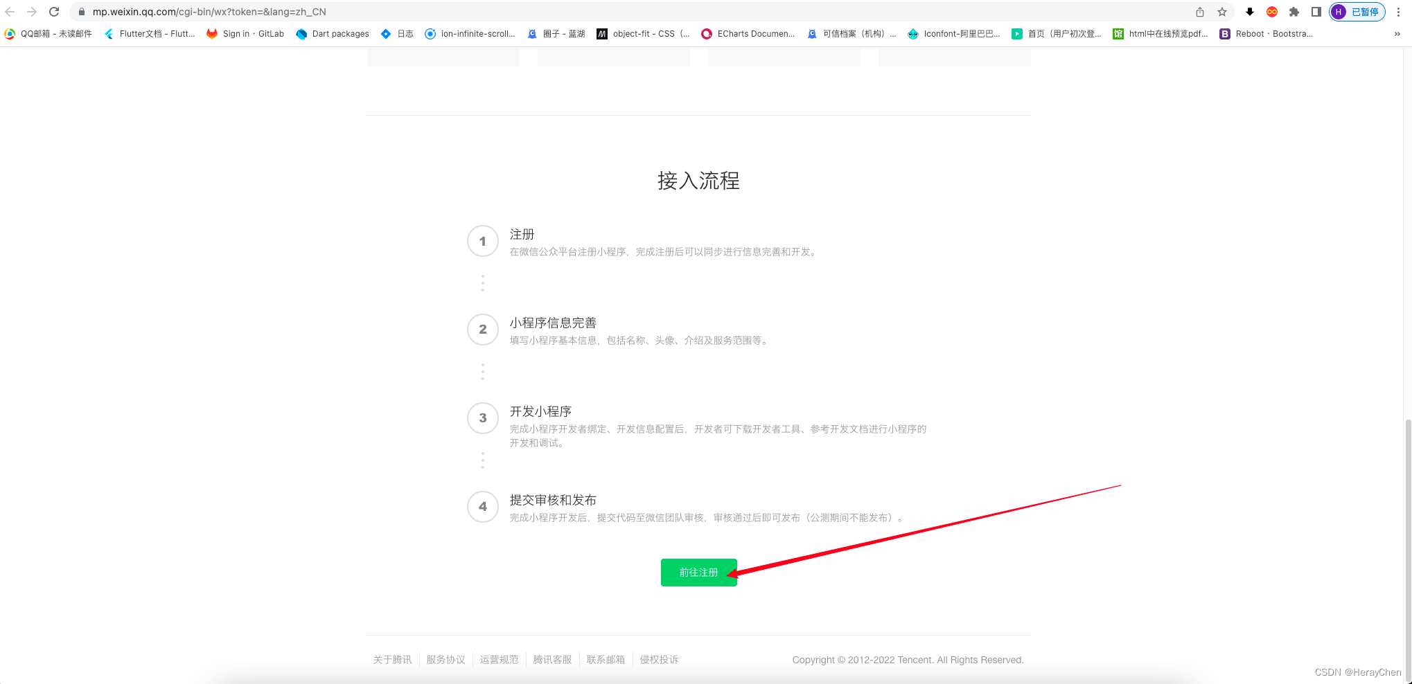
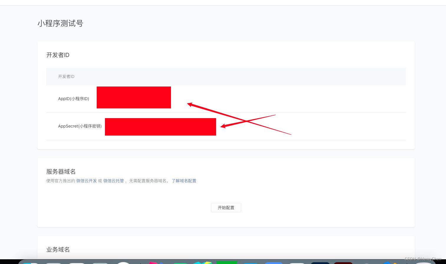
将测试号的地址放在后台配置上就可以实现登录了。
前台登录的时候要获取小程序的信息:

<!-- getPhoneNumber 获取用户手机号 -->
<!-- https://developers.weixin.qq.com/miniprogram/dev/component/button.html -->
<button class="primary-btn" open-type="getPhoneNumber" @getphonenumber="getPhoneNumber">点击微信登录</button>
export default class Login extends Vue {
  // 用户类型
  authorType: string | undefined = '';

 //
  sessionData: any | undefined = null;

  created(): void {
    uni.login({
      // 使用微信登录
      provider: 'weixin',
      success: (res) => {
        if (res.errMsg == 'login:ok' && res.code) {
          // 请求接口 获取用户登录信息
          // 注意: onlyAuthorize:true 才会返回
          this.sessionData = res.data;
        }
      }
    })
  }

   getPhoneNumber(e) {
		// 获取用户登录的身份
	    const authorType = uni.getStorageSync('authorType');
	    if (e.detail.errMsg != 'getPhoneNumber:ok') {
	      uni.showToast({
	        title: '获取手机号失败',
	        icon: 'none'
	      })
	      return;
	    }

	    // 判断手机号是否获取成功
	    WechatLoginController.decodePhone(this.$axios, {encryptedData: e.detail.encryptedData, iv: e.detail.iv, sessionkey: this.sessionData.session_key}).then(result => {
	      if (result.errMsg == 'request:ok') {
	      	// 通过拿到的信息 调用接口登录
	      	// 通过用户类型和手机号登录
	        WechatLoginController.authorLogin(this.$axios, authorType, result.data.phoneNumber).then(result => {
	          if (result.errMsg == 'request:ok') {
	            uni.setStorage({key: "token", data: result.data});
	            // 登录跳转到首页
	            uni.switchTab({
	              url: '/pages/tabBar/home/home'
	            });
	          }
	        })
	      } else {
	      	// 获取失败
	        uni.showToast({
	          title: '获取手机号失败',
	          icon: 'none'
	        })
	        return;
	      }
	    })
	}
}
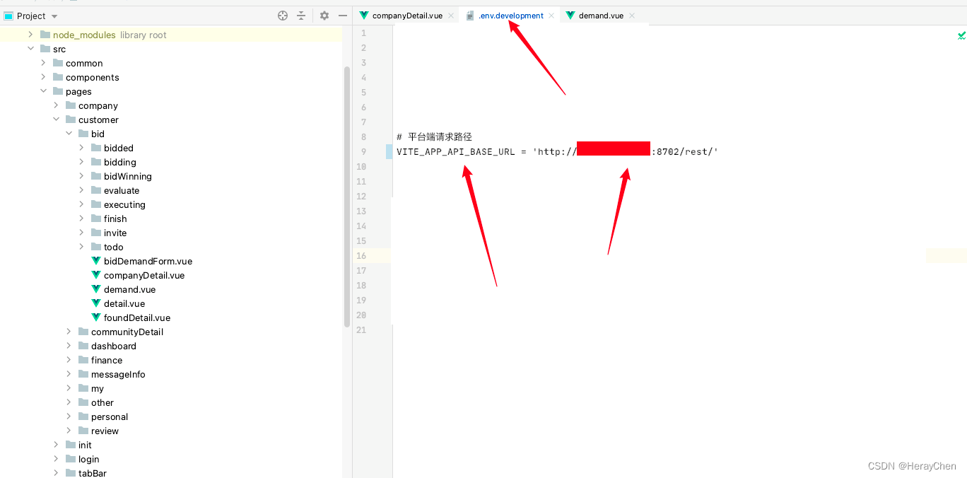
配置地址映射
创建.env.development和 .env.production文件配置根路由地址。
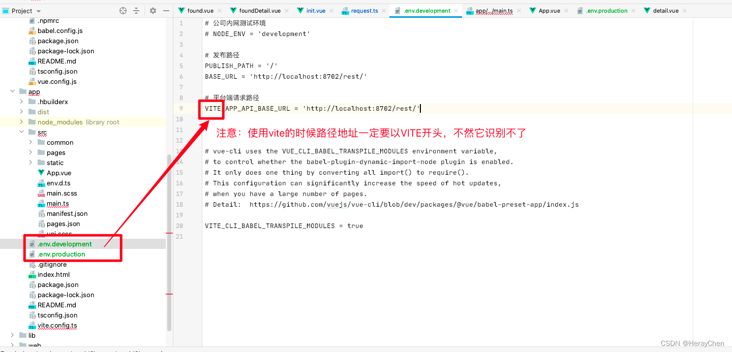
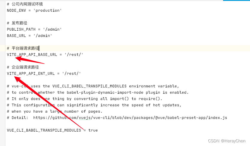
使用:通过import.meta.env来使用。
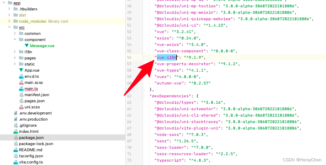
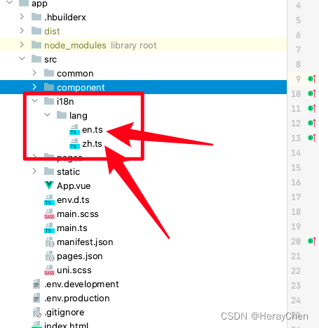
多语言
- 安装vue-i18n,
npm install vue-i18n
- 创建i18n文件存放多语言翻译文件
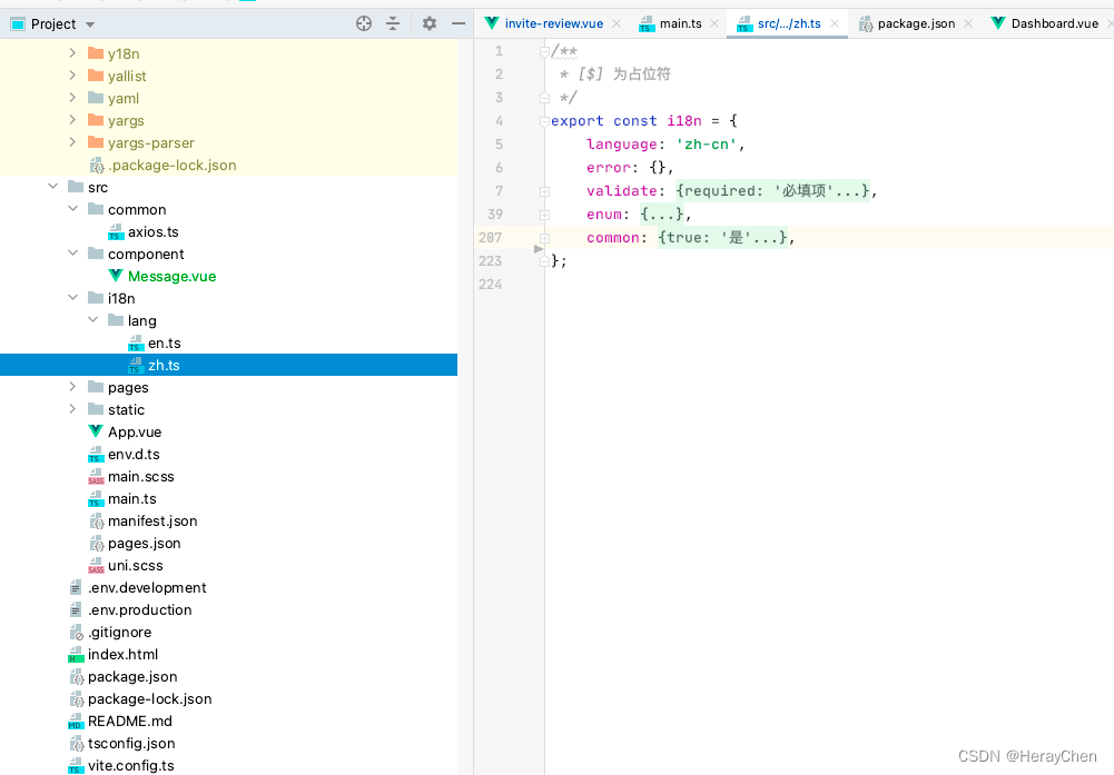
- 配置vue-i18n
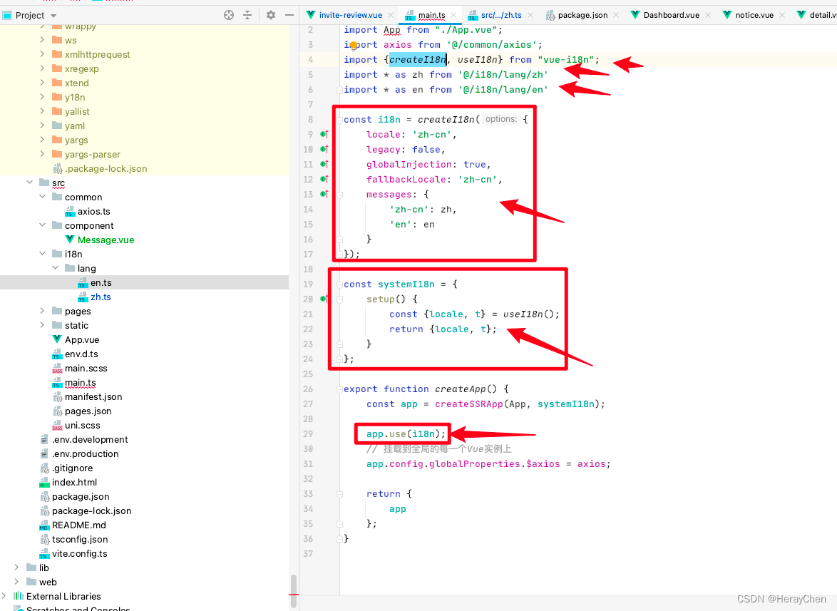
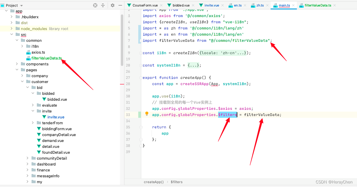
import {createSSRApp} from "vue";
import App from "./App.vue";
import axios from '@/common/axios';
import {createI18n, useI18n} from "vue-i18n";
import * as zh from '@/i18n/lang/zh'
import * as en from '@/i18n/lang/en'

const i18n = createI18n({
    locale: 'zh-cn',
    legacy: false,
    globalInjection: true,
    fallbackLocale: 'zh-cn',
    messages: {
        'zh-cn': zh,
        'en': en
    }
});

const systemI18n = {
    setup() {
        const {locale, t} = useI18n();
        return {locale, t};
    }
};

export function createApp() {
    const app = createSSRApp(App, systemI18n);

    app.use(i18n);
    // 挂载到全局的每一个Vue实例上
    app.config.globalProperties.$axios = axios;

    return {
        app
    };
}
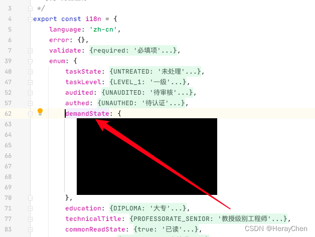
- 使用
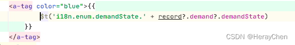
这里用的就是demandState里面的值
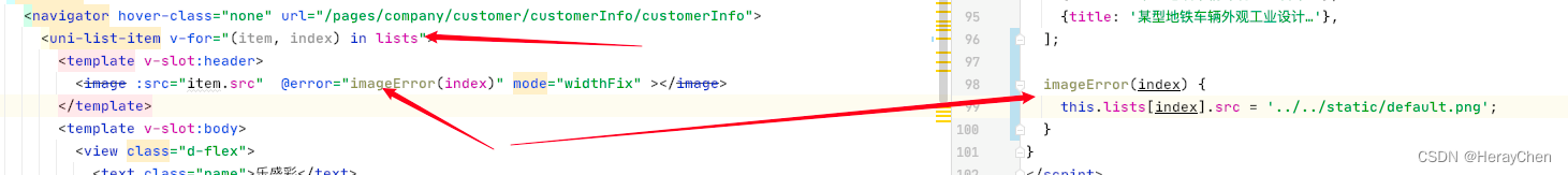
自定义组件
在src下创建components文件夹,把创建的组件存放在components中,然后就可以全局使用了,不用导入,也不用注册,直接通过自定义组件文件名称来使用,vit会自动识别components中的文件为组件。
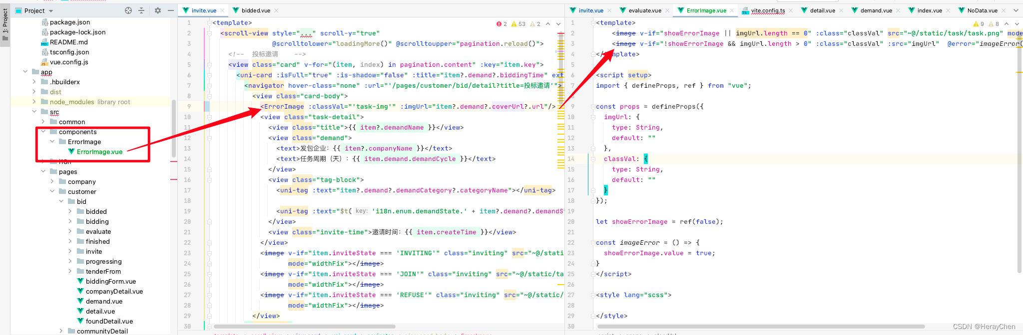
由于vue3中不支持require,所以我就用自定义组件的方式, 通过利用image的error方法来实现了图片加载失败的占位效果。
<template>
    <image v-if="showErrorImage || imgUrl.length == 0" :class="classVal" src="~@/static/task/task.png" mode="widthFix"></image>
    <image v-if="!showErrorImage && imgUrl.length > 0" :class="classVal" :src="imgUrl"  @error="imageError()" mode="widthFix" ></image>
</template>

<script setup>
import { defineProps, ref } from "vue";

const props = defineProps({
  imgUrl: {
    type: String,
    default: ""
  },
  classVal: {
    type: String,
    default: ""
  }
});

let showErrorImage = ref(false);

const imageError = () => {
  showErrorImage.value = true;
}
</script>

<style lang="scss">

</style>
也可以通过下面这种方式写,我是用自定义组件是因为调用接口的方法不支持内容的修改。
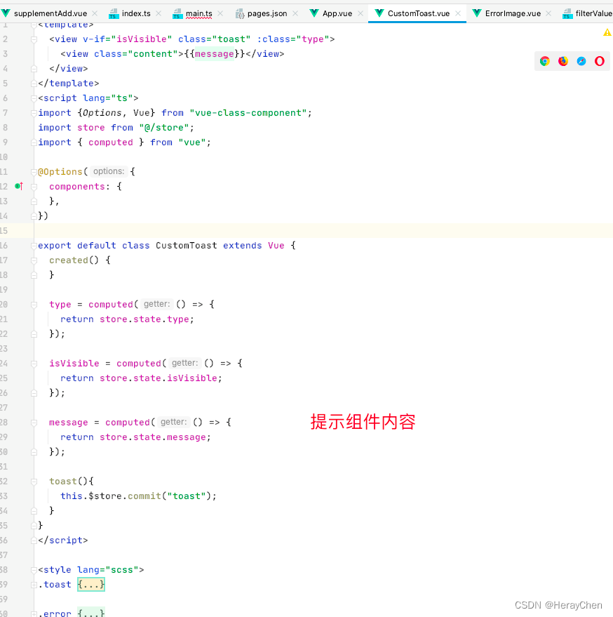
通过VueX自定义提示
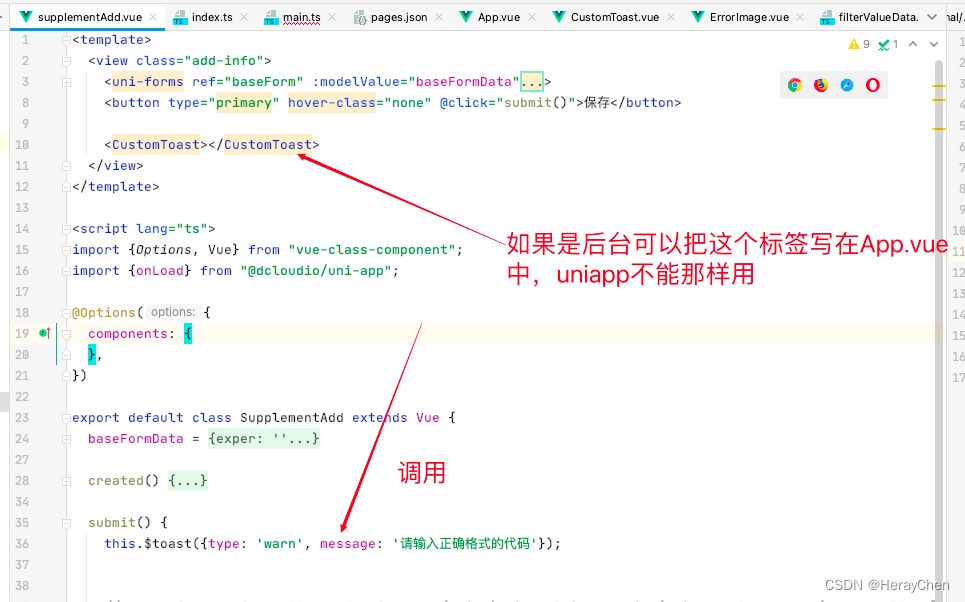
uniapp的uni-popup-message和wx.showToast等的局限性太多了,就自己弄了一个$toast实现自定义提示,但是每次使用的时候都要在页面上写一下CustomToast这个标签,麻了。

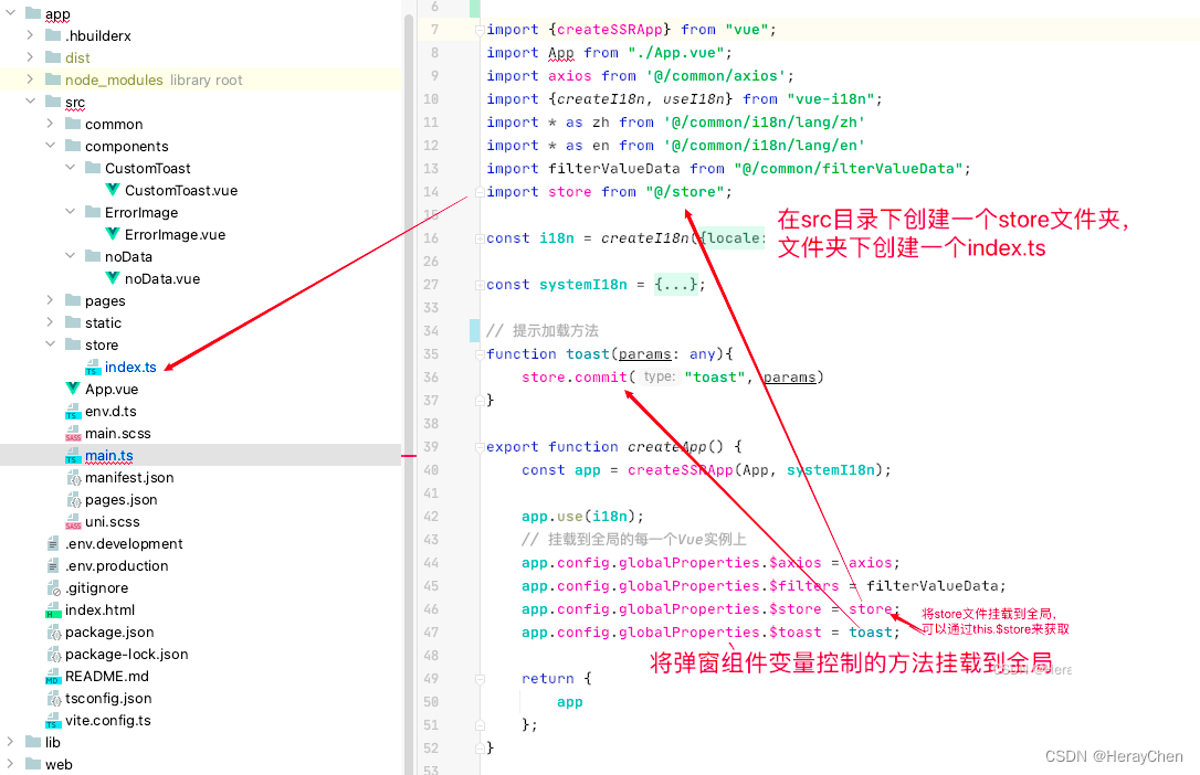
代码:
main.ts
import {createSSRApp} from "vue";
import App from "./App.vue";
import store from "@/store";

// 提示加载方法
function toast(params: any){
    store.commit("toast", params)
}

export function createApp() {
    const app = createSSRApp(App);
    // 挂载到全局的每一个Vue实例上
    app.config.globalProperties.$store = store;
    app.config.globalProperties.$toast = toast;

    return {
        app
    };
}
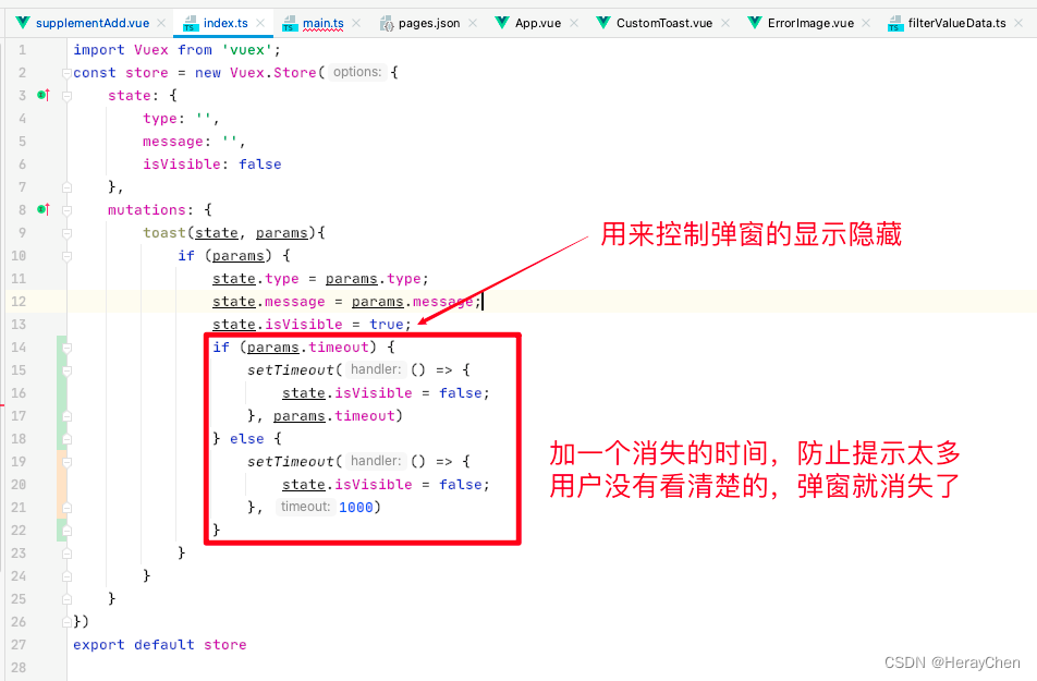
src/store/index.ts 内容:
import Vuex from 'vuex';
const store = new Vuex.Store({
    state: {
        type: '',
        message: '',
        isVisible: false
    },
    mutations: {
        toast(state, params){
            if (params) {
                state.type = params.type;
                state.message = params.message;
                state.isVisible = true;
                if (params.timeout) {
                    setTimeout(() => {
                        state.isVisible = false;
                    }, params.timeout)
                } else {
                    setTimeout(() => {
                        state.isVisible = false;
                    }, 1000)
                }
            }
        }
    }
})
export default store
CustomToast组件内容:
注意uniapp中把项目组件放在components文件夹中,可以在全局中使用。
<template>
  <view v-if="isVisible" class="toast" :class="type">
    <view class="content">{{message}}</view>
  </view>
</template>
<script lang="ts">
import {Options, Vue} from "vue-class-component";
import store from "@/store";
import { computed } from "vue";

@Options({
  components: {
  },
})

export default class CustomToast extends Vue {
  created() {
  }

  type = computed(() => {
    return store.state.type;
  });

  isVisible = computed(() => {
    return store.state.isVisible;
  });

  message = computed(() => {
    return store.state.message;
  });

  toast(){
    this.$store.commit("toast");
  }
}
</script>

<style lang="scss">
.toast {
  position: fixed;
  top: 4vh;
  left: 50%;
  transform: translateX(-50%);
  width: 90vw;
  border-radius: 8rpx;
  background: red;
  .content {
    display: -webkit-box;
    -webkit-box-orient: vertical;
    -webkit-line-clamp: 5;
    margin: 18rpx;
    line-height: 40rpx;
    overflow: hidden;
    text-overflow: ellipsis;
    text-align: center;
    font-size: 24rpx;
  }
}

.error {
  color: #f56c6c;
  background: #fde2e2;
}
.success {
  color: #09bb07;
  background: #e1f3d8;
}
.warn {
  color: #e6a23c;
  background: #faecd8;
}
</style>
使用:
<template>
  <view class="add-info">
    <button type="primary" hover-class="none" @click="submit()">保存</button>
    <!-- 引入组件 -->
    <CustomToast></CustomToast>
  </view>
</template><script lang="ts">
import {Options, Vue} from "vue-class-component";
import {onLoad} from "@dcloudio/uni-app";

@Options({
  components: {
  },
})

export default class SupplementAdd extends Vue {
  submit() {
  	// 显示组件
    this.$toast({type: 'warn', message: '请输入正确格式的代码'})
  }
}
</script>
动态渲染图片
只能使用绝对路径。
uni-segmented-control 和 swiper实现左右滑动点击切换
  <view class="segmented">
    <uni-segmented-control :current="current" :values="items" styleType="button" activeColor="#4699FA"
                           @clickItem="onClickItem"></uni-segmented-control>
  </view>
  <view class="equipment-content">
    <swiper class="swiper" style="height: calc(100vh - 172rpx);" duration="500" @change="swiperChange"
            :current="current">
      <swiper-item>
        <scroll-view v-if="current === 0" style="height: 100%;" scroll-y="true"
                     @scrolltolower="loadingMore('1')" @scrolltoupper="refresh()">
          1
          </scroll-view>
      </swiper-item>
      <swiper-item>
        <scroll-view v-if="current === 1" style="height: 100%;" scroll-y="true"
                     @scrolltolower="loadingMore('2')" @scrolltoupper="refresh()">
          2
          </scroll-view>
      </swiper-item>
      <swiper-item>
        <scroll-view v-if="current === 2" style="height: 100%;" scroll-y="true"
                     @scrolltolower="loadingMore('3')" @scrolltoupper="refresh()">
          3
          </scroll-view>
      </swiper-item>
    </swiper>
  </view>
items = ['评审邀请', '参与评审的任务', '完成评审的任务'];
current = 0;

// uni-segmented-control 点击切换
onClickItem(e) {
 if (this.current !== e.currentIndex) {
   this.current = e.currentIndex
 }
}

// swiper 左右滑动切换
swiperChange(e) {
 this.current = e.detail.current;
}

将右边改造成左边的样子。
::v-deep(.segmented-control) {
  height: 88rpx;
}

::v-deep(.segmented-control__text) {
  color: #000 !important;
}

::v-deep(.segmented-control__item--button--first),
::v-deep(.segmented-control__item--button) {
  background-color: #fff !important;
  border-color: #fff !important;
}

::v-deep(.segmented-control__item--button--active .segmented-control__text) {
  padding-bottom: 14rpx;
  color: #4699FA !important;
}

::v-deep(.segmented-control__item--button--active .segmented-control__text::after) {
  position: absolute;
  bottom: 0;
  left: 50%;
  transform: translateX(-50%);
  content: "";
  display: block;
  width: 28rpx;
  height: 6rpx;
  background: #4699FA;
  border-radius: 3rpx;
}

.segmented {
  padding-bottom: 10rpx;
  box-shadow: inset 0px -1px 0px 0px rgba(0, 0, 0, 0.08);
}
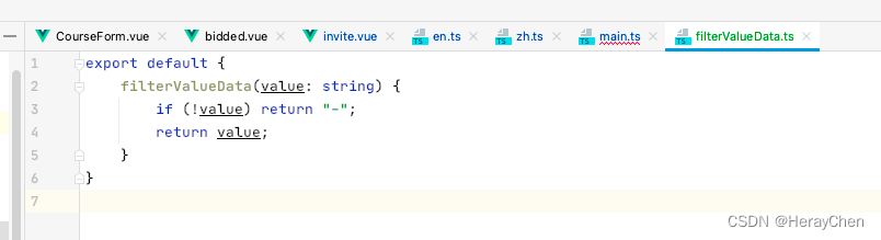
全局过滤器
在common文件夹中创建filters.ts文件,将文件的内容挂载到原型上,然后通过$filters.filterValueData()的方式来使用。

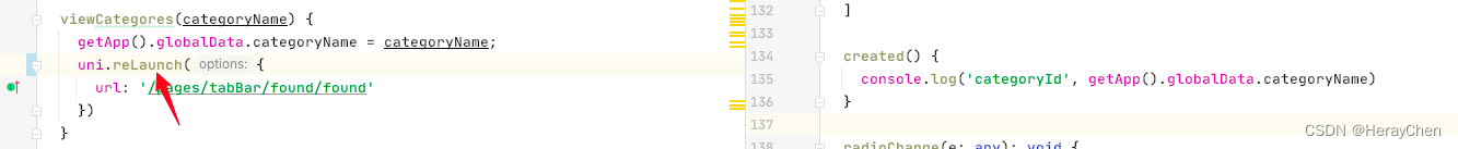
switchTab 跳转不能传参
可以通过全局变量的方式来使用。
存储:
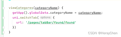
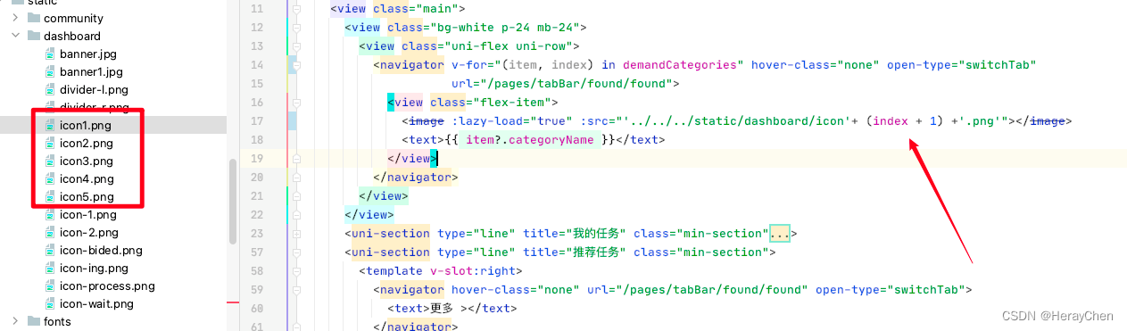
 viewCategores(categoryName) {
 	// 将要传递的参数存储为全局变量
    getApp().globalData.categoryName = categoryName;
    uni.switchTab({
      url: '/pages/tabBar/found/found'
    })
  }
接收/使用:
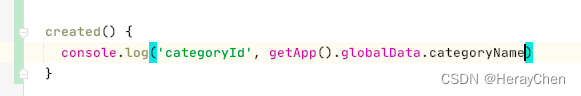
// 接收传递的参数
getApp().globalData.categoryName
注意:这样使用数据只会更新一次。
解决方法:将switchTab更换为reLaunch。
navigateTo 跳转传递多个参数
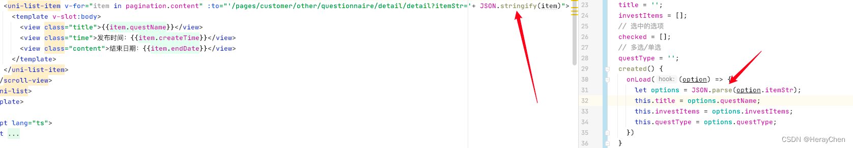
注意:navigateTo 传递的参数是string类型的,传递的时候要通过JSON.stringify转换为字符串之后使用。
<uni-list-item v-for="item in pagination.content" link="navigateTo" :to="'/pages/customer/other/questionnaire/detail/detail?itemStr='+ JSON.stringify(item)">
// 接收传递的参数
created() {
	// 这里 onLoad 只加载一次,
	// 页面每次加载都加载数据接口 用 onShow
    onLoad((option) => {
      let options = JSON.parse(option.itemStr);
    })
}
通过点击事件跳转
<uni-list-item v-for="item in pagination.content" @click="viewQuestionnaireDetail(item)" link>
</uni-list-item>
viewQuestionnaireDetail(item: any) {
    CustomerQuestionnireController.getQuestionnaireLogByQuestIdAndAccountId(this.$axios, item.questId).then(res => {
      if (res.data) {
        wx.showToast({
          title: '当前调查项已经填写过了!',
          icon: 'none',
          duration: 500
        })
      } else {
        uni.navigateTo({
          url: '/pages/customer/other/questionnaire/detail/detail?itemStr='+ JSON.stringify(item)
        })
      }
    })
  }

页面调整能使用navigator跳转尽量使用navigator跳转,有助于搜索引擎【来源 小程序搜索优化指南(SEO)】。
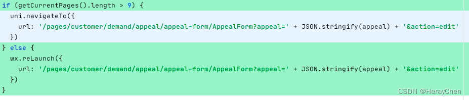
navigateTo 跳转次数超过10次栈溢出
解决方法:
通过 getCurrentPages().length 判断次数,超过之后用reluanch实现跳转。
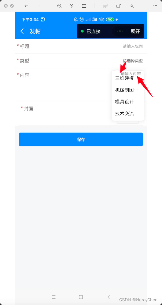
uni-data-picker 数据显示不出来
v-model绑定的数据必须要有值才行。
机型判断
uniapp种通过uni.getSystemInfoSync().platform来判断运行环境的机型。
百度小程序开发工具、微信小程序开发工具、支付宝(Alipay )小程序开发工具中uni.getSystemInfoSync ().platform的返回值都是devtools。
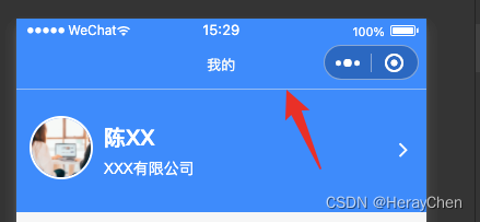
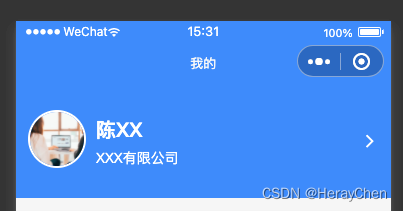
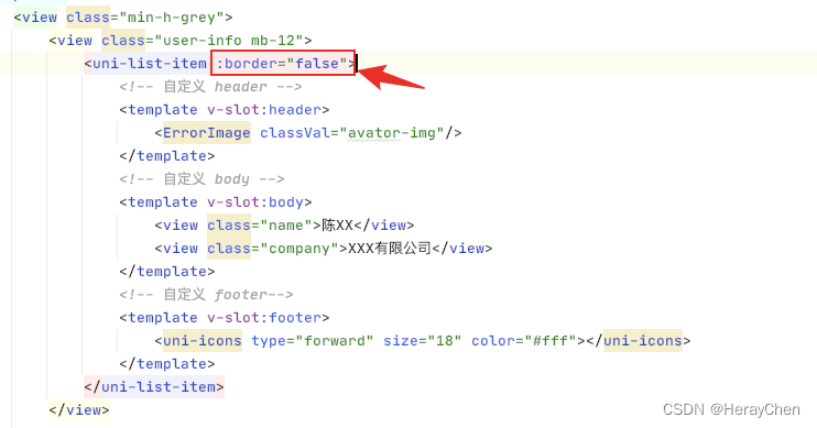
uni-list 不显示分割线
从这样:
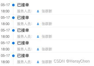
变成这样:
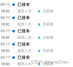
<uni-list-item :border="false"></uni-list-item>
uni-easyinput 获取焦点颜色修改
默认是蓝色的,修成成自己想要的颜色。
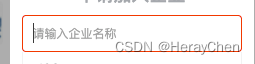
设置uni-easyinput的primaryColor的值。
<uni-easyinput primaryColor="red" trim="all" v-model="value" placeholder="请输入企业名称" @input="selectInfo()"></uni-easyinput>
表单
简单表单的校验
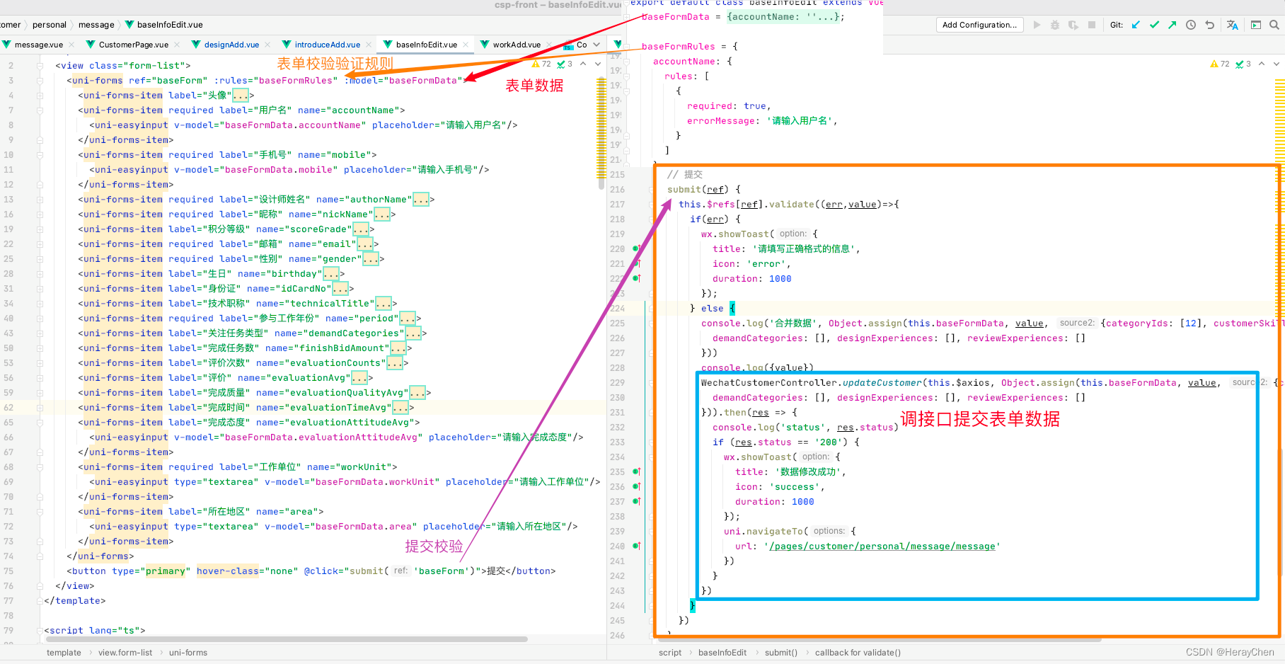
  <uni-forms ref="baseForm" :rules="baseFormRules" :model="baseFormData">
  	  <!--注意:这里必须要写name校验才会生效 -->
      <uni-forms-item required label="用户名" name="accountName">
        <uni-easyinput v-model="baseFormData.accountName" placeholder="请输入用户名"/>
      </uni-forms-item>
      <!--localdata 只支持 localdata: {text: '显示文本', value: '选中后的值', disable: '是否禁用'} 这样格式的数据-->
      <uni-data-select
            v-model="baseFormData.technicalTitle"
            :localdata="technicalTitles"
        ></uni-data-select>
</uni-forms>
<button type="primary" hover-class="none" @click="submit('baseForm')">提交</button>
baseFormData = {
    accountName: '',
    technicalTitle: '',
};
baseFormRules = {
    accountName: {
      rules: [
        {
          required: true,
          errorMessage: '请输入用户名',
        }
      ]
    }
}
// 提交
  submit(ref) {
    this.$refs[ref].validate((err,value)=>{
      if(err) {
        // 修改失败
        wx.showToast({
          title: '请填写正确格式的信息',
          icon: 'error',
          duration: 1000
        });
      } else {
        // 修改成功
      }
    })
  }
动态表单校验
<uni-forms ref="dynamicForm" :rules="dynamicRules" :model="dynamicFormData">
	<uni-forms-item label="邮箱" required name="email">
		<uni-easyinput v-model="dynamicFormData.email" placeholder="请输入姓名" />
	</uni-forms-item>
	<template v-for="(item,index) in dynamicFormData.domains">
		<uni-forms-item :label="item.label+' '+index" required
			:rules="[{'required': true,errorMessage: '域名项必填'}]" :key="item.id"
			:name="['domains',index,'value']">
			<view class="form-item">
				<uni-easyinput v-model="dynamicFormData.domains[index].value" placeholder="请输入域名" />
				<button class="button" size="mini" type="default" @click="del(item.id)">删除</button>
			</view>
		</uni-forms-item>
	</template>

</uni-forms>
<view class="button-group">
	<button type="primary" size="mini" @click="add">新增域名</button>
	<button type="primary" size="mini" @click="submit('dynamicForm')">提交</button>
</view>
export default {
	data() {
		return {
			// 数据源
			dynamicFormData: {
				email: '',
				domains: []
			},
			// 规则
			dynamicRules: {
				email: {
					rules: [{
						required: true,
						errorMessage: '域名不能为空'
					}, {
						format: 'email',
						errorMessage: '域名格式错误'
					}]
				}
			}
		}
	},
	methods: {
		// 新增表单域
		add() {
			this.dynamicFormData.domains.push({
				label: '域名',
				value:'',
				id: Date.now()
			})
		},
		// 删除表单域
		del(id) {
			let index = this.dynamicLists.findIndex(v => v.id === id)
			this.dynamicLists.splice(index, 1)
		},
		// 提交
		submit(ref) {
			this.$refs[ref].validate((err,value)=>{
				console.log(err,value);
			})
		},
	}
}
弹窗滑动底部页面滚动
遮罩最外层加上下面代码
@touchmove.stop.prevent
滚动到指定位置
1.使用wx.createSelectorQuery().select().boundingClientRect()查询到需要滚动到的元素位置
2.使用wx.pageScrollTo()将页面滚动到对应位置
需求:
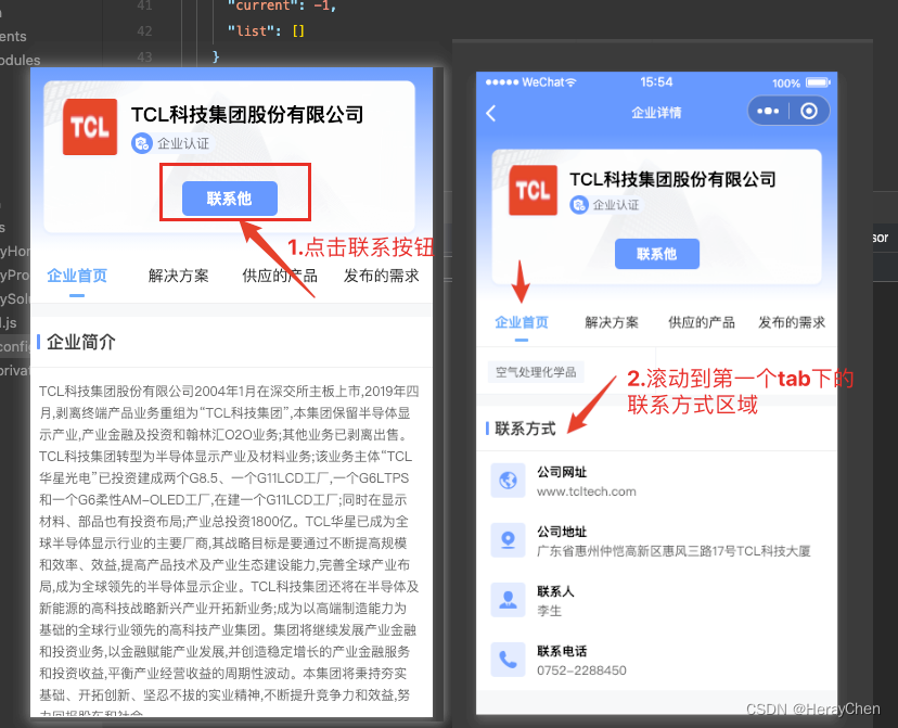
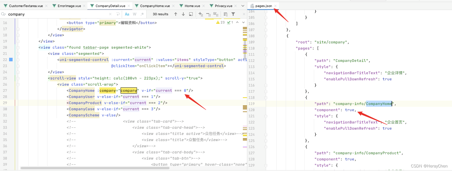
我使用的是scroll-view的scroll-top来控制的:
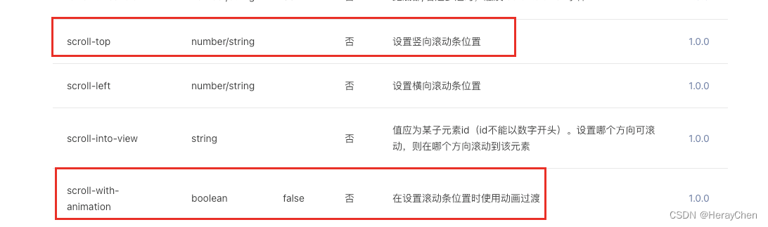
代码截图:
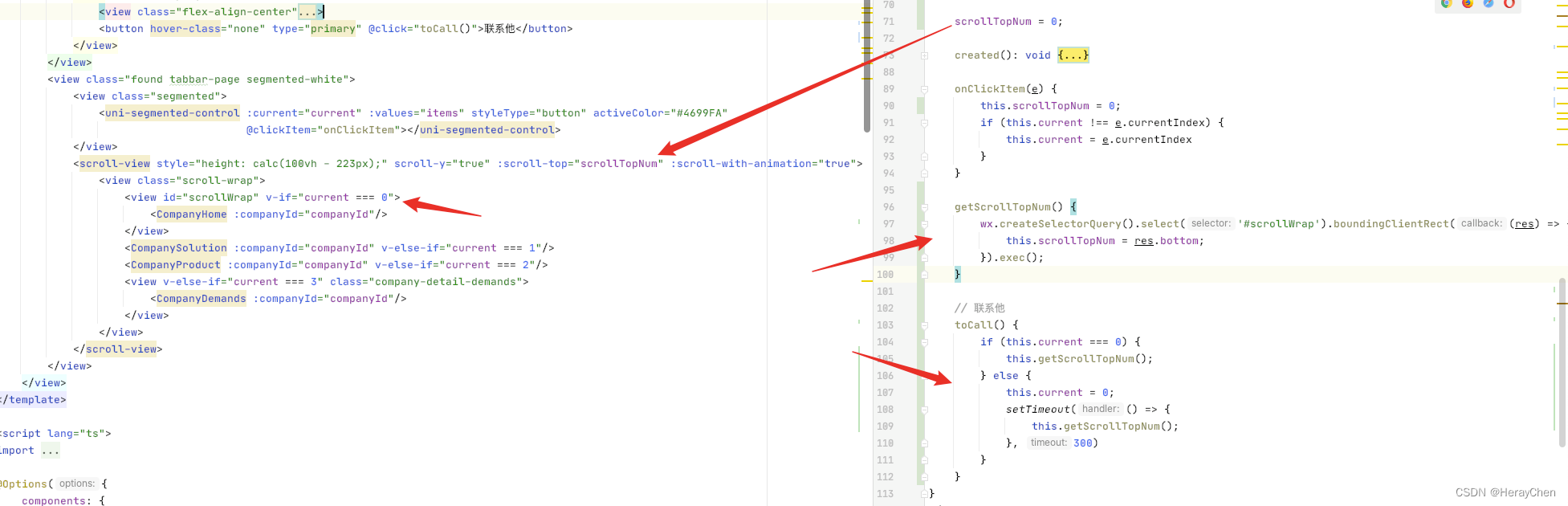
<scroll-view style="height: calc(100vh - 223px);" scroll-y="true" :scroll-top="scrollTopNum" :scroll-with-animation="true">
     <view id="scrollWrap" v-if="current === 0">
         <CompanyHome :companyId="companyId"/>
     </view>
</scroll-view>
scrollTopNum = 0;

getScrollTopNum() {
    wx.createSelectorQuery().select('#scrollWrap').boundingClientRect((res) => {
        this.scrollTopNum = res.bottom;
    }).exec();
}
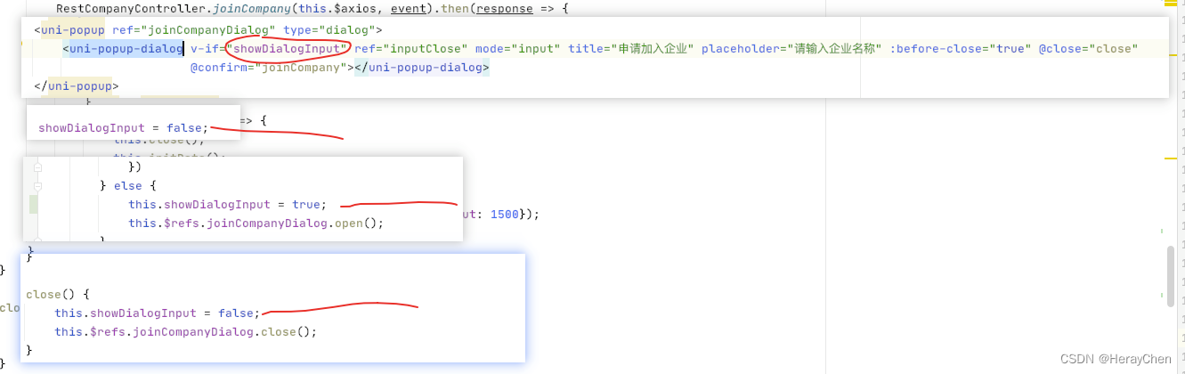
uni-popup-dialog 中的 uni-popup-dialog ios页面加载的时候会自动焦点弹出键盘
通过if来判断,弹窗显示的时候再显示uni-popup-dialog,不显示就隐藏uni-popup-dialog。
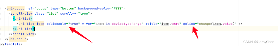
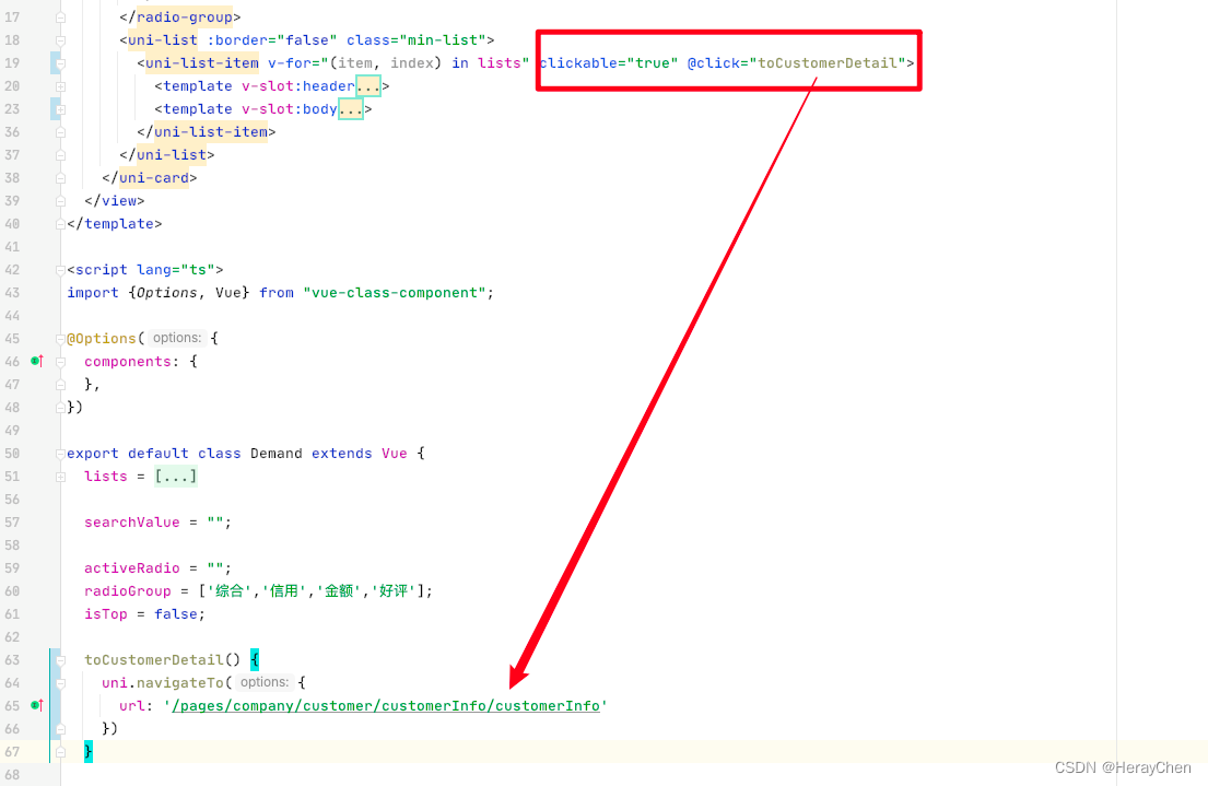
uni-list-item 点击事件不生效
解决给uni-list-item添加上link属性。
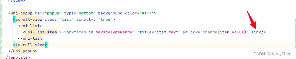
加了link之后,通过:showArrow="false"去除不了右箭头, 如果不需要右箭头可以使用clickable来实现。
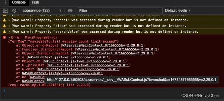
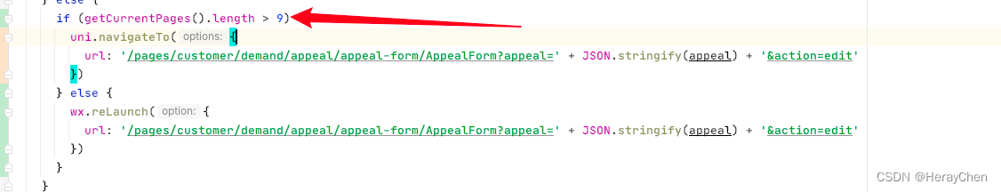
Error: MiniProgramError {“errMsg”:“navigateTo:fail webview count limit exceed”}
小程序中页面栈最多十层。
通过getCurrentPages().length来判断页面栈有多少层,大于9层的时候通过reLaunch来跳转,其他的时候通过navigateTo来跳转。
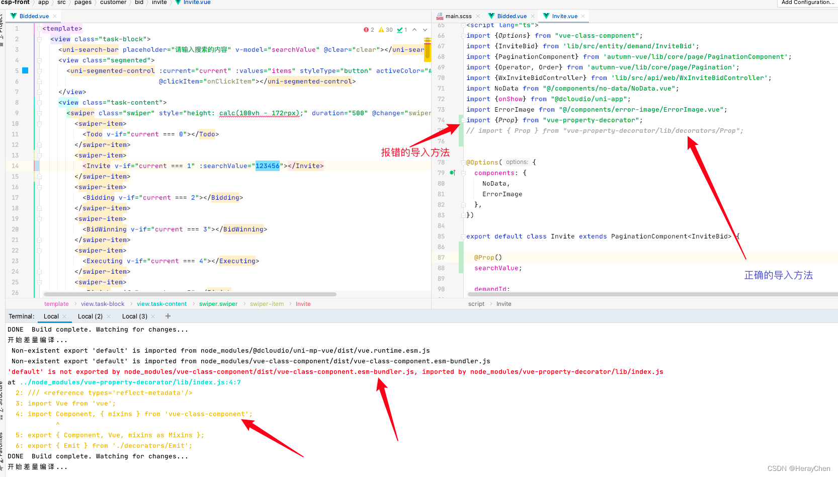
‘default’ is not exported by node_modules/vue-class-component/dist/vue-class-component.esm-bundler.js, imported by node_modules/vue-property-decorator/lib/index.js
Vue3 extends 写法 @Prop 报错。
处理导入prop包时要导入到具体的包。
通过 import { Prop } from "vue-property-decorator/lib/decorators/Prop";来导入Prop。
[Component] : should have url attribute when using navigateTo, redirectTo or switchTab(env: macOS,mp,1.06.2210310; lib: 2.27.2)
使用navigator标签实现跳转的时候要加上open-type。

uniapp 小程序 vue3使用echarts
小程序是不支持echarts的,那么怎么使用图表呢?
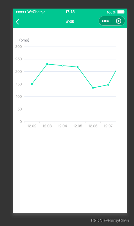
- 导入echarts,
npm i echarts
- 使用
lime-echart插件 插件地址
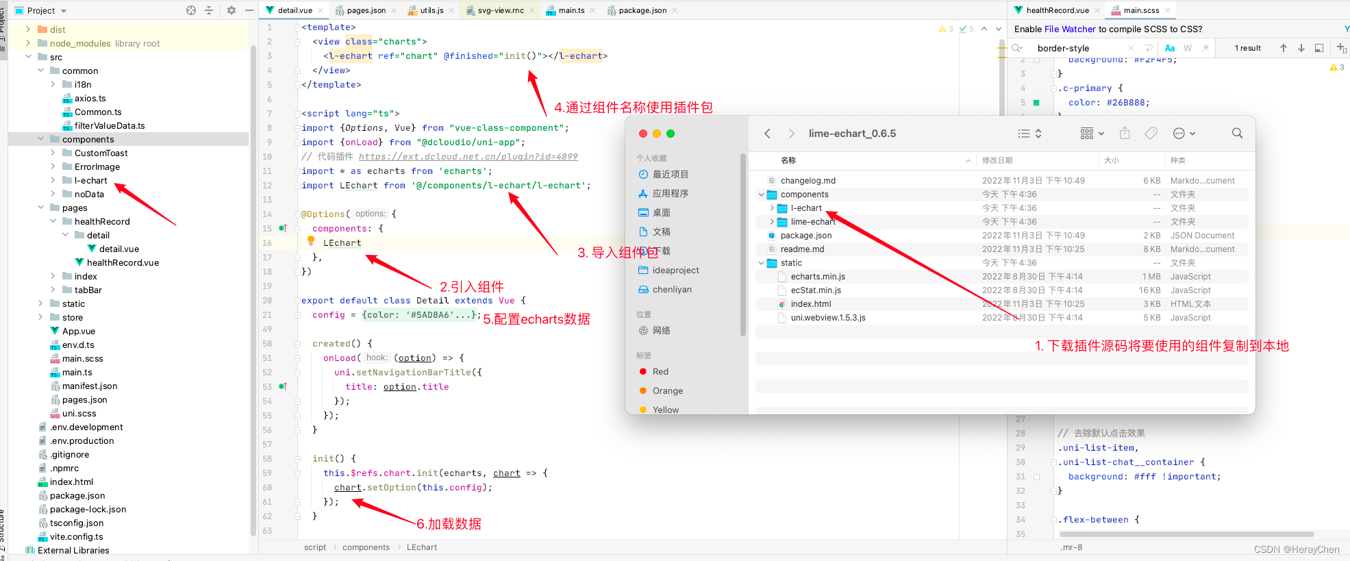
<template>
  <view class="charts">
    <l-echart ref="chart" @finished="init()"></l-echart>
  </view>
</template>

<script lang="ts">
import {Options, Vue} from "vue-class-component";
import {onLoad} from "@dcloudio/uni-app";
// 代码插件 https://ext.dcloud.net.cn/plugin?id=4899
import * as echarts from 'echarts';
import LEchart from '@/components/l-echart/l-echart';

@Options({
  components: {
    LEchart
  },
})

export default class Detail extends Vue {
  config = {
    xAxis: {
      type: 'category',
      data: ['12.02', '12.03', '12.04', '12.05', '12.06', '12.07'],
      axisLabel: {
        color: "rgba(0, 0, 0, 0.45)"
      },
      axisLine: {
        lineStyle: {
          color: 'rgba(0, 0, 0, 0.15)'
        }
      }
    },
    color: '#5AD8A6',
    yAxis: {
      type: 'value',
      name: "(bmp)",
      axisLabel: {
        color: "rgba(0, 0, 0, 0.45)"
      }
    },
    series: [
      {
        data: [150, 230, 224, 218, 135, 147, 260],
        type: 'line'
      }
    ]
  };

  created() {
    onLoad((option) => {
      uni.setNavigationBarTitle({
        title: option.title
      });
    });
  }

  init() {
  	// 这样写页面重新加载的时候size会失效
    this.$refs.chart.init(echarts, chart => {
      chart.setOption(this.config);
    });

	// 优化后的写法(图表的使用步骤都是,先清除,再渲染)
	if (this.$refs.chart) {
		// 这个resize就相当于window.addEventListener('resize', () => {})
        this.$refs.chart.resize({width: 150, height: 120});
        this.$refs.chart.init(echarts, chart => {
          sleepAHIChat.setOption(this.opt, true);
        });
    }
  }

}
</script>

<style>
.charts {
  width: 375px;
  height: 375px;
}
</style>
注意:
- l-echart最终是通过canvas 来生成的,canvas是原生组件,它的层级是最高的,不能通过 z-index 控制层级。
- 请勿在 scroll-view、swiper、picker-view、movable-view 中使用 canvas 组件。
- css 动画对 canvas 组件无效。
- 避免设置过大的宽高,在安卓下会有crash的问题
解决方法:
- 使用点击实现swiper效果
- 使用scroll-view实现滚动
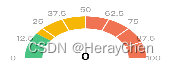
echarts组件页面加载size失效
<template>
  <l-echart ref="sleepAHIChat" @finished="sleepAHIChatInit()"></l-echart>
</template>
<script lang="ts">
import {Options, Vue} from "vue-class-component";
import * as echarts from 'echarts';
import LEchart from '@/components/l-echart/l-echart.vue';

@Options({
  components: {
    LEchart
  }
})
export default class SleepAHIChat extends Vue {

  opt = {
    series: [
      {
        name: '风险指数',
        type: 'gauge',
        center: ['150', '150'],
        radius: 104,
        min: 0,
        max: 100,
        startAngle: 180,
        endAngle: 0,
        splitNumber: 8,
        axisLine: {
          lineStyle: {
            color: [
              [0.2, '#30BF78'],
              [0.5, '#FAAD14'],
              [1, '#F4664A']
            ],
            width: 30,
          },
        },
        splitLine: {
          // 分隔线
          distance: -30,
          length: 50, //刻度节点线长度
          lineStyle: {
            width: 2,
            color: "#fff"
          } //刻度节点线
        },
        axisLabel: {
          distance: -45,
          color: 'rgba(0, 0, 0, 0.45)',
          fontSize: 16
        },
        axisTick: {
          // 刻度线样式(及短线样式)
          show: false
        },
        detail: {
          fontSize: '24',
          formatter: '{value}',
          color: '#000',
          offsetCenter: ['0', '-4%'],
        },
        pointer: {
          show: false,
        },
        data: [
          {
            value: 0,
          },
        ],
      },
    ],
  };


  created() {

  }

  sleepAHIChatInit() {
    if (this.$refs.sleepAHIChat) {
    	// 重点,resize
        this.$refs.sleepAHIChat.resize({width: 150, height: 120});
        this.$refs.sleepAHIChat.init(echarts, sleepAHIChat => {
          sleepAHIChat.setOption(this.opt, true);
        });
    }
  }
}
</script>
<style lang="scss">
</style>
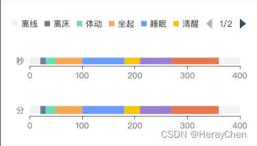
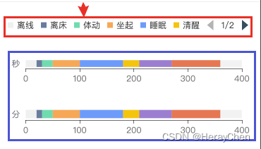
lenged点击事件修改多图表数据
最终实现效果是通过一个lenged控制两个echarts图表。
<template>
  <view class="statistic-chart-item statistic-chart-item1">
   <l-echart ref="sleepTimeDivisionChart1" @finished="sleepTimeDivisionChartInit1()"></l-echart>
  </view>
  <view class="statistic-chart-item statistic-chart-item2">
    <l-echart ref="sleepTimeDivisionChart2" @finished="sleepTimeDivisionChartInit2()"></l-echart>
  </view>
</template>
<script lang="ts">
import {Options, Vue} from "vue-class-component";
import * as echarts from 'echarts';
import LEchart from '@/components/l-echart/l-echart.vue';

@Options({
  components: {
    LEchart
  }
})
export default class SleepTimeDivisionChartView extends Vue {

  opt1 = {
    legend: {
      icon: "rect",
      itemWidth: 8,
      itemHeight: 8,
      type: 'scroll',
    },
    grid: {
      left: '3%',
      right: '4%',
      bottom: '6%',
      containLabel: true
    },
    color: ['#edeeee','#5D7092','#5AD8A6','#FF9D4D','#5B8FF9','#F6BD16','#9270CA','#E8684A'],
    xAxis: {
      type: 'value',
      axisLine: {
        show: true,
        lineStyle: {
          color: 'rgba(0,0,0,.65)'
        }
      },
      axisTick: {
        show: true,
        color: 'red'
      },
      splitLine: {
        show: false
      },
    },
    yAxis: {
      type: 'category',
      data: ['秒'],
      axisLine: {
        show: false
      },
      axisTick: {
        show: false
      }
    },
    series: [
      {
        name: '离线',
        type: 'bar',
        barMaxWidth: 28,
        stack: 'total',
        data: [20],
        showBackground: true
      },
      {
        name: '离床',
        type: 'bar',
        barMaxWidth: 28,
        stack: 'total',
        data: [10]
      },
      {
        name: '体动',
        type: 'bar',
        barMaxWidth: 28,
        stack: 'total',
        data: [20]
      },
      {
        name: '坐起',
        type: 'bar',
        barMaxWidth: 28,
        stack: 'total',
        data: [50]
      },
      {
        name: '睡眠',
        stack: 'total',
        barMaxWidth: 28,
        type: 'bar',
        data: [80]
      },
      {
        name: '清醒',
        stack: 'total',
        barMaxWidth: 28,
        type: 'bar',
        data: [30]
      },
      {
        name: '打鼾',
        stack: 'total',
        barMaxWidth: 28,
        type: 'bar',
        data: [60]
      },
      {
        name: '弱呼吸',
        stack: 'total',
        barMaxWidth: 28,
        type: 'bar',
        data: [90]
      }
    ]
  };

  opt2 = {
    legend: {
      show: false
    },
    grid: {
      left: '3%',
      right: '4%',
      bottom: '3%',
      containLabel: true
    },
    color: ['#edeeee','#5D7092','#5AD8A6','#FF9D4D','#5B8FF9','#F6BD16','#9270CA','#E8684A'],
    xAxis: {
      type: 'value',
      axisLine: {
        show: true,
        lineStyle: {
          color: 'rgba(0,0,0,.65)'
        }
      },
      axisTick: {
        show: true,
        color: 'red'
      },
      splitLine: {
        show: false
      },
    },
    yAxis: {
      type: 'category',
      data: ['分'],
      axisLine: {
        show: false
      },
      axisTick: {
        show: false
      }
    },
    series: [
      {
        name: '离线',
        type: 'bar',
        barMaxWidth: 28,
        stack: 'total',
        data: [20],
        showBackground: true
      },
      {
        name: '离床',
        type: 'bar',
        barMaxWidth: 28,
        stack: 'total',
        data: [10]
      },
      {
        name: '体动',
        type: 'bar',
        barMaxWidth: 28,
        stack: 'total',
        data: [20]
      },
      {
        name: '坐起',
        type: 'bar',
        barMaxWidth: 28,
        stack: 'total',
        data: [50]
      },
      {
        name: '睡眠',
        stack: 'total',
        barMaxWidth: 28,
        type: 'bar',
        data: [80]
      },
      {
        name: '清醒',
        stack: 'total',
        barMaxWidth: 28,
        type: 'bar',
        data: [30]
      },
      {
        name: '打鼾',
        stack: 'total',
        barMaxWidth: 28,
        type: 'bar',
        data: [60]
      },
      {
        name: '弱呼吸',
        stack: 'total',
        barMaxWidth: 28,
        type: 'bar',
        data: [90]
      }
    ]
  };

  created() {

  }

  sleepTimeDivisionChartInit1() {
    this.$refs.sleepTimeDivisionChart1.init(echarts, sleepTimeDivisionChart1 => {
      sleepTimeDivisionChart1.setOption(this.opt1);
      sleepTimeDivisionChart1.on('legendselectchanged', (params) => {
        // 在这里修改下面那个 图表的数据
        console.log('legendselectchanged', params)
      })
    });
  }

  sleepTimeDivisionChartInit2() {
    this.$refs.sleepTimeDivisionChart2.init(echarts, sleepTimeDivisionChart2 => {
      sleepTimeDivisionChart2.setOption(this.opt2);
    });
  }
}
</script>
<style lang="scss">
.statistic-chart-item {
  padding: 0 24rpx;
  box-sizing: border-box;
  width: 100%;
  height: 200rpx;
}

.statistic-chart-item2 {
  margin-top: -60rpx;
}
</style>
测试号真机调试
准备条件:
-
测试号(在微信开发者工具中将测试号修改成自己申请的测试号)
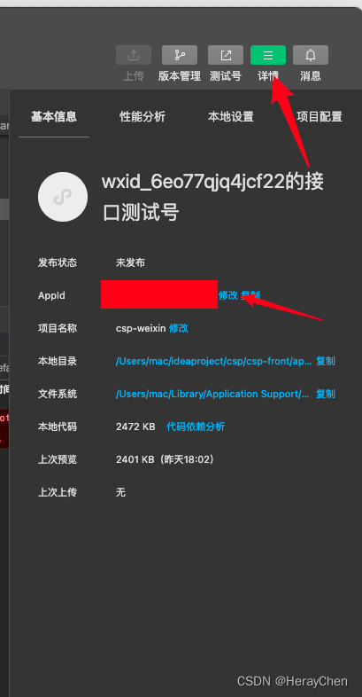
-
本机ip地址(将之前配置的地址映射使用的地址换成本机的ip地址)
利用swiper实现3d轮播
<swiper class="swiper" previous-margin="45rpx" next-margin="45rpx" circular @change="swiperChange" :current="current">
 <swiper-item class="item" v-for="(item, index) in sceneList" :key="index">
   <view class="content-block" :class="{'actived': current == index}">
     {{index}}
   </view>
 </swiper-item>
</swiper>
current = 1;

sceneList = [
  { img: '/static/1.png' },
  { img: '/static/2.png' },
  { img: '/static/3.png' },
  { img: '/static/4.png' }
];

// swiper 左右滑动切换
swiperChange(e) {
  console.log({e})
  this.current = e.detail.current;
}
.swiper {
  width: 750rpx;
  height: 350rpx;
  .item {
    display: flex;
    justify-content: center;
    align-items: center;
    width: 630rpx;
    height: 256px;
    .content-block {
      width: 630rpx;
      height: 256rpx;
      background-color: #fff;
      box-shadow: 0 3rpx 13rpx 0 rgba(0,0,0,0.08);
      border-radius: 6rpx;
      transition: height .5s ease 0s;
      &.actived {
        height: 320rpx !important;
        background: #FFFFFF;
        box-shadow: 0 4rpx 16rpx 0 rgba(0,0,0,0.08) !important;
        border-radius: 8rpx !important;
      }
    }
  }
}
Storage使用
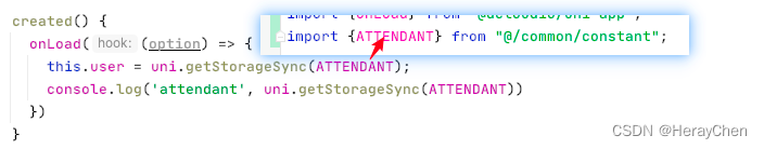
为了后续好维护,使用公共变量存储名称。
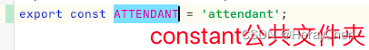
通过公共变量文件中的名称来存储对应的storage。

取值:
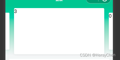
uni-list-item 的 rightText 为 0时不显示

rightText显示的是字符串格式的数据,当页面解析的字段为数字类型0时,会不显示。

解决方法:将数字类型的值,转换为字符串类型的值。
扩展:
String() 和 toString() 的区别:
toString()方法;数值、字符串、对象、布尔;都有toString方法;这个方法唯一能做的就是返回相应的字符串;其中null和undefined没有toString()方法。
String()属于强制转换, null转换的结果为null;undefined转换的结果为undefined;其余的如果有toString()方法,即调用该方法,返回相应的结果。
使用阿里图标库图标
- 创建项目,添加图标,下载代码;
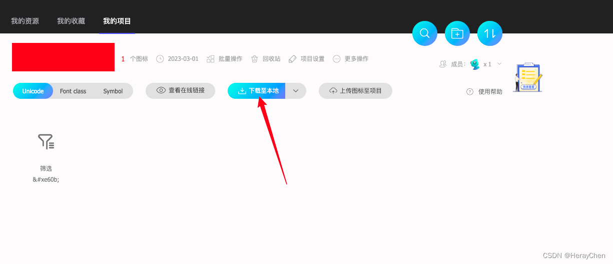
- 将静态资源文件放在项目中,在具体目录种引入资源文件
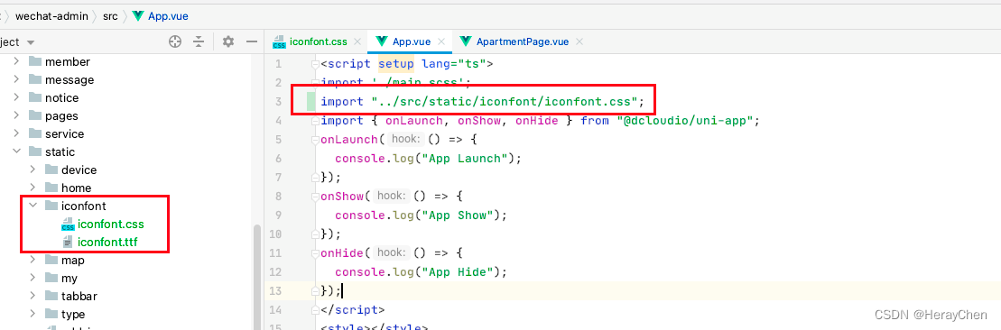
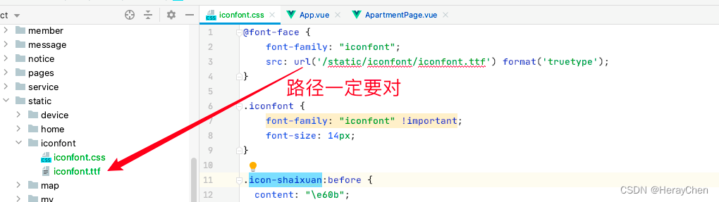
- 使用
type的值和iconfont.css的值一样。
 <uni-icons custom-prefix="iconfont" type="icon-shaixuan" size="30"></uni-icons>

tabbar上添加消息标识
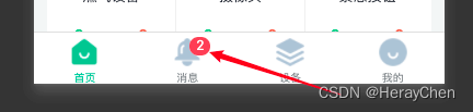
uni.setTabBarBadge({
  // 第几个tabbar上添加数字
  index: 1,
  // 添加的数字值
  text: '2'
})
表单选项优化
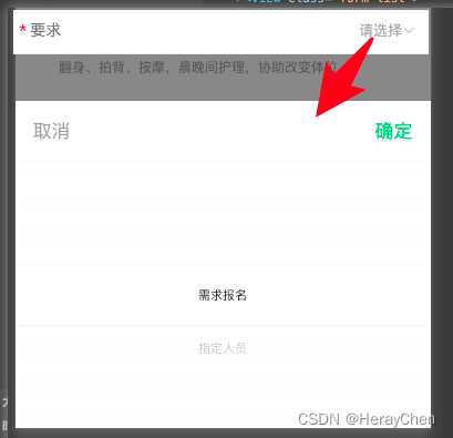
<uni-forms-item label="要求" name="requirement" required :rules="[{'required': true, errorMessage: '要求必选'}]">
<block v-if="requirementList?.length > 0">
<picker mode="selector" :value="requirementList['text']" :range-key="'text'" :range="requirementList"
@change="requirementChange">
<view class="flex-align-center">
<!-- 处理没有选择的时候点击弹窗不显示的问题 -->
<text> </text>
<view class="picker">
<!-- 如果没有值的时候就使用这一块 -->
<text class="select-placeholder">{{ '请选择' }}</text>
<!-- 有默认值就直接绑定数据 -->
<block v-if="false">
{{requirementList[requirementIndex].text}}
</block>
<uni-icons type="bottom" size="12" color="#b8b8b8"></uni-icons>
</view>
</view>
</picker>
</block>
<view v-else class="select-default">暂时没有可选项</view>
</uni-forms-item>
// picker 默认选项
.select-default {
  font-size: 14px;
  color: #000;
}
.select-placeholder {
  font-size: 14px;
  color: #989898;
}
用户绑定的手机需要进行验证,请在客户端完成短信验证步骤
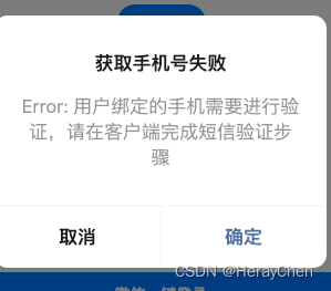
用微信开发者工具登录的时候,提醒在客户端短信验证,用二维码预览在手机上通过手机号短信验证之后就可以再次在微信小程序开发者工具中使用了。
自定义DropdownMenu
点击文字展开如下菜单。
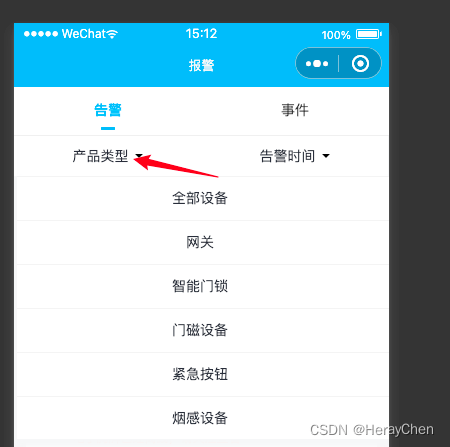
本来是想改一下那个uni-popup来实现的,但是那个动画出来的位置只能是最底下和最顶上,改不了我哭唧唧了呀(可以看源码研究下)~
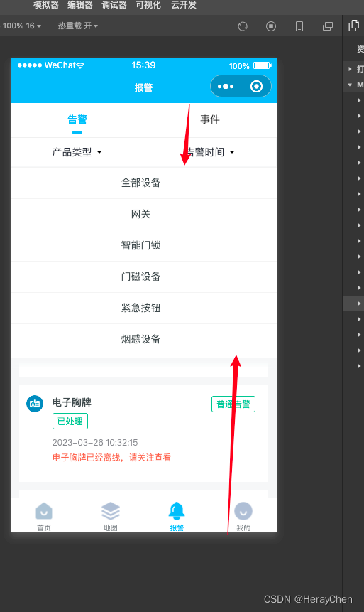
自定义dropdown-menu实现方法:
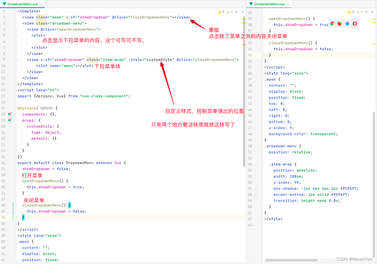
<template>
  <view class="mask" v-if="showDropdown" @click="closeDropdownMenu"></view>
  <view class="dropdown-menu">
    <view @click="openDropdownMenu">
      <slot>

      </slot>
    </view>
    <view v-if="showDropdown" class="item-wrap" :style="customStyle" @click="closeDropdownMenu">
        <slot name="menu"></slot>
    </view>
  </view>
</template>
<script lang="ts">
import {Options, Vue} from "vue-class-component";

@Options({
  components: {},
  props: {
    customStyle: {
      type: Object,
      default: {}
    }
  }
})
export default class DropdownMenu extends Vue {
  showDropdown = false;

  openDropdownMenu() {
    this.showDropdown = true;
  }

  closeDropdownMenu() {
    this.showDropdown = false;
  }
}
</script>
<style lang="scss">
.mask {
  content: "";
  display: block;
  position: fixed;
  top: 0;
  left: 0;
  right: 0;
  bottom: 0;
  z-index: 9;
  background-color: transparent;
}
.dropdown-menu {
  position: relative;

  .item-wrap {
    position: absolute;
    width: 100vw;
    z-index: 99;
    box-shadow: -1px 6px 6px 2px #f5f6f7;
    border-bottom: 1px solid #f5f6f7;
    transition: height ease 0.8s;
  }
}
</style>
使用:
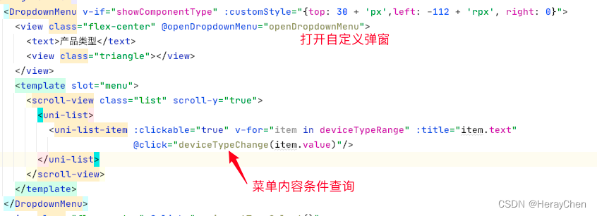
html:
<DropdownMenu v-if="showComponentType" :customStyle="{top: 30 + 'px',left: -112 + 'rpx', right: 0}">
  <view class="flex-center" @openDropdownMenu="openDropdownMenu">
    <text>产品类型</text>
    <view class="triangle"></view>
  </view>
  <template slot="menu">
    <scroll-view class="list" scroll-y="true">
      <uni-list>
        <uni-list-item :clickable="true" v-for="item in deviceTypeRange" :title="item.text"
                       @click="deviceTypeChange(item.value)"/>
      </uni-list>
    </scroll-view>
  </template>
</DropdownMenu>
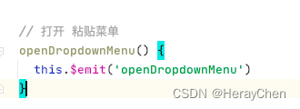
// 打开 粘贴菜单
openDropdownMenu() {
this.$emit('openDropdownMenu')
}
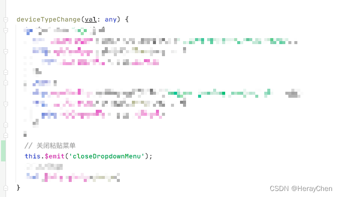
deviceTypeChange(val: any) {
// 点击项条件查询
// 关闭粘贴菜单
this.$emit('closeDropdownMenu');
}
包组件
配置页面的pages.json文件中要标识组件,才能通过组件的方式来引用。
"component": true
页面区域指示提醒

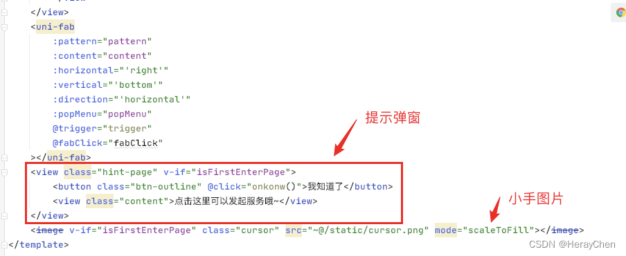
<uni-fab
        :pattern="pattern"
        :content="content"
        :horizontal="'right'"
        :vertical="'bottom'"
        :direction="'horizontal'"
        :popMenu="popMenu"
        @trigger="trigger"
    ></uni-fab>
    <view class="hint-page" v-if="isFirstEnterPage">
        <button class="btn-outline" @click="onkonw()">我知道了</button>
        <view class="content">点击这里可以发起服务哦~</view>
    </view>
    <image v-if="isFirstEnterPage" class="cursor" src="~@/static/cursor.png" mode="scaleToFill"></image>
// fab是否可以展开(必须要点我知道了之后才能展开)
popMenu = false;
// 是否是第一次进入页面(通过这个字段来做逻辑处理)
isFirstEnterPage = false;

onkonw() {
   this.isFirstEnterPage = false;
   this.popMenu = true;
}
.hint-page {
  position: fixed;
  top: 0;
  left: 0;
  width: 100vw;
  height: 100vh;
  font-size: 28rpx;
  background-color: rgba(0, 0, 0, .56);
  .btn-outline {
    position: absolute;
    bottom: 32px;
    left: 50%;
    transform: translateX(-50%);
    padding: 8rpx 53rpx;
    border: 1px solid #fff;
    border-radius: 8rpx;
    background-color: transparent;
    color: #fff;
    max-width: 234rpx;
    font-size: 28rpx;
    font-weight: bold;
  }
  .content {
    position: absolute;
    bottom: 110px;
    right: 38px;
    padding: 13rpx 24rpx;
    background-color: #fff;
    max-width: 370rpx;
    border-radius: 8rpx;
    &:before {
      position: absolute;
      right: 20rpx;
      bottom: -30rpx;
      display: inline-block;
      content: "";
      border-left: 30rpx solid transparent;
      border-right: 30rpx solid #fff;
      border-top: 30rpx solid transparent;
      border-bottom: 30rpx solid transparent;
    }
  }
}
.cursor {
  position: absolute;
  bottom: 22px;
  right: 23px;
  width: 56rpx;
  height: 71rpx;
  z-index: 18;
  animation: shake 800ms ease-in-out;
}

@keyframes shake {
  /* 动画需:“对称”实现 */
  10%, 90% { transform: translate3d(0, -1px, 0); }
  20%, 80% { transform: translate3d(0, +2px, 0); }
  30%, 70% { transform: translate3d(0, -4px, 0); }
  40%, 60% { transform: translate3d(0, +4px, 0); }
  50% { transform: translate3d(0, -4px, 0); }
}

ios底部安全区域
在每个页面上加上底部安全区域样式。
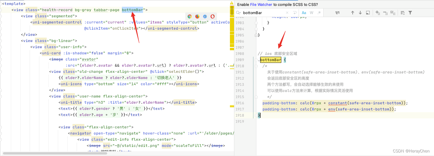
// ios 底部安全区域
.bottomBar {
  /*
    关于使用constant(safe-area-inset-bottom)、env(safe-area-inset-bottom)
    会返回底部安全区的高度
    两个方法都写,会自动选择能够生效的来使用
    可以使用calc方法来计算,根据实际情况灵活使用
    */
  padding-bottom: calc(0rpx + constant(safe-area-inset-bottom));
  padding-bottom: calc(0rpx + env(safe-area-inset-bottom));
}
将数据复制到剪切板(可做点击一键复制功能)
uni.setClipboardData({
  data: '复制的内容'
});
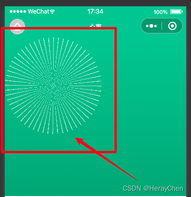
conic-gradient锥形渐变实现自定义进度条
可以参考conic-gradient锥形渐变
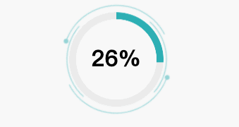
circle.png:
组件:
<template>
	<view class="circle-wrap">
        <image :class="{'rotate' : !isStop}" src="~@/static/imgs/circle.png" mode="scaleToFill"></image>
        <view class="g-progress" :style="{background: 'conic-gradient(#00AFB4 0, #00AFB4 ' + this.percent + '%, #ebebeb ' + this.percent + '%, #ebebeb)'}"></view>
        <view class="percent">{{percent}}%</view>
	</view>
</template>

<script lang="ts">
import {Options, Vue} from "vue-class-component";

@Options({
    components: {
    },
    props: {
        percent: {
            type: Number,
            default: 0
        },
        isStop: {
            type: Boolean,
            default: false
        }
    }
})

export default class Circle extends Vue {
}
</script>

<style lang="scss">
.circle-wrap {
    position: relative;
    margin-top: 20px;
    text-align: center;
    image {
        width: 160px;
        height: 160px;
    }
    .g-progress {
        position: absolute;
        left: 50%;
        top: 50%;
        transform: translate(-50%, -52%);
        width: 134px;
        height: 134px;
        border-radius: 50%;
        //background: conic-gradient(#00AFB4 0, #00AFB4 25.2%, #ebebeb 25.2%, #ebebeb);
        // mask 的大小决定了环的大小
        mask: radial-gradient(transparent, transparent 60%, #000 60.6%, #000 0);
    }
    .percent {
        position: absolute;
        left: 50%;
        top: 50%;
        transform: translate(-50%, -60%);
        font-size: 32px;
        font-weight: bold;
    }
}

.rotate {
    animation: rotate 10s linear infinite;
}

@keyframes rotate {
    0% {
        transform: rotate(0);
    }
    100% {
        transform: rotate(360deg);
    }
}
</style>
使用:
<Circle :percent="percent" :isStop="false"></Circle>

// 动态加载数据
setInterval(() => {
    this.percent += 2;
}, 1000)
wx.showModal样式调整
官方提供的可调整参数太少了,然后只能自定义调整一下modal让内容和小程序的整体布局统一一下。
改造前和改造后:
自定义封装组件Modal:
<template>
    <view class="error-model-mask" v-if="show"></view>
    <view class="error-model" v-if="show" :class="align">
        <uni-title type="h1" v-if="title" :title="title" align="center"></uni-title>
        <view class="deacription">{{description}}</view>
        <uni-grid class="grid-button" :column="btns.length" :showBorder="false"  :square="false" :highlight="false">
            <uni-grid-item v-for="(item, index) in btns">
                <button :type="index === 0 || index % 2 === 0 ? 'primary' : 'default'" hover-class="none" @click="selectBtn(index)">{{item}}</button>
            </uni-grid-item>
        </uni-grid>
    </view>
</template>

<script lang="ts">
import {Options, Vue} from "vue-class-component";

@Options({
    components: {},
})

export default class Modal extends Vue {
    show = false;
    title = '';
    description = '';
    align = 'center';
    btns = ['取消', '确认'];

    selectBtn(index) {
        this.$emit('didClickBtn', index);
    }


    showModal (params) {
        this.show = params.show;
        this.title = params.title;
        this.description = params.description;
        this.align = params.align;
        this.btns = params.btns;
    }
}

</script>

<style lang="scss">
.error-model-mask {
    position: fixed;
    top: 0;
    left: 0;
    right: 0;
    bottom: 0;
    width: 100vw;
    height: 100vh;
    background-color: rgba(0,0,0,.6);
}
.error-model {
    position: fixed;
    left: 50%;
    transform: translateX(-50%);
    padding: 24px;
    width: 96vw;
    min-height: 162px;
    box-sizing: border-box;
    text-align: center;
    border-radius: 8px;
    background-color: #fff;
    &.buttom {
        bottom: 0;
        width: 100vw;
        border-radius: 8px 8px 0 0;
    }
    &.center {
        width: 86vw;
        top: 50%;
        transform: translate(-50%, -50%);
    }
    .deacription {
        margin-bottom: 24px;
        font-size: 14px;
        color: #808080;
    }
    button {
        border-radius: 40px;
    }
}
</style>
使用:
<Modal ref="modal" @didClickBtn="didClickBtn"/>

didClickBtn(index) {
   // 有多个按钮的时候可以通过 index 来判断点击的是那个按钮
   this.$refs.modal.show = false;
}

showModalContent() {
   this.$refs.modal.showModal({
       show: true,
       description: '检测到设备不存在,或者设备状态异常等提示,请检查设备是否正常',
       align: 'center',
       btns: ['我知道了', '取消']
   })
}
自定义单个页面页头去掉页头下方边框线
刚开始我还以为是navigationBar的边框,结果是的uni-list-item边框,可以通过 :border="false"来去除。
去除前:
去除后:
扩展:
深色模式下,NavigationBar和TabBar添加了边框。
页面问题
uni-easyinput text-align:end 真机调试不生效
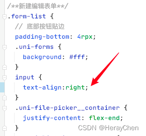
在写样式控制的时候用text-align:right。
uni-easyinput type=“textarea” placeholder 层级问题
这个问题只在安卓上有,ios是正常的。
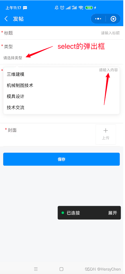
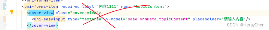
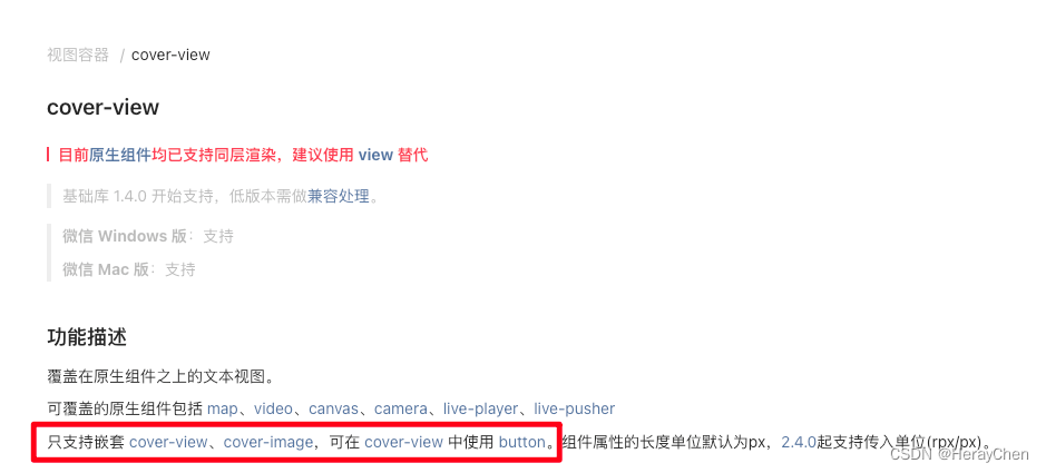
通过 cover-view 来解决
cover-view 是不支持嵌套input的。
出现弹框时将uni-easyinput的类型改为 text
这种方法反应有延迟,select只有一个change事件。
封装一个textarea
通过view标签来代替不点击输入时的状态。
去除uniapp button自带边框
button {
  &::after{
    border: initial;
  }
}
去除button默认样式:
.btn-share {
  padding: 0;
  margin: 0;
  border: 0;
  &::after {
    padding: 0;
    margin: 0;
    border: 0;
  }
}

作者:Tigger
链接:https://juejin.cn/post/7138221718518595621
来源:稀土掘金
著作权归作者所有。商业转载请联系作者获得授权,非商业转载请注明出处。
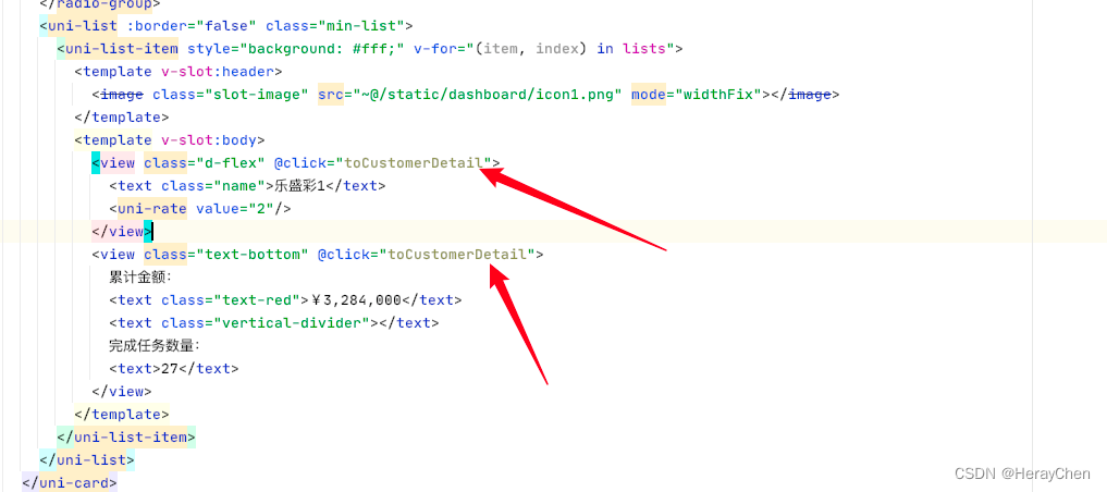
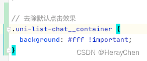
去除uni-list-chat的边框
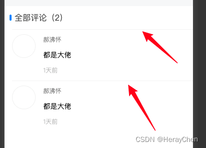
<uni-section titleFontSize="28" class="comments" title="全部评论(2)" type="line">
  <!-- 重点  :border="false"-->
  <uni-list :border="false">
    <uni-list-chat avatar="@/static/dashboard/icon1.png" :avatar-circle="true" >
      <view class="chat-custom-right">
        <view class="name">郝沸怀</view>
        <view class="comments-content">都是大佬</view>
        <view class="time">1天前</view>
      </view>
    </uni-list-chat>
    <uni-list-chat avatar="@/static/dashboard/icon1.png" :avatar-circle="true" >
      <view class="chat-custom-right">
        <view class="name">郝沸怀</view>
        <view class="comments-content">都是大佬</view>
        <view class="time">1天前</view>
      </view>
    </uni-list-chat>
  </uni-list>
</uni-section>
然后通过阴影来给uni-section下添加分割线,达到如下效果
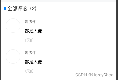
::v-deep(.uni-section-header) {
   box-shadow: inset 0px -1px 0px 0px rgba(0,0,0,0.08);
 }
uni-list-item 使用link跳转,右箭头不能去除

解决方法:
使用clickable来实现跳转。
这样虽然能跳转,但是点击uni-list-item点击的时候uni-list-item有一个黑色背景,可以通过把点击时间写在slot自定义内容上,点击时就不会有背景色了。
有时候会有点击态效果,可以通过设置它的背景色来去除。
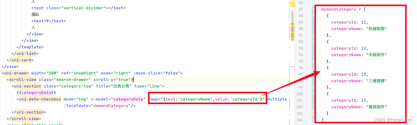
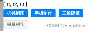
uni-data-checkbox 字段映射
text是显示的值,value是选中后显示的绑定的id值, 和v-model绑定的categoryData息息相关。
修改uni-data-checkbox默认样式
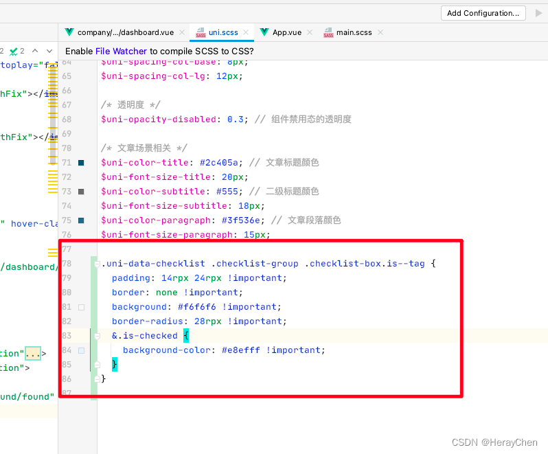
.uni-data-checklist .checklist-group .checklist-box.is--tag {
  padding: 14rpx 24rpx !important;
  border: none !important;
  background: #f6f6f6 !important;
  border-radius: 28rpx !important;
  &.is-checked {
    background-color: #e8efff !important;
  }
}
改完之后的样子:
通过 repeating-conic-gradient 实现表盘过渡
样式:
background: repeating-conic-gradient(rgba(255, 255, 255, .6) 0, rgba(255, 255, 255, .6) .8deg, transparent 1deg, transparent calc((360 / 60) * 1deg))
微信小程序switch开关大小调整
默认的switch太大了。
- 通过transform缩放来调整
.wx-switch-input{
  transform: scale(.6);
}
- 通过zoom来调整
.wx-switch-input{
  zoom: .6;
}
- 手动修改样式
/*swtich整体大小*/
.wx-switch-input{
  width:82rpx !important;
  height:40rpx !important;
}
/*白色样式(false的样式)*/
.wx-switch-input::before{
  width:80rpx !important;
  height: 36rpx !important;
}
/*绿色样式(true的样式)*/
.wx-switch-input::after{
  width: 40rpx !important;
  height: 36rpx !important;
}
微信小程序checkbox样式调整
从这样:
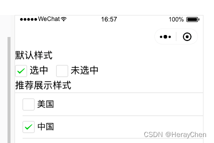
改成这样:

<label class="checkbox">
  <checkbox value="cb" checked="true" color="#26B888"/>
</label>
// 默认样式
checkbox .wx-checkbox-input {
  width: 32rpx;
  height: 32rpx;
  background-color: transparent;
}

// 选中的样式
checkbox .wx-checkbox-input.wx-checkbox-input-checked {
  color: #fff;
  background-color: #26B888; // 选中后的背景色
}

// 选中 ✓ 的样式
.wx-checkbox-input-checked::before {
  color: #fff; //  ✓ 的颜色
}
富文本图片自适应

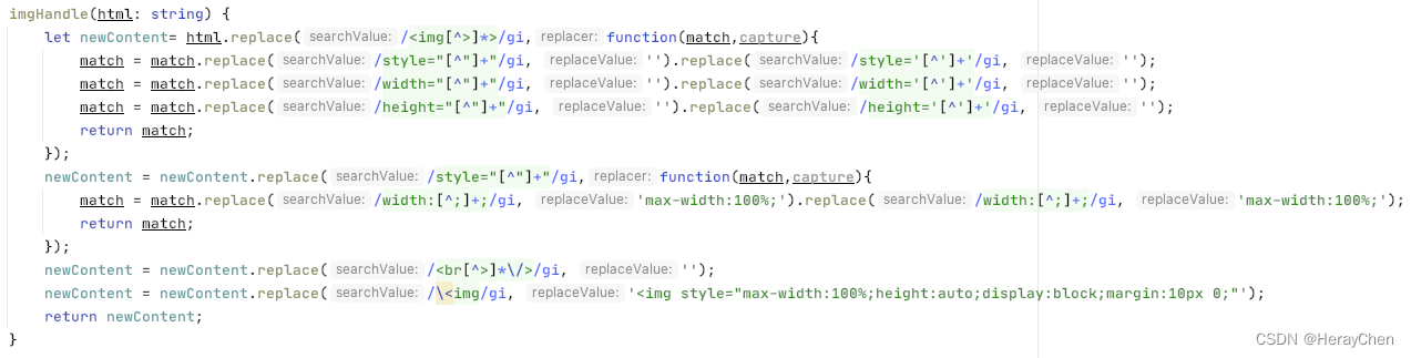
/**
 * 处理富文本里的图片宽度自适应
 * 1.去掉img标签里的style、width、height属性
 * 2.img标签添加style属性:max-width:100%;height:auto
 * 3.修改所有style里的width属性为max-width:100%
 * 4.去掉<br/>标签
 * @param html
 * @returns {void|string|*}
 */

imgHandle(html: string) {
    let newContent= html.replace(/<img[^>]*>/gi,function(match,capture){
        match = match.replace(/style="[^"]+"/gi, '').replace(/style='[^']+'/gi, '');
        match = match.replace(/width="[^"]+"/gi, '').replace(/width='[^']+'/gi, '');
        match = match.replace(/height="[^"]+"/gi, '').replace(/height='[^']+'/gi, '');
        return match;
    });
    newContent = newContent.replace(/style="[^"]+"/gi,function(match,capture){
        match = match.replace(/width:[^;]+;/gi, 'max-width:100%;').replace(/width:[^;]+;/gi, 'max-width:100%;');
        return match;
    });
    newContent = newContent.replace(/<br[^>]*\/>/gi, '');
    newContent = newContent.replace(/\<img/gi, '<img style="max-width:100%;height:auto;display:block;margin:10px 0;"');
    return newContent;
}
uniapp自带图标和文字不平齐处理
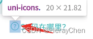
这个图标没在中间,我真的是会谢~
交互问题
动态修改页面标题
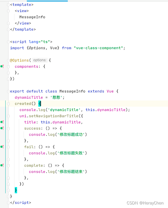
created() {
   console.log('dynamicTitle', this.dynamicTitle);
   uni.setNavigationBarTitle({
     title: this.dynamicTitle,
     success: () => {
       console.log('修改标题成功')
     },
     fail: () => {
       console.log('修改标题失败')
     },
     complete: () => {
       console.log('修改标题结束')
     },
   })
 }
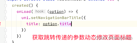
动态渲染页面的title:
传参:
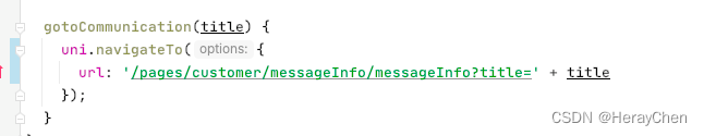
获取动态设置:
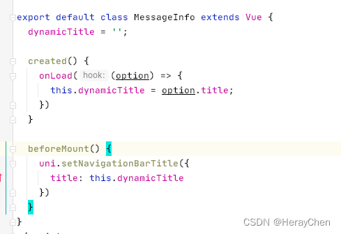
也可以直接设置:
优化
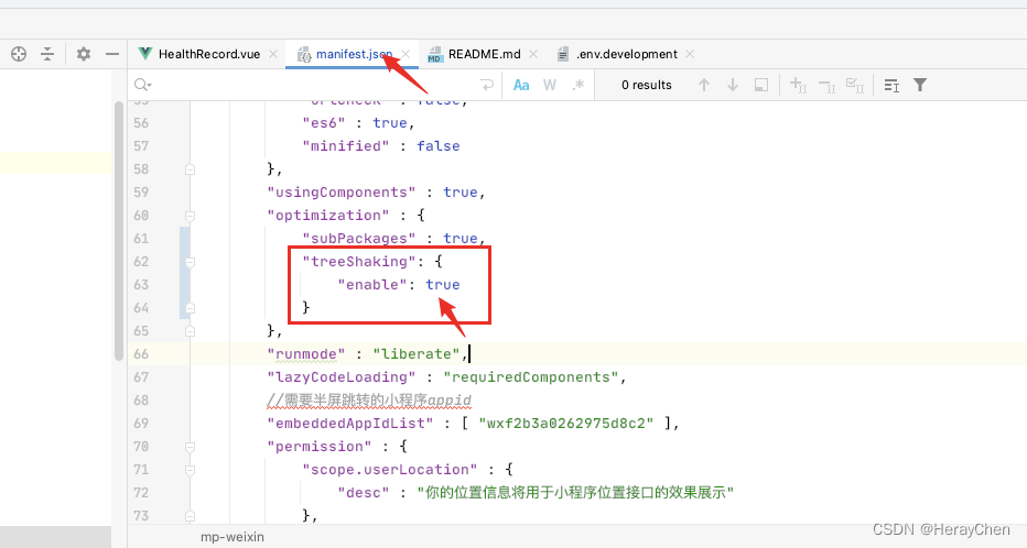
打包优化
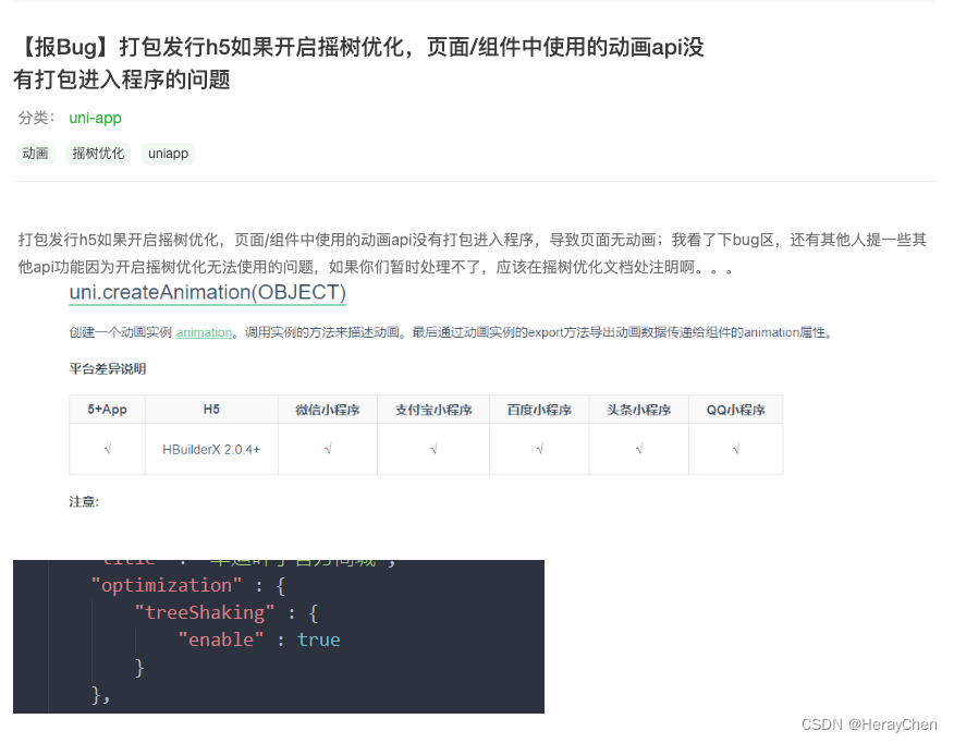
将小程序没有使用到的代码忽略打包到build文件中。
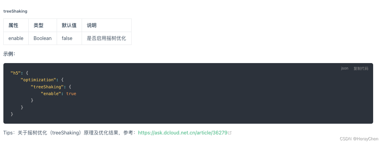
但是我看有人说开启摇树优化之后动画会不生效。
图片优化
微信小程序主包不能超过2M,所以在使用图片的时候尽量将图片压缩处理。
常用的在线压缩网站:
tinypng
iloveImg