这个效果很常见,当我们需要鼠标移入移出控制元素的显示隐藏
<div class="dynamic-height-btn">Hover Me</div>
<div class="dynamic-height-box fold">
    我是动态高度内容我是动态高度内容我是动态高度内容我是动态高度内容我是动态高度内容我是动态高度内容我是动态高度内容
</div>
const box = document.querySelector('.dynamic-height-box')
const btn = document.querySelector('.dynamic-height-btn')
btn.addEventListener('mouseenter', (e) => {
  box.classList.add('unfold')
})
btn.addEventListener('mouseout', (e) => {
  box.classList.remove('unfold')
})
为了实现高度动态变化,可能第一想法是这样写CSS
.dynamic-height-btn {
	width: 80px;
	height: 20px;
	border: 1px solid #ccc;
	cursor: pointer;
}
.dynamic-height-box {
	width: 120px;
	background-color: #efefef;
	border-radius: 4px;
	transition: height 0.3s ease;
	overflow: hidden;
	will-change: height;
	height: 0;
	&.unfold {
		height: auto;
	}
}
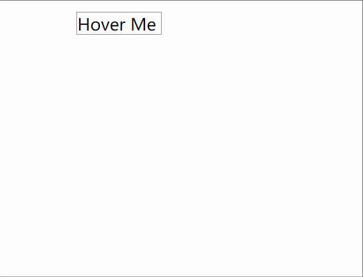
先看看效果:

过渡动画并没有生效,元素的高度变化是一步到位
transition 不支持 height: auto
通过查看规范,动画未生效的原因是 CSS transition 不支持元素的高度为 auto 的变化
如果把 height: auto 替换成一个具体的高度值,则动画是生效的
.dynamic-height-box {
	width: 120px;
	background-color: #efefef;
	border-radius: 4px;
	transition: height 0.3s ease;
	overflow: hidden;
	will-change: height;
	height: 0;
	&.unfold {
		height: 200px;
	}
}

但是,在元素高度不固定的情况下,即不知道有多少内容,这种方式就不适用了,会造成内容溢出或多余空白区域
使用 max-height
为了不造成内容溢出或多余空白区域的问题,使用 max-height 替换 height
.dynamic-height-box {
	width: 120px;
	background-color: gold;
	border-radius: 4px;
	transition: max-height 0.3s ease;
	overflow: hidden;
	will-change: max-height;
	max-height: 0;
	&.unfold {
		max-height: 1000px;
	}
}
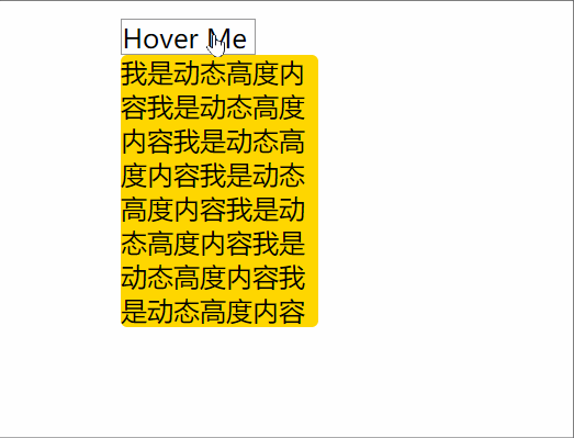
我们可以到,动画生效了,但是,细心的同学能发现,元素展开过程的时间比搜索过程的时间要短很多。这是因为元素的实际展开高度远没有1000px,而动画是作用在max-height上的,展开动画期望的是将容器的高度在0.3s内从0拉伸到1000px,实际在大约200px的时候就停止了,所以动画时间远没有0.3s。
使用 rotate 优雅实现
使用rotate旋转容器,能避免以上所有的坑,如果不在意旋转过程中内容看起来拥挤,这不失为一个好的选择
.dynamic-height-box {
	width: 120px;
	background-color: gold;
	border-radius: 4px;
	transform: rotateX(-90deg);
	transform-origin: center top;
	transition: transform 0.3s ease;
	will-change: max-height;
	&.unfold {
		transform: rotateX(0deg);
	}
}
本文内容由网友自发贡献,版权归原作者所有,本站不承担相应法律责任。如您发现有涉嫌抄袭侵权的内容,请联系:hwhale#tublm.com(使用前将#替换为@)