<!DOCTYPE html>
<html lang="en">
<head>
    <meta charset="UTF-8">
    <meta http-equiv="X-UA-Compatible" content="IE=edge">
    <meta name="viewport" content="width=device-width, initial-scale=1.0">
    <title>css画三角形</title>
    <style type="text/css">
        .popover{
            position: relative;
            width: 100%;
            height: 800px;
        }

        .div{
            position: absolute;
            left: 30px;
            top: 30px;
            width: 200px;
            height: 100px;
            background-color: white;
            border: 1px solid rgb(240,240,240);
            box-shadow: 0px 0px 5px 5px rgb(235, 235, 235);
                        /*-5px -5px 5px rgb(230, 230, 230);*/
            border-radius: 5px;
            box-sizing: border-box;

        }

        .triangle-left{
            position: absolute;
            top: 40px;
            left: -19px;
            width: 0;
            height: 0;
            border-top: 10px solid transparent;
            border-bottom: 10px solid transparent;
            border-left: 10px solid transparent;
            border-right: 10px solid white;
        }
        .triangle-right{
            position: absolute;
            top: 40px;
            right: -19px;
            width: 0;
            height: 0;
            border-top: 10px solid transparent;
            border-bottom: 10px solid transparent;
            border-left: 10px solid white;
            border-right: 10px solid transparent;
        }
        .triangle-bottom{
            position: absolute;
            top: 100%;
            left: calc(50% - 19px);
            width: 0;
            height: 0;
            border-top: 10px solid white;
            border-bottom: 10px solid transparent;
            border-left: 10px solid transparent;
            border-right: 10px solid transparent;
        }
        .triangle-top{
            position: absolute;
            top: 100%;
            left: calc(50% - 19px);
            width: 0;
            height: 0;
            border-top: 10px solid transparent;
            border-bottom: 10px solid white;
            border-left: 10px solid transparent;
            border-right: 10px solid transparent;
        }
    </style>
</head>
<body>
    <div class="popover">
      <!-- <div class="div">
        三角形朝左
        <div class="triangle-left"></div>
        </div>
       <div class="div">
        三角形朝右
        <div class="triangle-right"></div>
        </div>
       <div class="div">
        三角形朝上
        <div class="triangle-top"></div>
        </div>  -->
        <div class="div">
        三角形朝下
        <div class="triangle-bottom"></div>
        </div>
    </div>


</body>
</html>
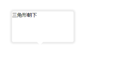
气泡朝下的形式如图所示: