你的箭头以left:48%。这将定位箭头靠近中心基于箭头元素左边缘的容器。
换句话说,假设您使用left:50%(这是正确的方法),这doesn't将箭头元素置于容器的中心。它实际上集中在左边缘容器中的元素。
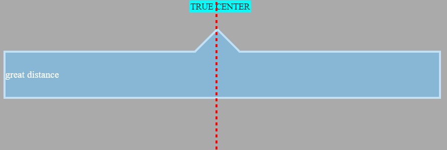
在下图中,标记位于页面中央,使用text-align:center.
为了进行比较,请参阅以left:50%.
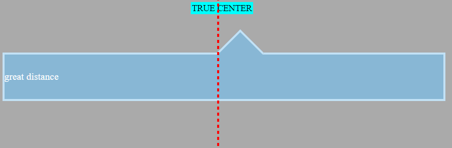
该元素位于右中位置。随着窗口变小,这种错位变得更加明显。
因此,经常会看到居中、绝对定位的元素使用transform财产:
.triangle {
   position: absolute;
   left: 50%;
   transform: translate(-50%,0);
}
The transform规则告诉三角形将自身向后移动其宽度的 50%。这使得它完全居中于该线上。现在它模拟text-align:center.
In translate(-50%,0),第一个值针对 x 轴(水平),另一个值适用于 y 轴。等效的规则是transform:translateX(-50%)(还有transform:translateY()).
顺便说一句,以下是如何将元素水平居中和居中
垂直使用此方法:
.triangle {
   position: absolute;
   left: 50%;
   top: 50%;
   transform: translate(-50%,-50%);
}
注意:如果您使用的是right: 50% or bottom: 50%, 各自的translate值将是50%(非负数).
然而,在这个特定问题中,出现了一个问题,因为transform:rotate(45deg)也在声明块中。添加第二个transform意味着第一个被忽略(每个级联)。
因此,作为解决方案,请尝试以下操作:
.container::before {
    left: 50%;
    transform: translate(-50%,0) rotate(45deg);
}
通过将函数链接在一起,可以应用多个函数。
请注意顺序很重要。如果translate and rotate颠倒过来,三角形会先旋转 45 度,然后平移 -50%沿着旋转轴,打破布局。所以请确保translate首先。 (谢谢@Oriol在评论中指出这一点。)
这是完整的代码:
body {
    background: #333333;
}

.container {
    width: 98%;
    height: 80px;
    line-height: 80px;
    position: relative;
    top: 20px;
    min-width: 250px;
    margin-top: 50px;
}

.container-decor {
    border: 4px solid #C2E1F5;
    color: #fff;
    font-family: times;
    font-size: 1.1em;
    background: #88B7D5;
    text-align: justify;
}

.container::before {
    top: -33px;
    left: 50%;
    transform: translate(-50%,0) rotate(45deg);
    position: absolute;
    border: solid #C2E1F5;
    border-width: 4px 0 0 4px;
    background: #88B7D5;
    content: '';
    width: 56px;
    height: 56px;
}
<div class="container container-decor">great distance</div>
jsFiddle