一般来说,您无法单独使用 Flexbox 来做到这一点,尽管根据每个给定的情况可能会有折衷方案。
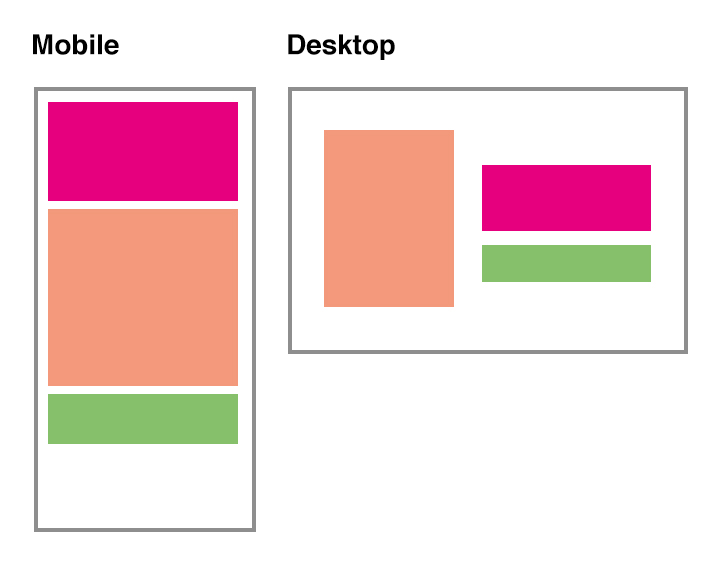
单独使用 Flexbox,使用固定高度,您就可以实现这一点
* {
  box-sizing: border-box;
}

body, html {
  margin: 0;
}

.flex {
  width: 90%;
  margin: 5vh auto;
  height: 90vh;
  background: rgba(0, 0, 0, 0.05);
  display: flex;
  flex-flow: column wrap;
}
.flex div {
  flex: 1;
  width: 50%;
}
.flex div:nth-child(2) {
  order: -1;
}
.flex::before {
  content: '';
  height: 100%;
}

@media (max-width:768px) {
  .flex div {
    width: auto;
  }
  .flex::before {
    display: none;
  }
 .flex div:nth-child(2) {
    order: 0;
  }
}


/*  styling  */
.flex-child {
  color: white;
  font-size: 2em;
  font-weight: bold;
}
.flex-child:nth-child(1) {
  background: #e6007e;
}
.flex-child:nth-child(2) {
  background: #f4997c;
}
.flex-child:nth-child(3) {
  background: #86c06b;
}
<div class="flex">
  <div class="flex-child">
    <div>Top/Right</div>
  </div>
  <div class="flex-child">
    <div>Center/Left</div>
  </div>
  <div class="flex-child">
    <div>Bottom/Right</div>
  </div>
</div>
在这种情况下,如果不允许固定高度,您可以将 Flexbox 和float.
通过使用 Flexbox 将其设置为移动设备,您可以在其中添加center项目首先出现在标记中,然后,order,将其移动到top and bottom.
通过媒体查询,您只需制作柔性容器块元素及其使用float定位left向左和向right向右。
* {
  box-sizing: border-box;
}

body, html {
  margin: 0;
}

.flex {
  max-width: 1024px;
  width: 90%;
  margin: 5vh auto;
  height: 90vh;
  background: rgba(0, 0, 0, 0.05);

  display: flex;
  flex-direction: column;
}

.flex-child {
  color: white;
  font-size: 2em;
  font-weight: bold;
  padding: 5%;
  flex-basis: 33.333%;

  display: flex;
  align-items: center;
}

.flex-child:nth-child(1) {
  background: #e6007e;
  order: 1;
}
.flex-child:nth-child(2) {
  background: #f4997c;
}
.flex-child:nth-child(3) {
  background: #86c06b;
  order: 2;
}

@media (min-width: 768px) {
  .flex {
    display: block;
  }
  .flex-child {
    width: 50%;
  }
  .flex-child:nth-child(1) {
    float: left;
    height: 100%;
  }
  .flex-child:nth-child(2),
  .flex-child:nth-child(3) {
    float: right;
    height: 50%;
  }
}
<div class="flex">
  <div class="flex-child">
    <div>Center/Left</div>
  </div>
  <div class="flex-child">
    <div>Top/Right</div>
  </div>
  <div class="flex-child">
    <div>Bottom/Right</div>
  </div>
</div>
Update
这是结合 Flexbox 的另一个版本position: absolute,这也将项目垂直居中桌面模式
更新,添加了一个脚本来控制,以便绝对定位的元素不会变得比正确的项目更大,如果是这样,请调整弹性容器的高度。
请注意,该脚本绝不是经过优化的,它只是为了展示如何在某些情况下进行修复
(function() {

  window.addEventListener("resize", resizeThrottler, false);

  var fp = document.querySelector('.flex');
  var fi = fp.querySelector('.flex-child:nth-child(1)');
  var resizeTimeout;
  function resizeThrottler() {
    // ignore resize events as long as an actualResizeHandler execution is in the queue
    if ( !resizeTimeout ) {
      resizeTimeout = setTimeout(function() {
        resizeTimeout = null;
        actualResizeHandler();

       // The actualResizeHandler will execute at a rate of 15fps
       }, 66);
    }
  }

  function actualResizeHandler() {
    // handle the resize event
    if (fp.offsetHeight <= fi.offsetHeight) {
      fp.style.cssText = 'height: '+fi.offsetHeight+'px';
    } else {
      fp.style.cssText = 'height: auto';
    }
  }

  window.addEventListener('load', function() {
    actualResizeHandler();
  })

}());
* {
  box-sizing: border-box;
}

body, html {
  margin: 0;
}

.flex {
  position: relative;
  max-width: 1024px;
  width: 90%;
  margin: 5vh auto;
  height: 90vh;
  background: rgba(0, 0, 0, 0.05);

  display: flex;
  flex-direction: column;
}

.flex-child {
  color: white;
  font-size: 2em;
  font-weight: bold;
  padding: 5%;
}

.flex-child:nth-child(1) {
  order: 1;
}
.flex-child:nth-child(3) {
  order: 2;
}

.flex-child:nth-child(1) div {
  background: #e6007e;
}
.flex-child:nth-child(2) div {
  background: #f4997c;
}
.flex-child:nth-child(3) div {
  background: #86c06b;
}

@media (min-width: 768px) {
  .flex {
    justify-content: center;
  }
  .flex-child {
    width: 50%;
  }
  .flex-child:nth-child(1) {
    position: absolute;
    top: 50%;
    transform: translateY(-50%);
  }
  .flex-child:nth-child(n+2) {
    margin-left: 50%;
  }
}
<div class="flex">
  <div class="flex-child">
    <div>Center/Left<br>with more<br>content<br>than any<br>of the<br>other items<br>other items<br>other items<br>other items<br>other items</div>
  </div>
  <div class="flex-child">
    <div>Top/Right<br>with more<br>content</div>
  </div>
  <div class="flex-child">
    <div>Bottom/Right<br>with more</div>
  </div>
</div>
通过脚本,我们还可以在元素之间重新排序/移动项目。
堆栈片段
您还可以将其与媒体查询结合起来,并使用它来对元素进行实际的重新排序
$( document ).ready(function() {
  $(window).resize(function() {
    if ($( window ).width() < 600 ) {
      $(".one").insertBefore("#b");
    } else {
      $(".one").insertBefore(".two");
    }
  });
});
.outer, #flex, #flex2 {
  display: flex;
  flex-direction: column;
}
#a {
  order: 4;
  background: #ccc;
}
#b {
  order: 1;
  background: #aaa;
}
#c {
  order: 3;
  background: #d33;
}
.one {
  order: 2;
  background: #aaa;
}
.two {
  order: 5;
  background: #aaa;
}
<script src="https://ajax.googleapis.com/ajax/libs/jquery/2.1.1/jquery.min.js"></script>

<div class="outer">
  <div id="flex">
    <div id="a">A</div>
    <div id="b">B</div>
    <div id="c">C</div>
  </div>

  <div id="flex2">
    <div class="one">Show me 2nd</div>
    <div class="two">Show me 5th</div>
  </div>

</div>
更新2(已回答在另一个问题上但后来搬到了这里)
如果我们谈论较小的项目,例如标题或较小的菜单,则可以做许多网站平台提供商(如“squarespace”、“weebly”、“wordpress”等)所做的事情。他们的模板拥有不同的标记结构,其中一个项目有时存在两次,一个在桌面上可见,另一个在移动设备上可见。
另外,由于体积如此之小,在性能方面几乎没有任何影响(就我个人而言,我认为这不会比重复的 CSS 规则(每个屏幕尺寸都有一个规则)有更多问题,并且很乐意这样做而不是引入脚本) 。
小提琴演示
堆栈片段
.container {
  display: flex;
}
.container > div {
  width: 50%;
}
.container div:nth-child(-n+2) {
  border: dashed;
  padding: 10px;
}
.container > div:nth-child(1) {
  display: none;                                  /*  hide outer "Flower"  */
}

@media (max-width:768px) {
  .container {
    flex-direction: column;
  }
  .container div {
    width: auto;
  }
 .container div:nth-child(1) {
    display: block;                               /*  show outer "Flower"  */
  }
  .container div:nth-child(3) div:nth-child(1) {
    display: none;                                /*  hide inner "Flower"  */
  }
}
<div class="container">
  <div>Flower</div>
  <div>Tree</div>
  <div>
    <div>Flower</div>
    <div>Bee</div>
  </div>
</div>