您可以通过添加新的国家/地区标签来显示国家/地区标签scattergeo追踪与mode set to "text"仅显示标签。
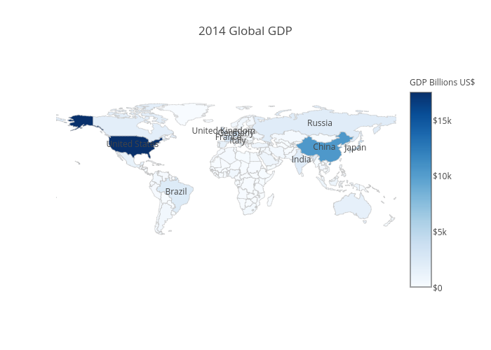
这是一个例子。我正在使用 dplyr 过滤出 10 个最大的行。
df <- read.csv('https://raw.githubusercontent.com/plotly/datasets/master/2014_world_gdp_with_codes.csv')

# light grey boundaries
l <- list(color = toRGB("grey"), width = 0.5)

# specify map projection/options
g <- list(
  showframe = FALSE,
  showcoastlines = FALSE,
  projection = list(type = 'Mercator')
)

p <- (plot_ly(df, z = GDP..BILLIONS., text = COUNTRY, locations = CODE, type = 'choropleth',
        color = GDP..BILLIONS., colors = 'Blues', marker = list(line = l),
        colorbar = list(tickprefix = '$', title = 'GDP Billions US$'),
        inherit = FALSE, # don't pass arguments into the next trace
        filename="r-docs/choropleth-with-country-labels") %>%
  layout(title = '2014 Global GDP',
         geo = g) %>%
  dplyr::arrange(dplyr::desc(GDP..BILLIONS.)))[seq(1, 10), ] %>%
  add_trace(type="scattergeo", # view all scattergeo properties here: https://plot.ly/r/reference/#scattergeo
            locations = CODE, text = COUNTRY, mode="text")
全屏、互动版