css在布局和样式微调中,有很多小技巧,今天总结一些小妙招,这些方法基本上很好用,而且不会轻易弄混淆。
我们为了看出效果,将页面做了一些修饰,比如很多地方加上了边框,设置了背景色,主要是为了更直观的表现我们的效果。首先贴出一段主体的样式:
/**reset*/
html,body,div,p,span,h1,h2,h3,h4,h5,h6,input{margin:0;padding:0;font-weight:normal;}
#root{
	width:1000px;
	margin:0 auto;
}
.tips{
	color:red;
	font-weight:bold;
	font-size:18px;
	margin:20px 0;
}
.box{

}
.box-header,.box-footer{
	border:1px solid #ddd;
	border-radius:3px;
	padding:5px;
}
.box-content{
	margin:10px auto;
}
.box-item{
	width:100px;
	height:100px;
	border:1px solid #000;
	border-radius:3px;
}
.bg-red{
	background:red;
}
.bg-blue{
	background:lightblue;
}
.bg-green{
	background:lightgreen;
}
1.1、首先要说的是浮动,我们知道,浮动的元素,会因为脱离了默认的布局,周围的元素,会因为浮动而发生改变,为了消除浮动带来的影响,我们需要清除浮动,所以浮动最主要的就是清除浮动,默认我们需要在父元素上清除浮动,无论是左浮动,还是右浮动,或者左右浮动都有,我们均需要在父级元素上做清除浮动的操作。
浮动与清除浮动的主要样式代码如下:
.clearfix{
    zoom:1;
}
.clearfix:before,.clearfix:after{
	display:table;
	height:0;
	content:'';
}
.clearfix:after{
	clear:both;
}
.fl{
	float:left;
}
.fr{
	float:right;
}
HTML部分:
<h2>1-1、浮动原生样式</h2>
<div class="box-header">this is header</div>
<div class="box-content clearfix">
   <div class="box-item bg-red fl">left</div>
   <div class="box-item bg-blue fr">right</div>
   <!--
   <div class="box-item bg-green fr">center</div>
   -->
</div>
<div class="box-footer">this is footer</div>
展示效果:

对于这种浮动的效果,一个居左,一个居右的情况,在实际应用中也会有很多,可能不是这种效果,但是基本逃不出这样的技巧。重点样式在于父级元素上的.clearfix,以及他们的伪类样式.clearfix:before与.clearfix:after。核心代码在于:
.clearfix:before,.clearfix:after{display:table;height:0;content:'';}
.clearfix:after{clear:both;}
默认的浮动,我们需要做一些工作,父元素需要设置清除浮动样式,子元素设置浮动,我们需要注意的是子元素有三个的情况,这时候,如果右浮动是两个的时候,我们需要将浮动在最右边的元素放在中间浮动的元素左边,如果不这么设置,最终靠中间的元素会被显示在最右边,很奇怪,这种设置,好像很不容易理解。这也是一种技巧。
1.2、在css3中,有一种flex布局,也可以实现这种左右布局的情况,他的实现很巧妙,主要在父级元素上设置子元素的对齐属性。
css样式很简单,如下:
.box-content-flex{
	margin:10px auto;
	display:flex;
	justify-content:space-between;
}
HTML代码如下:
<h2>1-2、浮动flex样式</h2>
<div class="box-header">this is header</div>
<div class="box-content-flex">
   <div class="box-item bg-red">left</div>
   <div class="box-item bg-blue">right</div>
</div>
<div class="box-footer">this is footer</div>
html部分和默认通过浮动的方式没有区别,唯一的区别就是在于父级元素上的.box-content-flex这个class 。display:flex;是让块级子元素显示在一行上,类似子集元素设置inline-block的效果。justify-content:space-between;是让子集元素排列的时候,中间有空隙,这样就正好一左一右。效果如下所示:

2.1、接下来是介绍一个子元素在父容器中水平垂直居中的示例,这个用法很常见,比如对话框的样式,我们一般是让他们在页面正中间。最简单的垂直居中,就是借助定位来实现,即让父元素相对定位,然后子元素绝对定位,向上和向左偏移均为50%,这样,还需要设置外边距,分别为高度和宽度的1/2负值,相当于拉回来一部分,正好居中。
样式代码如下所示:
.content-wrapper{
	height:200px;
	background:#eee;
	/**relative for child layout*/
	position:relative;
}
.align-center{
	position:absolute;
	left:50%;
	top:50%;
	margin-left:-50px;
	margin-top:-50px;
}
HTML代码如下:
<h2>2-1、居中原生样式</h2>
<div class="box-header">this is header</div>
<div class="box-content content-wrapper">
	<div class="box-item bg-green align-center"></div>
</div>
<div class="box-footer">this is footer</div>
这种布局,适合所有常规的水平垂直居中。样式效果:

2.2、今天要介绍的另一种水平垂直居中的做法,还是借助于flex布局,他的设置也很简单。
css样式部分:
/**flex layout*/
.content-wrapper-flex{
	height:200px;
	background:#eee;
	/***/
	display:flex;
	justify-content:center;
	align-items:center;
}
HTML代码部分:
<h2>2-2、居中flex布局样式</h2>
<div class="box-header">this is header</div>
<div class="box-content content-wrapper-flex">
	<div class="box-item bg-green"></div>
</div>
<div class="box-footer">this is footer</div>
与浮动效果一样,这个样式技巧中,也是只需要在父级元素上设置即可, 很方便。justify-content:center;align-items:center;这两个设置,分别是设置水平,垂直居中对齐效果。最终的效果: 
与利用top,left,position这种计算位置来实现居中的方式不同,flex让子元素居中,不需要知道子元素的宽度和高度,很方便。
3、四周阴影效果,为了和普通阴影效果对比,我们做了两个阴影的示例。
css样式部分:
/**3 shadow */
.border-shadow-around{
	box-shadow:0 0 10px #000;
}
.border-shadow-not-around{
	box-shadow:5px 5px 10px #000;
}
HTML代码部分:
<h2>3、四周阴影</h2>
<div class="box-content-flex">
	<div class="box-item bg-green border-shadow-around">shadow</div>
	<div class="box-item bg-green border-shadow-not-around">shadow-not-around</div>
</div>
tips:四周阴影,在有些地方我们是会使用到的,默认都是两条边的阴影。我们需要四条边都有阴影,就 设置box-shadow的前面两个参数都为0,即:box-shadow: 0 0 5px #000;
最终展示效果如下: 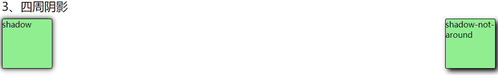
4、relative定位的妙用,一般有这样的场景,我们在一行中,会有2个或者2个以上的行内元素,他们如果高度不一致,或者还存在左右浮动的情况,会不在一条水平线上,而设计要求,会让我们把他们放置在一条线上,这样一来,我们需要对容器中的子元素,设置垂直对齐方式vertical-align:middle,有时候,即使这么设置了,还是会存在不在一条水平线上的情况:
我们设置的样式如下:
/**relative tips*/
.content-relative{
	border:1px solid #ddd;
}
.form-label{
	display:inline-block;
	width:100px;
	border:1px solid lightgreen;
	height:28px;
	line-height:28px;
}
.input-item{
	height:28px;
	line-height:28px;
	outline:none;
	border:1px solid #ddd;
	border-radius:3px;
	padding: 2px 5px;
}
input[type='text']:focus{
	border-color:rgb(82,168,236,0.8);
	-webkit-box-shadow:inset 0 1px 1px rgba(0,0,0,0,0.075),0 0 8px rgba(82,168,236,0.6);
	-moz-box-shadow:inset 0 1px 1px rgba(0,0,0,0,0.075),0 0 8px rgba(82,168,236,0.6);
	box-shadow:inset 0 1px 1px rgba(0,0,0,0,0.075),0 0 8px rgba(82,168,236,0.6);
}
.btn-primary{
	height:30px;
	line-height:30px;
	color:#fff;
	background:#1890ff;
	border-radius:3px;
	border:1px solid #1890ff;
	padding: 0 10px;
}
.img-wrapper{
	height:30px;
	width:30px;
	display:inline-block;
	vertical-align:middle;
	position:relative;
}
.img-wrapper img{
	width:100%;
}
html代码部分:
<h2>4、relative定位的妙用</h2>
<div class="box-content content-relative">
	<form>
		<label class="form-label">username:</label>
		<input type="text" name="username" class="input-item" />
		<span class="img-wrapper"><img src="images/avatar.png" alt="haha"/></span>
		<input type="button" value="add" class="btn-primary" />
	</form>
</div>

<div class="box-content content-relative bugfix">
	<form>
		<label class="form-label">username:</label>
		<input type="text" name="username" class="input-item" />
		<span class="img-wrapper"><img src="images/avatar.png" alt="haha"/></span>
		<input type="button" value="add" class="btn-primary" />
	</form>
</div>
效果展示以及解决办法:
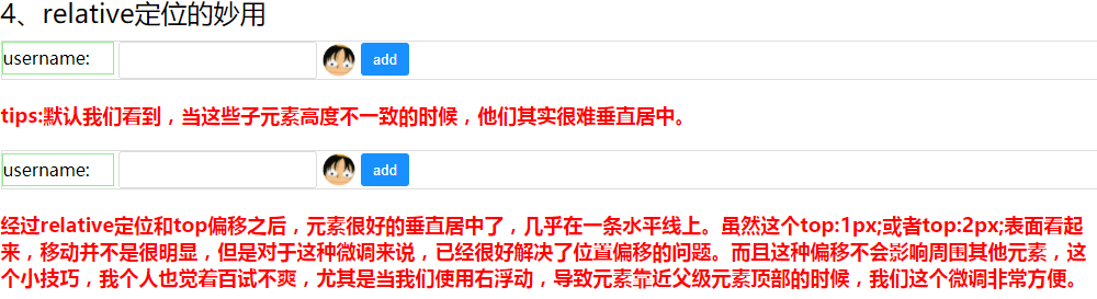
解决技巧:
/**position-relative top */
.bugfix{

}
.bugfix .form-label{
	position:relative;
	top:2px;
}
.bugfix .btn-primary{
	position:relative;
	top:1px;
}
最后,给出完整的html和css代码:
index.html
<!doctype html>
<html>
	<head>
		<meta charset="utf-8"/>
		<title>css demo</title>
		<link rel="stylesheet" type="text/css" href="styles/base.css?_t=123"/>
	</head>
	<body>
		<div id="root">
			<div class="box">
			    <h2>1-1、浮动原生样式</h2>
				<div class="box-header">this is header</div>
				<div class="box-content clearfix">
				   <div class="box-item bg-red fl">left</div>
				   <div class="box-item bg-blue fr">right</div>
				   <!--
				   <div class="box-item bg-green fr">center</div>
                   -->
				</div>
				<div class="box-footer">this is footer</div>
				<div class="tips">
					默认的浮动,我们需要做一些工作,父元素需要设置清除浮动样式,子元素设置浮动,我们需要注意的是子元素有三个的情况,这时候,如果右浮动是两个的时候,我们需要将浮动在最右边的元素放在中间浮动的元素左边,如果不这么设置,最终靠中间的元素会被显示在最右边,很奇怪,这种设置,好像很不容易理解。这也是一种技巧。
				</div>
			</div>
			<div class="box">
			    <h2>1-2、浮动flex样式</h2>
				<div class="box-header">this is header</div>
				<div class="box-content-flex">
				   <div class="box-item bg-red">left</div>
				   <div class="box-item bg-blue">right</div>
				</div>
				<div class="box-footer">this is footer</div>
				<div class="tips">
					flex用来做左右浮动也挺合适的,主要适合于两个子元素的情况。它不需要关心子元素的高度和宽度。
				</div>
			</div>
			<div class="box">
			    <h2>2-1、居中原生样式</h2>
				<div class="box-header">this is header</div>
				<div class="box-content content-wrapper">
					<div class="box-item bg-green align-center"></div>
				</div>
				<div class="box-footer">this is footer</div>
				<div class="tips">	最简单的垂直居中,就是借助定位来实现,即让父元素相对定位,然后子元素绝对定位,向上和向左偏移均为50%,这样,还需要设置外边距,分别为高度和宽度的1/2负值,相当于拉回来一部分,正好居中。
				</div>
			</div>
			<div class="box">
			    <h2>2-2、居中flex布局样式</h2>
				<div class="box-header">this is header</div>
				<div class="box-content content-wrapper-flex">
					<div class="box-item bg-green"></div>
				</div>
				<div class="box-footer">this is footer</div>
				<div class="tips">flex布局,水平垂直居中,其实很好实现,主要在需要居中的元素父级上设置display:flex;justify-content:center;align-items:center;这种方式百试不爽,理解起来也非常容易。</div>
			</div>
			<div class="box">
			    <h2>3、四周阴影</h2>
				<div class="box-content-flex">
					<div class="box-item bg-green border-shadow-around">shadow</div>
					<div class="box-item bg-green border-shadow-not-around">shadow-not-around</div>
				</div>
				<div class="tips">
					tips:四周阴影,在有些地方我们是会使用到的,默认都是两条边的阴影。我们需要四条边都有阴影,就
					设置box-shadow的前面两个参数都为0,即:box-shadow: 0 0 5px #000;
				</div>
			</div>
			<div class="box">
			    <h2>4、relative定位的妙用</h2>
				<div class="box-content content-relative">
					<form>
						<label class="form-label">username:</label>
						<input type="text" name="username" class="input-item" />
						<span class="img-wrapper"><img src="images/avatar.png" alt="haha"/></span>
						<input type="button" value="add" class="btn-primary" />
					</form>
				</div>
				<div class="tips">
					tips:默认我们看到,当这些子元素高度不一致的时候,他们其实很难垂直居中。
				</div>
				<div class="box-content content-relative bugfix">
					<form>
						<label class="form-label">username:</label>
						<input type="text" name="username" class="input-item" />
						<span class="img-wrapper"><img src="images/avatar.png" alt="haha"/></span>
						<input type="button" value="add" class="btn-primary" />
					</form>
				</div>
				<div class="tips">经过relative定位和top偏移之后,元素很好的垂直居中了,几乎在一条水平线上。虽然这个top:1px;或者top:2px;表面看起来,移动并不是很明显,但是对于这种微调来说,已经很好解决了位置偏移的问题。而且这种偏移不会影响周围其他元素,这个小技巧,我个人也觉着百试不爽,尤其是当我们使用右浮动,导致元素靠近父级元素顶部的时候,我们这个微调非常方便。</div>
			</div>
		</div>
	</body>
</html>
base.css
/**reset*/
html,body,div,p,span,h1,h2,h3,h4,h5,h6,input{margin:0;padding:0;font-weight:normal;}
#root{
	width:1000px;
	margin:0 auto;
}
.tips{
	color:red;
	font-weight:bold;
	font-size:18px;
	margin:20px 0;
}
.box{

}
.box-header,.box-footer{
	border:1px solid #ddd;
	border-radius:3px;
	padding:5px;
}
.box-content{
	margin:10px auto;
}
.box-item{
	width:100px;
	height:100px;
	border:1px solid #000;
	border-radius:3px;
}
.bg-red{
	background:red;
}
.bg-blue{
	background:lightblue;
}
.bg-green{
	background:lightgreen;
}


/**1 float */
.clearfix{
	*zoom:1;
}
.clearfix:before,.clearfix:after{
	display:table;
	height:0;
	content:'';
}
.clearfix:after{
	clear:both;
}
.fl{
	float:left;
}
.fr{
	float:right;
}

.box-content-flex{
	margin:10px auto;
	display:flex;
	justify-content:space-between;
}

/**2 vertical horizontal center */
.content-wrapper{
	height:200px;
	background:#eee;
	/**relative for child layout*/
	position:relative;
}
.align-center{
	position:absolute;
	left:50%;
	top:50%;
	margin-left:-50px;
	margin-top:-50px;
}
/**flex layout*/
.content-wrapper-flex{
	height:200px;
	background:#eee;
	/***/
	display:flex;
	justify-content:center;
	align-items:center;
}

/**3 shadow */
.border-shadow-around{
	box-shadow:0 0 10px #000;
}
.border-shadow-not-around{
	box-shadow:5px 5px 10px #000;
}
/**relative tips*/
.content-relative{
	border:1px solid #ddd;
}
.form-label{
	display:inline-block;
	width:100px;
	border:1px solid lightgreen;
	height:28px;
	line-height:28px;
}
.input-item{
	height:28px;
	line-height:28px;
	outline:none;
	border:1px solid #ddd;
	border-radius:3px;
	padding: 2px 5px;
}
input[type='text']:focus{
	border-color:rgb(82,168,236,0.8);
	-webkit-box-shadow:inset 0 1px 1px rgba(0,0,0,0,0.075),0 0 8px rgba(82,168,236,0.6);
	-moz-box-shadow:inset 0 1px 1px rgba(0,0,0,0,0.075),0 0 8px rgba(82,168,236,0.6);
	box-shadow:inset 0 1px 1px rgba(0,0,0,0,0.075),0 0 8px rgba(82,168,236,0.6);
}
.btn-primary{
	height:30px;
	line-height:30px;
	color:#fff;
	background:#1890ff;
	border-radius:3px;
	border:1px solid #1890ff;
	padding: 0 10px;
}
.img-wrapper{
	height:30px;
	width:30px;
	display:inline-block;
	vertical-align:middle;
	position:relative;
}
.img-wrapper img{
	width:100%;
}
/**position-relative top */
.bugfix{

}
.bugfix .form-label{
	position:relative;
	top:2px;
}
.bugfix .btn-primary{
	position:relative;
	top:1px;
}
还有一个icon,这里就不贴出来了,如果你有兴趣,其实可以自己随便弄一个替换就OK了。
样式的学习,都在平时的积累,有一些样式并不是只能有一种办法实现,我们不要搞混淆了。
本文内容由网友自发贡献,版权归原作者所有,本站不承担相应法律责任。如您发现有涉嫌抄袭侵权的内容,请联系:hwhale#tublm.com(使用前将#替换为@)