Method 2: Using the set() method: In this method, we use the set() method and pass a string with the title parameter to display the title for our plot. The code snippet below can explain how to use it.
import seaborn as sns
import numpy as np
import matplotlib.pyplot as plt
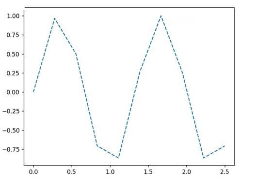
s = 10
g = np.linspace(0, 2.5, s)
k = np.sin(1.5*np.pi*g)
z = sns.lineplot(g, k)
z.lines[0].set_linestyle("--")
plt.show()
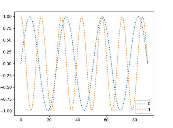
import seaborn as sns
import numpy as np
import matplotlib.pyplot as plt
import pandas as pd
s = 90
g = np.linspace(0, 5, s)
y1 = np.sin(1.4*np.pi*g)
y2 = np.cos(2.5*np.pi*g)
dataf = pd.DataFrame(np.c_[y1, y2])
ax = sns.lineplot(data = dataf, dashes=[(2, 2), (2, 2)])
plt.show()
Output
Method 3: Using the linestyle parameter: Using the linestyle parameter of the Seaborn lineplot(), we can determine customized styles for our lines. Here is a code snippet showing how to implement it.
import seaborn as sns
import numpy as np
import matplotlib.pyplot as plt
import pandas as pd
s = 90
g = np.linspace(0, 5, s)
y1 = np.sin(1.4*np.pi*g)
y2 = np.cos(2.5*np.pi*g)
dataf = pd.DataFrame(np.c_[y1, y2])
ax = sns.lineplot(data = dataf, linestyle='-.')
plt.show()
import pandas as pd
import seaborn as sns
import matplotlib.pyplot as plt
yr = [2014, 2016, 2017, 2018, 2020, 2019, 2022]
revenuePercent = [60.2, 89.8, 78, 81, 73.3, 69, 93.2]
datf = pd.DataFrame({"Year":yr, "Profit":revenuePercent})
sns.lineplot(x = "Year", y = "Profit", data=datf, color="r")
plt.show()
Output
Method 2: Using the palette parameter: We can use the palette parameter of the lineplot() and pass the palette color code or color name as a string to change the line color. Here is a code snippet showing how to use it.
import seaborn as sns
import numpy as np
import matplotlib.pyplot as plt
import pandas as pd
s = 90
g = np.linspace(0, 2, s)
y1 = np.sin(1.4*np.pi*g)
y2 = np.cos(2.5*np.pi*g)
dataf = pd.DataFrame(np.c_[y1, y2])
sns.lineplot(data=dataf, palette="rocket")
plt.show()
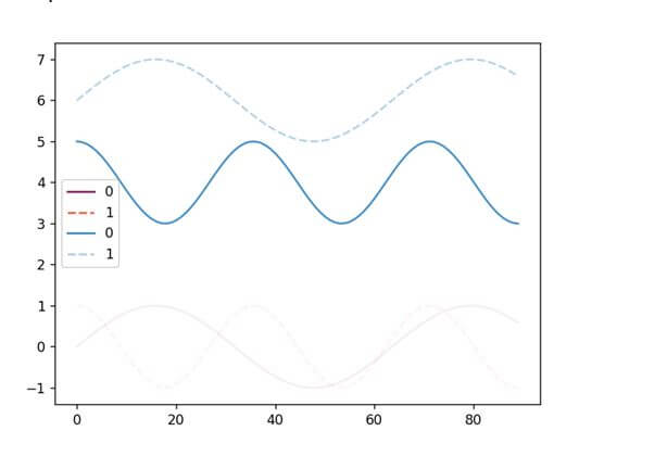
import seaborn as sns
import numpy as np
import matplotlib.pyplot as plt
import pandas as pd
s = 90
g = np.linspace(0, 2, s)
y1 = np.sin(1.4*np.pi*g)
y2 = np.cos(2.5*np.pi*g)
dataf = pd.DataFrame(np.c_[y1, y2])
dataf2 = pd.DataFrame(np.c_[y2+4, y1+6])
sns.set(rc={'axes.facecolor':'goldenrod', 'figure.facecolor':'goldenrod'})
sns.lineplot(data=dataf2, palette="rocket", alpha = 1.0)
plt.show()
Output
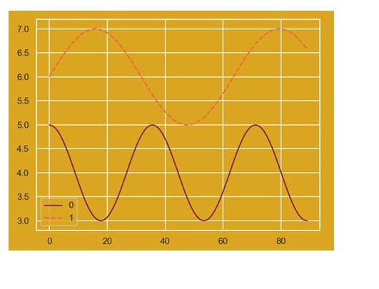
Method 2: Using the set_style() method: We can use the set_style() method to set the background theme for the line plot, hence changing the color. Here is a code showing how to do it.
import seaborn as sns
import numpy as np
import matplotlib.pyplot as plt
import pandas as pd
s = 90
g = np.linspace(0, 2, s)
y1 = np.sin(1.4*np.pi*g)
y2 = np.cos(2.5*np.pi*g)
dataf = pd.DataFrame(np.c_[y1, y2])
dataf2 = pd.DataFrame(np.c_[y2+4, y1+6])
sns.set_style("darkgrid")
sns.lineplot(data = dataf2, palette = "rocket", alpha = 1.0)
plt.show()
Method 2: Using the Matplotlib.pyplot.legend() method: Seaborn runs on top of matplotlib. The matplotlib.pyplot.legend() function helps in adding a customized legend to the Seaborn plots.
Method 3: Using the remove() method: The legend_.remove() method is another popular way of removing a legend from a plot. Here is a code snippet showing how to implement it.
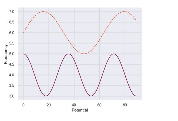
Method 2: Using matplotlib’s xlabel() and ylabel(): Seaborn uses matplotlib, which is why it becomes easy to integrate matplotlib methods with Seaborn. We can use the xlabel() and ylabel() methods to set labels for the x and y axes. Here is a code snippet showing how to use it.
import seaborn as sns
import numpy as np
import matplotlib.pyplot as plt
import pandas as pd
s = 90
g = np.linspace(0, 2, s)
y1 = np.sin(1.4*np.pi*g)
y2 = np.cos(2.5*np.pi*g)
dataf = pd.DataFrame(np.c_[y1, y2])
dataf2 = pd.DataFrame(np.c_[y2+4, y1+6])
sns.set()
plt.grid(color='gainsboro', linestyle='-', linewidth=2)
gk = sns.lineplot(data=dataf2, palette="rocket", alpha = 1.0, legend=False)
plt.xlabel('Potential')
plt.ylabel('Frequency')
plt.show()