序言
在做前端页面时,需要做一些样式上的改变,使用伪元素很轻易就做到了。之前一直说伪元素还可以清除浮动,然后就想了解一下这东西到底能干什么。如下图,之前碰到的,为元素添加边框样式,小程序中修改radio,checkbox的默认样式,都用到了伪元素。


接下来,我们详细了解一下css中的伪元素
伪元素
css3为了区分伪类和伪类元素,伪元素采用了双冒号的写法。
常见伪类::hover,:link,:active,:target,:not(),:focus
常见为元素:::first-letter,::first-line,::after,::before,::selection
这里顺便说一下 :before,:after 与::before,::after的区别
不同点:
- :before/:after是css2的写法,::before/::after是css3的写法,本质写法还是一样
- :before/:after的兼容性要比::before/::after好,所有支持::的浏览器都会支持:,但IE8只支持单冒号,一般开发的话还是使用双冒号即可
相同点:
- 都可以用作伪元素,用来设置对象前或后的内容
注意:
- 必须配合content属性一起使用
- 这些元素不会出现在DOM中,所以无法通过js操作,仅仅是css渲染层加入
1.概念理解
伪元素之所以被称为为元素,是因为他们不是真正的元素,他们不会出现在DOM中,主要用于为当前元素增加修饰性的内弄,显示的内容是content,默认是行内元素,如果没有设置content,伪元素是不起作用的,可以为其设置css样式
伪元素几个必要的参数:
- content:字符串:作为内容添加在主元素的前和后
- attr(attr_name):伪元素跟某个属性值进行关联,伪类元素的内容就是指定属性的值
- url()/uri():引用外部资源,例如图片
- counter:调用计数器,可以不适用列表元素实现序号问题。、
counter使用案列:本质就是在使用该计数器前必须先设置好计数器名称
1.使用counter-reset:name
2.使用counter-increment累加

2.::before,::after特点
上面说过伪元素是通过样式达到效果,为元素并不会在DOM中,所以总结其特点:
- 伪元素不在DOM中,所以js无法操作它
- 伪元素属于主元素一部分,因此点击它触发的也是主元素的click事件
- 块级元素,行内元素,行内块级元素都可以设置::brfore,::after,但是因为行内块元素可替换元素,例如:img标签,以为其外观和尺寸都是由外部资源决定的,当外部资源加载正确,就会替换其内部内容,伪元素内容就会被替换掉,但当加载失败时,伪元素可以发挥一些效果。
总结一下伪元素的优缺点:
1.优点
- 解决一些问题可以无需增加DOM节点就可以解决
- 可以让css解决部分js问题
2.缺点
- 不利于SEO
- 无法审查元素,调试样式比较困难
伪元素的使用场景
1.清除浮动
这个在我对浮动的博客已经有详细解释了,这里就自己简单介绍伪元素清除浮动。
清除浮动本质解决的是子元素浮动后,父元素高度为零的现象。其中一个解决方法是在子元素后添加一个空的div设置clear:both,这样可以解决,但是却添加了DOM树复杂程度,因此使用伪元素,就两两全其美了。
使用伪类元素是清除浮动的正常方法

如上图,清除浮动前后对比,效果明显。
对清除浮动有兴趣的请移步css之浮动(图文并茂)详细了解
2.改变某些元素的默认样式
例如:img图片失效时默认样式如下
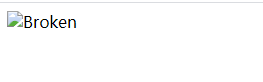
我们可以使用伪元素修改默认的样式

代码:
 		img::before{
            content: '\21BB' "Broken of the Image";
            display: block;
            width: 100%;
            height: 100px;
            background-color:lightgray;
            position: absolute;
        }
        img{
            content: '';
            display: block;
            font-size: 16px;
            position: absolute;
            width: 100%;
            text-align: center;
        }
控件原样式
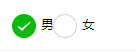
修改后
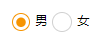
代码
		/*调小控件大小*/
		radio .wx-radio-input{
		  width: 33rpx;
		  height: 33rpx;
		  border-radius: 50%;
		}
		/*使用伪元素添加中间圆点*/
		radio .wx-radio-input.wx-radio-input-checked::before{
		   border-radius: 50%;
		   width: 25rpx;
		   height: 25rpx; /*宽高要比控件小一点*/
		   text-align: center;
		   font-size:0rpx; /*去除中间对号*/
		   background-color: #F69401;
		}
		/*点中后边框*/
		 radio .wx-radio-input.wx-radio-input-checked{
		  background: #fff !important;
		  width: 30rpx;
		  height: 30rpx;
		  border: 3rpx solid #F69401 !important;
		}
3.特效
在一些a标签链接中常会见到这些特效
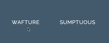
这种特效就是通过伪元素写出来的,代码如下:
		a{
            display: block;
            outline: none;
            text-decoration: none;
            color: #000;
            font-size: 32px;
            text-align: center;
        }
        a:before {
            content: "\5B";
            display: inline-block;
            transform: translateX(0);
            visibility: hidden;
            transition: transform 0.3s;
         }
        a:hover::before {
            visibility: visible;
            transform: translateX(-20px);
         }

         a::after {
            content: "\5D";
            display: inline-block;
            transform: translateX(0);
            visibility: hidden;
            transition: transform 0.3s;
         }
        a:hover::after {
            visibility: visible;
            transform: translateX(20px);
         }
4.webfont的图标
现在webfont图标的最佳实践就是使用i标签和::after或者::before,实现这种图标最佳实践的工具非常多,比如http://fontello.com/,从这个网站我们可以下载svg的图标库。这里引用before和after的用法
比如电话图标

<style type="text/css">
    #phone{width:50px;height:50px;border-left:6px solid #EEB422;border-radius:20%;transform:rotate(-30deg);-webkit-		transform:rotate(-30deg);margin:20px;margin-right:0px;position:relative;display: inline-block;top: -5px;}
    #phone:before{width:15px;height:15px;background:#EEB422;border-radius: 20%;content: "";position: absolute;left:-2px;top: 1px;}
    #phone:after{width:15px;height:15px;background:#EEB422;border-radius: 20%;content: "";position: absolute;left:-3px;top: 34px;}
</style>
<div id="wraper">
    <div id="phone"></div>
</div>
更多图标:
<!doctype html>
<html>
<head>
    <title>伪类标签使用</title>
</head>
<style type="text/css">
    #wraper{padding:10px;width:380px;height:380px;border:3px solid #ccc;margin:auto;}
    #power{width: 30px;height: 30px;margin:20px;border: 6px solid #EEB422;border-radius: 50%;position: relative;display: inline-block;}
    #power:before{width:7px;height:22px;background:#EEB422;position: absolute;left:8px;top:-13px;content: "";border: 3px solid #fff;}
    #play{width: 30px;height: 30px;margin:20px;border: 6px solid #EEB422;border-radius: 50%;position:relative;display: inline-block;background: #EEB422;}
    #play:before{border:11px solid transparent;border-left:17px solid #fff;content: "";position: absolute;left:9px;top: 3px;}
    #pause{width: 30px;height: 30px;margin:20px;border: 6px solid #EEB422;border-radius: 50%;position:relative;display: inline-block;background: #EEB422;}
    #pause:before{height:20px;width:5px;border:0px solid transparent;border-left:8px solid #fff;border-right:8px solid #fff;content: "";position: absolute;left:4px;top: 5px;}
    #stop{width: 30px;height: 30px;margin:20px;border: 6px solid #EEB422;border-radius: 50%;position:relative;display: inline-block;background: #EEB422;}
    #stop:before{height:17px;width:17px;background:#fff;content: "";position: absolute;left:6px;top: 6px;}
    #comment{width: 50px;height: 25px;margin:20px;border: 6px solid #EEB422;border-radius: 20%;position:relative;display: inline-block;background: #EEB422;}
    #comment:before{border:10px solid transparent;border-top:10px solid #EEB422;content: "";position: absolute;left:28px;top: 28px;}
    #comment:after{content: "....";position: absolute;color: #fff;font-size: 26px;top: -10px;left: 2px;}
    #like{width: 50px;height: 30px;margin:20px;border-radius: 55%;transform:rotate(55deg);-webkit-transform:rotate(55deg);position:relative;display: inline-block;background: #EEB422;}
    #like:before{width:50px;height:30px;border-radius: 55%;transform:rotate(-110deg);-webkit-transform:rotate(-110deg);background:#EEB422;content: "";position: absolute;left:8px;top: -12px;}
    #search{width: 20px;height: 20px;border:4px solid #EEB422;border-radius:50%;margin:20px;position:relative;display: inline-block;top: -5px;left: -5px;}
    #search:before{width:20px;height:5px;background:#EEB422;transform:rotate(45deg);-webkit-transform:rotate(45deg);content: "";position: absolute;left:15px;top: 22px;}
    #home{width: 30px;height: 30px;background:#EEB422;margin:20px;position:relative;display: inline-block;top: 5px;}
    #home:before{width:6px;height:12px;background:#fff;content: "";position: absolute;left:12px;top: 20px;}
    #home:after{border:25px solid transparent;border-bottom:20px solid #EEB422;content: "";position: absolute;top: -38px;left:-10px;}
    #photo{width:40px;height:30px;background:#EEB422;margin:20px;position:relative;display: inline-block;top: 5px;}
    #photo:before{width:13px;height:13px;border:4px solid #fff;border-radius:50%;background:#EEB422;content: "";position: absolute;left:10px;top: 5px;}
    #photo:after{width:15px;height:10px;background:#EEB422;content: "";position: absolute;top: -7px;left:13px;}
    #photo{width:40px;height:30px;background:#EEB422;margin:20px;position:relative;display: inline-block;top: 5px;}
    #email{width:50px;height:35px;background:#EEB422;margin:20px;position:relative;display: inline-block;top: 5px;}
    #email:before{border:25px solid transparent;border-top:20px solid #fff;content: "";position: absolute;left:0px;top: 2px;}
    #email:after{border:25px solid transparent;border-top:20px solid #EEB422;content: "";position: absolute;top:0px;}
    #file{width:30px;height:45px;border:4px solid #EEB422;margin:20px;position:relative;display: inline-block;top: 5px;}
    #file:before{border:10px solid #fff;border-right:10px solid #EEB422;border-bottom:10px solid #EEB422;content: "";position: absolute;left:-4px;top: -4px;}
    #file:after{width:20px;height:5px;border-top:3px solid #EEB422;border-bottom:3px solid #EEB422;content: "";position: absolute;left: 5px;top: 25px;}
    #history{width:35px;height:35px;border:4px solid #EEB422;border-radius: 50%;margin:20px;position:relative;display: inline-block;top: 5px;}
    #history:before{width:14px;height:14px;border-bottom:4px solid #EEB422;border-left:4px solid #EEB422;content: "";position: absolute;left:14px;top: 3px;}
    #video{width:50px;height:35px;background:#EEB422;border-radius: 20%;margin:20px;position:relative;display: inline-block;top: -5px;}
    #video:before{width:6px;height:6px;border:11px solid transparent;border-right:11px solid #EEB422;content: "";position: absolute;left:35px;top: 4px;}
    #video:after{width:10px;height:10px;border:6px solid transparent;border-top:6px solid #EEB422;border-left:6px solid #EEB422;transform:rotate(45deg);-webkit-transform:rotate(45deg);content: "";position: absolute;left:13px;top: 35px;}
    #tags{width:50px;height:25px;background:#EEB422;border-radius: 35% 0% 0% 35%;transform:rotate(45deg);-webkit-transform:rotate(45deg);margin:20px;margin-left:35px;position:relative;display: inline-block;top: -5px;}
    #tags:before{width:10px;height:10px;border-radius:50%;background:#fff;content: "";position: absolute;left:7px;top: 7px;}
    #phone{width:50px;height:50px;border-left:6px solid #EEB422;border-radius:20%;transform:rotate(-30deg);-webkit-transform:rotate(-30deg);margin:20px;margin-right:0px;position:relative;display: inline-block;top: -5px;}
    #phone:before{width:15px;height:15px;background:#EEB422;border-radius: 20%;content: "";position: absolute;left:-2px;top: 1px;}
    #phone:after{width:15px;height:15px;background:#EEB422;border-radius: 20%;content: "";position: absolute;left:-3px;top: 34px;}
    #profile{width: 40px;height:15px;background:#EEB422;border-radius: 45% 45% 0 0;margin:20px;position:relative;display: inline-block;top: 0px;}
    #profile:before{width: 20px;height:22px;background:#EEB422;border-radius:40%;content: "";position: absolute;left: 10px;top: -22px;}
</style>
<body>
    <div id="wraper">
        <div id="power"></div>
        <div id="play"></div>
        <div id="pause"></div>
        <div id="stop"></div>
        <div id="comment"></div>
        <div id="like"></div>
        <div id="search"></div>
        <div id="home"></div>
        <div id="photo"></div>
        <div id="email"></div>
        <div id="file"></div>
        <div id="history"></div>
        <div id="video"></div>
        <div id="tags"></div>
        <div id="phone"></div>
        <div id="profile"></div>
    </div>
</body>
</html>

伪元素还有很多有趣的地方,希望这些对你们有帮助!!