通用教程简介(Introduction To ggplot2)
代码下载地址
以前,我们看到了使用ggplot2软件包制作图表的简短教程。它很快涉及制作ggplot的各个方面。现在,这是一个完整而完整的教程。现在讨论如何构造和自定义几乎所有ggplot。它涉及的原则,步骤和微妙之处,使图像的情节有效和更具视觉吸引力。因此,出于实用目的,我希望本教程可以作为书签参考,对您日常的绘图工作很有用。
这是ggplot2的三部分通用教程的第1部分,ggplot2是R中的美观(非常流行)的图形框架。该教程主要针对具有R编程语言的一些基本知识并希望制作复杂且美观的图表的用户与R ggplot2。
- ggplot2简介(Introduction to ggplot2)
- 自定义外观(Customizing the Look and Feel)
- 前50个ggplot2可视化效果(top 50 ggplot2 Visualizations)
ggplot2简介涵盖了有关构建简单ggplot以及修改组件和外观的基本知识;自定义外观是关于图像的自定义,如使用多图,自定义布局操作图例、注释;前50个ggplot2可视化效果应用在第1部分和第2部分中学到的知识来构造其他类型的ggplot,例如条形图,箱形图等。
2 ggplot2入门笔记2—通用教程ggplot2简介
本章节简介涵盖了有关构建简单ggplot以及修改组件和外观的基本知识,该章节主要内容有:
- 了解ggplot语法(Understanding the ggplot Syntax)
- 如何制作一个简单的散点图(How to Make a Simple Scatterplot)
- 如何调整XY轴范围(How to Adjust the X and Y Axis Limits)
- 如何更改标题和轴标签(How to Change the Title and Axis Labels)
- 如何更改点的颜色和大小(How to Change the Color and Size of Points)
- 如何更改X轴文本和刻度的位置(How to Change the X Axis Texts and Ticks Location)
参考文档
http://r-statistics.co/Complete-Ggplot2-Tutorial-Part1-With-R-Code.html
1. 了解ggplot语法(Understanding the ggplot Syntax)
如果您是初学者或主要使用基本图形,则构造ggplots的语法可能会令人困惑。主要区别在于,与基本图形不同,ggplot适用于数据表而不是单个矢量。绘图所需的所有数据通常都包含在提供给ggplot()本身的数据框中,或者可以提供给各个geom。第二个值得注意的功能是,您可以通过向使用该ggplot()功能创建的现有图上添加更多层(和主题)来继续增强图。
让我们根据midwest数据集初始化一个基本的ggplot
# Setup
# #关闭科学记数法,如1e+06
# turn off scientific notation like 1e+06
options(scipen=999)
library(ggplot2)
# load the data 载入数据
data("midwest", package = "ggplot2")
# 显示数据
head(midwest)
# Init Ggplot 初始化图像
# area and poptotal are columns in 'midwest'
ggplot(midwest, aes(x=area, y=poptotal))
Warning message:
"package 'ggplot2' was built under R version 3.6.1"
A tibble: 6 × 28
| PID |
county |
state |
area |
poptotal |
popdensity |
popwhite |
popblack |
popamerindian |
popasian |
... |
percollege |
percprof |
poppovertyknown |
percpovertyknown |
percbelowpoverty |
percchildbelowpovert |
percadultpoverty |
percelderlypoverty |
inmetro |
category |
| <int> |
<chr> |
<chr> |
<dbl> |
<int> |
<dbl> |
<int> |
<int> |
<int> |
<int> |
... |
<dbl> |
<dbl> |
<int> |
<dbl> |
<dbl> |
<dbl> |
<dbl> |
<dbl> |
<int> |
<chr> |
| 561 |
ADAMS |
IL |
0.052 |
66090 |
1270.9615 |
63917 |
1702 |
98 |
249 |
... |
19.63139 |
4.355859 |
63628 |
96.27478 |
13.151443 |
18.01172 |
11.009776 |
12.443812 |
0 |
AAR |
| 562 |
ALEXANDER |
IL |
0.014 |
10626 |
759.0000 |
7054 |
3496 |
19 |
48 |
... |
11.24331 |
2.870315 |
10529 |
99.08714 |
32.244278 |
45.82651 |
27.385647 |
25.228976 |
0 |
LHR |
| 563 |
BOND |
IL |
0.022 |
14991 |
681.4091 |
14477 |
429 |
35 |
16 |
... |
17.03382 |
4.488572 |
14235 |
94.95697 |
12.068844 |
14.03606 |
10.852090 |
12.697410 |
0 |
AAR |
| 564 |
BOONE |
IL |
0.017 |
30806 |
1812.1176 |
29344 |
127 |
46 |
150 |
... |
17.27895 |
4.197800 |
30337 |
98.47757 |
7.209019 |
11.17954 |
5.536013 |
6.217047 |
1 |
ALU |
| 565 |
BROWN |
IL |
0.018 |
5836 |
324.2222 |
5264 |
547 |
14 |
5 |
... |
14.47600 |
3.367680 |
4815 |
82.50514 |
13.520249 |
13.02289 |
11.143211 |
19.200000 |
0 |
AAR |
| 566 |
BUREAU |
IL |
0.050 |
35688 |
713.7600 |
35157 |
50 |
65 |
195 |
... |
18.90462 |
3.275891 |
35107 |
98.37200 |
10.399635 |
14.15882 |
8.179287 |
11.008586 |
0 |
AAR |
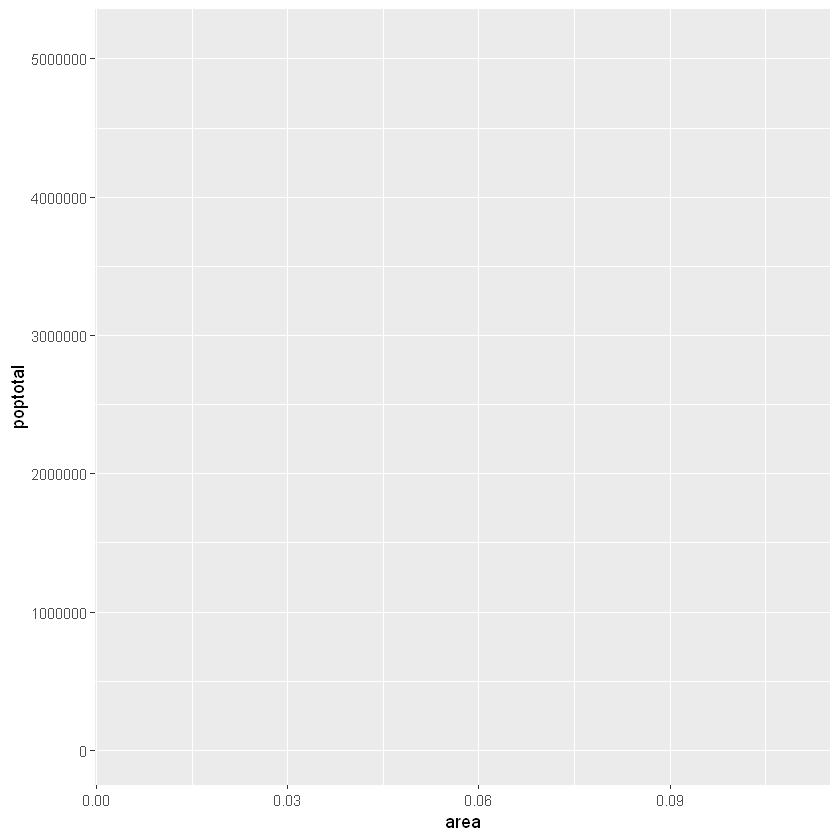
上面绘制了一个空白ggplot。即使指定了x和y,也没有点或线。这是因为ggplot并不假定您要绘制散点图或折线图。我只告诉ggplotT使用什么数据集,哪些列应该用于X和Y轴。我没有明确要求它画出任何点。还要注意,该aes()功能用于指定X和Y轴。这是因为,必须在aes()函数中指定属于源数据帧的任何信息。
2. 如何制作一个简单的散点图(How to Make a Simple Scatterplot)
让我们通过使用称为的geom层添加散点图,在空白ggplot基础制作一个散点图geom_point。
library(ggplot2)
ggplot(midwest, aes(x=area, y=poptotal)) +
geom_point()
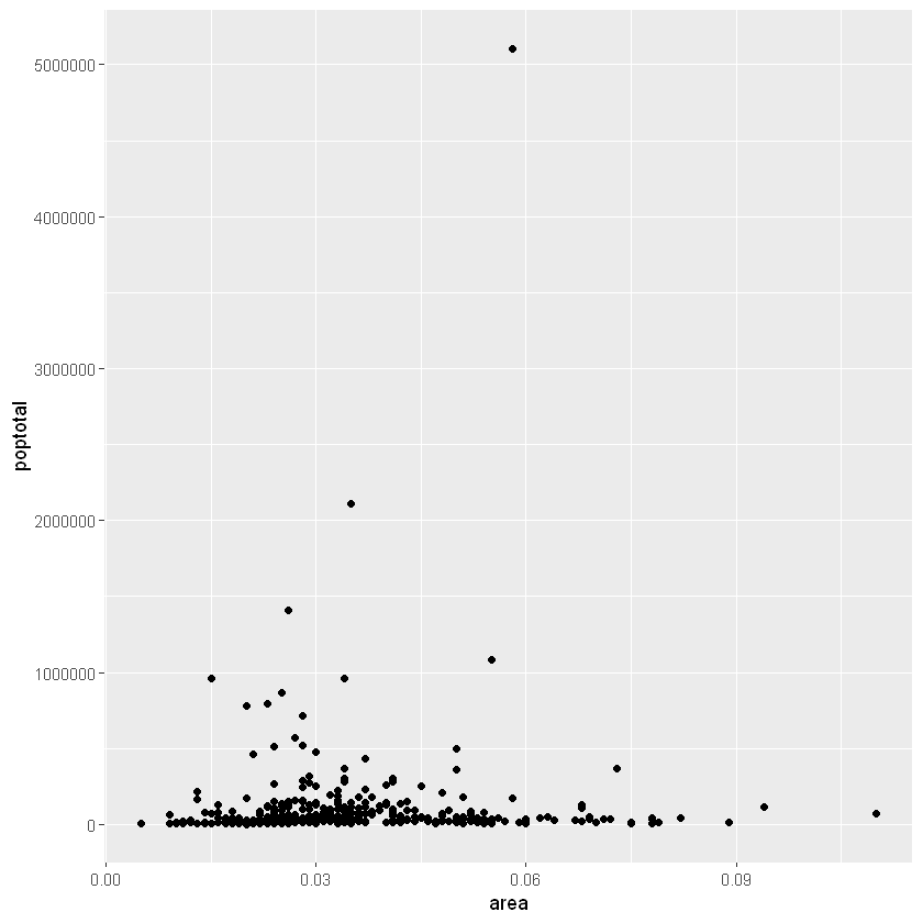
我们得到了一个基本的散点图,其中每个点代表一个县。但是,它缺少一些基本组成部分,例如绘图标题,有意义的轴标签等。此外,大多数点都集中在绘图的底部,这不太好。您将在接下来的步骤中看到如何纠正这些问题。
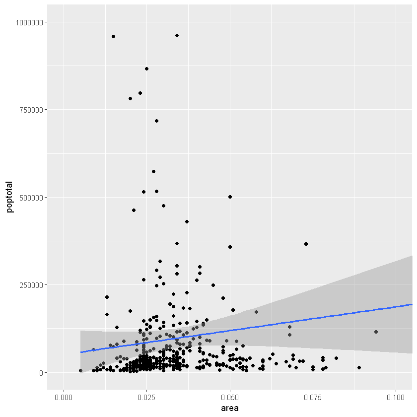
像geom_point()一样,有许多这样的geom层,我们将在本教程系列的后续部分中看到。现在,让我们使用geom_smooth(method=‘lm’)添加一个平滑层。由于该方法被设置为lm(线性模型的简称),所以它会画出最适合的拟合直线。
g <- ggplot(midwest, aes(x=area, y=poptotal)) +
geom_point() +
# set se=FALSE to turnoff confidence bands
# 设置se=FALSE来关闭置信区间
geom_smooth(method="lm", se=TRUE)
plot(g)
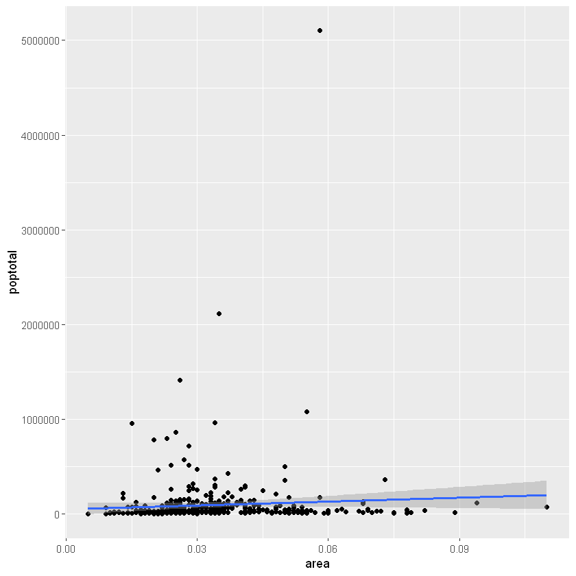
最合适的线是蓝色。您能找到其他method可用的选项geom_smooth吗?(注意:请参阅geom_smooth)。您可能已经注意到,大多数点都位于图表的底部,看起来并不好看。因此,让我们更改Y轴限制以关注下半部分。
3. 如何调整XY轴范围(How to Adjust the X and Y Axis Limits)
X轴和Y轴范围可以通过两种方式控制。
3.1 方法1:通过删除范围之外的点
与原始数据相比,这将更改最佳拟合线或平滑线。这可以通过xlim()和ylim()完成。可以传递长度为2的数值向量(具有最大值和最小值)或仅传递最大值和最小值本身。
library(ggplot2)
# set se=FALSE to turnoff confidence bands
# 设置se=FALSE来关闭置信区间
g <- ggplot(midwest, aes(x=area, y=poptotal)) +
geom_point() +
geom_smooth(method="lm")

# Delete the points outside the limits
# deletes points 删除点
g + xlim(c(0, 0.1)) + ylim(c(0, 1000000))
# g + xlim(0, 0.1) + ylim(0, 1000000)
Warning message:
"Removed 5 rows containing non-finite values (stat_smooth)."
Warning message:
"Removed 5 rows containing missing values (geom_point)."
在这种情况下,图表不是从头开始构建的,而是建立在g之上的。这是因为先前的图g以ggplot对象存储为,该对象在被调用时将重现原始图。使用ggplot,您可以在该图的顶部添加更多的图层,主题和其他设置。
您是否注意到最佳拟合线与原始图相比变得更加水平?这是因为,当使用xlim()和时ylim(),指定范围之外的点将被删除,并且在绘制最佳拟合线(使用geom_smooth(method=‘lm’))时将不考虑这些点。当您希望知道移除某些极值(或离群值)时最佳拟合线将如何变化时,此功能可能会派上用场。
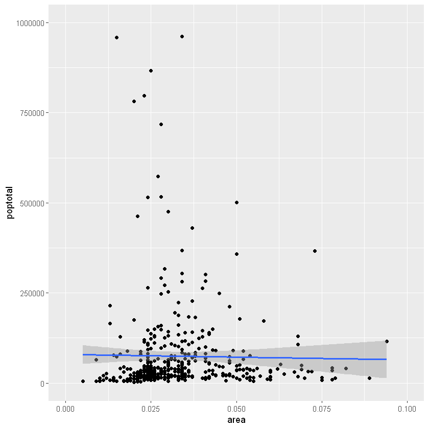
3.2 方法2:放大
另一种方法是通过放大感兴趣的区域而不删除点来更改X和Y轴限制。这是使用coord_cartesian()完成的。让我们将该图存储为g1,由于考虑了所有要点,因此最佳拟合线没有改变。
library(ggplot2)
g <- ggplot(midwest, aes(x=area, y=poptotal)) +
geom_point() +
# set se=FALSE to turnoff confidence bands
geom_smooth(method="lm")

# Zoom in without deleting the points outside the limits.
# As a result, the line of best fit is the same as the original plot.
# 放大而不删除超出限制的点。因此,最佳拟合线与原始图相同。
g1 <- g + coord_cartesian(xlim=c(0,0.1), ylim=c(0, 1000000))
plot(g1)
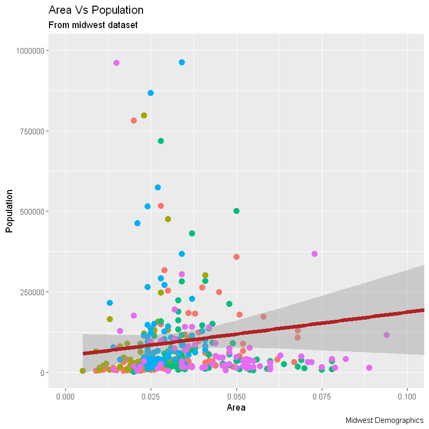
4. 如何更改标题和轴标签(How to Change the Title and Axis Labels)
我将其存储为g1。让我们为X和Y轴添加绘图标题和标签。这可以一次性使用来完成labs()与功能title,x和y参数。另一种选择是使用ggtitle(),xlab()和ylab()
library(ggplot2)
# 画图
# set se=FALSE to turnoff confidence bands
g <- ggplot(midwest, aes(x=area, y=poptotal)) + geom_point() + geom_smooth(method="lm")
# 限制范围
g1 <- g + coord_cartesian(xlim=c(0,0.1), ylim=c(0, 1000000))  # zooms in
# Add Title and Labels
# 添加标签,标题名,小标题名,说明文字
g1 + labs(title="Area Vs Population", subtitle="From midwest dataset", y="Population", x="Area", caption="Midwest Demographics")
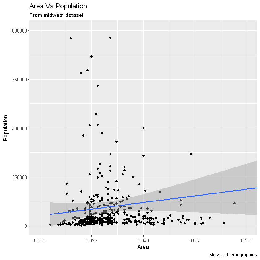
# 另外一种方法
g1 + ggtitle("Area Vs Population", subtitle="From midwest dataset") + xlab("Area") + ylab("Population")
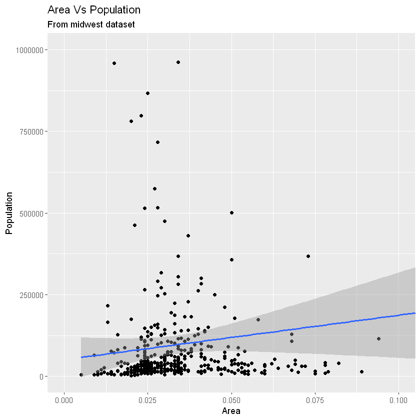
优秀!因此,这是完整功能调用。
# Full Plot call
library(ggplot2)
ggplot(midwest, aes(x=area, y=poptotal)) +
geom_point() +
geom_smooth(method="lm") +
coord_cartesian(xlim=c(0,0.1), ylim=c(0, 1000000)) +
labs(title="Area Vs Population", subtitle="From midwest dataset", y="Population", x="Area", caption="Midwest Demographics")

5. 如何更改点的颜色和大小(How to Change the Color and Size of Points)
本节主要内容有:
- 如何将颜色和尺寸更改为静态?(How to Change the Color and Size To Static?)
- 如何更改颜色以在另一列中反映类别?(How to Change the Color To Reflect Categories in Another Column?)
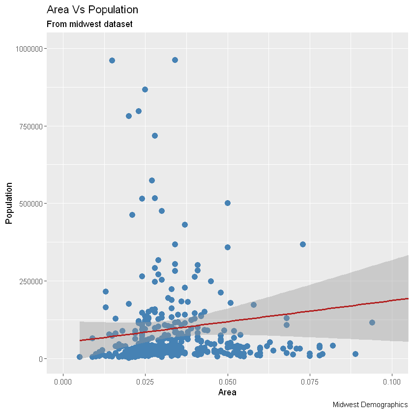
5.1 如何将颜色和尺寸更改为静态?(How to Change the Color and Size To Static?)
我们可以通过修改相应的几何图形来改变几何图形图层的美感。让我们将点和线的颜色更改为静态值。
library(ggplot2)
# 画图
ggplot(midwest, aes(x=area, y=poptotal)) +
# Set static color and size for points
# 设置固定颜色和尺寸
geom_point(col="steelblue", size=3) +
# change the color of line
# 更改拟合直线颜色
geom_smooth(method="lm", col="firebrick") +
coord_cartesian(xlim=c(0, 0.1), ylim=c(0, 1000000)) +
labs(title="Area Vs Population", subtitle="From midwest dataset", y="Population", x="Area", caption="Midwest Demographics")
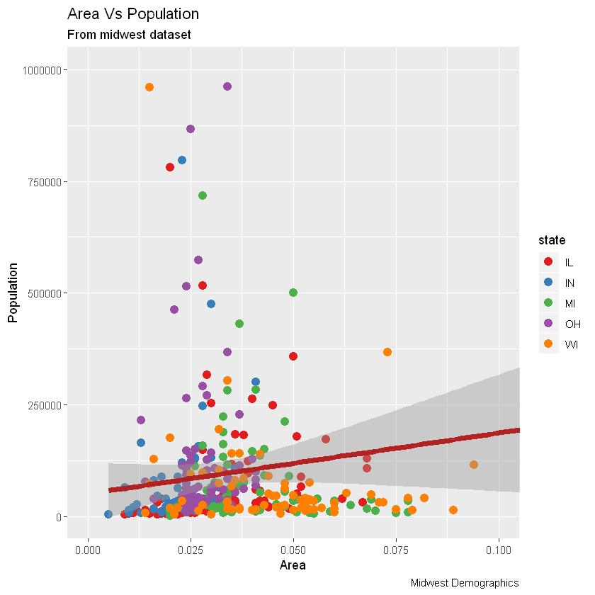
5.2 如何更改颜色以在另一列中反映类别?(How to Change the Color To Reflect Categories in Another Column?)
假设我们要根据源数据集中的另一列更改颜色midwest,则必须在aes()函数内指定颜色。
library(ggplot2)
gg <- ggplot(midwest, aes(x=area, y=poptotal)) +
# Set color to vary based on state categories.
# 根据状态类别将颜色设置为不同。
geom_point(aes(col=state), size=3) +
geom_smooth(method="lm", col="firebrick", size=2) +
coord_cartesian(xlim=c(0, 0.1), ylim=c(0, 1000000)) +
labs(title="Area Vs Population", subtitle="From midwest dataset", y="Population", x="Area", caption="Midwest Demographics")
plot(gg)

现在,每个点都基于aes所属的状态(col=state)上色。不只是颜色,大小、形状、笔划(边界的厚度)和填充(填充颜色)都可以用来区分分组。作为附加的优点,图例将自动添加。如果需要,可以通过在theme()函数中将legend.position设置为None来删除它。
# remove legend 移除图例
gg + theme(legend.position="None")
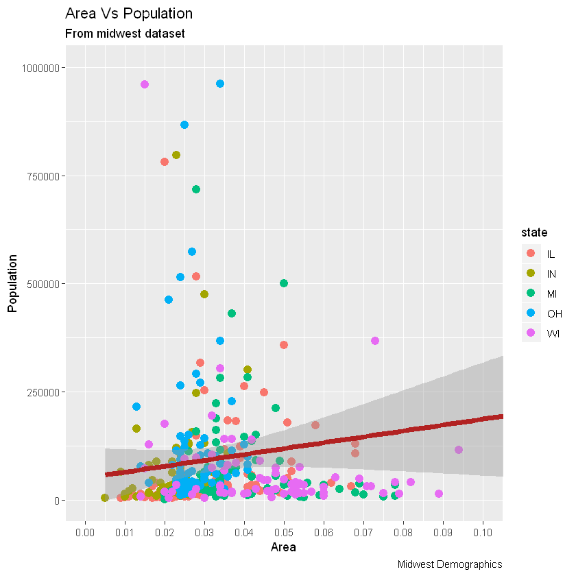
另外,您可以用调色板完全更改颜色。
# change color palette 更改调色板
gg + scale_colour_brewer(palette = "Set1")
在RColorBrewer软件包中可以找到更多这样的调色板,具体颜色显示见网页
library(RColorBrewer)
head(brewer.pal.info, 10)
A data.frame: 10 × 3
|
maxcolors |
category |
colorblind |
|
<dbl> |
<fct> |
<lgl> |
| BrBG |
11 |
div |
TRUE |
| PiYG |
11 |
div |
TRUE |
| PRGn |
11 |
div |
TRUE |
| PuOr |
11 |
div |
TRUE |
| RdBu |
11 |
div |
TRUE |
| RdGy |
11 |
div |
FALSE |
| RdYlBu |
11 |
div |
TRUE |
| RdYlGn |
11 |
div |
FALSE |
| Spectral |
11 |
div |
FALSE |
| Accent |
8 |
qual |
FALSE |
6. 如何更改X轴文本和刻度的位置(How to Change the X Axis Texts and Ticks Location)
本节主要内容有:
- 如何更改X和Y轴文本及其位置?(How to Change the X and Y Axis Text and its Location?)
- 如何通过设置原始值的格式为轴标签编写自定义文本?(How to Write Customized Texts for Axis Labels, by Formatting the Original Values?)
- 如何使用预置主题一次性定制整个主题?(How to Customize the Entire Theme in One Shot using Pre-Built Themes?)
6.1 如何更改X和Y轴文本及其位置?(How to Change the X and Y Axis Text and its Location?)
好了,现在让我们看看如何更改X和Y轴文本及其位置。这涉及两个方面:breaks和labels。
第1步:设置breaks
坐标轴间隔breaks的范围应该与X轴变量相同。注意,我使用的是scale_x_continuous,因为X轴变量是连续变量。如果它是一个日期变量,那么可以使用scale_x_date。与scale_x_continuous()类似,scale_y_continuous()也可用于Y轴。
library(ggplot2)

# Base plot
gg <- ggplot(midwest, aes(x=area, y=poptotal)) +
# Set color to vary based on state categories
# 设置颜色
geom_point(aes(col=state), size=3) +
geom_smooth(method="lm", col="firebrick", size=2) +
coord_cartesian(xlim=c(0, 0.1), ylim=c(0, 1000000)) +
labs(title="Area Vs Population", subtitle="From midwest dataset", y="Population", x="Area", caption="Midwest Demographics")

# Change breaks
# 改变间距
gg + scale_x_continuous(breaks=seq(0, 0.1, 0.01))
第2步:更改labels
可以选择更改labels轴刻度。labels取与长度相同的向量breaks。通过设置labels从a到k的字母进行演示(尽管在这种情况下它没有任何意义)。
library(ggplot2)

# Base plot
gg <- ggplot(midwest, aes(x=area, y=poptotal)) +
# Set color to vary based on state categories
# 设置颜色
geom_point(aes(col=state), size=3) +
geom_smooth(method="lm", col="firebrick", size=2) +
coord_cartesian(xlim=c(0, 0.1), ylim=c(0, 1000000)) +
labs(title="Area Vs Population", subtitle="From midwest dataset", y="Population", x="Area", caption="Midwest Demographics")

# Change breaks + label
# letters字母表
gg + scale_x_continuous(breaks=seq(0, 0.1, 0.01), labels = letters[1:11])

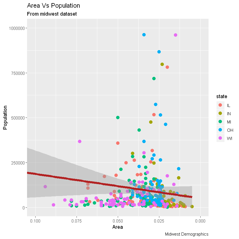
如果需要反转刻度,请使用scale_x_reverse()/scale_y_reverse()
library(ggplot2)

# Base plot
gg <- ggplot(midwest, aes(x=area, y=poptotal)) +
# Set color to vary based on state categories
# 设置颜色
geom_point(aes(col=state), size=3) +
geom_smooth(method="lm", col="firebrick", size=2) +
coord_cartesian(xlim=c(0, 0.1), ylim=c(0, 1000000)) +
labs(title="Area Vs Population", subtitle="From midwest dataset", y="Population", x="Area", caption="Midwest Demographics")

# Reverse X Axis Scale
# 反转x轴
gg + scale_x_reverse()
6.2 如何通过设置原始值的格式为轴标签编写自定义文本?(How to Write Customized Texts for Axis Labels, by Formatting the Original Values?)
让我们设置Y轴文本的breaks,并设置X轴和Y轴标签。我用了两种方法格式化标签。方法1:使用sprintf()。(在下面的示例中,将其格式化为%)* 方法2:使用自定义的用户定义函数。(按1000到1K的比例格式化)
library(ggplot2)
# Base plot
gg <- ggplot(midwest, aes(x=area, y=poptotal)) +
# Set color to vary based on state categories
# 设置颜色
geom_point(aes(col=state), size=3) +
geom_smooth(method="lm", col="firebrick", size=2) +
coord_cartesian(xlim=c(0, 0.1), ylim=c(0, 1000000)) +
labs(title="Area Vs Population", subtitle="From midwest dataset", y="Population", x="Area", caption="Midwest Demographics")
# Change Axis Texts
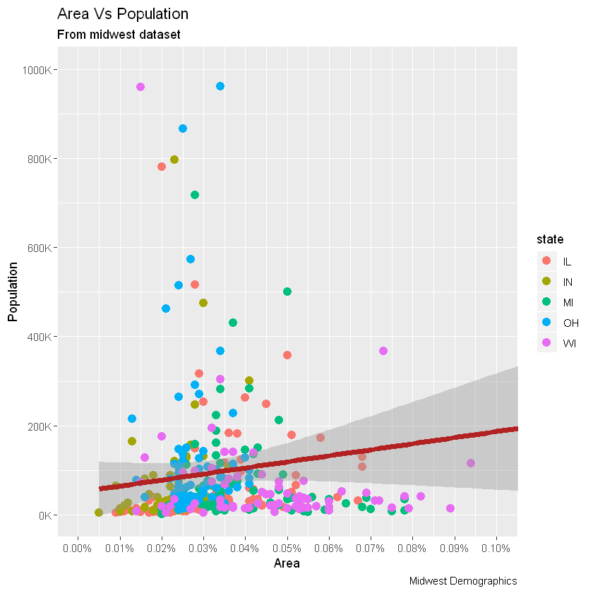
gg +
# 更改x轴
scale_x_continuous(breaks=seq(0, 0.1, 0.01), labels = sprintf("%1.2f%%", seq(0, 0.1, 0.01))) +
# 更改y轴
scale_y_continuous(breaks=seq(0, 1000000, 200000), labels = function(x){paste0(x/1000, 'K')})
6.3 如何使用预置主题一次性定制整个主题?(How to Customize the Entire Theme in One Shot using Pre-Built Themes?)
最后,我们可以使用预先构建的主题来更改整个主题本身,而不是单独更改主题组件。帮助页面?theme_bw显示了所有可用的内置主题。这通常是通过两种方式来实现的。在绘制ggplot之前,使用theme_set()设置主题。请注意,此设置将影响将来的所有绘图。或者绘制ggplot,然后添加整个主题设置(例如theme_bw())
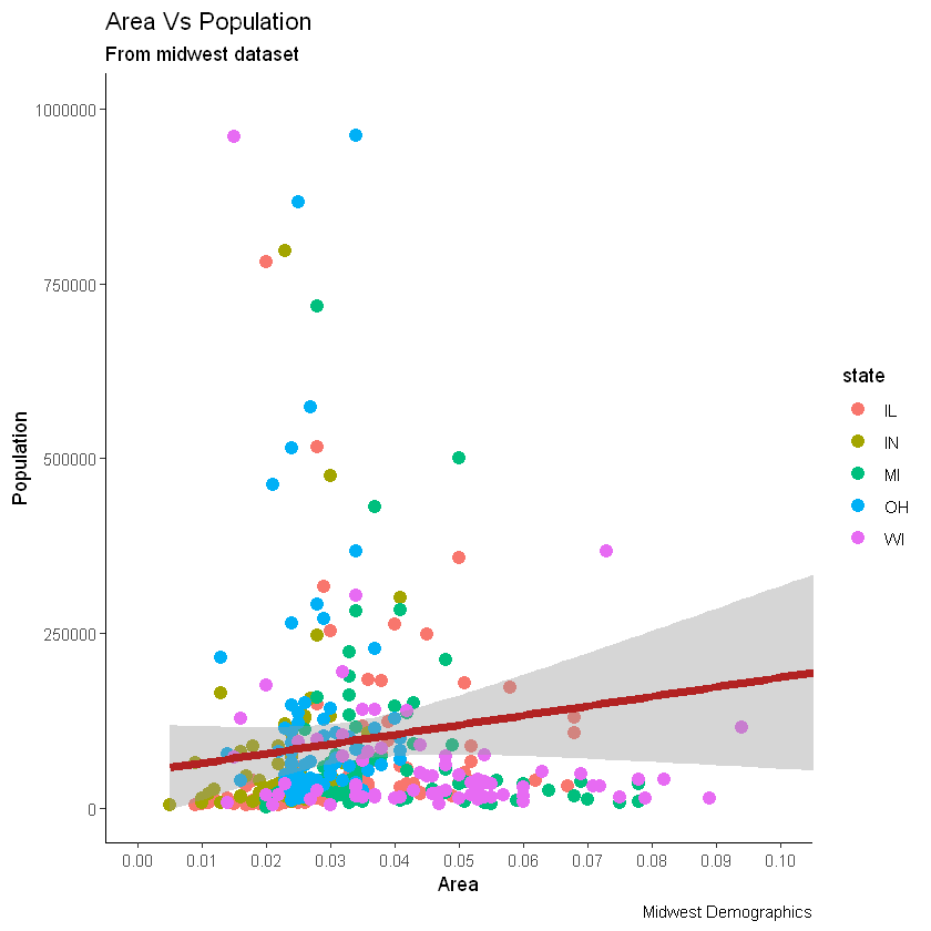
library(ggplot2)

# Base plot
gg <- ggplot(midwest, aes(x=area, y=poptotal)) +
# Set color to vary based on state categories.
geom_point(aes(col=state), size=3) +
geom_smooth(method="lm", col="firebrick", size=2) +
coord_cartesian(xlim=c(0, 0.1), ylim=c(0, 1000000)) +
labs(title="Area Vs Population", subtitle="From midwest dataset", y="Population", x="Area", caption="Midwest Demographics")

gg <- gg + scale_x_continuous(breaks=seq(0, 0.1, 0.01))

# method 1: Using theme_set()
theme_set(theme_classic())
gg
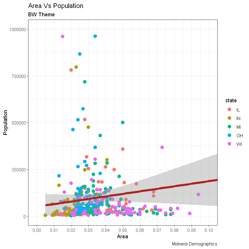
# method 2: Adding theme Layer itself.
# 添加主题层
gg + theme_bw() + labs(subtitle="BW Theme")
gg + theme_classic() + labs(subtitle="Classic Theme")
