flex-wrap属性
默认情况下,项目都排在一条线(又称”轴线”)上。flex-wrap属性定义,如果一条轴线排不下,如何换行。
语法
.box{
  flex-wrap: nowrap | wrap | wrap-reverse;
}
flex-wrap 取值有三个: nowrap | wrap | wrap-reverse。
- (1)
nowrap(默认):不换行。
- (2)
wrap:换行,第一行在上方。
- (3)
wrap-reverse:换行,第一行在下方。
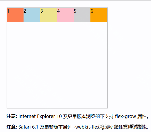
nowrap
nowrap(默认):不换行。
实例:
<!DOCTYPE html>
<html>
<head>
<style>
.container {
  width: 350px;
  height: 350px;
  border: 1px solid #c3c3c3;
  display: flex;
  display: -webkit-flex; /* Safari */
  flex-wrap: nowrap;
}
.container div { width:100px;height:50px; }
.container div:nth-of-type(1) {background-color:coral;}
.container div:nth-of-type(2) {background-color:lightblue;}
.container div:nth-of-type(3) {background-color:khaki;}
.container div:nth-of-type(4) {background-color:pink;}
.container div:nth-of-type(5) {background-color:lightgrey;}
.container div:nth-of-type(6) {background-color:orange;}

</style>
</head>
<body>

<div class="container">
  <div>1</div>
  <div>2</div>
  <div>3</div>
  <div>4</div>
  <div>5</div>
  <div>6</div>
</div>

<p><b>注意:</b> Internet Explorer 10 及更早版本浏览器不支持 flex-grow 属性。</p>
<p><b>注意:</b> Safari 6.1 及更新版本通过 -webkit-flex-grow 属性支持该属性。</p>

</body>
</html>
页面效果:
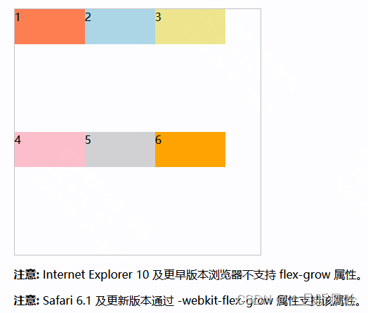
wrap
wrap:换行,第一行在上方。
实例:
flex-wrap: wrap;
页面效果:
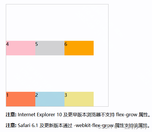
wrap-reverse
wrap-reverse:换行,第一行在下方。
实例:
flex-wrap: wrap-reverse;
页面效果: