Flex布局详解
1. 父项属性
- flex-direction:设置主轴的方向
- justify-content:设置主轴上的子元素排列方式
- flex-wrap:设置子元素是否换行
- align-content:设置侧轴上的子元素排列方式(多行)
- align-items:设置侧宙上的子元素排列方式(单行)
- flex-flow: 复核属性,相当于同时设置了flex-direction和flex-wrap
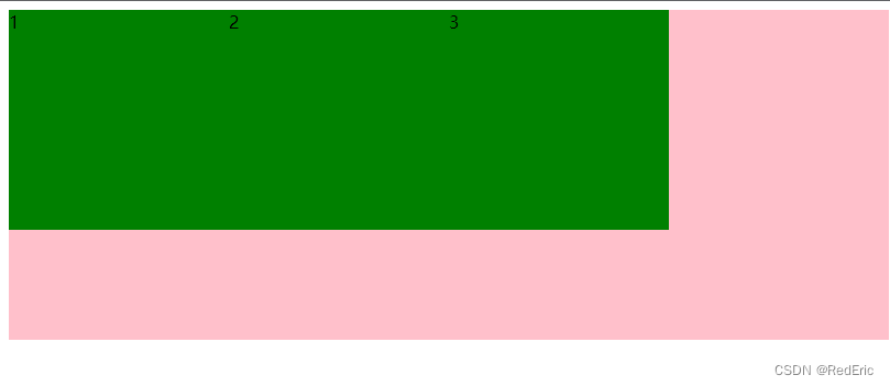
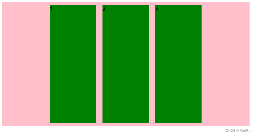
1.1 flex-direction 设置主轴的方向
flex-direction属性决定主轴的方向(即项目的排列方向)
注意:主轴和侧轴是会变化的,就看flex-direction设置谁为主轴,剩下的就是侧轴。而我们的 子元素都是跟着主轴来排列的
| 属性值 |
说明 |
| row |
默认从左到右 |
| row-reverse |
从右到左 |
| column |
从上到下 |
| column |
从下到上 |
<!DOCTYPE html>
<html>
	<head>
		<meta charset="utf-8" />
		<title></title>
		<style>
		div{
			width: 800px;
			height: 300px;
			background-color: pink;
			display: flex ;
			/* 默认的按照行排列的,元素是按照主轴排列的 */
			/* flex-direction: row; */
			/* flex-direction: row-reverse; */
			flex-direction: column;
		}
		div span{
			width: 200px;
			height: 200px;
			background-color: green;
		}
		</style>
	</head>
	<body>
		<div>
			<span>1</span>
			<span>2</span>
			<span>3</span>
		</div>
	</body>
</html>
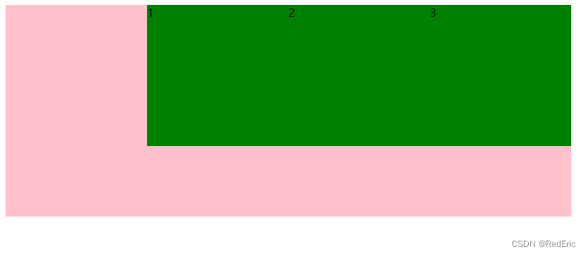
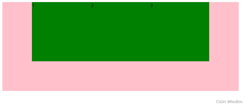
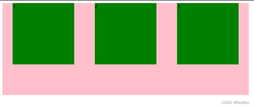
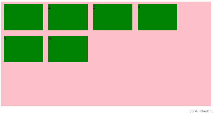
1.2 justify-content设置主轴上的子元素排列方式
justify-content属性定义了项目在主轴上的对齐方式
注意:使用这个属性之前一定要确定好主轴是那个
| 属性值 |
说明 |
| flex-start |
默认值从头部开始,如果主轴是x轴,则从左到右 |
| flex-end |
从尾部开始排列 |
| center |
在主轴居中对齐(如果主轴是x轴则水平居中) |
| space-around |
平分剩余空间 |
| space-between |
先两边贴边 再平分剩余空间(重要) |
1.2.1 flex-start(默认)
1.2.2 flex-end
1.2.3 center
1.2.4 space-around
1.2.5 space-between
<style>
div{
    width: 800px;
    height: 300px;
    background-color: pink;
    display: flex ;
    /* 默认沿着主轴从左到右排列 */
    justify-content: flex-start;
    /* 如果主轴是x,则从右到左排列 */
    justify-content: flex-end;
    /* 居中排列 */
    justify-content: center;
    /* 平分剩余空间 */
    justify-content: space-around;
    /* 先两边贴边再平分剩余空间 */
    justify-content: space-between;

}
div span{
    width: 200px;
    height: 200px;
    background-color: green;
}
</style>
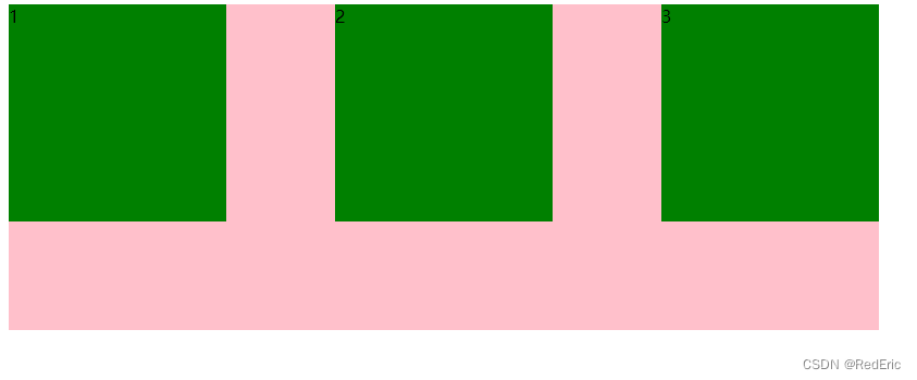
1.3 flex-wrap设置元素是否换行
flex默认让子元素在一行显示,项目都排在一条线上(又称“轴线”),如果装不开会缩小子元素的宽度。
| 属性值 |
说明 |
| nowrap |
默认值,不换行 |
| wrap |
换行 |

设置flex-wrap:wrap之后
1.4 align-items设置侧轴上的子元素排列方式(单行)
该属性是控制子项在侧轴(默认是y轴)上的排列方式,在子项为单项的时候使用
| 属性值 |
说明 |
| flex-start |
默认值 从上到下 |
| flex-end |
从下到上 |
| center |
挤在一起居中(垂直居中) |
| streth |
拉伸 |
1.4.1 flex-start(默认)

1.4.2 flex-end
从下到上

1.4.3 center
垂直居中

1.4.4 streth
去掉height
<!DOCTYPE html>
<html>
	<head>
		<meta charset="utf-8" />
		<title></title>
		<style>
			div{
				width: 800px;
				height: 400px;
				background-color: pink;
				display: flex ;
				justify-content: center;
				align-items: flex-start;
				align-items: flex-end;
				align-items: center;
				align-items: stretch;
			}
			div span{
				width: 150px;
				height: 100px;
				background-color: green;
				margin: 10px;
			}
		</style>
	</head>
	<body>
		<div>
			<span>1</span>
			<span>2</span>
			<span>3</span>
		</div>
	</body>
</html>
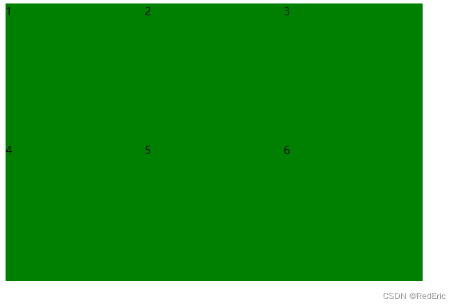
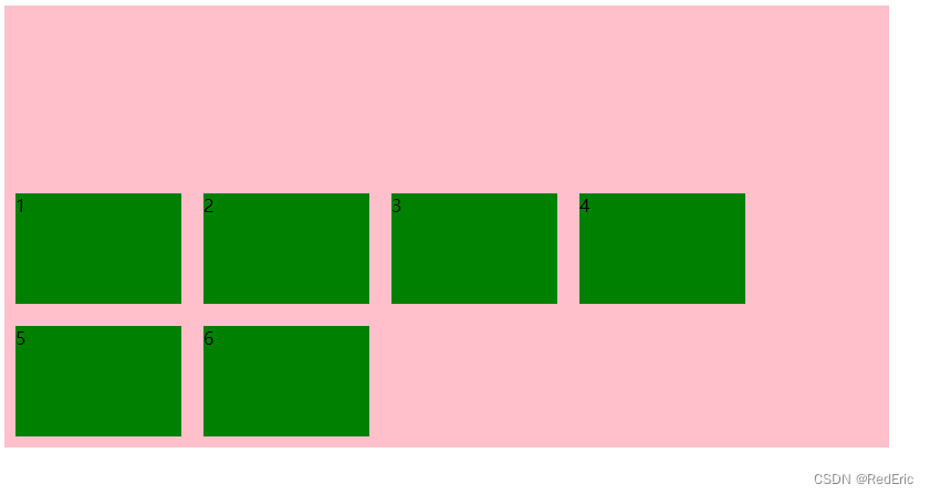
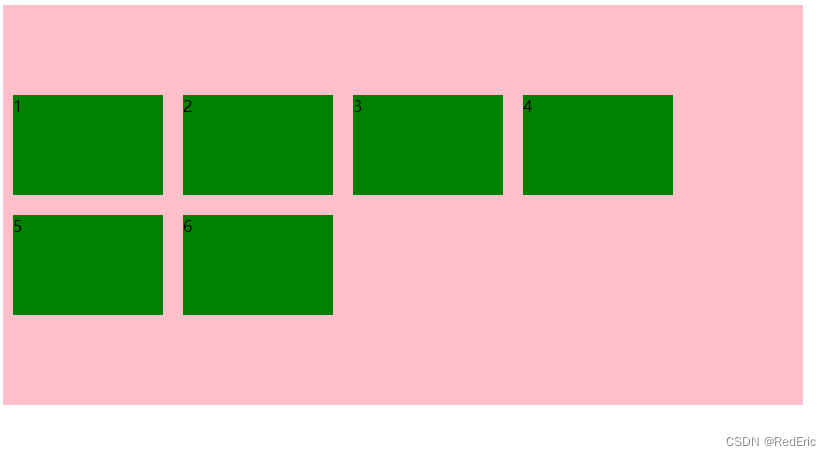
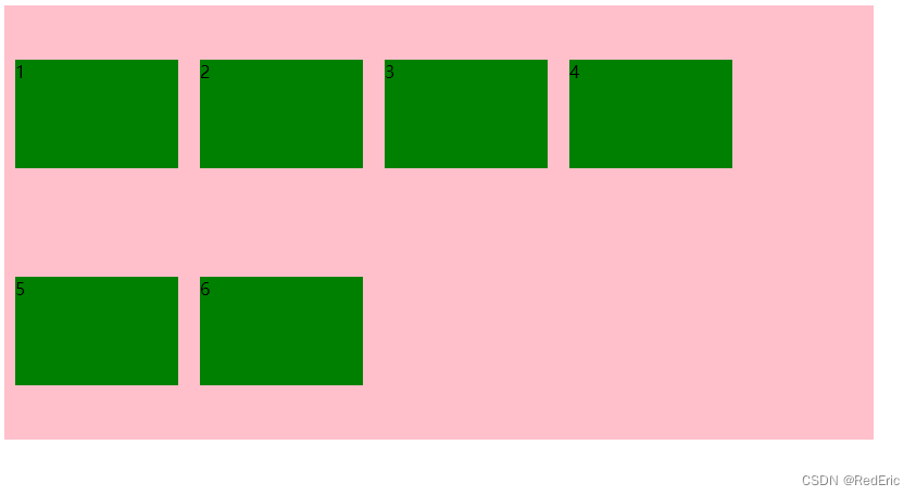
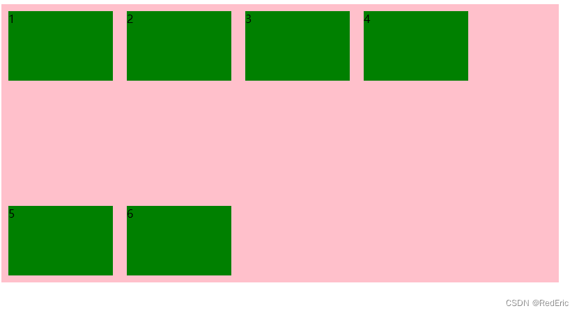
1.5 align-content设置侧轴上的子元素的排列方式(多行)
设置子项在侧轴上的排列方式并且只能用于子项出现换行的情况(多行),单行的情况下是无效的
| 属性值 |
说明 |
| flex-start |
默认值在侧轴的头部开始排列 |
| flex-end |
在侧轴的尾部开始排列 |
| center |
在侧轴中间显示 |
| space-around |
子项在侧轴平分剩余空间 |
| space-between |
子项在侧轴先分布在两头,再平分剩余空间 |
| stretch |
设置子项元素高度平分父元素高度 |
1.5.1 flex-start(默认)
1.5.2 flex-end
在侧轴的尾部开始排列
1.5.3 center
1.5.4 space-around
1.5.5 space-between
1.5.6 stretch
去掉子元素的hight

<!DOCTYPE html>
<html>
	<head>
		<meta charset="utf-8" />
		<title></title>
		<style>
			div{
				width: 800px;
				height: 400px;
				background-color: pink;
				display: flex;
				flex-wrap: wrap;
				align-content: flex-start;
				align-content: flex-end;
				align-content: center;
				align-content: space-around;
				align-content: space-between;
				align-content: stretch;
			}
			div span{
				width: 150px;
				background-color: green;
				margin: 10px;
			}
		</style>
	</head>
	<body>
		<div>
			<span>1</span>
			<span>2</span>
			<span>3</span>
			<span>4</span>
			<span>5</span>
			<span>6</span>
		</div>
	</body>
</html>
1.6 align-content和align-items的区别
- align-items 适用于单行情况下,只有上对齐、下对其、居中和拉伸
- align-content 适用于换行(多行)的情况下(单行情况下无效),可以设置上对齐、下对齐、居中、拉伸以及平均分配剩余空间等属性值
- 总结就是单行找align-items多行找align-content
1.7 flex-flow
flex-flow属性是flex-direction和flex-wrap的复核属性

<!DOCTYPE html>
<html>
	<head>
		<meta charset="utf-8" />
		<title></title>
		<style>
			div{
				width: 800px;
				height: 400px;
				background-color: pink;
				display: flex;
				/* flex-direction: column; */
				/* flex-wrap: wrap; */
				flex-flow: column wrap;

			}
			div span{
				width: 150px;
				height: 100px;
				background-color: green;
				margin: 10px;
			}
		</style>
	</head>
	<body>
		<div>
			<span>1</span>
			<span>2</span>
			<span>3</span>
			<span>4</span>
			<span>5</span>
			<span>6</span>
		</div>
	</body>
</html>
2. 子项属性
- flex 子项目占的份数
- align-self 控制子项自己在侧轴的排列方式
- order 属性定义子项的排列顺序(前后顺序)
2.1 flex 属性
flex属性定义子项目分配剩余空间,用flex来表示占多少份数。默认为0
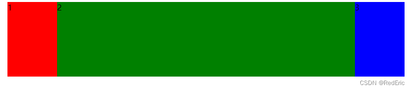
例子1: 两端固定,中间自适应布局
<!DOCTYPE html>
<html>
	<head>
		<meta charset="utf-8" />
		<title></title>
		<style>
			section{
				display: flex;
				margin: 0 auto;
				width: 800px;
				height: 150px;
				background-color: pink;
			}
			section div:nth-child(1){
				width: 100px;
				height: 150px;
				background-color: red;
			}
			section div:nth-child(3){
				width: 100px;
				height: 150px;
				background-color: blue;
			}
			section div:nth-child(2){
				width: 100px;
				height: 150px;
				flex: 1;
				background-color: green;
			}
		</style>
	</head>
	<body>
		<section>
			<div>1</div>
			<div>2</div>
			<div>3</div>
		</section>
	</body>
</html>
例子2:等分份数
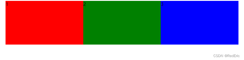
<style>
section{
display: flex;
margin: 0 auto;
width: 800px;
height: 150px;
background-color: pink;
}
section div:nth-child(1){
width: 100px;
height: 150px;
flex: 1;
background-color: red;
}
section div:nth-child(3){
width: 100px;
height: 150px;
flex: 1;
background-color: blue;
}
section div:nth-child(2){
width: 100px;
height: 150px;
flex: 1;
background-color: green;
}
</style>
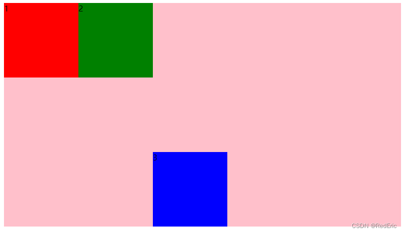
2.2 align-self控制子项自己在侧轴上的排列方式
align-self属性允许单个项目有与其他项目不一样的对齐方式,可覆盖align-items属性。默认值为auto,表示可以继承父元素的align-items属性,如果没有父元素,则等同于stretch。
<!DOCTYPE html>
<html>
	<head>
		<meta charset="utf-8" />
		<title></title>
		<style>
			section{
				display: flex;
				margin: 0 auto;
				width: 800px;
				height: 450px;
				background-color: pink;
			}
			section div:nth-child(1){
				width: 150px;
				height: 150px;
				background-color: red;
			}
			section div:nth-child(3){
				width: 150px;
				height: 150px;
				align-self: flex-end;
				background-color: blue;
			}
			section div:nth-child(2){
				width: 150px;
				height: 150px;
				background-color: green;
			}
		</style>
	</head>
	<body>
		<section>
			<div>1</div>
			<div>2</div>
			<div>3</div>
		</section>
	</body>
</html>
2.3 order属性定义项目的排列顺序
数值越小,排列越靠前,默认为0
注意:和z-index不一样
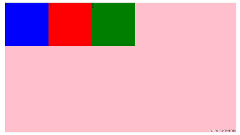
section div:nth-child(1){
    width: 150px;
    height: 150px;
    background-color: red;
}
section div:nth-child(3){
    width: 150px;
    height: 150px;
    order: -1;
    background-color: blue;
}
section div:nth-child(2){
    width: 150px;
    height: 150px;
    background-color: green;
}