一、纯css 控制
布局等分 (2/1,3/1 , …)
可任意等分
2/1
3/1
4/1
5/1
6/1
7/1
 .btpk-from {
            display: grid;
            grid-template-columns: repeat(2, 1fr);
            column-gap: 20px;
            row-gap: 0px;
            justify-content: center;
            /*padding: 0px 15px 20px 15px;*/
        }
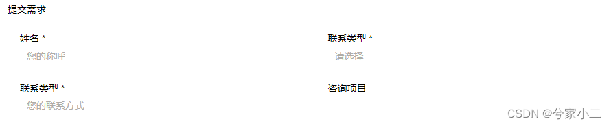
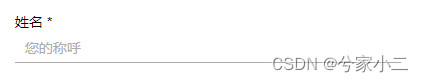
      <div class="btpk-from">
            <div class="btpk-from-text">
                <div> 姓名 *</div>
                <input type="text" placeholder="您的称呼"></div>
            <div class="btpk-from-text">
                <div> 联系类型 *</div>
                <input type="text" placeholder="请选择"></div>
            <div class="btpk-from-text">
                <div> 联系类型 *</div>
                <input type="text" placeholder="您的联系方式">
            </div>
            <div class="btpk-from-text">
                <div> 咨询项目</div>
                <input type="text">
            </div>
        </div>
效果
指定列单列展示
 /**
   * :nth-child(7)
   *  从第一列开始,跨域列数3
   */
 .indexservicesArea-a a:nth-child(7) {
       grid-column-start: 1;
       grid-column-end: 3;
  }
position 定位
-
absolute :生成绝对定位的元素,相对于 static 定位以外的第一个父元素进行定位。
元素的位置通过 “left”, “top”, “right” 以及 “bottom” 属性进行规定。
-
fixed :生成绝对定位的元素,相对于浏览器窗口进行定位。
元素的位置通过 “left”, “top”, “right” 以及 “bottom” 属性进行规定。
-
relative :生成相对定位的元素,相对于其正常位置进行定位。
因此,”left:20” 会向元素的 LEFT 位置添加 20 像素。
-
static : 默认值。没有定位,元素出现在正常的流中(忽略 top, bottom, left, right 或者 z-index 声明)。
-
inherit :规定应该从父元素继承 position 属性的值。
-
static : 默认值,就是没有定位,那就没必要多解释了。inherit 继承父元素,基本上这个参数用得相当少,所以也不做过多的解释
示例1:在当前父元素下把按钮定位到右边
   .navbar-toggleBox {
            position: absolute;
            right: 20px;
}
input 只展示下边线
        input {
            width: 90%;
            height: 30px;
            border-radius: 0;
            border-color: #afaca7;
            border-top-width: 0px;
            border-left-width: 0px;
            border-right-width: 0px;
            border-bottom-width: 1px;
        }
input / textarea placeholder 提示 的颜色
   input::-webkit-input-placeholder { /* WebKit, Blink, Edge */
            color: #afaca7;
        }

        :-moz-placeholder { /* Mozilla Firefox 4 to 18 */
            color: #afaca7;
        }

        ::-moz-placeholder { /* Mozilla Firefox 19+ */
            color: #afaca7;
        }

        input:-ms-input-placeholder { /* Internet Explorer 10-11 */
            color: #afaca7;
        }

        input::-ms-input-placeholder { /* Microsoft Edge */
            color: #afaca7;
        }

        textarea::-webkit-input-placeholder { /* WebKit, Blink, Edge */
            color: #afaca7;
        }

        textarea:-ms-input-placeholder { /* Internet Explorer 10-11 */
            color: #afaca7;
        }

        textarea::-ms-input-placeholder { /* Microsoft Edge */
            color: #afaca7;
        }

input 输入框增加 搜索图标 1
父元素使用 relative 定位
子元素使用 absolute 定位
<style type="text/css">
            *{
                margin: 0;
                padding: 0;
            }
            .box{
                width: 200px;
                position: relative;
            }
            .box .icon-search{
                background: url(image/search.gif) no-repeat;
                width: 20px;
                height: 20px;
                position: absolute;
                top: 6px;
                left: 0;
            }
            .box .username{
                padding-left: 30px;
                height: 25px;
            }
        </style>
    </head>
    <body>
        <div class="box">
            <i class="icon-search"></i>
            <input type="text" class="username" value="搜索"/>
        </div>
    </body>
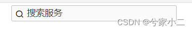
input 输入框增加 搜索图标 2
父元素无任何内容
图标使用 relative 定位
内容使用 absolute 定位
html
  <div class="searchicon">
        <i class="iconfont icon-sousuo1"></i>
        <input type="text" name="keyword" placeholder="搜索服务">
    </div>
css
        .searchicon i {
            width: 20px;
            height: 20px;
            position: relative;
            top: 5px;
            left: 8px;
            z-index: 1;
        }

        .searchicon input {
            position: absolute;
            width: 50%;
            padding-left: 30px;
            height: 33px;
            top: 5px;
            background-color: #fafafa;
        }
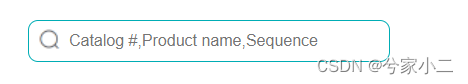
input 输入框增加 搜索图标 3 (进化)
html
<div class="search-box">
     <input aria-label="Search" autocomplete="off" placeholder="请输入搜索条件" spellcheck="false" value="" class="">
</div>
css
/* 搜索框容器 */
.search-box {
    margin-top: 38px;
    width: 400px;
    position: relative;
}

/* 输入框 */
.search-box input {
    width: 90%;
    height: 40px;
    color: #4e6e8e;
    border: 1px solid #00adb5;
    border-radius: 10px;
    font-size: 16px;
    line-height: 30px;
    padding: 0 0 0 40px;
    background: #fff url(/static/assets/icon/search.png) 5px 3px no-repeat;
    background-size: 2rem;
}


/* 按钮 */
.search-box button {
    width: 80px;
    height: 40px;
    position: absolute;
    border-radius: 0 10px 10px 0;
    color: #4e6e8e;
    border: 1px solid #00adb5;
    background: #fff;
    top: 0;
    right: 0;
    vertical-align:middle;
    box-sizing: content-box;
}

/* 按钮选中色 */
.search-box button:hover {
    background-color: #00adb5;
    color: white;
}
展示
/static/assets/icon/search.png 为 element-ui 截图而来
input 输入框增加 搜索按钮
<style type="text/css">
.search-box {
            width: 600px;
            position: relative;
        }

        .search-box input {
            padding-left: 30px;
            height: 38px;
        }

        .search-box button {
            /*background: url(image/search.gif) no-repeat;*/
            width: 103px;
            height: 38px;
            position: absolute;
            top: 0px;
            right: 0px;
        }
        /* 按钮选中色 */
        .search-box button:hover {
            background-color: #afaca7;
            color: white;
        }
        /* 按钮选中色 */
        .search-box button:focus {
            background-color: #090c10;
            color: white;
        }
    </style>

       <div class="search-box">
           <input id="keyword" type="search" name="keyword" placeholder="搜索检测服务" value="">
           <button type="submit" οnclick="current=1;search()">
               <svg class="icon icon-search" aria-hidden="true" role="img">
                   <use href="#icon-search" xlink:href="#icon-search"></use>
               </svg>
               <span>搜索</span>
           </button>
       </div>
示例
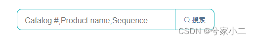
input 输入框增加 搜索按钮2 (进化)
html
<div class="search-box">
     <input aria-label="Search" autocomplete="off" placeholder="请输入搜索条件" spellcheck="false" value="" class="">
     <button>
          <i class="el-icon-search"></i>
          <span>搜索</span>
     </button>
</div>
css
/* 搜索框容器 */
.search-box {
    margin-top: 38px;
    width: 400px;
    position: relative;
}

/* 输入框 */
.search-box input {
    width: 90%;
    height: 40px;
    padding-left: 15px;
    color: #4e6e8e;
    border: 1px solid #00adb5;
    border-radius: 10px;
    font-size: 16px;
    line-height: 30px;
}

/* 按钮 */
.search-box button {
    width: 80px;
    height: 40px;
    position: absolute;
    border-radius: 0 10px 10px 0;
    color: #4e6e8e;
    border: 1px solid #00adb5;
    background: #fff;
    top: 0;
    right: 0;
    vertical-align:middle;
    box-sizing: content-box;
}

/* 按钮选中色 */
.search-box button:hover {
    background-color: #00adb5;
    color: white;
}
演示
搜索图标为 element-ui , 需自行处理
按钮选中/点击 颜色
 .btpk-from-box button {
            margin-top: 2%;
            width: 120px;
            height: 30px;
            background-color: #090c10;
        }

        .btpk-from-box button:hover {
            background-color: #afaca7;
            color: white;
        }

        .btpk-from-box button:focus {
            background-color: #090c10;
            color: white;
        }
显示小手 (鼠标移动当前元素)
cursor: pointer;
内容标红 + 显示小手 + 点击事件
<font style="color: red;cursor: pointer;" οnclick="customerService()">在线咨询</font>


function customerService() {
 // 点击标红的字
}
内容超出省略(div / span 等标签)
文本超出显示省略号 …
        .describeText {
            /* 多行隐藏  */
            /* 在恰当的断字点进行换行 */
            word-break: break-all;
            /* 超出范围隐藏 */
            overflow: hidden;
            /* 文字超出用省略号 */
            text-overflow: ellipsis;
            /* 盒子模型 */
            display: -webkit-box;
            /* 显示的文本行数 */
            -webkit-line-clamp: 3;
            /* 子元素的垂直排列方式 */
            -webkit-box-orient: vertical;
        }
div 边线
上边线
其他可举一反三
border-top: 6px solid #dd1c1f;
hr 线条(分割线)
<hr style="height : 3px ;background-color:#000710 ">

css 图标变色 (滤镜变色)
使用filter 滤镜可对图标进行任意变色
filter: invert(47%) sepia(5%) saturate(8%) hue-rotate(313deg) brightness(96%) contrast(83%);
https://www.zhangxinxu.com/sp/filter.html
a链接变色/去掉下划线
a:link { color: yellow;}     /*未访问的链接颜色*/
a:visited { color: red;}     /*已访问的链接颜色*/
a:hover {  color: blue; text-decoration: underline;} /*鼠标移动到链接的颜色*/
a:active { color: orange; }   /*鼠标点击时的颜色*/
a { text-decoration: none;}   /*去掉下划线*/
图片左/内容右
html
 <div class="product-details-info">
        <img class="product-pic" src="/static/assets/img/details.0da8102.jpg">
        <h1 class="product-title"> 标题 </h1>
        <P class="product-tip"> 描述 </P>
        <P> 占位 </P>
        <P> 占位 </P>
       省略p....
 </div>
css
    /* 封面图 */
    .product-details-info .product-pic {
        float: left;
        height: 300px;
        width: 300px;
        /* 图片与内容间距 */
        padding-right: 20px;
    }
    // 省略其他css
示例
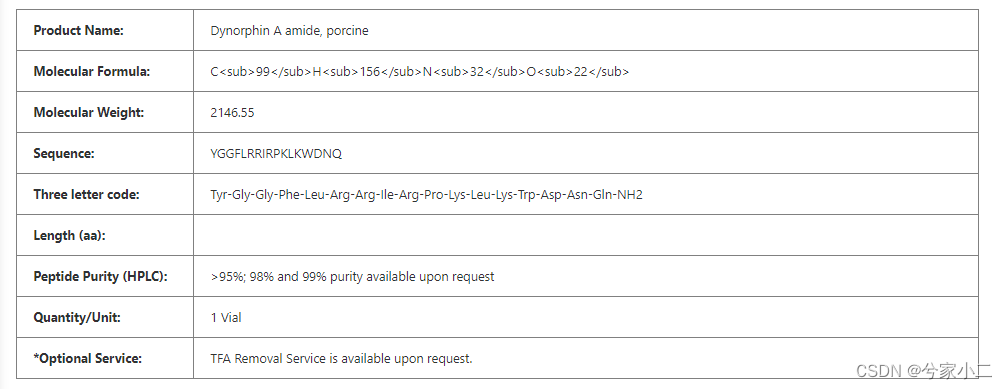
简易表格
可增加 <tr> <th> 展示标题栏
html
  <table class="product-details-table" border="1px" width="width: 100%;" cellpadding="0">
                        <tr>
                            <td> Product Name:</td>
                            <td> [[ ${product.name} ]]</td>
                        </tr>
                        <tr>
                            <td> Molecular Formula:</td>
                            <td> [[ ${product.molecularFormula} ]]</td>
                        </tr>
                        <tr>
                            <td> Molecular Weight:</td>
                            <td> [[ ${product.molecularWeight} ]]</td>
                        </tr>
                        <tr>
                            <td> Sequence:</td>
                            <td> [[ ${product.sequence} ]]</td>
                        </tr>
                        <tr>
                            <td> Three letter code:</td>
                            <td> [[ ${product.threeLetterCode} ]]</td>
                        </tr>
                        <tr>
                            <td> Length (aa):</td>
                            <td> [[ ${product.length} ]]</td>
                        </tr>
                        <tr>
                            <td> Peptide Purity (HPLC):</td>
                            <td> [[ ${product.peptidePurityHplc} ]]</td>
                        </tr>
                        <tr>
                            <td> Quantity/Unit:</td>
                            <td> [[ ${product.quantityUnit} ]]</td>
                        </tr>
                        <tr>
                            <td> *Optional Service:</td>
                            <td> TFA Removal Service is available upon request.</td>
                        </tr>
                    </table>
css
    .product-details-table {
        margin-top: 10px;
        border-collapse: collapse;
    }

    /*.product-details-table tr th {*/
    /*    width: 500px;*/
    /*    line-height: 50px;*/
    /*    background-color: #F8F8F8;*/
    /*}*/

    .product-details-table tr td:nth-child(1) {
        width: 200px;
        line-height: 50px;
        padding-left: 20px;
        /*color: #00ADB5;*/
        font-weight: bold;
        vertical-align: top;
    }

    .product-details-table tr td:nth-child(2) {
        width: 960px;
        line-height: 50px;
        padding-left: 20px;
        /*color: #00ADB5;*/
    }
展示
border=“0px” 示例
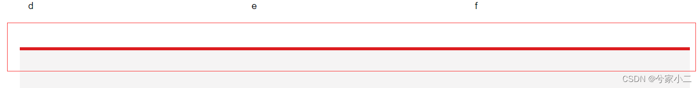
多 div 遮挡 ,层级关系指定
.a {
   z-index: 0;
}

/**
* 关键要素
* 1、必需有 position 指定
* 2、必需有层级关系 z-index, 值小的 被 值大的遮挡
* 3、遮挡div必需指定背景色, 被遮挡可以不指定
*/
.b {
    position: relative ;
    z-index: 1;
    background-color: #FFFFFF;
}
遮挡前
遮挡后
div 一直位于底部 (不管内容多与少)
参考: https://blog.csdn.net/YSJ367635984/article/details/118945823
div 透明
0,0,0 控制背景色 ,分别表示 Red(红色)Green(绿色)Blue(蓝色)
0.3 控制透明度
background-color: rgba(0,0,0, 0.3) !important;
常用颜色
白色: rgb(255,255,255)
黑色:rgb(0,0,0)
红色:rgb(255,0,0)
绿色:rgb(0,255,0)
蓝色:rgb(0,0,255)
青色: rgb(0,255,255)
紫色: rgb(255,0,255)
二、js / jquery 控 css
判断是手机 / pc 打开网页进行自适应
/**
 * 是否 pc打开
 * 返回true表示为pc端打开,返回false表示为手机端打开
 * @author wangsong
 * @param null
 * @date 2022/1/11 17:18
 * @return
 */
function isPc() {
    var userAgentInfo = navigator.userAgent;
    var Agents = new Array("Android", "iPhone", "SymbianOS", "Windows Phone", "iPad", "iPod");
    var flag = true;
    for (var v = 0; v < Agents.length; v++) {
        if (userAgentInfo.indexOf(Agents[v]) > 0) {
            flag = false;
            break;
        }
    }
    return flag;
}
自适应控制css
     // 可扩展任意内容
      if (isPc()) {
                $('.floating_ck').css("top", "256px")
                $('.floating_ck').css("bottom", "node")
            } else {
                $('.floating_ck').css("bottom", "60px")
                $('.floating_ck').css("top", "node")
            }
元素隐藏展示
- .show(); 展示
- .hide(); 隐藏
- .toggle() 展示时就隐藏 / 隐藏时就展示
参数: 展示隐藏动画时间,默认无动画
$('#mobileHeaderMenu-' + menu.id).toggle(300)
图片旋转 180°
同css : transform:rotate(180deg)
 // 图标180度旋转
            let transform = $('#mobileHeaderMenuIcon-' + menu.id).css("transform")
            if (transform == "none") {
                $('#mobileHeaderMenuIcon-' + menu.id).css("transform", "rotate(180deg)")
            } else {
                $('#mobileHeaderMenuIcon-' + menu.id).css("transform", "none")
            }
回车触发搜索
$(document).ready(function () {
$("#doc-search").keydown(function (event) {
if (event.keyCode == 13) {
//这里写事件,例如写个 a();
console.log("----------回车搜索")
let searchKeyword = document.getElementById("doc-search").value.trim()
window.location.href = "/search.html?keyword=" + searchKeyword + "¤t=1";
}
});
});
三、高级篇
h5 手机端菜单
html
    <div class="mobileHeaderMenu" hidden>
        <li th:each="menu : ${menuTop}">
            <a th:href=" ${menu.url} != null? ${menu.url}: 'javacript:void(0);'"> <span th:text="${menu.name}"></span> </a>
            <svg th:if="${menu.menus} != null" class="icon icon-angle-down" style="float: right; margin-top: 10px" aria-hidden="true" role="img"
                 th:id="'mobileHeaderMenuIcon-' + ${menu.id}" th:onclick="isUnfold([[${menu}]])">
                <use href="#icon-angle-down" xlink:href="#icon-angle-down"></use>
            </svg>
            <ul th:if="${menu.menus} != null" th:id="'mobileHeaderMenu-' + ${menu.id}" hidden>
                <li th:each="menuTwo : ${menu.menus}">
                    <a th:href=" ${menuTwo.url} != null? ${menuTwo.url}: 'javacript:void(0);'"> <span th:text="${menuTwo.name}"></span> </a>
                    <svg th:if="${menuTwo.menus} != null" class="icon icon-angle-down" style="float: right;margin-top: 10px" aria-hidden="true" role="img"
                         th:id="'mobileHeaderMenuIcon-' + ${menuTwo.id}" th:onclick="isUnfold([[${menuTwo}]])">
                        <use href="#icon-angle-down" xlink:href="#icon-angle-down"></use>
                    </svg>
                    <ul th:if="${menuTwo.menus} != null" th:id="'mobileHeaderMenu-' + ${menuTwo.id}" hidden>
                        <li th:each="menuThree : ${menuTwo.menus}" class="newli">
                            <a th:href=" ${menuThree.url} != null? ${menuThree.url}: 'javacript:void(0);'"> <span th:text="${menuThree.name}"></span></a>
                        </li>
                    </ul>
                </li>
            </ul>
        </li>
    </div>
css
        /* 手机端顶部菜单样式 */
        .mobileHeaderMenu {
            position: fixed;
            z-index: 99999 !important;
            height: 100%;
            overflow: auto;
            margin-top: 56px;
            padding: 0 15px;
            padding-bottom: 100px;
            line-height: 35px;
            font-size: 17px;
            padding-left: 5%;
            background-color: white;
        }

        /* 二级菜单 */
        .mobileHeaderMenu li ul {
            padding-left: 30px;
            border-top: 1px solid #c1c1c1;
        }

        /* 三级菜单 */
        .mobileHeaderMenu li ul li ul {
            padding-left: 50px;
            border-top: 1px solid #c1c1c1;
        }
点击菜单
1-展开隐藏
2-图标展开隐藏切换
 function isUnfold(menu) {
            $('#mobileHeaderMenu-' + menu.id).toggle(300)
            // 图标180度旋转
            let transform = $('#mobileHeaderMenuIcon-' + menu.id).css("transform")
            if (transform == "none") {
                $('#mobileHeaderMenuIcon-' + menu.id).css("transform", "rotate(180deg)")
            } else {
                $('#mobileHeaderMenuIcon-' + menu.id).css("transform", "none")
            }
        }