CSS学习视频:狂神说 CSS
简介
如何学习:
1.什么是CSS
2.CSS怎么用(快速入门)
3.CSS选择器(重点+难点)
4.美化网页(文字、阴影、超链接、列表、渐变…)
5.盒子模型
6.浮动
7.定位
8.网页动画(特效效果)
什么是CSS
什么是CSS
Cascading Style Sheet 层叠级联样式表
CSS:表现(美化网页)
字体、颜色、边距、高度、宽度、背景图片、网页浮动…
效果修改演示:

CSS发展史
版本:
CSS1.0
CSS2.0 DIV(块)+CSS,HTML与CSS结构分离的思想,网页变得简单,SEO
CSS2.1 浮动、定位
CSS3.0 圆角,阴影,动画… 浏览器兼容性
快速入门
1.直接在HTML编写CSS
代码说明:
<!DOCTYPE html>
<html lang="en">
<head>
    <meta charset="UTF-8">
    <title>第一个CSS程序</title>
    <!--规范,<style>可以编写css的代码
    每一个声明最好以分号结尾
    语法:
        选择器{
            声明1;
            声明2;
            声明3
        }
     -->
    <style>
        h1{
            color: red;
        }
    </style>
</head>
<body>
    <h1>我是标题</h1>
</body>
</html>
效果图:

2.分离CSS和HTML
代码说明:
<!DOCTYPE html>
<html lang="en">
<head>
    <meta charset="UTF-8">
    <title>第一个CSS程序</title>
    <link rel="stylesheet" href="../CSS/style.css">
</head>
<body>
    <h1>我是标题</h1>
</body>
</html>
h1{
    color: blue;
}

效果图:

3.CSS优势
1.内容和表现分离
2.网页结构表现统一,可以实现复用
3.样式十分丰富
4.建议使用独立于html的css文件
5.利用SEO,容易被搜索引擎收录
CSS的3种导入方式
外部样式
内部样式
行内样式
代码说明:
h1{
    color: blue;
}
<!DOCTYPE html>
<html lang="en">
<head>
    <meta charset="UTF-8">
    <title>导入方式</title>
    <!--内部样式-->
    <style type="text/css" >
        h1{
            color: green;
        }
    </style>
    <link rel="stylesheet" href="css/style.css">
</head>
<body>
    <!--优先级:就近原则-->
    <!--行内样式: 在标签元素中,编写一个style属性,编写样式即可-->
    <h1 style="color: red">我是标题</h1>
</body>
</html>
效果图:

选择器
作用:选择页面上的某一个或者某一类元素
基本选择器
标签选择器:选择一类标签 标签{}
类选择器 class:选择鄋class属性一致的标签,跨标签 .类名{}
id选择器:全局唯一! #id{}
1.标签选择器
<!DOCTYPE html>
<html lang="en">
<head>
    <meta charset="UTF-8">
    <title>标签选择器</title>
    <style>
        /*标签选择器会选择到页面所有标签*/
        h1{
            color: #aa1133;
            background: #3cbda6;
            border-radius: 24px;
        }
        p{
            font-size: 80px;
        }
    </style>
</head>
<body>
    <h1>学习JAVA</h1>
    <h1>学习JAVA</h1>
    <p>入门到入土</p>
</body>
</html>
效果图:

2.类选择器
代码说明:
<!DOCTYPE html>
<html lang="en">
<head>
    <meta charset="UTF-8">
    <title>类选择器</title>
    <style>
        /*类选择器的格式 .class的名称{}好处,可以多个标签归类
         */
        .yi{
            color: #3748ff;
        }
        .xin{
            color: #a24fff;
        }
    </style>
</head>
<body>
    <h1 class="xin">标题1</h1>
    <h1 class="yi">标题2</h1>
    <h1 class="xin">标题3</h1>
    <p class="yi">p标签</p>
</body>
</html>
效果图:

3.id 选择器
代码说明:
<!DOCTYPE html>
<html lang="en">
<head>
    <meta charset="UTF-8">
    <title>id选择器</title>

    <style>
        /*id选择器
        #id名称{}
         优先级 id>class>标签>*(所有标签)
         */
        #xin{
            color: #ff008a;
        }
        .chuan{
            color: #3cbda6;
        }
        h1{
            color: #a24fff;
        }
        *{
            color: #3748ff;
        }
    </style>
</head>
<body>
    <h1 id="xin" class="chuan">标题1</h1>
    <h1 class="chuan">标题1</h1>
    <h1>标题1</h1>
    <p>p标签</p>
</body>
</html>
效果图:

层次选择器
后代选择器:在某个元素后面的所有元素,祖爷爷 爷爷 爸爸 儿子
子选择器:一代,儿子
相邻兄弟选择器:同辈 只有一个
通用选择器:包括自己的所有兄弟
1.后代选择器
代码说明:
/*后代选择器*/
        body p{
            background: #aa1133;
        }
效果图:

2.子选择器:
代码说明:
 body>p{
            background: green;
        }
效果图:

3.相邻兄弟选择器:
代码说明:
 .active + p{
            background: #ff008a;
        }
效果图:

4.通用选择器:
代码说明:
.active~p{
            background: aqua;
        }
效果图:

完整代码:
<!DOCTYPE html>
<html lang="en">
<head>
    <meta charset="UTF-8">
    <title>层次选择器</title>
    <style>
        /*p{
            background: green;
        }*/
        /*后代选择器*/
        /*body p{
            background: #aa1133;
        }*/
        /*子选择器*/
        /*body>p{
            background: green;
        }*/
        /*相邻兄弟选择器: 只有一个 相邻(向下)*/
        /*.active + p{
            background: #ff008a;
        }*/
        /*通用兄弟选择器,当前选中元素的向下所有元素*/
        /*.active~p{
            background: aqua;
        }*/
    </style>
</head>
<body>
    <p>p0</p>

    <p class="active">p1</p>
    <p>p2</p>
    <p>p3</p>
    <ul>
        <li><p>p4</p></li>
        <li><p>p5</p></li>
        <li><p>p6</p></li>
    </ul>
    <p class="active">p7</p>
    <p>p8</p>
</body>
</html>
结构伪类选择器
伪类:条件
代码说明:
<!DOCTYPE html>
<html lang="en">
<head>
    <meta charset="UTF-8">
    <title>结构伪类选择器</title>
    <!--避免使用,class id选择器-->
    <style>
        /*ul的第一个子元素*/
        ul li:first-child{
            background: #3cbda6;
        }

        /*ul的最后一个子元素*/
        ul li:last-child{
            background: #ff008a;
        }

        /*选中p1:定位到父元素, 选择当前的第一个元素
        选择当前p元素的父级元素,选中父级元素的第一个,并且是当前元素才生效
         */
        p:nth-child(2){
            background: #a24fff;
        }
        /*选择父元素,下的p元素的第二个元素*/
        p:nth-of-type(2){
            background: wheat;
        }
        a:hover{
            background: orange;
        }
    </style>
</head>
<body>
    <h1>h1</h1>
    <p>p1</p>
    <p>p2</p>
    <p>p3</p>
    <ul>
        <li>li1</li>
        <li>li2</li>
        <li>li3</li>
    </ul>
    <a href="">1234567</a>
</body>
</html>
效果图:

属性选择器
id+class结合
代码说明:
<!DOCTYPE html>
<html lang="en">
<head>
    <meta charset="UTF-8">
    <title>属性选择器</title>
    <style>
        .demo a{
            float: left;
            display: block;
            height: 50px;
            width: 50px;
            border-radius: 10px;
            background: #3cbda6;
            text-align: center;
            color: gainsboro;
            text-decoration: none;
            margin: 5px;
            font: bold 20px/50px Arial;
        }

        /*存在id属性的元素 a[]{}*/
        a[id]{
            background: #a24fff;
        }
        /*id属性为first的元素*/
        a[id=first]{
            background: #ff008a;
        }
        /*class中存links的元素*/
        a[class~="link"]{
            background: #aa1133;
        }
        /*class中含有字符lin的元素*/
        a[class*="link"]{
            background: aqua;
        }
        /*选中href中以http开头的元素*/
        a[href^="http"]{
            background: yellow;
        }
        /*选中href中以doc结尾的元素*/
        a[href$="doc"]{
            background: orange;
        }
    </style>
</head>
<body>
    <p class="demo">
        <a href="https://www.baidu.com" class="links item first" id="first">1</a>
        <a href="http://" class="link item active" target="_blank" title="test">2</a>
        <a href="images/123.html" class="link item">3</a>
        <a href="images/123.png" class="link item">4</a>
        <a href="images/123.jpg" class="link item">5</a>
        <a href="abc">6</a>
        <a href="/a.pdf">7</a>
        <a href="/abc.pdf">8</a>
        <a href="abc.doc">9</a>
        <a href="abcd.doc" class="link item last" id="last">10</a>
    </p>
</body>
</html>
效果图:

美化网页元素
为什么要美化网页
- 有效的传递页面信息
- 美化网页,页面漂亮,才能吸引用户
- 凸显页面的主题
- 提高用户的体验
span标签:重点要突出的字,使用span套起来
代码说明:
<!DOCTYPE html>
<html lang="en">
<head>
    <meta charset="UTF-8">
    <title>span</title>
    <style>
        #title{
            font-size: 50px;
        }
    </style>
</head>
<body>
    欢迎学习 <span id="title">java</span>
    </body>
</html>
效果图:

字体样式
代码说明:
<!DOCTYPE html>
<html lang="en">
<head>
    <meta charset="UTF-8">
    <title>字体样式</title>
    <!--
        font-famity: 字体
        font-size: 字体大小
        font-weight: 字体粗细
    -->
    <style>
        body{
            font-family: "Arial Black",楷体;
            color: #3748ff;
        }
        h1{
            font-size: 50px;
        }
        .p1{
            font-weight: bold;
        }
        #x{
            font: bold 20px/50px Arial;/*粗细 大小 行高 样式*/
        }
    </style>
</head>
<body>
    <h1>正月初一</h1>
    <p class="p1">正月初一,是农历年、月、日的开始,这一天是农历正月的头一天; [1]  又因为它是第一个朔日,所以又称“元朔” [1]  。春节俗称过年,是中国最重要最盛大的传统节日,主要的民俗活动有拜年,放鞭炮,贴春联,给压岁钱。隋代杜台卿在《玉烛宝典》中说:“正月为端月,其一日为元日,亦云正朝,亦云元朔。”</p>
    <p>正月一日是农历一年之元,一月之元,一日之元,所以称为“三元”;因为这一天还是岁之朝,月之朝,日之朝,所以又称“三朝”;又因为它是第一个朔日,所以又称“元朔”。正月初一还有上日、正朝、三朔、三始等别称,意即正月初一是年、月、日三者的开始。</p>
    <p>Every atom in your body came from a star that exploded.
        And, the atoms in your left hand probably came from a different star than your right hand.
        It really is the most poetic thing I know about physics:
        You are all stardust.

    </p>
    <p id="x">—Lawrence M. Krauss</p>
</body>
</html>
效果图:

文本样式(阴影)
- 颜色 color rgb rgba
- 文本对齐方式 text-aligin=center
- 首行缩进 text-indent:2em
- 行高 line-height 单行位子上下居中! line-height=height
- 装饰 text-decoration 下划线
- 文本图片水平对齐: vertical-aligin: middle
- 阴影:
text-shadow: 阴影颜色,水平偏移,垂直偏移,阴影半径
p{
text-shadow: #3cc7f5 10px 10px 1px;
}
代码说明:
<!DOCTYPE html>
<html lang="en">
<head>
    <meta charset="UTF-8">
    <title>index01</title>
    <!--
        颜色:
            单词
            RGB 0-F
            RGBA A 0.0-1.0 透明度

    -->
    <style>
        h1{
            color: rgba(0,255,255,0.2);
            text-align: center;/*居中*/
        }
        .p1{
            text-indent: 2em;/*首行缩进*/
        }
        .p3{
            background: #ff008a;
            height: 200px;/*块高*/
            line-height: 100px;/*行高*/
        }
        /*
        水平对齐 参照物
        */
         img,span{
             vertical-align: middle;
         }
        /*下划线*/
        .l1{
            text-decoration: underline;
        }
        /*中划线*/
        .l2{
            text-decoration:line-through;
        }
        /*上划线*/
        .l3{
            text-decoration: overline;
        }
        a{
            text-decoration: none;
        }
        /*text-shadow: 阴影颜色,水平偏移,垂直偏移,阴影半径*/
        #price{
            text-shadow: #3cc7f5 10px 10px 1px;
        }
    </style>
</head>
<body>
<p class="l1">123123</p>
<p class="l2">123123</p>
<p class="l3">123123</p>
<a href="">123123</a>


<h1>正月初一</h1>

<p class="p1">正月初一,是农历年、月、日的开始,这一天是农历正月的头一天; [1]  又因为它是第一个朔日,所以又称“元朔” [1]  。春节俗称过年,是中国最重要最盛大的传统节日,主要的民俗活动有拜年,放鞭炮,贴春联,给压岁钱。隋代杜台卿在《玉烛宝典》中说:“正月为端月,其一日为元日,亦云正朝,亦云元朔。”</p>
<p>正月一日是农历一年之元,一月之元,一日之元,所以称为“三元”;因为这一天还是岁之朝,月之朝,日之朝,所以又称“三朝”;又因为它是第一个朔日,所以又称“元朔”。正月初一还有上日、正朝、三朔、三始等别称,意即正月初一是年、月、日三者的开始。</p>
<p class="p3">Every atom in your body came from a star that exploded.
    And, the atoms in your left hand probably came from a different star than your right hand.
    It really is the most poetic thing I know about physics:
    You are all stardust.
</p>
<p class="p3">
    <img src="./image/sha.png" alt="">
    <span>adshfakhefiwawllf</span>
</p>
</body>
</html>
效果图:

超链接伪类
正常情况下 a,a:hover
代码说明:
<!DOCTYPE html>
<html lang="en">
<head>
    <meta charset="UTF-8">
    <title>index01</title>
    <style>
        /*默认颜色*/
        a{
            text-decoration: none;
            color: #000000;
        }
        /*鼠标悬浮颜色*/
        a:hover{
            color: orange;
            font-size: 50px;
        }
        /*鼠标按住未释放的状态*/
        a:active{
            color: green;
        }
        /*已点击状态*/
        a:visited{
            color: #ff008a;
        }

        /*text-shadow: 阴影颜色,水平偏移,垂直偏移,阴影半径*/
        #price{
            text-shadow: #3cc7f5 10px 10px 1px;
        }
    </style>
</head>
<body>
    <a href="#">
        <img src="./images/book.png">
    </a>
<p>
    <a href="#">java语言程序设计</a>
</p>
<p>
    <a href="#">作者:XXX</a>
</p>
<p id="price">
    $88
</p>
</body>
</html>
效果图:

列表样式
代码说明:
<!DOCTYPE html>
<html lang="en">
<head>
    <meta charset="UTF-8">
    <title>Title</title>
    <link href="css/style.css" rel="stylesheet" type="text/css">
</head>
<body>
<div id="nav">

<h2 class="title">全部商品分类</h2>

<ul>
    <li>
        <a href="#">图书</a>
        <a href="#">音像</a>
        <a href="#">数字商品</a>
    </li>
    <li>
        <a href="#">家用电器</a>
        <a href="#">手机</a>
        <a href="#">数码</a>
    </li>
    <li>
        <a href="#">电脑</a>
        <a href="#">办公</a>
    </li>
    <li>
        <a href="#">家居</a>
        <a href="#">家装</a>
        <a href="#">厨具</a>
    </li>
    <li>
        <a href="#">服饰鞋帽</a>
        <a href="#">个性化妆</a>
    </li>
    <li>
        <a href="#">礼品箱包</a>
        <a href="#">钟表</a>
        <a href="#">珠宝</a>
    </li>
    <li>
        <a href="#">食品饮料</a>
        <a href="#">保健食品</a>
    </li>
    <li>
        <a href="#">彩票</a>
        <a href="#">旅行</a>
        <a href="#">充值</a>
        <a href="#">票务</a>
    </li>
</ul>
</div>

</body>
</html>
效果图:

背景
背景颜色:background
背景图片
- 平铺方式
代码说明:
<!DOCTYPE html>
<html lang="en">
<head>
    <meta charset="UTF-8">
    <title>背景</title>
    <style>
        div{
            width: 1000px;
            height: 700px;
            border: 1px solid red;
            /*默认全部平铺*/
            background-image: url("images/logo.jpg");
        }
        .div1{
            background-repeat: repeat-x;/*水平平铺*/
        }
        .div2{
            background-repeat: repeat-y;/*竖直平铺*/
        }
        .div3{
            background-repeat: no-repeat/*平铺*/;
        }
    </style>
</head>
<body>
    <div class="div1"></div>
    <div class="div2"></div>
    <div class="div3"></div>
</body>
</html>
效果图:

2.综合演示
代码说明:
<!DOCTYPE html>
<html lang="en">
<head>
    <meta charset="UTF-8">
    <title>Title</title>
    <link href="css/style.css" rel="stylesheet" type="text/css">
</head>
<body>
<div id="nav">

    <h2 class="title">全部商品分类</h2>

    <ul>
        <li>
            <a href="#">图书</a>
            <a href="#">音像</a>
            <a href="#">数字商品</a>
        </li>
        <li>
            <a href="#">家用电器</a>
            <a href="#">手机</a>
            <a href="#">数码</a>
        </li>
        <li>
            <a href="#">电脑</a>
            <a href="#">办公</a>
        </li>
        <li>
            <a href="#">家居</a>
            <a href="#">家装</a>
            <a href="#">厨具</a>
        </li>
        <li>
            <a href="#">服饰鞋帽</a>
            <a href="#">个性化妆</a>
        </li>
        <li>
            <a href="#">礼品箱包</a>
            <a href="#">钟表</a>
            <a href="#">珠宝</a>
        </li>
        <li>
            <a href="#">食品饮料</a>
            <a href="#">保健食品</a>
        </li>
        <li>
            <a href="#">彩票</a>
            <a href="#">旅行</a>
            <a href="#">充值</a>
            <a href="#">票务</a>
        </li>
    </ul>
</div>

</body>
</html>
.title{
  font-size:18px;
  font-weight: bold;
  text-indent: 1em;
  line-height: 35px;
  /*颜色,图片,图片位置,平铺方式*/
  background: red url("../images/jian2.jpg") 260px 5px no-repeat;

}
/*ul il*/
/*
list-style:
none:去掉原点
circle:空心圆
decimal:数字
square:正方形

 */
ul{
  /*background: #a0a0a0;*/
}
ul li{
  height: 30px;
  list-style: none;
  text-indent: 1em;
  background-image: url("../images/jian1.jpg");
  background-repeat: no-repeat;
  background-position: 220px 3px;
}
a{
  text-decoration: none;
}

a:hover{
  color:orange;
  text-decoration: underline;
}

#nav{
  background: #a0a0a0;
  width: 300px;
}
效果图:

渐变
代码说明:
<!DOCTYPE html>
<html lang="en">
<head>
    <meta charset="UTF-8">
    <title>渐变</title>
    <style>
        body{
            background-color: #4158D0;
            background-image: -webkit-linear-gradient(43deg, #4158D0 0%, #C850C0 30%, #FFCC70 66%, #ffffff 100%);
            background-image: -moz-linear-gradient(43deg, #4158D0 0%, #C850C0 30%, #FFCC70 66%, #ffffff 100%);
            background-image: -o-linear-gradient(43deg, #4158D0 0%, #C850C0 30%, #FFCC70 66%, #ffffff 100%);
            background-image: linear-gradient(43deg, #4158D0 0%, #C850C0 30%, #FFCC70 66%, #ffffff 100%);

        }
    </style>
</head>
<body>
</body>
</html>
效果图:

盒子模型
什么是盒子模型

margin:外边框
padding:内边框
border:边框
边框
1.边框的粗细
2.边框的样式
3.边框的颜色
代码说明:
<!DOCTYPE html>
<html lang="en">
<head>
    <meta charset="UTF-8">
    <title>Title</title>
    <style>
        /*body总有一个外边距margi:0*/
        h1,ul,li,a,body{
            margin: 0;
            padding: 0;
            text-decoration: none;
        }
        /*div{*/
        /*    background-color: #3cbda6;*/
        /*}*/
        h2{
            font-size: 16px;
            background-color: #3cbda6;
            line-height: 30px;
            color: white;
        }
        /*border: 粗细 样式 颜色*/
        #box{
            width: 300px;
            border: 1px solid red;

        }
        form{
            background: #3cbda6;
        }
        div:nth-of-type(1) input{
            border:3px solid black;
        }
        div:nth-of-type(2) input{
            border:3px dashed #4d0b8c;
        }
        div:nth-of-type(2) input{
            border:3px dashed #008c27;
        }
    </style>
</head>
<body>
<div id="box">
    <h2>会员登录</h2>
    <form action="#">
        <div>
            <span>姓名:</span>
            <input type="text">
        </div>
        <div>
            <span>密码:</span>
            <input type="text">
        </div>
        <div>
            <span>邮箱:</span>
            <input type="text">
        </div>
    </form>
</div>
</body>
</html>
效果图:

内外边框
盒子的计算方式:你这个元素多大?
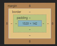
margin + border +padding +内容宽度
代码说明:
<!DOCTYPE html>
<html lang="en">
<head>
    <meta charset="UTF-8">
    <title>Title</title>
    <!--外边距的作用居中元素-->
    <style>
        /*
        margin:0 0 0 0上 右 下 左
        */
        h2{
            font-size: 16px;
            background-color: #3cbda6;
            line-height: 30px;
            color: white;
            margin: 0 1px 2px 3px;
        }
        #box{
            width: 30px;
            border: 1px solid red;
            margin: 0 auto;
        }
        /*border: 粗细 样式 颜色*/
        #box{
            width: 300px;
            border: 1px solid red;

        }
        form{
            background: #3cbda6;
        }
        input{
            border: 1px solid black;
        }

        div:nth-of-type(1){
            padding: 10px 10px;
        }
    </style>
</head>
<body>
<div id="box">
    <h2>会员登录</h2>
    <form action="#">
        <div>
            <span>姓名:</span>
            <input type="text">
        </div>
        <div>
            <span>密码:</span>
            <input type="text">
        </div>
        <div>
            <span>邮箱:</span>
            <input type="text">
        </div>
    </form>
</div>
</body>
</html>
效果图:

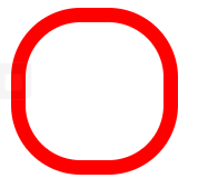
圆角边框
圆角边框
圆形图片
1.圆角边框
代码说明:
<!DOCTYPE html>
<html lang="en">
<head>
    <meta charset="UTF-8">
    <title>Title</title>
    <!--
    左上 右上 右下 左下
    -->
    <style>
        div1{
            width: 100px;
            height: 100px;
            border: 10px solid red;
            border-radius: 50px;
        }
    </style>
</head>
<body>
    <div></div>
</body>
</html>
效果图:
2.圆形图片
代码说明:
<!DOCTYPE html>
<html lang="en">
<head>
    <meta charset="UTF-8">
    <title>Title</title>
    <style>

        img{
            border-color: #3cbda6;
            border-radius: 100px;
            border-style: solid;
            border-width: 5px;
            background: black;
            width: 100px;
            height: 100px
        }
    </style>
</head>
<body>
<div></div>
<img src="images/logo.jpg">
</body>
</html>
效果图:
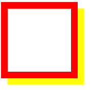
边框阴影
box-shadow: 10px 10px 1px yellow; 行 列 半径 颜色
1.边框阴影
代码说明:
<!DOCTYPE html>
<html lang="en">
<head>
    <meta charset="UTF-8">
    <title>Title</title>
    <style>
        div{
            width: 100px;
            height: 100px;
            border: 10px red solid;
            box-shadow: 10px 10px 1px yellow;/*行 列 半径 颜色*/
        }
    </style>
</head>
<body>
    <div></div>
</body>
</html>
效果图:
2.图片阴影
代码说明:
<!DOCTYPE html>
<html lang="en">
<head>
    <meta charset="UTF-8">
    <title>Title</title>
    <style>
        img{
            border-radius: 50px;
            box-shadow: 10px 10px 100px yellow;


        }
        div{
            height: 1000px;
            width: 1180px;
            text-align:center;
            vertical-align: middle;

            display: table-cell;
        }
    </style>
</head>
<body>
<div>
    <img src="images/logo.jpg">
</div>
</body>
</html>
效果图:

浮动
标准文档流

块级元素:独占一行
h1~h6 p div 列表...
行内元素:不独占一行
span a img strong...
行内元素可以被包含在块级元素中 反之则不可以
display
display: block 块元素
inline 行内元素
inline-block 是块元素 但可以在一行
<!DOCTYPE html>
<html lang="en">
<head>
    <meta charset="UTF-8">
    <title>Title</title>
    <!--
    block 块元素
    inline 行内元素
    inline-block 是块元素 但可以在一行
    -->

    <style>
        div{
           width: 100px;
            height: 100px;
            border: 1px solid red;
            display: inline;
        }
        span{
            width: 100px;
            height: 100px;
            border: 1px solid red;
            display: inline-block;
        }
    </style>
</head>
<body>
    <div>div块元素</div>
<span>span行内元素</span>
</body>
</html>
float
float:left right
clear:none left right both清除浮动,即旁边如果有浮动自动换行
代码说明:
div{
    margin: 10px;
    padding: 5px;
}

#father{
    border: 1px #000 solid;
}

.layer01{
    border: 1px #F00 dashed;
    display: inline-block;
    float: left;
}
.layer02{
    border: 1px #F00 dashed;
    display: inline-block;
    float: left;
}
.layer03{
    border: 1px #F00 dashed;
    display: inline-block;
    float: left;
    clear: both;
}

.layer04{
    border: 1px #F00 dashed;
    display: inline-block;
    float: left;

}

img{
    width: 100px;
    height: 100px;
}
<!DOCTYPE html>
<html lang="en">
<head>
    <meta charset="UTF-8">
    <title>浮动</title>
    <link href="css/style.css" rel="stylesheet">
</head>
<body>
    <div id="father">
        <div class="layer01"><img src="images/01.jpg" alt="" title="01"></div>
        <div class="layer02"><img src="images/02.jpg" alt="" title="02"></div>
        <div class="layer03"><img src="images/03.jpg" alt="" title="03"></div>
        <div class="layer04">浮动的盒子可以向左,也可以向右浮动,直到他的外边缘碰到包</div>
    </div>
</body>
</html>
效果图:

qq会员顶部状态栏
1.视频写法
代码说明:
<!DOCTYPE html>
<html lang="en">
<head>
    <meta charset="UTF-8">
    <title>QQ会员</title>
    <style>
        /*清空所有元素的边框*/
        *{
            padding:0;
            margin: 0;
        }
        /*清除所有链接的下划线*/
        a{
            text-decoration: none;
        }
        /*设置头部边框高宽及背景颜色*/
        .nav-header{

            background: rgba(0, 0, 0, 0.6);
        }
        /*设置头部div的高宽并居中*/
        .head-contain{
            width: 1180px;
            height: 90px;
            margin: 0 auto;
            /*background: rgba(0,0,0,0.6);*/
            text-align: center;
        }
        /*将所有块设置为内联块,高为90,垂直居中对齐*/
        .top-logo,.top-nav,.top-nav li,.top-right{
            height: 90px;
            display: inline-block;
            vertical-align: top;
        }
        /*使与qq图标距离48px*/
        .top-nav{
            margin: 0 48px;
        }
        /*列表行高和宽度*/
        .top-nav li{
            line-height: 90px;
            width: 90px;
        }
        /*将列表中的连接设为块元素使其能居中*/
        .top-nav li a{
            display: block;
            text-align: center;
            font-size: 16px;
            color: #fff;
        }
        /*悬停变色*/
        .top-nav li a:hover{
            color: blue;
        }
        /*设置登录和会员链接字体大小 居中 圆角边框*/
        .top-right a{
            display: inline-block;
            font-size: 16px;
            text-align: center;
            margin-top: 25px;
            border-radius: 35px;
        }
        /*设置登录按键高宽 行高 字体颜色 边框*/
        .top-right a:first-of-type{
            width: 93px;
            height: 38px;
            line-height: 38px;
            color: #fad65c;
            border: 1px #fad65c solid;
        }
        /*设置登录按键悬停时字体颜色和背景颜色*/
        .top-right a:first-of-type:hover{
            color: #986b0d;
            background: #fad65c;
        }
        /*设置会员按键高宽 字体粗细 行高 背景颜色 字体颜色*/
        .top-right a:last-of-type{
            width: 140px;
            height: 40px;
            font-weight: 700;
            line-height: 40px;
            background: #fad65c;
            color: #986b0d;
        }
        /*悬停背景颜色*/
        .top-right a:last-of-type:hover{
            background: #fddc6c;
        }
    </style>
</head>
<body>
<div class="wrap">
    <!--头部-->
    <header class="nav-header">
        <div class="head-contain">
            <a href="" class="top-logo"><img src="images/qq.png"  width="145" height="90" alt=""></a>
            <nav class="top-nav">
                <ul>
                    <li><a href="">功能特权</a> </li>
                    <li><a href="">游戏特权</a> </li>
                    <li><a href="">生活特权</a> </li>
                    <li><a href="">会员特权</a> </li>
                    <li><a href="">成长体系</a> </li>
                    <li><a href="">年费专区</a> </li>
                    <li><a href="">超级会员</a> </li>
                </ul>
            </nav>
            <div class="top-right">
                <a href="">登录</a>
                <a href="">开通超级会员</a>
            </div>
        </div>
    </header>
</div>
</body>
</html>
效果图:

2.笔者写法:
<!DOCTYPE html>
<html lang="en">
<head>
    <meta charset="UTF-8">
    <title>Title</title>
    <style>
        *{
            padding: 0;
            margin: 0;
        }

        .head-contain{
            width: 1180px;
            height: 90px;
            margin: 0 auto;
            text-align: center;
            background-color: chocolate;
        }
        .nav-header a{
            text-decoration: none;
            color: white;
        }
        .nav-header li{
            list-style-type: none;
            float:left;
            line-height: 90px;
            width: 90px;

        }
        .nav-header{
            background-color: chocolate;
        }
        .top-logo{
            float:left;
            margin-right: 48px;
        }
        .top-nav ul a:hover{
            color: blue;
        }
        .top-right a{
            display: inline-block;
            font-size: 16px;
            text-align: center;
            margin-top: 25px;
            border-radius: 35px;
        }
        .top-right a:first-of-type{
            width: 93px;
            height: 38px;
            line-height: 38px;
            color: #fad65c;
            border: 1px #fad65c solid;
        }
        .top-right a:first-of-type:hover{
            background-color: #fad65c;
            color: #986b0d
        }
        .top-right a:last-of-type{
            width: 140px;
            height: 40px;
            font-weight: 700;
            line-height: 40px;
            background: #fad65c;
            color: #986b0d;
        }
        .top-right a:last-of-type:hover{
            background: #fddc6c;
        }
    </style>
</head>
<body>
<header class="nav-header">
    <div class="head-contain">
        <a href="" class="top-logo"><img src="images/qq.png" width="145" height="90" /></a>
        <nav class="top-nav">
            <ul>
                <li><a href="">功能特权</a> </li>
                <li><a href="">游戏特权</a> </li>
                <li><a href="">生活特权</a> </li>
                <li><a href="">会员特权</a> </li>
                <li><a href="">成长体系</a> </li>
                <li><a href="">年费专区</a> </li>
                <li><a href="">超级会员</a> </li>
            </ul>
        </nav>
        <div class="top-right">
            <a href="">登录</a>
            <a href="">开通超级会员</a>
        </div>
    </div>
</header>
</body>
</html>
父级边框塌陷的问题
解决方案:
1、增加父级元素高度
#father{
	boder: 1p #000 solid
	height:800;
}
2、增加一个空div标签,清除浮动
<div class="clear"></div>
.clear{
    clear: both;
    margin: 0;
    padding: 0;

}
3、overflow
在父级元素中增加一个 overflow:hidden scroll
4、父级对象添加一个伪类 after
#father:after{
    content: '';
    display: block;
    clear: both;
}
小结:
1、浮动元素后面增加空div
简单,代码中尽量避免空div
2.设置父元素的高度
简单,元素假设有了固定的高度,就会被限制
3.overflow
简单,下拉的一些场景避免使用
4、父类添加一个伪类:after(推荐)
写法稍微复杂一点,但是没有副作用,推荐使用!
display和float对比
- display
方向不可以控制
- float
浮动起来会脱离标椎文档流,所以需要解决父级边框塌陷的问题
定位
相对定位
1.相对定位
相对定位:position:relative
相对于原来的位置,进行指定的偏移,相对定位的话,它任然在标椎文档流中,原来的位置会被保留
top:-20px;
left:20px;
bottom:-10px;
right:20px;
代码说明:
<!DOCTYPE html>
<html lang="en">
<head>
<meta charset="UTF-8">
<title>Title</title>
<!--相对定位
相对于自己原来的位置进行偏移
-->
<style>
div{
margin: 10px;
padding: 5px;
line-height: 25px;
}
body{
padding: 10px;
}
#father{
border: red 1px solid;
}
.class1{
border: red 1px solid;
background-color: #3cbda6;
position: relative;
bottom: 20px;
left: 20px;
}
.class2{
border: red 1px solid;
background-color: #ff008a;
}
.class3{
border: red 1px solid;
background-color: #3748ff;
position: relative;
top: 20px;
right: 20px;
}
</style>
</head>
<body>
<div id="father">
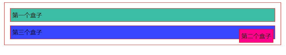
<div class="class1">第一个盒子</div>
<div class="class2">第二个盒子</div>
<div class="class3">第三个盒子</div>
</div>
</body>
</html>
效果图:

2.练习
题目:链接卡

笔者代码:
<!DOCTYPE html>
<html lang="en">
<head>
    <meta charset="UTF-8">
    <title>Title</title>
    <style>
        #father{
            width: 320px;
            height: 320px;
            border: 2px red solid;
        }

        a{
            color: white;
            text-decoration: none;
            font: bold 20px/50px Arial;
            /*margin: 0 auto;*/
            display: block;
            padding-top: 25px;
        }
        div div{
            padding: 0;
            margin: 0;
            width: 100px;
            height: 100px;
            background-color: #e28fdc;
            text-align: center;
            position: relative;
        }
        div div:hover{
            background-color: #569ef5;
        }
        .class1,.class3{
            top:10px;
            left:10px;
        }
        .class2,.class4{
            top:-90px;
            left:210px;
        }
        .class5{
            top: -290px;
            left: 110px;
        }
    </style>
</head>
<body>
    <div id="father">
        <div class="class1"><a href="#" content="链接1">链接1</a></div>
        <div class="class2"><a href="#" content="链接1">链接2</a></div>
        <div class="class3"><a href="#" content="链接1">链接3</a></div>
        <div class="class4"><a href="#" content="链接1">链接4</a></div>
        <div class="class5"><a href="#" content="链接1">链接5</a></div>
    </div>
</body>
</html>
效果图:

视频写法:
<!DOCTYPE html>
<html lang="en">
<head>
    <meta charset="UTF-8">
    <title>Title</title>
    <style>
        #box{
            width: 300px;
            height: 300px;
            padding: 10px;
            border: 2px solid red;
        }
        a{
            width: 100px;
            height: 100px;
            text-decoration: none;
            background-color: #e56ce3;
            line-height: 100px;
            text-align: center;
            color: white;
            display: block;
        }
        a:hover{
            background: #0facea;
        }
        .a2,.a4{
            position: relative;
            left: 200px;
            top: -100px;
        }
        .a5{
            position: relative;
            left: 100px;
            top: -300px;
        }
    </style>
</head>
<body>

<div id="box">
    <a class="a1" href="#">链接1</a>
    <a class="a2" href="#">链接2</a>
    <a class="a3" href="#">链接3</a>
    <a class="a4" href="#">链接4</a>
    <a class="a5" href="#">链接5</a>
</div>
</body>
</html>
绝对定位
定位:基于XXX定位,上下左右~
1、没有父级元素定位的前提下,相对于浏览器定位
2、假设父级元素存在定位,我们通常会相对于父级元素进行偏移
3.在父级元素范围内移动
相对于父级或浏览器的位置,进行指定的偏移,绝对定位的话,他不在标准文档流中,原来位置不会被保留
1.相对于浏览器
代码说明:
.class2{
            border: red 1px solid;
            background-color: #ff008a;
            position: absolute;
            right:10px

        }
效果图:

2.相对于父级元素div
代码说明:
/*将父元素设置位置*/
 #father{
            border: red 1px solid;
            position: relative;
 }
 .class2{
            border: red 1px solid;
            background-color: #ff008a;
            position: absolute;
            right:10px
}
<!DOCTYPE html>
<html lang="en">
<head>
    <meta charset="UTF-8">
    <title>Title</title>
    <!--相对定位
    相对于自己原来的位置进行偏移
    -->
    <style>
        div{
            margin: 10px;
            padding: 5px;
            line-height: 25px;
        }
        body{
            padding: 10px;
        }
        #father{
            border: red 1px solid;
            position: relative;
        }

        .class1{
            border: red 1px solid;
            background-color: #3cbda6;
        }
        .class2{
            border: red 1px solid;
            background-color: #ff008a;
            position: absolute;
            right:10px

        }
        .class3{
            border: red 1px solid;
            background-color: #3748ff;
        }
    </style>
</head>
<body>
<div id="father">
    <div class="class1">第一个盒子</div>
    <div class="class2">第二个盒子</div>
    <div class="class3">第三个盒子</div>

</div>

</body>
</html>
效果图:
注:
位置不会超过浏览器或父级边框
固定定位 fixed
代码说明:
<!DOCTYPE html>
<html lang="en">
<head>
    <meta charset="UTF-8">
    <title>Title</title>
    <style>
        body{
            height: 1000px;
        }
        div:nth-of-type(1){
            width: 100px;
            height: 100px;
            background-color: red;
            position: absolute;
            right: 0;
            bottom: 10px;
        }
        div:nth-of-type(2){
            width: 50px;
            height: 50px;
            background-color: yellow;
            position: fixed;
            right: 0;
            bottom: 10px;
        }
    </style>
</head>
<body>
    <div>div1</div>
	<div>div2</div>
</body>
</html>
效果图:

z-index

图层~
z-index: 默认是0,最高无限~999
代码说明:
<!DOCTYPE html>
<html lang="en">
<head>
    <meta charset="UTF-8">
    <title>Title</title>
    <style>
        img{
            width: 400px;
            height: 200px;
        }
        ul,li{
            margin: 0;
            padding: 0;
            list-style-type: none;
        }
        #content ul{
            position: relative;
        }
        .tipText,.tipBg{
            width: 400px;
            height: 25px;
            position: absolute;
            top: 150px;
        }
        .tipText{
            color: white;
            z-index: 0;
        }
        .tipBg{
            background: black;
            opacity: 0.5;   /*背景透明度*/
        }
    </style>
</head>
<body>
    <div id="content">
        <ul>
            <li>
                <img src="images/01.jpg" alt="">
            </li>
            <li class="tipText">
                夏目友人帐
            </li>
            <li class="tipBg"></li>
            <li>时间:2020-01-01</li>
            <li>地点:地球家园基地</li>
        </ul>
    </div>
</body>
</html>
图层为999效果图:

图层为0效果图:

动画即学习网站
css动画参考网站:
卡巴斯基网络威胁:超好看的地图网站
canvas:好看的css模板
less:用编程实现css
tricks:好看的html模板
模板之家:好看的html模板
bootstrap:前端框架
源码之家:https://www.mycodes.net/
模板之家:http://www.cssmoban.com/
layui: https://www.layui.com/
eleme: https://element.eleme.cn/#/zh-CN
飞冰:https://ice.work/