ChartUtil.py
import matplotlib.pyplot as plt
from pylab import mpl

def plotLine(xData,yData,xLabel,chartTitle):

    mpl.rcParams['font.sans-serif'] = ['FangSong']  # 指定默认字体
    mpl.rcParams['axes.unicode_minus'] = False  # 解决保存图像是负号'-'显示为方块的问题

    fig = plt.figure()
    ax = fig.add_subplot(1, 1, 1)

    #xData = range(0, 5)

    #xLabel = ["2009-June", "2009-Dec", "2010-June", "2010-Dec", "2011-June"]

    ax.set_xticks(range(len(xLabel)))

    ax.set_xticklabels(xLabel, rotation=40)

    ax.set_title(chartTitle)#设置标题

    #yData = [10, 13, 5, 40, 30]

    ax.plot(xData, yData, marker='o')

    # plt.plot(x1,y1,label='Frist line',linewidth=1.5,color='blue',marker='o',markerfacecolor='red',markersize=7)

    # plt.plot(x1,y1,'bo')
    plt.show()
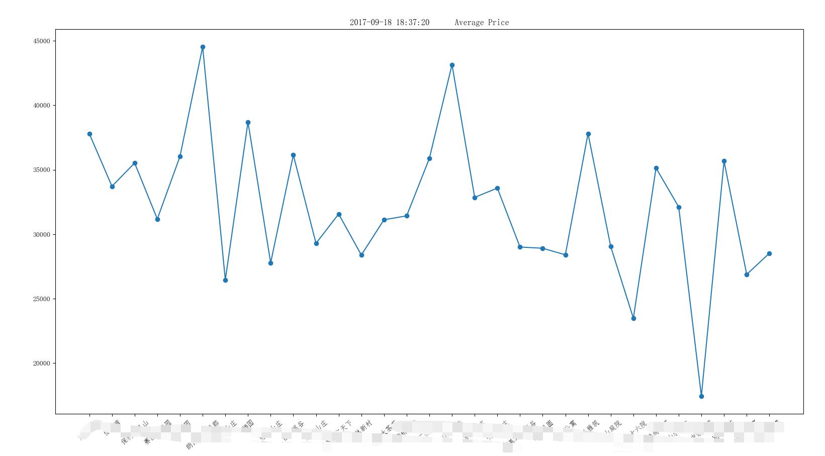
使用
import  DbUtil as dbu
import ChartUtil as cu


conn, cursor = dbu.getDbConnection()

sql="select * from data_house where create_time BETWEEN '2017-09-18 00:00:00' and '2017-09-19 00:00:00' ";

cursor.execute(sql);
results = cursor.fetchall();

xLable=[]
yData=[]
for row in results:
    xLable.append(row[3])
    yData.append(row[4])
    createTime=row[2]


dbu.closeDb(conn, cursor)

dataCount=len(xLable)
xData=range(0,dataCount,1)
chartTitle=str(createTime) + '      Average Price'


cu.plotLine(xData, yData, xLable,chartTitle)
结果