
作者:李誉辉
四川大学在读研究生
接上一篇:GGally与pairs相关关系图_史上最全(一)
2.4
wrap()封装
其它需要指定到geom_xxx()中的参数,可以通过wrap()传递给lower,upper, 或diag。
语法:
1wrap(funcVal, ..., funcArgName = deparse(substitute(funcVal)))
2wrapp(funcVal, params = NULL, funcArgName = deparse(substitute(funcVal)))
解释:
wrap()为参数传递,wrapp()为列表传递。
funcVal, 表示需要见参数传递给什么类型的对象,
如ggally_points或"points"则将参数传递给散点图;
ggally_facetdensity或"facetdensity"则将参数传递给分面密度图。
-
..., params,表示要传递的参数,都是geom_xxx()中的参数,
如alpha, size, binwidth。
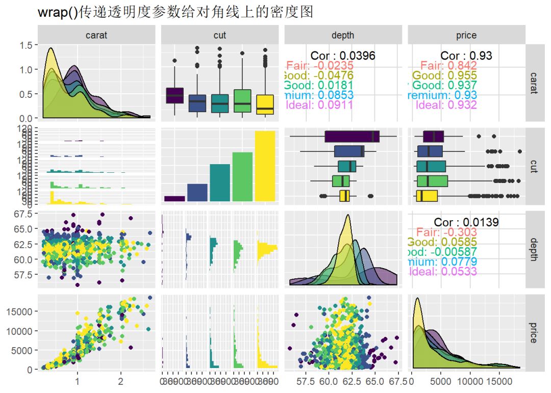
 1library(GGally)
 2library(ggplot2)
 3diamonds.samp <- diamonds[sample(1:dim(diamonds)[1], 1000), ]
 4
 5# 下面是plots超过15个,为16个,所以默认产生进度条
 6ggpairs(
 7  diamonds.samp[, c(1:2,5,7)],
 8  mapping = aes(color = cut),
 9  diag = list(
10    continuous = wrap("densityDiag",alpha = 0.5)), # 给对角线的密度图增加透明度参数
11  title = "wrap()传递透明度参数给对角线上的密度图"
12)
13
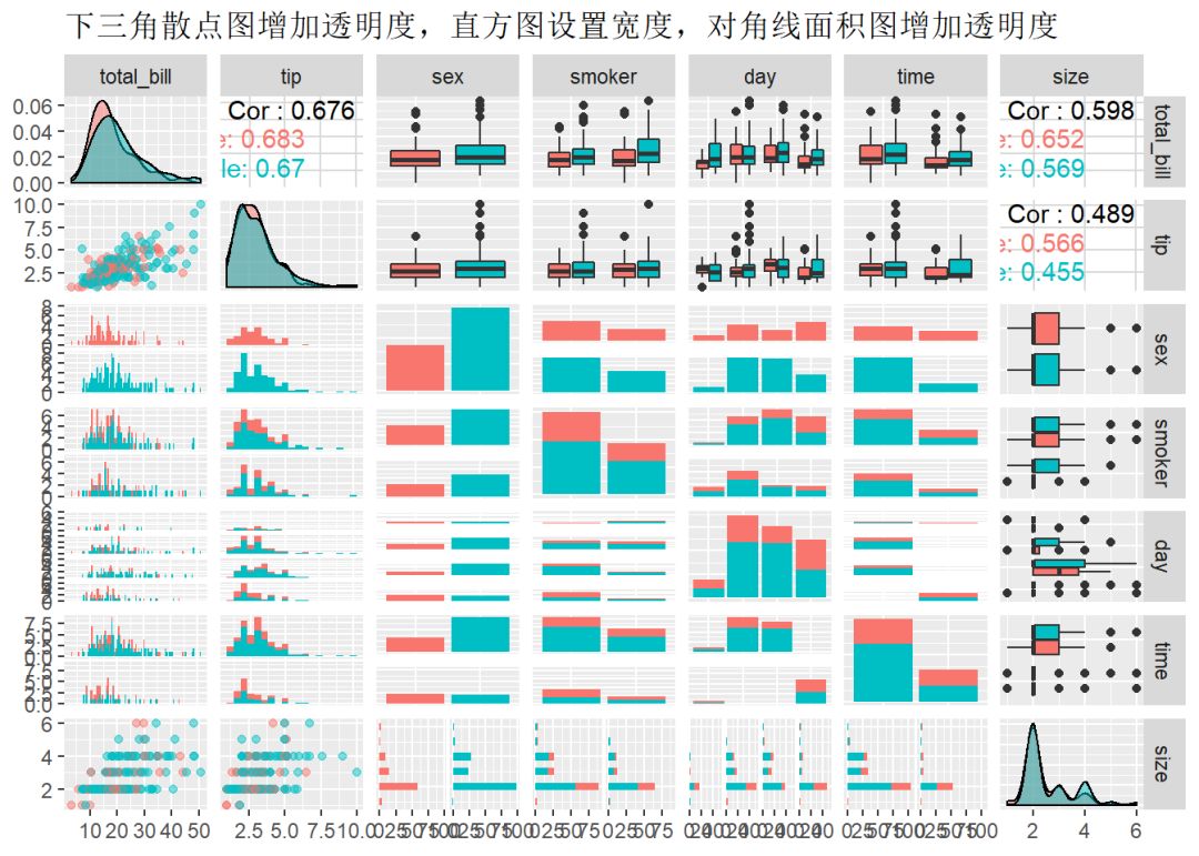
 1require(GGally)
 2data(tips, package="reshape")
 3g1 <-
 4  ggpairs(data = tips, mapping = aes(colour = sex),
 5    lower = list(
 6      continuous = wrap(ggally_points, alpha = 0.5), # 增加透明度参数
 7      combo = wrap("facethist", binwidth = 0.5) # 增加柱子宽度参数
 8      ),
 9    diag = list(
10      continuous = wrap(ggally_densityDiag, alpha = 0.5) # 增加透明度参数
11    ),
12    title="下三角散点图增加透明度,直方图设置宽度,对角线面积图增加透明度"
13  )
14g1
15
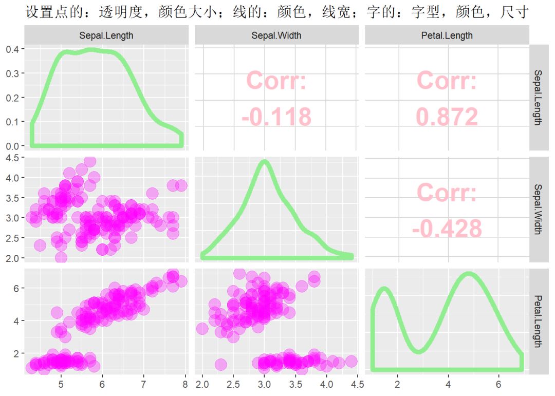
 1wrap_1 <- wrap(ggally_points, size = 5, color = "magenta", alpha = 0.3)
 2wrap_2 <- wrap(ggally_densityDiag, size = 2, color = "lightgreen")
 3wrap_3 <- wrap(ggally_cor, size = 8, color = "pink", fontface = "bold")
 4
 5ggpairs(iris, 1:3,
 6        lower = list(continuous = wrap_1),
 7        diag = list(continuous = wrap_2),
 8        upper = list(continuous = wrap_3),
 9        title = "设置点的:透明度,颜色大小;线的:颜色,线宽;字的:字型,颜色,尺寸"
10        )
11
2.5
自定义主题
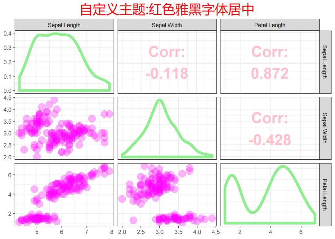
 1library(GGally)
 2library(ggplot2)
 3library(showtext)
 4
 5# 添加字体
 6windowsFonts(YaHei_rontine = windowsFont("微软雅黑"))
 7font_add("YaHei_rontine", regular = "msyh.ttc", bold = "msyhbd.ttc")
 8
 9wrap_1 <- wrap(ggally_points, size = 5, color = "magenta", alpha = 0.3)
10wrap_2 <- wrap(ggally_densityDiag, size = 2, color = "lightgreen")
11wrap_3 <- wrap(ggally_cor, size = 8, color = "pink", fontface = "bold")
12
13gg_1 <- ggpairs(iris, 1:3,
14                lower = list(continuous = wrap_1),
15                diag = list(continuous = wrap_2),
16                upper = list(continuous = wrap_3),
17                title = "自定义主题:红色雅黑字体居中"
18        )
19
20gg_1 + theme_bw() +
21  theme(plot.title = element_text(size = 20, color = "red", hjust = 0.5,
22                                  family = "YaHei_rontine"))
23
2.6
scale_xxx()标度调整
只能索引出来子集后调整子集的标度。
1library(ggplot2)
2library(GGally)
3data(tips, package = "reshape")
4
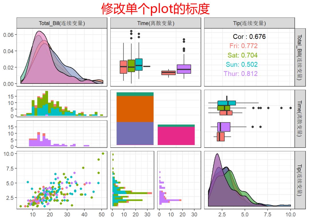
5mygg <- ggpairs(tips, mapping = aes(color = day),
6 columns = c("total_bill", "time", "tip"),
7 columnLabels = c("Total_Bill(连续变量)", "Time(离散变量)", "Tip(连续变量)"),
8 diag = list(continuous = wrap(ggally_densityDiag, alpha = 0.7)),
9 title = "修改单个plot的标度"
10)
11
12mygg[1,1] <- mygg[1,1] + scale_fill_brewer(palette = "Set2")
13mygg[2,2] <- mygg[2,2] + scale_fill_brewer(palette = "Dark2")
14mygg[3,3] <- mygg[3,3] + scale_fill_brewer(palette = "Set1")
15
16mygg + theme_bw() +
17 theme(plot.title = element_text(size = 20, color = "red", hjust = 0.5,
18 family = "YaHei_rontine"))
19
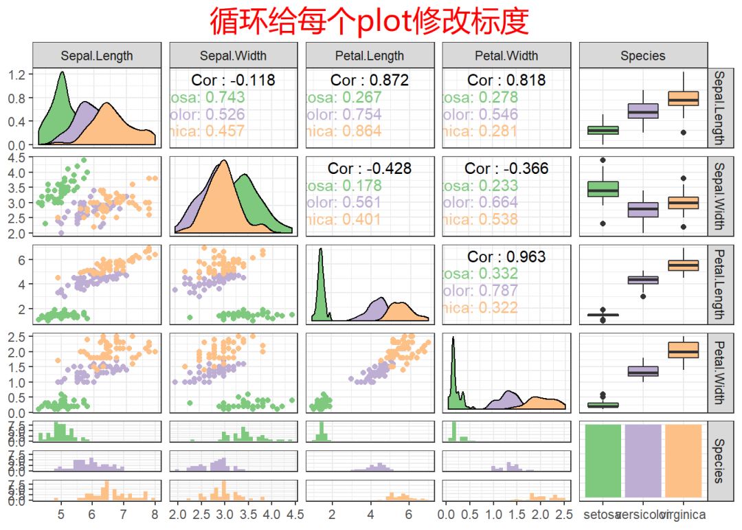
 1gg_2 <- ggpairs(iris, aes(color = Species),
 2                title = "循环给每个plot修改标度"
 3                )
 4
 5# 循环给每一个子集plot修改标度
 6for(i in 1:gg_2$nrow) {
 7  for(j in 1:gg_2$ncol){
 8    gg_2[i,j] <- gg_2[i,j] +
 9        scale_fill_manual(values=c("#7fc97f", "#beaed4", "#fdc086")) +
10        scale_color_manual(values=c("#7fc97f", "#beaed4", "#fdc086"))
11  }
12}
13gg_2 + theme_bw() +
14  theme(plot.title = element_text(size = 20, color = "red", hjust = 0.5,
15                                  family = "YaHei_rontine"))
2.7
legend图例
1library(ggplot2)
2library(GGally)
3data(tips, package = "reshape")
4
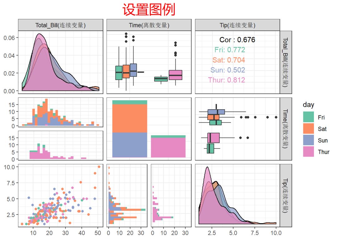
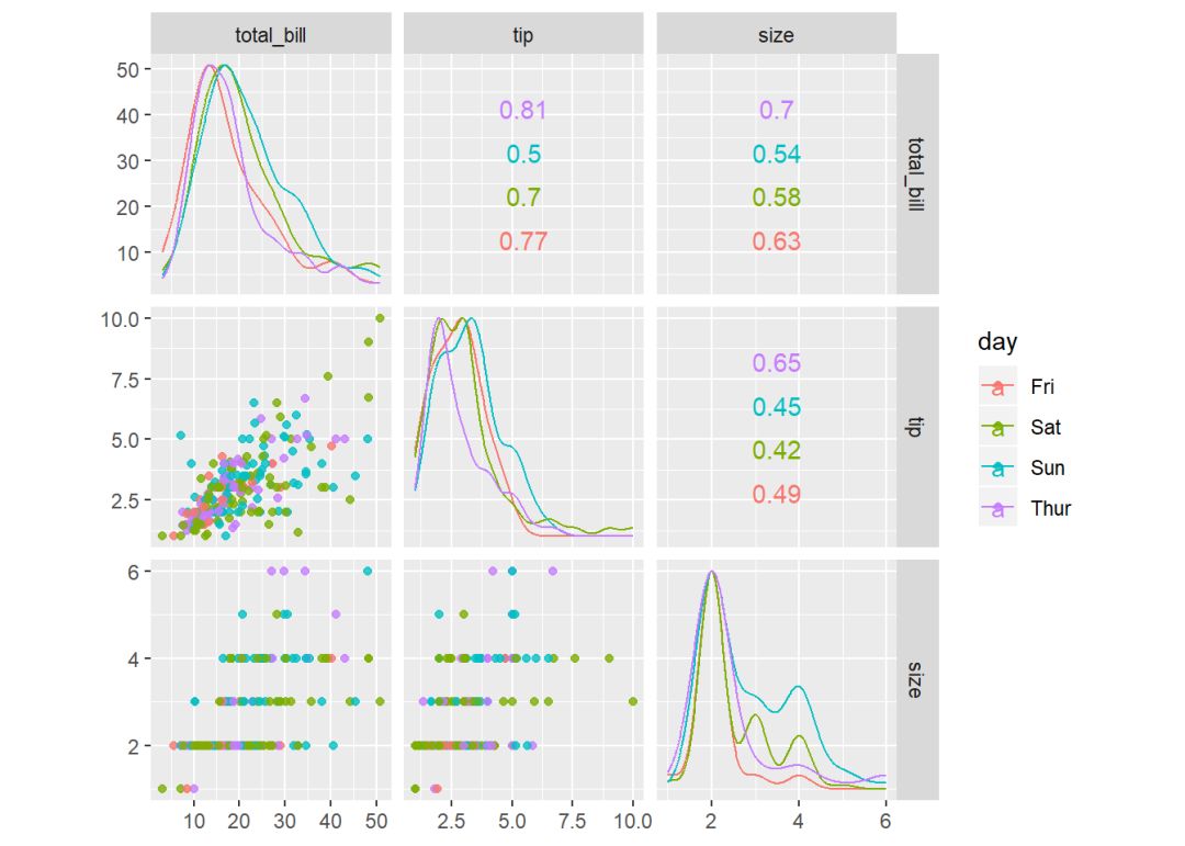
5gg_3 <- ggpairs(tips, mapping = aes(color = day),
6 columns = c("total_bill", "time", "tip"),
7 columnLabels = c("Total_Bill(连续变量)", "Time(离散变量)", "Tip(连续变量)"),
8 diag = list(continuous = wrap(ggally_densityDiag, alpha = 0.7)),
9 legend = c(2,2),
10 title = "设置图例"
11)
12
13for(i in 1:gg_3$nrow) {
14 for(j in 1:gg_3$ncol){
15 gg_3[i,j] <- gg_3[i,j] +
16 scale_fill_brewer(palette = "Set2") +
17 scale_color_brewer(palette = "Set2")
18 }
19}
20
21gg_3 + theme_bw() +
22 theme(plot.title = element_text(size = 20, color = "red", hjust = 0.5,
23 family = "YaHei_rontine"),
24 legend.position = "right")
1library(ggplot2)
2library(GGally)
3data(tips, package = "reshape")
4
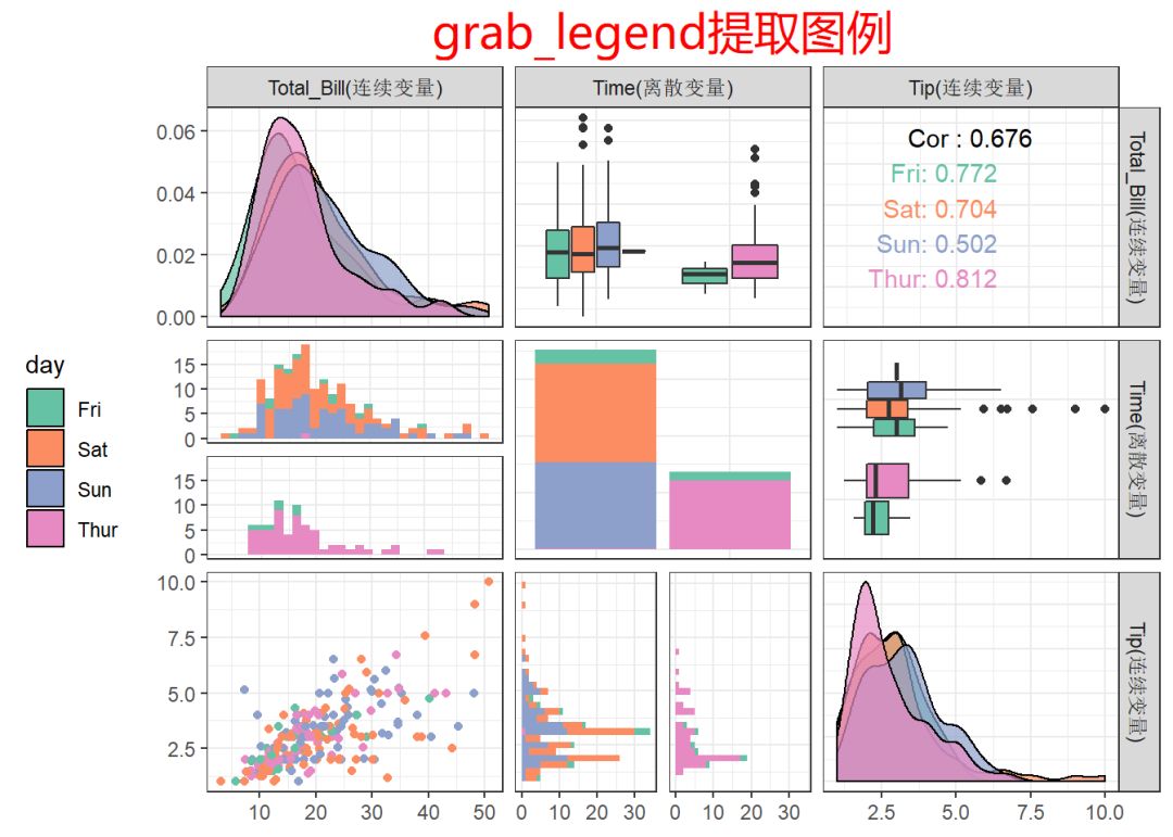
5# 提取图例
6mylegend <- grab_legend(ggplot(tips, aes(x = total_bill, fill = day)) +
7 geom_density() +
8 scale_fill_brewer(palette = "Set2")
9 )
10
11gg_3 <- ggpairs(tips, mapping = aes(color = day),
12 columns = c("total_bill", "time", "tip"),
13 columnLabels = c("Total_Bill(连续变量)", "Time(离散变量)", "Tip(连续变量)"),
14 diag = list(continuous = wrap(ggally_densityDiag, alpha = 0.7)),
15 legend = mylegend,
16 title = "grab_legend提取图例"
17)
18
19for(i in 1:gg_3$nrow) {
20 for(j in 1:gg_3$ncol){
21 gg_3[i,j] <- gg_3[i,j] +
22 scale_fill_brewer(palette = "Set2") +
23 scale_color_brewer(palette = "Set2")
24 }
25}
26
27gg_3 + theme_bw() +
28 theme(plot.title = element_text(size = 20, color = "red", hjust = 0.5,
29 family = "YaHei_rontine"),
30 legend.position = "left")
3.ggscatmat()
语法:
1ggscatmat(data, columns = 1:ncol(data), color = NULL, alpha = 1,
2  corMethod = "pearson")
解释:
ggscatmat()非常简单,功能也非常单一,运算速度比ggpairs更快,
只能使用连续变量,也就产生下三角为散点图,上三角为相关系数,对角线为密度图。
color,表示指定颜色变量。
alpha,指定散点图的透明度,默认为1(不透明)。
corMethod, 表示指定相关系数的计算方法,默认"pearson",还有"kendall", "spearman"。
1library(ggplot2)
2library(GGally)
3
4ggscatmat(tips, columns = c("total_bill", "tip", "size"), # 变量名指定
5          color="day", alpha = 0.8)
6
7ggscatmat(tips, columns = c(1,2,7), # 索引值指定
8          color="day", alpha = 0.8)
4.pairs()
前面介绍了ggpairs及相关的绘图函数,接下来,我们将介绍graphics包中的pairs()函数。
语法:
 1pairs(formula, data = NULL, ..., subset,
 2      na.action = stats::na.pass)
 3
 4pairs(x, labels, panel = points, ...,
 5      horInd = 1:nc, verInd = 1:nc,
 6      lower.panel = panel, upper.panel = panel,
 7      diag.panel = NULL, text.panel = textPanel,
 8      label.pos = 0.5 + has.diag/3, line.main = 3,
 9      cex.labels = NULL, font.labels = 1,
10      row1attop = TRUE, gap = 1, log = "")
关键参数:
x, 数据矩阵或数据框,其中逻辑和因子型变量会被强制转换为数值型。
formula, 形如~x + y + z的公式,x,y,z分别代表多个数值变量。
data, formula中,变量所在的数据框或列表。
subset, 指定进行可视化的观测。
horInd,verInd,表示用索引值指定要绘图的变量。
na.action, 指定缺失值的处理方式。
labels, 变量名称(给变量贴标签)。
panel, 自定义面板函数。
lower.panel, upper.panel,自定义上三角和下三角面板中的绘图函数。
diag.panel, 指定主对角线面板上的作图函数。
text.panel, 指定主对角线面板上文本标签的函数。
label.pos, 指定文本标签的位置。
cex.labels, font.labels, 指定文本标签的缩放倍数及字体样式。
rowlattop, 逻辑值,指定散点图第一行出现在顶部还是底部。
main, 指定标题。
gap, 指定子区域之间的间距。
log, 表示对坐标轴进行对数变换,log = "x"表示x轴对数变换,log="y"表示对y轴对数变换;
log = "xy"表示x,y同时对数变换。 log = 1:4 表示前4个变量对数变换。
...,其它要传递的绘图参数,一般是par()中的参数。
4.1
默认绘图样式
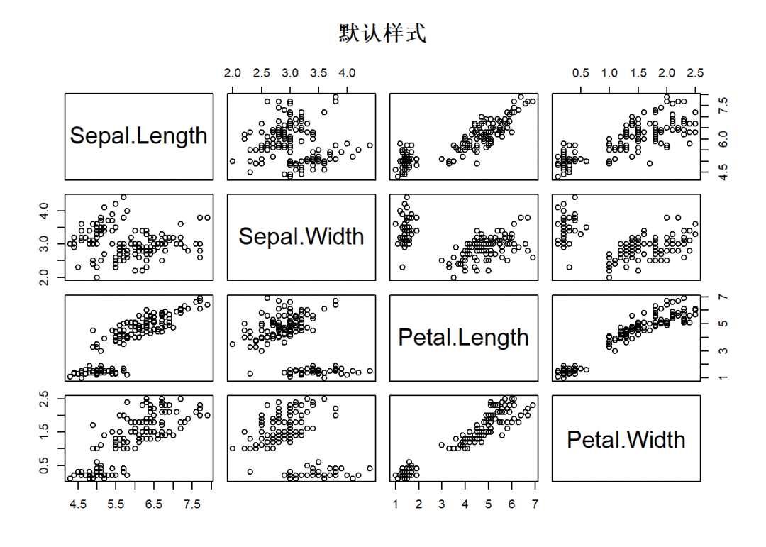
1library(graphics)
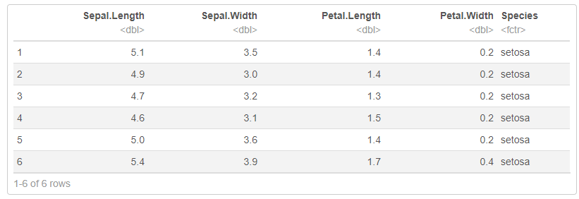
2head(iris) # 前4列为数字变量
3
4pairs(iris[1:4], main = "默认样式") # 默认绘图样式
4.2
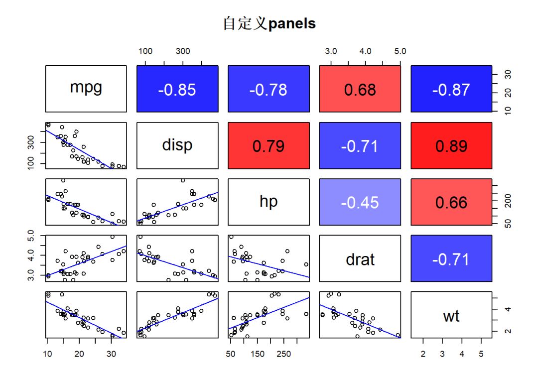
自定义panel
1library(grDevices)
2
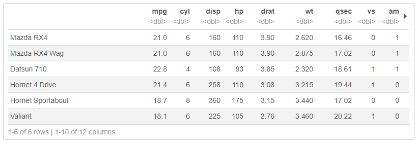
3head(mtcars)
4df <- mtcars[, c(1,3:6)]
5
6# 定义上三角panel
7panel_upper <- function(x, y, digits = 2, col, ...) {
8 usr <- par("usr"); on.exit(par(usr))
9 par(usr = c(0, 1, 0, 1))
10 # 文本颜色
11 text_color <- if(cor(x, y) > 0) {"black"} else {"white"} # 大于0为黑色,小于0为白色
12 # 文本内容
13 txt <- round(cor(x,y), 2) # 保留2位小数
14 # 背景颜色
15 col_index <- if (cor(x,y) > 0) {(1 - cor(x,y))} else {(1 + cor(x,y))}
16 bg_col <- if (cor(x,y) > 0) {
17 rgb(red = 1, green = col_index, blue = col_index)
18 } else { rgb(red = col_index, green = col_index, blue = 1)}
19 # 绘图
20 rect(xleft = 0, ybottom = 0, xright = 1, ytop = 1, col = bg_col) # rect画背景
21 text(x = 0.5, y = 0.5, labels = txt, cex = 2, col = text_color)
22}
23
24# 定义下三角panel
25panel_lower <- function(x, y, bg = NA, pch = par("pch"),
26 cex = 1, col_smooth = "blue",...) {
27 points(x, y, pch = pch, bg = bg, cex = cex)
28 abline(stats::lm(y ~ x), col = col_smooth,...)
29}
30
31
32# 绘图
33pairs(df, main = "自定义panels",
34 pch = 21,
35 upper.panel = panel_upper,
36 lower.panel = panel_lower
37)
do.call()调用:
 1panel_upper <- function(x, y, digits = 2, bg = NULL, col = NULL, ...) {
 2  u <- par("usr")
 3  names(u) <- c("xleft", "xright", "ybottom", "ytop")
 4  # 背景颜色: 要求,相关系数大于0为红色渐变,小于0为蓝色渐变
 5  col_index <- if (cor(x,y) > 0) {(1 - cor(x,y))} else {(1 + cor(x,y))}
 6  bg_col <- if (cor(x,y) > 0) {
 7    rgb(red = 1, green = col_index, blue = col_index)
 8  } else { rgb(red = col_index, green = col_index, blue = 1)}
 9  do.call(rect, c(col = bg_col, as.list(u)))
10  par(usr = c(0, 1, 0, 1))
11  # 文本颜色:要求相关系数大于0为黑色,小于0为白色
12  text_color <- if(cor(x, y) > 0) {"black"} else {"white"} # 大于0为黑色,小于0为白色
13  # 文本内容
14  txt <- round(cor(x,y), 2) # 保留2位小数
15  # 绘图
16  text(x = 0.5, y = 0.5, labels = txt, cex = 2, col = text_color)
17}
18
19# 绘图
20pairs(df, main = "自定义panels",
21  pch = 21,
22  upper.panel = panel_upper,
23  lower.panel = panel_lower
24)
参
考资料
-
R语言相关关系可视化函数梳理
https://zhuanlan.zhihu.com/p/36925332
-
相关性分析了解一下
https://mp.weixin.qq.com/s/Nm9NEGG9gy-lEX34kyxFgQ?token=1086251536&lang=zh_CN
-
R手册(Visualise)–GGally(ggplot2 extensions)
https://blog.csdn.net/qq_41518277/article/details/80517791
-
Plot Multivariate Continuous Data
http://www.sthda.com/english/articles/32-r-graphics-essentials/130-plot-multivariate-continuous-data/
-
Scatter Plot Matrices - R Base Graphs
http://www.sthda.com/english/wiki/scatter-plot-matrices-r-base-graphs
-
R Exploratory Analysis with ggpairs
http://timothykylethomas.me/ggpairs.html#1_overview
-
ggpairs 参数
https://www.rdocumentation.org/packages/GGally/versions/1.4.0/topics/ggpairs
-
DT包用法
https://rstudio.github.io/DT/
-
R语言相关关系可视化函数梳理
http://developer.51cto.com/art/201805/573479.htm
-
R语言学习系列19-基本统计图形
https://wenku.baidu.com/view/cfcff51fc4da50e2524de518964bcf84b9d52dc
-
R语言中用pairs作图时标出各个分图中的所要显示的点
https://blog.csdn.net/faith_mo_blog/article/details/39694897
-
R 学习笔记: Par 函数
https://zhuanlan.zhihu.com/p/21394945
-
Scatter Plot Matrices - R Base Graphs
http://www.sthda.com/english/wiki/scatter-plot-matrices-r-base-graphs
——————————————
往期精彩: