我希望使用纯 CSS 来实现这种边框效果:
我的偏好是在不添加额外的 div 元素的情况下实现它。任何建议,将不胜感激
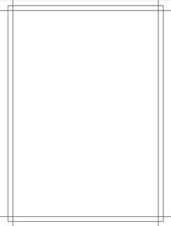
编辑:固定图像描述
你可以像下面这样做:
.box {
  width:150px;
  height:200px;
  border:15px solid transparent; /* control the offset of the lines */
  outline:2px solid #000; /* adjust the 2px here */
  outline-offset:-10px; /* control the offset of the rectangle */
  background:
    linear-gradient(#000 0 0) top,
    linear-gradient(#000 0 0) left,
    linear-gradient(#000 0 0) bottom,
    linear-gradient(#000 0 0) right;
  background-size:200% 2px,2px 200%; /* adjust the 2px here */
  background-origin:padding-box;
  background-repeat:no-repeat;
}
<div class="box"></div>
使用 CSS 变量轻松控制:
.box {
  --c:red;   /* color */
  --b:2px;   /* thickness of lines */
  --o1:15px; /* offest of lines*/
  --o2:10px; /* offset of rectangle */

  width:150px;
  height:200px;
  box-sizing:border-box;
  display:inline-block;
  border:var(--o1) solid transparent;
  outline:var(--b) solid var(--c);
  outline-offset:calc(-1*var(--o2));
  background:
    linear-gradient(var(--c) 0 0) top,
    linear-gradient(var(--c) 0 0) left,
    linear-gradient(var(--c) 0 0) bottom,
    linear-gradient(var(--c) 0 0) right;
  background-size:200% var(--b),var(--b) 200%;
  background-origin:padding-box;
  background-repeat:no-repeat;
}
<div class="box"></div>
<div class="box" style="--c:green;--b:1px;--o1:20px;"></div>
<div class="box" style="--c:blue;--b:4px;--o1:40px;--o2:20px;"></div>
<div class="box" style="--c:#000;--b:1px;--o1:10px;--o2:0;"></div>
本文内容由网友自发贡献,版权归原作者所有,本站不承担相应法律责任。如您发现有涉嫌抄袭侵权的内容,请联系:hwhale#tublm.com(使用前将#替换为@)