我想在矩形中制作一颗钻石。我已经用正方形做到了:
.box {
  width:100px;
  height:100px;
  background:orange;
  z-index:1;
  position:relative;
}

.box:before {
  position:absolute;
  content:'';
  width:70.71%;
  height:70.71%;
  transform: rotate(45deg);
  background: red;
  top: 15%;
  left: 15%;
}
<div class="box"></div>
但我想把它做成这样:
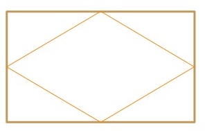
矩形是响应式的,因此它的大小永远不会相同。任何想法 ?
多谢
此方法使用 CSS 生成的两个三角形border.
我认为你不能使用% for border宽度,所以我使用了视口单位。
.box {
  width: 50vw;
  height: 25vw;
  background: orange;
  z-index: 1;
  position: relative;
}

.box:before,
.box:after {
  content: '';
  position: absolute;
  width: 0;
  height: 0;
}

.box:before {
  border-right: solid 25vw red;
  border-top: solid 12.5vw transparent;
  border-bottom: solid 12.5vw transparent;
}

.box:after {
  right: 0;
  border-left: solid 25vw red;
  border-top: solid 12.5vw transparent;
  border-bottom: solid 12.5vw transparent;
}
<div class="box"></div>
本文内容由网友自发贡献,版权归原作者所有,本站不承担相应法律责任。如您发现有涉嫌抄袭侵权的内容,请联系:hwhale#tublm.com(使用前将#替换为@)