做这个教程的初心是:虽然plt.plot(x,y)是一个简单方便的方式,但涉及到学术paper里的绘图教程往往会有很多细致的要求,需要进一步去细调图片,而这个时候则需要不断地百度百度百度,不妨写个教程从整体上整理一下。
本文参考资料:
https://zhuanlan.zhihu.com/p/93423829
https://matplotlib.org/1.5.1/faq/usage_faq.html#parts-of-a-figure


基础概念
1. fig,ax,axes
fig: 画布对象
axes(句柄): 用法:ax = fig.add_subplot(1,1,1),对于有子图的情形,每个subplot都是一个axes.
其中如何根据 fig, 构建axes 的内容,在subplot的ipynb中详细介绍
轴域,ax = fig.add_axes([left, bottom, width, height])
参数说明:left, bottom, width, height百分比,即比例。
axes 和 subplot 是处于同一个级别的概念,都是在fig(画布)上选取一部分可控制的区域进而进行绘图等操作。区别在于axes自由度大,可以自己指定相关参数;而subplot则是在格式化等间隔将fig进行划分。可以说,subplot是axes的特例。
详情可以参考:https://www.zhihu.com/question/51745620
具体参考下图
图像的元素
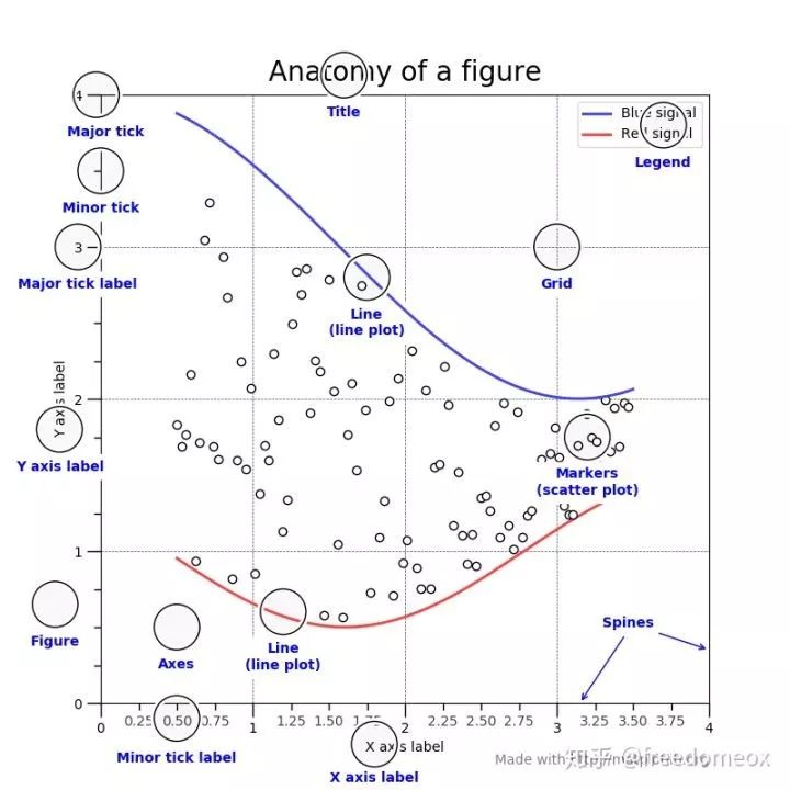
标题类
title, 标题: ax.set_title()
x_label, y_label, xy坐标轴的标题: ax.set_xlabel('x'),ax.set_ylabel('y')
axis类
横纵轴均等 ax.set_aspect('equal')
范围设置: ax.set_xlim(0,1), ax.set_ylim(0,1)
格子设置: ax.grid(which = 'minor', axis = 'both')
坐标轴 tick
这个可能是最常用的功能之一了,因为经常涉及到一些坐标轴的调整。
设置显示的位置 ax.set_xticks([0,1,2]) ;ax.set_yticks([0,1,2])
将显示的位置设置为指定的标签 ax.set_xticklabels(['a', 'b', 'c'])
旋转标签 plt.setp( ax.xaxis.get_majorticklabels(), rotation=-45 )
设置标签为右端 (shift labels to the right)
for tick in ax.xaxis.get_majorticklabels():
    tick.set_horizontalalignment("right")
设置标签的其它属性:字体, facecolor, edgecolor
for label in ax.get_xticklabels() + ax.get_yticklabels():
    label.set_fontsize(12)
    #make the background a little clear, to clear the original data
    label.set_bbox(dict(facecolor='blue', edgecolor='None', alpha=0.65 ))
主次刻度线, ax.xaxis.get_minorticklines()
不想看到刻度的标注,次刻度线不予显示。
for line in ax.xaxis.get_minorticklines():
    line.set_visible(False)
spines 类
这里共有四个可控参数:ax.spines['right'],ax.spines['left'],ax.spines['top'],ax.spines['bottom']
以下选择其中的一个进行说明,其余自行扩展
设置可见 ax.spines['right'].set_visible(False)
设置颜色 ax.spines['right'].set_color('b')
设置ticks位置 ax.xaxis.set_ticks_position('bottom'),参数left,right,top
这个常见于图片大小无法再扩大,但图片中元素较多,放不下时,可以将ticks置于之上
将坐标轴的原点设为中心点 ax.spines['left'].set_position(('data',0))
grid ,网格
ax.grid(True)
annotate,注释
ax.annotate(text,xy=(x,y))
text 为内容, 使用latex r'$xx$', xy 参数为显示的位置
注意事项
如果在matplotlib 中输入latex 公式,使用r'$xxx$'的方法
设置style, matplotlib.style.use(u'grayscale')#xkcd,ggplot,classic
%matplotlib notebook
import matplotlib
from matplotlib import pyplot as plt

#%matplotlib tk
from matplotlib import rcdefaults
rcdefaults()
import numpy as np
import pandas as pd
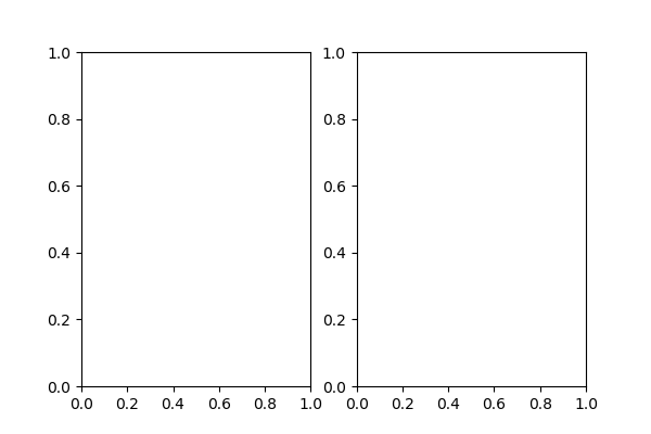
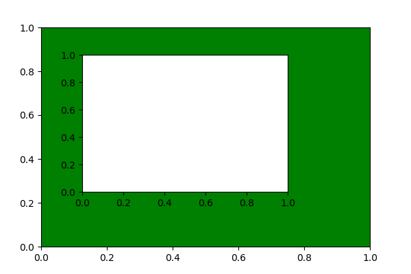
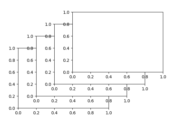
fig, subplot, axes示意
#Axes
# The axes command allows more manual placement of the plots in the figure.
fig = plt.figure(figsize= (6,4))
ax1 = fig.add_subplot(1,2,1)
ax2 = fig.add_subplot(1,2,2)
plt.show()

fig = plt.figure(figsize= (6,4))
fig.add_axes([0.1, 0.1, 0.8, 0.8],facecolor='g')
fig.add_axes([0.2, 0.3, 0.5, 0.5])
plt.show()

fig = plt.figure(figsize= (6,4))
fig.add_axes([0.1, 0.1, 0.5, 0.5])
fig.add_axes([0.2, 0.2, 0.5, 0.5])
fig.add_axes([0.3, 0.3, 0.5, 0.5])
fig.add_axes([0.4, 0.4, 0.5, 0.5])
plt.show()
C:\ProgramData\Anaconda3\lib\site-packages\matplotlib\pyplot.py:522: RuntimeWarning: More than 20 figures have been opened. Figures created through the pyplot interface (`matplotlib.pyplot.figure`) are retained until explicitly closed and may consume too much memory. (To control this warning, see the rcParam `figure.max_open_warning`).
  max_open_warning, RuntimeWarning)


<IPython.core.display.Javascript object>
<IPython.core.display.Javascript object>
<IPython.core.display.Javascript object>
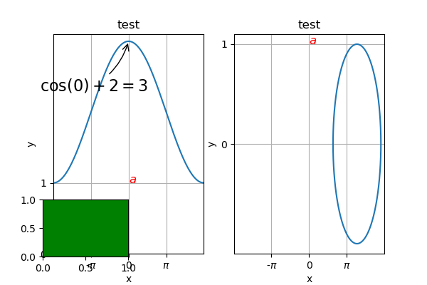
图基础设置示意图
# Numbers 0 - 256
X = np.linspace(-np.pi, np.pi, 256, endpoint=True)
# cosine(X), sin(X)
C, S = np.cos(X)+2, np.sin(X)

fig = plt.figure(figsize = (6,4))
ax1 = fig.add_subplot(1,2,1)
ax2 = fig.add_subplot(1,2,2)
axs = [ax1, ax2]

ax1.plot(X,C)
ax2.plot(C,S)

for ax in axs:
    print(ax)
    ax.set_title('test')
    ax.set_xlabel('x'); ax.set_ylabel('y')

    ax.set_xlim(np.min(X), np.max(X))
    #ax.set_ylim

    ax.set_yticks([0,1])
    ax.set_xticks([-np.pi/2, 0, np.pi/2])
    ax.set_xticklabels([r'-$\pi$',0, r'$\pi$' ])

    ax.grid(True)

    ax.annotate(r'$a$', xy = (0, 1),color="r",size=12)

ax1.annotate(r'$\cos(0) + 2 = 3$',
             xy=(0, 3), xycoords='data',
             xytext=(-90, -50), textcoords='offset points', fontsize=16,
             arrowprops=dict(arrowstyle="->", connectionstyle="arc3,rad=.2"))

fig.add_axes([0.1, 0.1, 0.2, 0.2],facecolor='g')

plt.show()
AxesSubplot(0.125,0.11;0.352273x0.77)
AxesSubplot(0.547727,0.11;0.352273x0.77)


C:\ProgramData\Anaconda3\lib\site-packages\matplotlib\pyplot.py:522: RuntimeWarning: More than 20 figures have been opened. Figures created through the pyplot interface (`matplotlib.pyplot.figure`) are retained until explicitly closed and may consume too much memory. (To control this warning, see the rcParam `figure.max_open_warning`).
  max_open_warning, RuntimeWarning)


<IPython.core.display.Javascript object>
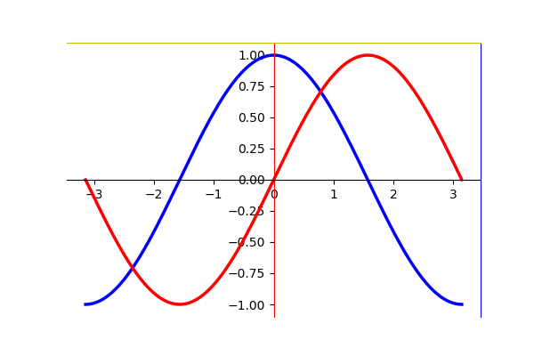
spines示意图
plt.figure(figsize = (6,4))
X = np.linspace(-np.pi, np.pi, 256, endpoint=True)
# cosine(X), sin(X)
C, S = np.cos(X), np.sin(X)
plt.plot(X, C, color="blue", linewidth=2.5)
plt.plot(X, S, color="red",  linewidth=2.5)

#Moving spines
#    Spines are the lines connecting the axis tick marks and noting the boundaries of the data area. They can be placed at arbitrary positions and until now, they were on the border of the axis. We'll change that since we want to have them in the middle. Since there are four of them (top/bottom/left/right), we'll discard the top and right by setting their visibility to False and we'll move the bottom and left ones to coordinate 0 in data space coordinates.
#    this is 2nd the axe preparation part
ax = plt.gca()   # to get the present axe
#ax.spines['right'].set_visible(False)
ax.spines['right'].set_color('b')
#ax.spines['top'].set_visible(False)
ax.spines['top'].set_color('y')

ax.xaxis.set_ticks_position('bottom')
ax.spines['bottom'].set_position(('data',0))
ax.spines['bottom'].set_visible(True)
#ax.spines['bottom'].set_color('g')

ax.yaxis.set_ticks_position('left')
ax.spines['left'].set_position(('data',0))
ax.spines['left'].set_visible(True)
ax.spines['left'].set_color('r')


plt.show()
<IPython.core.display.Javascript object>
编辑:庄桢

“交通科研Lab”:分享学习点滴,期待科研交流!

如果觉得还不错
点这里!???