一.平滑加载
<div class="loading-1"></div>
        *{
            box-sizing: border-box;
        }
        .loading-1{
            margin: 0 auto;
            width: 120px;
            height: 20px;
            background: linear-gradient(#000 0 0) 0/0% no-repeat #add;
            animation: load1 2s infinite linear;
        }
        @keyframes load1 {
            100%{background-size: 100%;}
        }

linear-gradient(#000 0 0) 你可以理解为 linear-gradient(#000 0 100%),如果还不熟悉,复制 linear-gradient(#000 0 50%, #f00 50% 0) ,替换原先的部分跑一下。觉得 linear-gradient(#000 0 0) 别扭的话,直接写 #000 即可。
0/0% 是 background-position: 0;/background-size: 0; 的简写。
二.按部加载
<div class="loading-2"></div>
 .loading-2 {
            width: 120px;
            height: 20px;
            border-radius: 20px;
            background:
                linear-gradient(orange 0 0) 0/0% no-repeat lightblue;
            animation: p2 2s infinite steps(10);
        }

  @keyframes p2 {
            100% {
                background-size: 110%
            }
   }

steps(10) 是 step(10, end) 的简写,指明刚开始没有,所以有第2点的处理
100% {background-size:110%} 添加多一个 step 的百分比,上面的 step 是 10,所以是100% + (1/10)*100% = 110%
三.条纹加载
.loading-3{
  width:120px;
  height:20px;
  border-radius: 20px;
  background:
   repeating-linear-gradient(135deg,#f03355 0 10px,#ffa516 0 20px) 0/0% no-repeat,
   repeating-linear-gradient(135deg,#ddd 0 10px,#eee 0 20px) 0/100%;
  animation:p3 2s infinite;
}
@keyframes p3 {
    100% {background-size:100%}
}
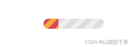
repeating-linear-gradient(135deg,#ddd 0 10px,#eee 0 20px) 0/100%; 画出灰色的斑马线条纹,repeating-linear-gradient(135deg,#f03355 0 10px,#ffa516 0 20px) 0/0% no-repeat 则是进度条加载的条纹。
四。虚线加载
.loading-4 {
            width: 120px;
            height: 20px;
            -webkit-mask: linear-gradient(90deg, #000 70%, #0000 0) 0/20%;
            background:
                linear-gradient(#000 0 0) 0/0% no-repeat #ddd;
            animation: p4 2s infinite steps(6);
        }

        @keyframes p4 {
            100% {
                background-size: 120%
            }
        }

-webkit-mask 默认有值 repeat,不然遮罩不会有五个。
五.电池加载
.loading-5 {
            margin: 50px auto;
            width: 80px;
            height: 40px;
            border: 2px solid #000;
            padding: 3px;
            background:
                repeating-linear-gradient(90deg, #000 0 10px, #0000 0 16px) 0/0% no-repeat content-box content-box;
            position: relative;
            animation: p5 2s infinite steps(6);
        }

        .loading-5::before {
            content: "";
            position: absolute;
            top: 50%;
            left: 100%;
            transform: translateY(-50%);
            width: 10px;
            height: 10px;
            border: 2px solid #000;
        }

        @keyframes p5 {
            100% {
                background-size: 120%
            }
        }

六。内嵌加赞
 .loading-6 {
            width: 120px;
            height: 22px;
            border-radius: 20px;
            color: #514b82;
            border: 2px solid;
            position: relative;
        }

        .loading-6::before {
            content: "";
            position: absolute;
            margin: 2px;
            inset: 0 100% 0 0;
            border-radius: inherit;
            background: #514b82;
            animation: p6 2s infinite;
        }

        @keyframes p6 {
            100% {
                inset: 0
            }
        }

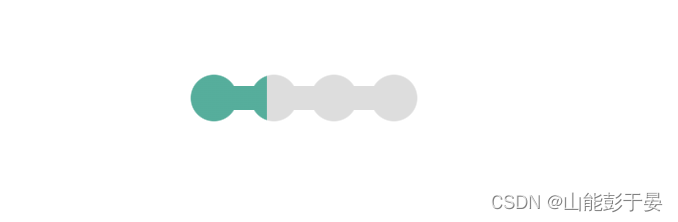
七。珠链加载
 .loading-7 {
            width: 120px;
            height: 24px;
            -webkit-mask:
                radial-gradient(circle closest-side, #000 94%, #0000) 0 0/25% 100%,
                linear-gradient(#000 0 0) center/calc(100% - 12px) calc(100% - 12px) no-repeat;
            background:
                linear-gradient(#25b09b 0 0) 0/0% no-repeat #ddd;
            animation: p7 2s infinite linear;
        }

        @keyframes p7 {
            100% {
                background-size: 100%
            }
        }
八。斑马线加载
.loading-8 {
            width: 60px;
            height: 60px;
            border-radius: 50%;
            -webkit-mask: linear-gradient(0deg, #000 55%, #0000 0) bottom/100% 18.18%;
            background:
                linear-gradient(#f03355 0 0) bottom/100% 0% no-repeat #ddd;
            animation: p8 2s infinite steps(7);
        }

        @keyframes p8 {
            100% {
                background-size: 100% 115%
            }
        }

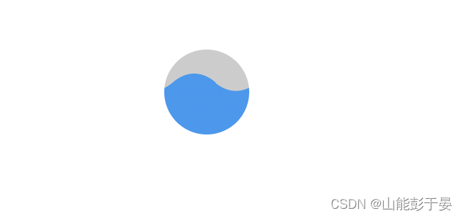
九。水柱加载
  .loading-9 {
            --r1: 154%;
            --r2: 68.5%;
            width: 60px;
            height: 60px;
            border-radius: 50%;
            background:
                radial-gradient(var(--r1) var(--r2) at top, #0000 79.5%, #269af2 80%) center left,
                radial-gradient(var(--r1) var(--r2) at bottom, #269af2 79.5%, #0000 80%) center center,
                radial-gradient(var(--r1) var(--r2) at top, #0000 79.5%, #269af2 80%) center right,
                #ccc;
            background-size: 50.5% 220%;
            background-position: -100% 0%, 0% 0%, 100% 0%;
            background-repeat: no-repeat;
            animation: p9 2s infinite linear;
        }

        @keyframes p9 {
            33% {
                background-position: 0% 33%, 100% 33%, 200% 33%
            }

            66% {
                background-position: -100% 66%, 0% 66%, 100% 66%
            }

            100% {
                background-position: 0% 100%, 100% 100%, 200% 100%
            }
        }
十。信号加载
.loading-10 {
            width: 120px;
            height: 60px;
            border-radius: 200px 200px 0 0;
            -webkit-mask: repeating-radial-gradient(farthest-side at bottom, #0000 0, #000 1px 12%, #0000 calc(12% + 1px) 20%);
            background:
                radial-gradient(farthest-side at bottom, #514b82 0 95%, #0000 0) bottom/0% 0% no-repeat #ddd;
            animation: p10 2s infinite steps(6);
        }

        @keyframes p10 {
            100% {
                background-size: 120% 120%
            }
        }

总结了十种,拿来即用,整体效果如下

本文内容由网友自发贡献,版权归原作者所有,本站不承担相应法律责任。如您发现有涉嫌抄袭侵权的内容,请联系:hwhale#tublm.com(使用前将#替换为@)