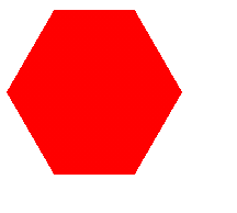
1.行内样式
<div style="background: linear-gradient(120deg,
transparent 30px,red 0) top left ,
 linear-gradient(-120deg,transparent 30px,red 0) top right,
 linear-gradient(-60deg,transparent 30px,red 0) bottom right ,
 linear-gradient(60deg,transparent 30px,red 0)  bottom left ;
 background-size:50% 50%;background-repeat: no-repeat;
 width:128px;height:120px;"></div>
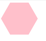
2.嵌入式
<div style="display: inline-block;">
        <div style="width: 125px; height: 108px; overflow: hidden; transform: rotate(60deg); display: inline-block;">
            <div style="width: 125px; height: 108px; overflow: hidden; transform: rotate(60deg); display: inline-block;">
                <div style=" width: 125px; height: 108px; background: pink; transform: rotate(-120deg); overflow: hidden; display: inline-block;"></div>
            </div>
            <a href="" style="text-decoration: none;"></a>
        </div>
 </div>