x轴刻度的隐藏显示:
xAxis: {
axisTick: {
show: true/false
},
x轴的显示隐藏:
xAxis: {
axisLine: {
show: true/false
},
},
y轴去掉0刻度线:
yAxis:
{
// min: 0,
scale: true,
axisLine: {
show: false,
},
},
(注意去掉min:0 ,数据比较小的时候0刻度不能去掉)
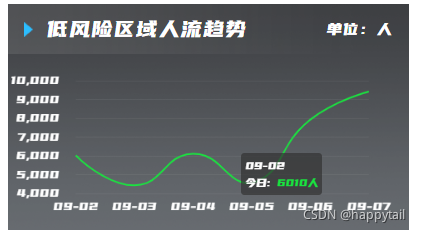
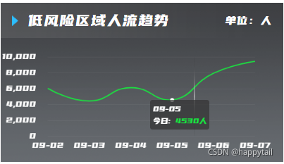
tooltip中使用fomatter(格式化 自定义):
formatter: (params) => {
consol.log(params);
const html =
`${params[0].axisValue}<br/>` +
`${params[0].seriesName}: <span style="color: #2cbeff">${Number(params[0].value).toFixed(0)}人</span>`;
return html;
},
光滑折线,去掉拐点,鼠标hover显示效果:
series: {
// symbol: "none",//没有小球和hover效果
type: 'line',
smooth: true, //是否平滑
showSymbol: false,
tooltip: {
show: true
},
},
series.showSymbol
说明:显示数据点。
默认值:true。
参数类型:boolean。
可选值:
(1)true,显示所有数据点。
(2)false,隐藏所有数据点,只有在 tooltip hover 的时候显示。
tooltip:提示框组件,用于配置鼠标滑过或点击图表时的显示框。
修改legend的样式等:
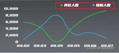
默认是从与legend同级的color数组获取颜色,但是需要设置legend里面的data与series里面的name相同,并且去掉series.itemStyle.color
color: [lineColor, "#2CBEFF"],
legend: {
type: "plain",
icon: "diamond",
data: [{ name: "岗位人数" }, { name: "核酸人数" }],
},
series: [
{
// symbol: "none",
name: "岗位人数",
type: "line",
color: lineColor,
smooth: true, //是否平滑
itemStyle: {
// color: "#ffffff",
borderColor: "rgb(0,115,100)",
},
},
{
// symbol: "none",
name: "核酸人数",
type: "line",
color: #2CBEFF,
smooth: true, //是否平滑
itemStyle: {
// color: "#ffffff",
borderColor: "rgb(0,115,100)",
},
},
(series中的series.color可以不用设置)