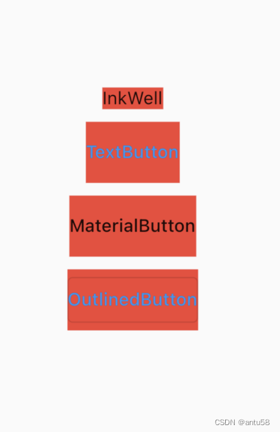
作为一个常用到不能再常用的组件,material库中的button组件都有一点奇怪——存在无法设置的内外边距,我们做一个简单的展示,选几个常见button,统一使用Text做child,外加一个带红色的Container组件,观察margin和padding.
你会发现,除了InkWell,即使padding设置为0,仍然无法消除消除上下padding,这其实不是padding属性没有生效,而是这些按钮有默认大小的约束。这点可以通过源码和不设置child的UI来佐证。
MaterialButton设置它的高度属性,看源码的使用,是修改高度约束,但是小到一定程度还是无法修改,是因为有别的地方进一步作出了限制,这就是我觉得奇怪的一些地方。这会给使用者带来不便,所以我设计基础组件的基本原则之一就是不要去干涉外界的使用,比如我做了一个Card组件,我就不会给它一个默认margin。
MaterialButton(
  onPressed: () {

  },
  // child: Text("MaterialButton"),
  padding: EdgeInsets.all(0),
  height: 10,
)
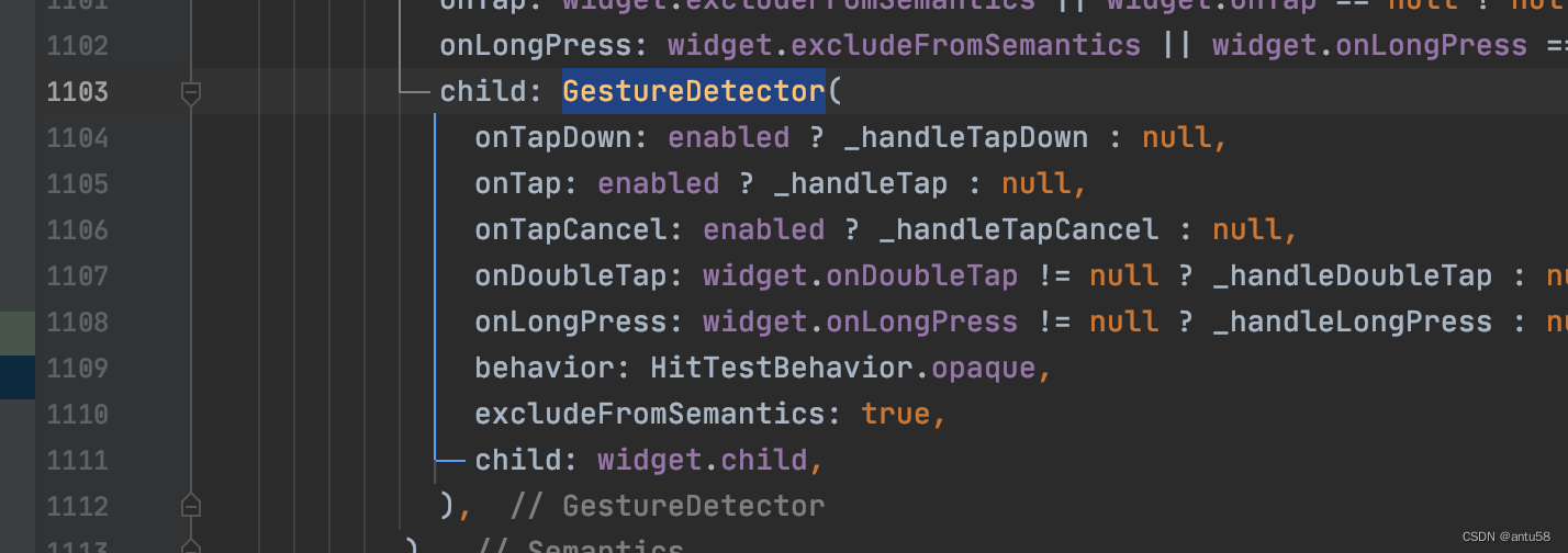
其实上面所有的button都是对Inkwell的进一步封装,它包含点击特效(水波纹),以及各种手势识别,而它的本质也是在GestureDetector的基础上加了一个动画层,所以如果不需要动画效果,你大可以直接使用GestureDetector。进阶一点的做法就是基于这两者来创建你自己的Button。
InkWell的build部分源码(ink_well.dart)
这时你可能会觉得直接使用InkWell不就好了,假如你把它放在一个container里面,并且container具有背景色,你会发现水波纹效果消失了,你需要再套上一个Material组件,水波纹才会出现,这时你又回发现,这个组件自己具有形状背景色,你还得去消除,是不是很蛋疼。所以最终我是自己做了一个带有点击效果的Button组件,默认支持按钮禁用,背景色,大小,圆角等常用属性设置,供大家参考
import 'package:flutter/material.dart';

class UIButton extends StatefulWidget {

  final Widget? child;

  final bool disabled;

  final double? width;
  final double? height;

  final EdgeInsetsGeometry? padding;

  final Color? backgroundColor;
  final Color? disabledColor;
  final BorderRadiusGeometry? borderRadius;
  //大部分时间只需要统一四角圆角, 和borderRadius二选一
  final double? allRadius;

  final GestureTapCallback? onTap;
  final GestureTapCallback? onDoubleTap;
  final GestureLongPressCallback? onLongPress;
  final GestureTapCancelCallback? onTapCancel;

  final Clip? clipBehavior;

  UIButton({
    Key? key,
    this.child,
    this.disabled = false,
    this.width,
    this.height,
    this.padding,
    this.borderRadius,
    this.allRadius,
    this.backgroundColor,
    this.disabledColor,
    this.onTap,
    this.onDoubleTap,
    this.onLongPress,
    this.onTapCancel,
    this.clipBehavior
  }) : assert(allRadius == null || borderRadius == null), super(key: key);

  @override
  State<StatefulWidget> createState() => _UIButton();

}

class _UIButton extends State<UIButton> {

  bool _isTap = false;

  @override
  Widget build(BuildContext context) {
    BorderRadiusGeometry radiusGeometry = widget.borderRadius ?? BorderRadius.all(Radius.circular(widget.allRadius ?? 0));

    return GestureDetector(
      child: Container(
        child: Center(child: widget.child,),
        width: widget.width,
        height: widget.height,
        clipBehavior: widget.clipBehavior ?? Clip.none,
        foregroundDecoration: _isTap || widget.disabled ? BoxDecoration(
          color: widget.disabledColor ?? Color(0x85ffffff),
          borderRadius: radiusGeometry
        ) : null,
        decoration: BoxDecoration(
          borderRadius: radiusGeometry,
          color: widget.backgroundColor
        ),
        padding: widget.padding,
      ),
      onTap: widget.disabled ? null : widget.onTap,
      onDoubleTap: widget.disabled ? null : widget.onDoubleTap,
      onLongPress: widget.disabled ? null : widget.onLongPress,
      onTapUp: (TapUpDetails details) {
        refreshTapState(false);
      },
      onLongPressEnd: (LongPressEndDetails details) {
        refreshTapState(false);
      },
      onTapDown: (TapDownDetails details) {
        refreshTapState(true);
      },
      onTapCancel: () {
        //TODO:会导致长按时自动移除前景色
        refreshTapState(false);
        if (widget.onTapCancel != null) widget.onTapCancel!();
      },
    );
  }

  void refreshTapState(bool state) {
    setState(() {
      _isTap = state;
    });
  }
}
测试的代码
Column(children: [
SizedBox(width: double.infinity,),
addSpacer(),
InkWell(child: Text("InkWell"), onTap: () {
},).addRedBackground(),
addSpacer(),
TextButton(
onPressed: () {},
child: Text("TextButton"),
style: ButtonStyle(
padding: MaterialStateProperty.all(EdgeInsets.zero)
),
).addRedBackground(),
addSpacer(),
MaterialButton(
onPressed: () {
},
child: Text("MaterialButton"),
padding: EdgeInsets.all(0),
).addRedBackground(),
addSpacer(),
OutlinedButton(
onPressed: () {},
child: Text("OutlinedButton"),
style: ButtonStyle(
padding: MaterialStateProperty.all(EdgeInsets.zero),
),
).addRedBackground(),
],
mainAxisAlignment: MainAxisAlignment.center,
crossAxisAlignment: CrossAxisAlignment.center,
),
//空button
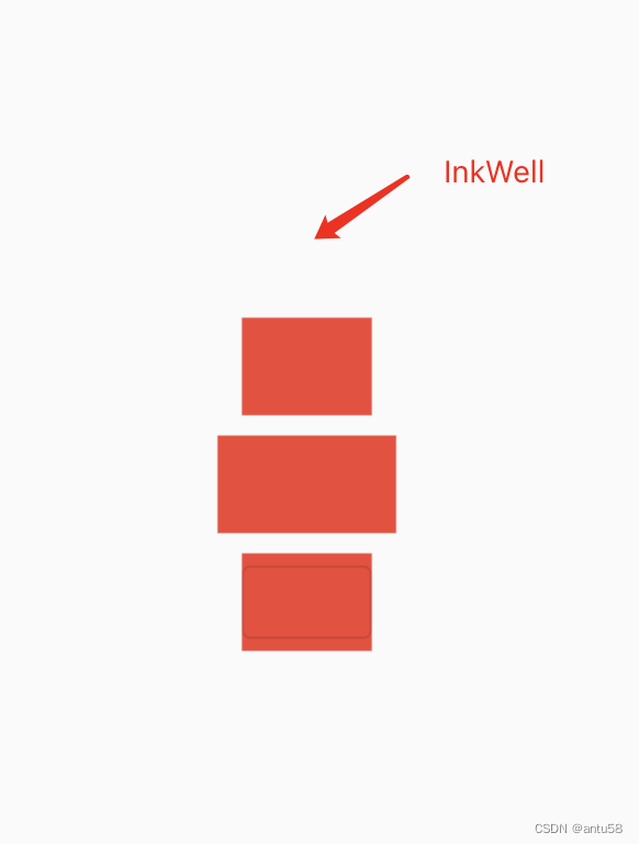
Column(children: [
SizedBox(width: double.infinity,),
addSpacer(),
InkWell(child: Text(""), onTap: () {
},).addRedBackground(),
addSpacer(),
TextButton(
onPressed: () {},
child: Text(""),
style: ButtonStyle(
padding: MaterialStateProperty.all(EdgeInsets.zero)
),
).addRedBackground(),
addSpacer(),
MaterialButton(
onPressed: () {
},
// child: Text("MaterialButton"),
padding: EdgeInsets.all(0),
).addRedBackground(),
addSpacer(),
OutlinedButton(
onPressed: () {},
child: Text(""),
style: ButtonStyle(
padding: MaterialStateProperty.all(EdgeInsets.zero),
),
).addRedBackground(),
],
mainAxisAlignment: MainAxisAlignment.center,
crossAxisAlignment: CrossAxisAlignment.center,
)