本文仅供参考:
首先你要掌握的基础知识:
row 行概念
<el-row></el-row>
col 列概念
<el-col></el-col>
col组件的:span属性的布局调整,一共分为24栏:
代码示例:
<el-row>
  <el-col :span="24"><div class="grid-content"></div></el-col>
</el-row>
效果展示:

代码示例:
<el-row>
  <el-col :span="12"><div class="grid-content"></div></el-col>
</el-row>
效果展示:

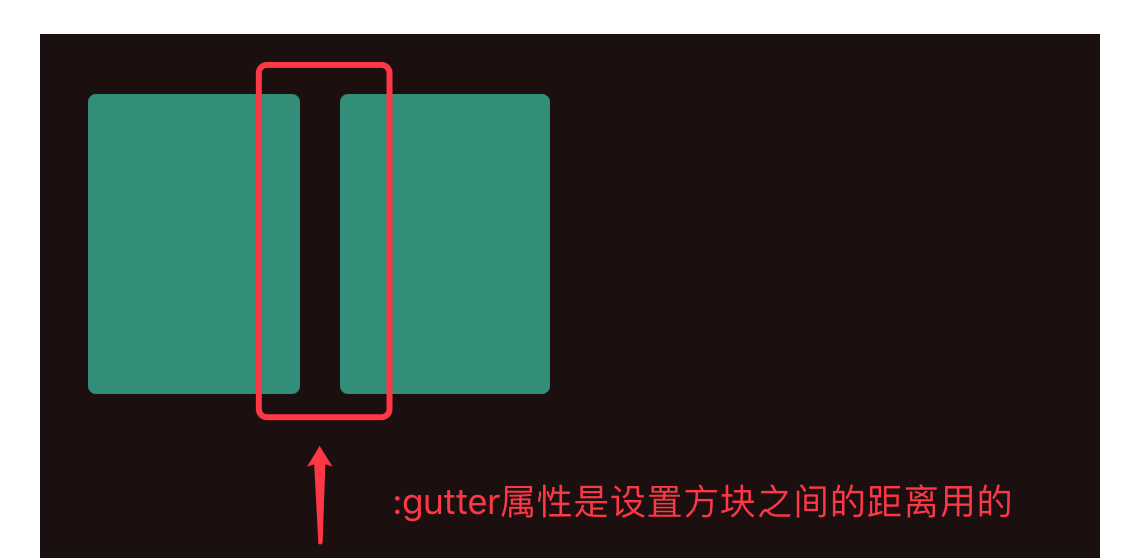
row组件的:gutter属性来调整布局之间的宽度---分栏间隔
代码示例:
<el-row :gutter="20">
  <el-col :span="6"><div class="grid-content bg-purple"></div></el-col>
  <el-col :span="6"><div class="grid-content bg-purple"></div></el-col>
</el-row>
效果:
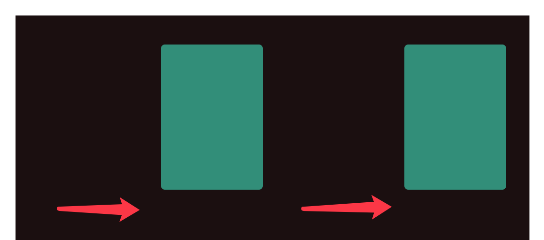
Col组件的:offset属性调整方块的偏移位置(每次1格/24格)
<el-row :gutter="20">
  <el-col :span="6" :offset="6"><div class="grid-content"></div></el-col>
  <el-col :span="6" :offset="6"><div class="grid-content"></div></el-col>
</el-row>
效果:
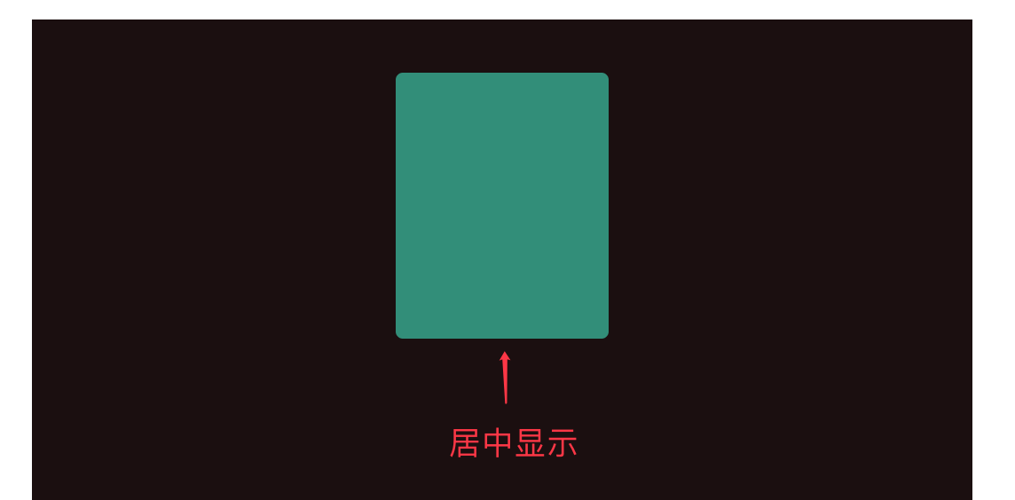
对齐方式:
row组件的type="flex"启动flex布局,再通过row组件的justify属性调整排版方式,属性值分别有:
- justify=center 居中对齐
- justify=start 左对齐
- justify=end 右对齐
- justify=space-between 空格间距在中间对齐
- justify=space-around 左右各占半格空格对齐
 <el-row type="flex" class="row-bg" justify="center">
   <el-col :span="6"><div class="grid-content"></div></el-col>
 </el-row>
效果:
响应式布局:
参考bootstrap的响应式,预设四个尺寸
- xs <768px
- sm ≥768px
- md ≥992
- lg ≥120
使用方式:
<el-row :gutter="10">
  <el-col :xs="8" :sm="6" :md="4" :lg="3"><div class="grid-content bg-purple"></div></el-col>
  <el-col :xs="4" :sm="6" :md="8" :lg="9"><div class="grid-content bg-purple-light"></div></el-col>
  <el-col :xs="4" :sm="6" :md="8" :lg="9"><div class="grid-content bg-purple"></div></el-col>
  <el-col :xs="8" :sm="6" :md="4" :lg="3"><div class="grid-content bg-purple-light"></div></el-col>
</el-row>
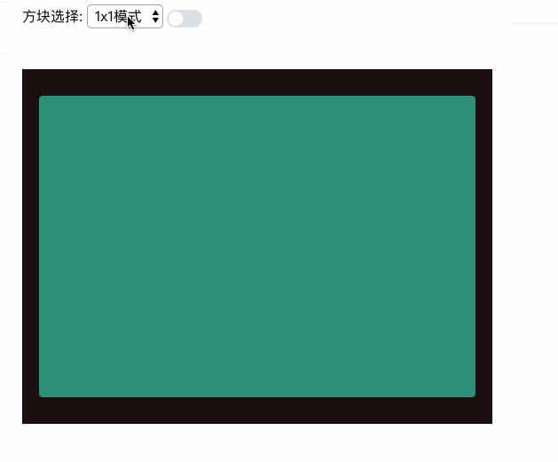
练习示例:
        <span class="field-label">方块选择:</span>
        <!-- 选择屏幕框 -->
          <select v-model="selected" @change="selectbj(selected)">
            <option v-for="option in layouts" :value="option.value">
                {{ option.name }}
            </option>
          </select>
data默认初始化数据:
      selected: 0,
      layouts: [
        { 'name': '1x1模式', 'value': '0' },
        { 'name': '2x1模式', 'value': '1' },
        { 'name': '2x2模式', 'value': '2' },
        { 'name': '3x2模式', 'value': '3' },
        { 'name': '3x3模式', 'value': '4' },
        { 'name': '1+5模式', 'value': '5' }
      ],
布局代码:
    <el-main v-model="selected" >
      <div class="block" style="height:400px">
            <!-- {{selected}} -->
            <div style="height:100%;width:100%" v-if="selected==0">
            <!-- 1*1布局 -->
                <el-row :gutter="10" type="flex" class="grid-one-contentheight" justify="center">
                  <el-col :span="24"></el-col>
                </el-row>
            </div>
            <!-- 2*1布局 -->
            <div style="height:100%;width:100%" v-else-if="selected==1">
                <el-row :gutter="10" type="flex" class="row-bg el-row-two" justify="space-between">
                  <el-col :span="12"><div class="grid-content "></div></el-col>
                  <el-col :span="12"><div class="grid-content "></div></el-col>
                </el-row>
            </div>
            <!-- 2*2 -->
            <div style="height:100%;width:100%" v-else-if="selected==2">
              <el-row :gutter="10" type="flex" class="row-bg" justify="center">
                  <el-col :span="12"><div class="grid-content "></div></el-col>
                  <el-col :span="12"><div class="grid-content "></div></el-col>
                </el-row>
                <br>
                <el-row :gutter="10" type="flex" class="row-bg" justify="center">
                  <el-col :span="12"><div class="grid-content "></div></el-col>
                  <el-col :span="12"><div class="grid-content "></div></el-col>
                </el-row>
            </div>
            <!-- 3*2布局 -->
            <div style="height:100%;width:100%" v-else-if="selected==3">
              <el-row :gutter="10" type="flex" class="row-bg" justify="center">
                  <el-col :span="12"><div class="grid-content "></div></el-col>
                  <el-col :span="12"><div class="grid-content "></div></el-col>
                  <el-col :span="12"><div class="grid-content "></div></el-col>
                </el-row>
                <br>
                <el-row :gutter="10" type="flex" class="row-bg" justify="center">
                  <el-col :span="12"><div class="grid-content "></div></el-col>
                  <el-col :span="12"><div class="grid-content "></div></el-col>
                  <el-col :span="12"><div class="grid-content "></div></el-col>
                </el-row>
            </div>
            <!-- 3*3模式 -->
            <div style="height:100%;width:100%" v-else-if="selected==4">
                <el-row :gutter="10" type="flex" class="row-bg" justify="center">
                  <el-col :span="8"><div class="grid-a-contentWidth"></div></el-col>
                  <el-col :span="8"><div class="grid-a-contentWidth"></div></el-col>
                  <el-col :span="8"><div class="grid-a-contentWidth"></div></el-col>
                </el-row>
                <br>
                <el-row :gutter="10" type="flex" class="row-bg" justify="center">
                  <el-col :span="8"><div class="grid-a-contentWidth"></div></el-col>
                  <el-col :span="8"><div class="grid-a-contentWidth"></div></el-col>
                  <el-col :span="8"><div class="grid-a-contentWidth"></div></el-col>
                </el-row>
            </div>
            <!-- 模式 -->
            <div style="height:100%;width:100%" v-else>
               <el-row :gutter="10" type="flex" class="row-bg" justify="start">
                  <el-col :span="8"><div class="grid-a-contentWidth"></div></el-col>
                  <el-col :span="8"><div class="grid-a-contentWidth"></div></el-col>
                  <el-col :span="8"><div class="grid-a-contentWidth"></div></el-col>
                </el-row>
                <br>
                <el-row :gutter="10" type="flex" class="row-bg" justify="start">
                    <el-col :span="8">
                      <div class="grid-a-contentWidth"></div>
                      <br>
                      <div class="grid-a-contentWidth"></div>
                      </el-col>
                    <el-col :span="16"><div class="grid-a-content-a-Width" ></div></el-col>
                </el-row>
            </div>
          </div>
    </el-main>
样式(从里面对应取一下):
<style scoped>
  .box-card{
    width: 400px;
    margin: 20px auto;
  }
  .block{
    padding: 30px 24px;
    background-color: rgb(27, 16, 16);
  }
  .alert-item{
    margin-bottom: 10px;
  }
  .tag-item{
    margin-right: 15px;
  }
  .link-title{
    margin-left:35px;
  }
  .components-container {
		position: relative;
		height: 100vh;
	}

	.left-container {
		background-color: #F38181;
		height: 100%;
	}

	.right-container {
		background-color: #FCE38A;
		height: 200px;
	}

	.top-container {
		background-color: #FCE38A;
		width: 100%;
		height: 100%;
	}

	.bottom-container {
		width: 100%;
		background-color: #95E1D3;
		height: 100%;
	}

  .left-container-twoOne {
		background-color: rgb(110, 75, 75);
    height: 100%;
  }

  .container-onetoOne {
      background-color: rgb(47, 80, 74);
      height: 100%;
      width: 50%;
  }

  .container-onetoTwo {
      background-color: rgb(61, 19, 56);
      height: 100%;
      width: 50%;
  }

  .el-col {
    border-radius: 4px;
  }
  .bg-purple-dark {
    background: #57926b;
  }
  .bg-purple {
    background: #7e2970;
  }
  .bg-purple-light {
    background: #071c4d;
  }
  .grid-content {
    background-color: rgb(44, 143, 121);
    border-radius: 4px;
    min-height: 150px;
    min-width: 100px;
  }
  .grid-contentB {
    background-color: rgb(64, 56, 134);
    border-radius: 4px;
    min-height: 150px;
    min-width: 100px;
  }
  .grid-a-contentWidth {
    background-color: rgb(44, 143, 121);
    border-radius: 4px;
    min-height: 100px;
  }
  .grid-a-content-a-Width {
    background-color: rgb(44, 143, 121);
    border-radius: 4px;
    min-height: 220px;
  }

  .grid-one-contentheight {
    background-color: rgb(44, 143, 121);
    border-radius: 4px;
    min-height: 100%;
  }

.el-row-two {
    margin-bottom: 80px;
    margin-top: 80px;

  }
</style>
效果: