1.散点图:基于ggplot内置数据mtcars,以mpg列为横坐标,以wt列为纵坐标,以cyl列分组控制颜色,绘制散点图,点的形状为三角形,大小为150,图的标题为“MPG VS WT”。
from ggplot import *

data = ggplot(mtcars,aes(x='mpg',y='wt',color='factor(cyl)'))

geom =geom_point(size=150,shape='^')

title = ggtitle('MPG VS WT')

print (data+ geom +title)

2.统计平滑线:基于ggplot内置数据meat,以date作为横轴,以beef作为纵轴,绘制散点图和线性回归的平滑线,x轴的刻度格式化为“年-月-日“。
from ggplot import *

print(meat.head())

p = ggplot(meat, aes(x="date", y="beef")) \

    + geom_point() \

    + stat_smooth(method="lm", linetype="dashed", size=3, color="red", alpha=.7) \

    + scale_x_date(labels="%Y-%m") \

    + labs("x", "y", "title")

print(p)


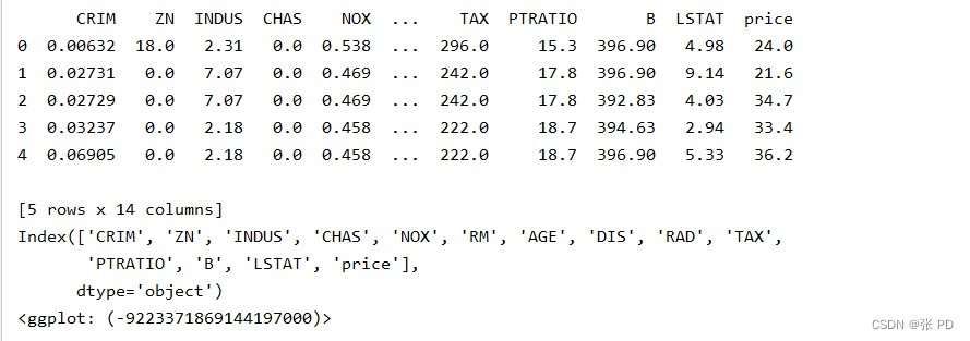
3.使用sklearn中的波士顿房价数据集,绘制散点图分析一氧化氮浓度NOX与房价的关联性,周边高速公路便利性RAD与房价的关联性,图中需加入回归线,给出你的分析结论。
p = ggplot(df, aes(x="NOX", y="price")) \

    + geom_point(size=100, color="red", shape="^") \

    + stat_smooth(method="lm", linetype="dashed", size=3, color="red", alpha=.7) \

    + theme(axis_title_x=element_text("一氧化碳浓度", size=20, color="r"),

            axis_title_y=element_text("房价", size=20, color="b"), title=element_text("关联性分析", color="black", size=40))

分析结论:一氧化碳浓度与房价呈负相关关系,随一氧化碳浓度的升高房价逐渐降低。
p = ggplot(df, aes(x="RAD", y="price")) \

    + geom_point(size=100, color="red", shape="^") \

    + stat_smooth(method="lm", linetype="dashed", size=3, color="red", alpha=.7) \

    + theme(axis_title_x=element_text("周边高速公路便利性", size=20, color="r"),

            axis_title_y=element_text("房价", size=20, color="b"), title=element_text("关联性分析", color="black", size=40))

结论:在便利性低的地方房屋居住多,房价贵,随着便利性的逐渐增强,居于一般便利性的地方房屋居住少,便利性更高的地方房屋居住率开始恢复。但是便利性与房价仍然是负相关的关系。