一、表单
1、输入框(input)样式
input{
width:100%
}
2、选择器:
input[type=text] -选取文本输入框
input[type=password] -选择密码的输入框
input[type=number] -选择数字的输入框
3、输入框(input)边框样式设置
border属性可以修改input边框的大小或颜色
border-radius属性可以给input添加圆角
input[type=text] {
border:2px solid red;
border-radius:4px;
}
4、输入框底部边框的设置
使用border-bottom属性设置底边框样式
input[type=text]{
border:none;
border-bottom:2px solid red;
}
5、输入框的背景颜色和字体颜色
使用background-color属性来设置输入框的背景颜色
使用color属性修改文本颜色
input[type=text] {
background-color:white;
color:black;
}
6、输入框聚焦效果
游览器在输入框获取焦点时(点击输入框)会有一个默认的蓝色轮廓。
我们可以设置outline:none来忽略默认效果。
使用:focus选择器可以设置输入框在获取焦点时的样式。
input[type=text]:focus {
background-color:lightblue;
border:3px solid red;
}
7、文本框(textarea)样式
使用resize属性来禁用文本框可以重置大小的功能
textarea{
width:100%;
height:150px;
padding:12px 20px;
border:2px solid #ccc;
border-radius:4px;
resize:none;
}
8、按钮样式设置
input[type=button],input[type=submit],input[type=reset]{
background-color:#666;
border:none;
color:white;
padding:16px 32px;
text-decoration:none;
margin:4px 2px;
cursor:pointer;
}
具体的实现内容如下:

代码如下:
<!DOCTYPE html>
<html>
	<head>
		<title>小莫初学</title>
		<meta charset="UTF-8">
		<link rel="stylesheet" type="text/css" href="实验.css">
	</head>
	<body>
		<form>
			<input type="text">
			<textarea></textarea>
			<select>               <!--创建单选或多选菜单-->
				<option>1</option> <!--定义列表中的可用选项-->
				<option>2</option>
				<option>3</option>
				<option>4</option>
			</select>
			<input type="button" value="按钮">
			<input type="submit" value="提交">
			<input type="reset" value="重置">
		</form>
	</body>
</html>
input[type=text]{
	width:50%;
	padding:12px 12px;
	margin:5px 10px;
	box-sizing:border-box;                /*修改border和padding数值的盒子的大小不变,防止出现溢出情况*/
	border:3px solid red;
	border-radius:10px;                   /*设置圆角属性*/
	border:none;                          /*去除边框*/
	border-bottom:2px solid red;          /*单独设置底部的边框*/
	border-radius:0;                      /*设置圆角属性为零*/
	background-color:#f1f1f1;
	color:green;
	outline:none;                          /*去除原来未设置的上、左、右默认的黑色边框*/

}
input[type=text]:focus{
	background-color:yellow;
	border:5px solid blue;
}
textarea{
	width:50%;
	margin:0 10px;
	height:150px;
	padding:12px 12px;
	border:2px solid #ccc;
	resize:none;                          /*设置文本框不能随便更改大小*/
}
select{
	width:50%;
	padding:16px 20px;
	border:none;
	border-radius:5px;                     /*设置圆角属性*/
	background-color:#f1f1f1;

}
input[type=button],input[type=reset],input[type=submit]{
	background-color:green;
	color:#fff;
	border:none;
	padding:16px 32px;
	text-decoration:none;
	margin:5px 2px;
	cursor:pointer;
}
二、响应式表单
效果如下:

代码如下:
<!DOCTYPE html>
<html>
	<head>
		<meta charset="UTF-8">
		<title>小莫初学</title>
		<style>
		*{
			box-sizing:border-box;    <!--获取最大尺寸-->
		}
		input[type=text],select,textarea{
			width:100%;
			padding:12px;
			border:1px solid #ccc;
			border-radius:4px;         /*设置圆角属性*/
			resize:none;			/*设置文本框大小不能随便更改*/
		}
		label{
			padding:12px 12px 12px 0;
			display:inline-block;   /*呈递为内联对象,但是对象的内容作为块传递*/
		}
		input[type=submit]{
			background-color:#666;
			color:white;
			padding:12px 20px;
			border:none;
			border-radius:4px;
			cursor:pointer;       /*把鼠标光标变成一只手*/
			float:right;
		}
		input[type=submit]:hover{
			background-color:#333;
		}
		.container{
			border-radius:5px;
			background-color:#f2f2f2;
			padding:20px;
		}
		.col-25{
			float:left;
			width:25%;
			margin-top:6px;
		}
		.col-75{
			float:left;
			width:75%;
			margin-top:6px;
		}
		.row:after{
			content:"";
			display:table;/*此元素会作为块级表格来显示(类似<table>),表格前后带有换行符*/
			clear:both;   /*清除浮动*/
		}
		/*响应式布局layout-在屏幕宽度小于600px时,设置为上下堆叠元素*/
		@media screen and (max-width:600px){
			.col-25,.col-75,input[type=submit]{
				width:100%;
				margin-top:0;
			}
		}
		</style>
	</head>
	<body>
		<h2>响应式表单</h2>
		<p>响应式表单可以根据游览器窗口的大小重新布局各个元素,我们可以通过重置游览器窗口大小
		来查看效果:</p>
		<div class="container">
			<form action="">
			<div class="row">
				<div class="col-25">
					<label>姓名</label>
			</div>
			<div class="col-75">
				<input type="text">
			</div>
		</div>
		<div class="row">
			<div class="col-25">
				<label>年龄</label>
			</div>
			<div class="col-75">
				<input type="text">
			</div>
		</div>
		<div class="row">
			<div class="col-25">
				<label>爱好</label>
			</div>
			<div class="col-75">
				<select>
					<option>请选择</option>
					<option>1</option>
					<option>2</option>
					<option>3</option>
				</select>
			</div>
		</div>
		<div class="row">
			<div class="col-25">
				<label>其它的个人信息</label>
		</div>
		<div class="col-75">
			<textarea style="height:200px"></textarea>
		</div>
		</div>
		<div class="row">
			<input type="submit">
		</div>
		</form>
		</div>
	</body>
</html>
三、布局
1、网页布局一般分为以下几个部分:
头部布局、菜单导航栏区域、内容区域、底部区域
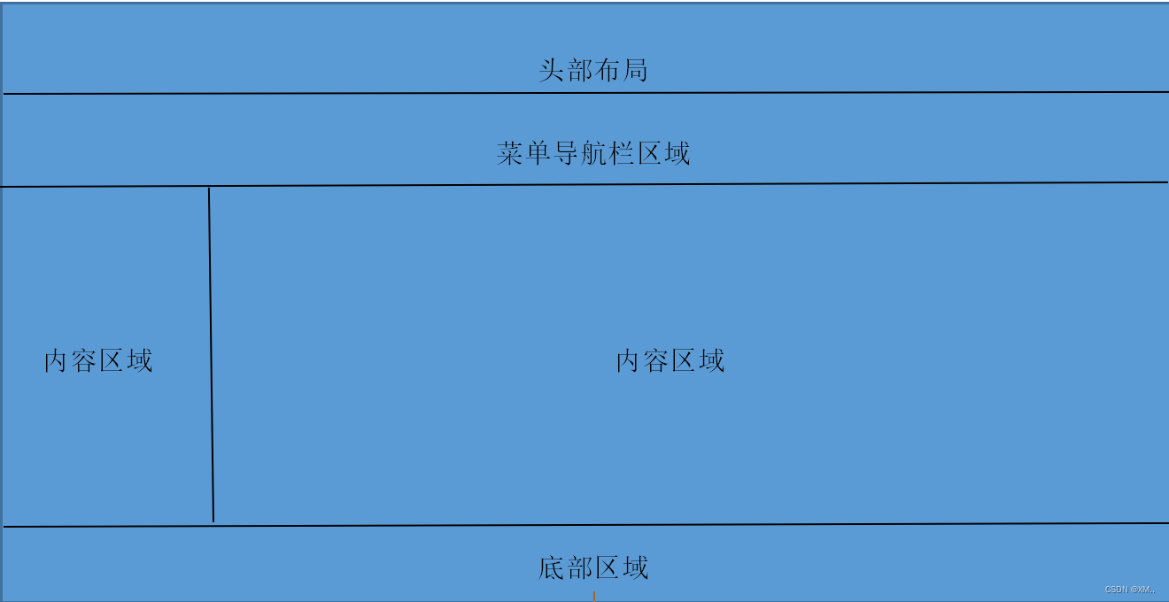
2、头部区域
位于整个网页的顶部,一般用于设置网页的标题或者网页的logo。
.header{
background-color:#f1f1f1;
text-align:center;
padding:20px;
}
3、菜单导航栏区域
菜单导航条包含了一些链接,可以引导用户游览其它页面
.topnav{
overflow:hidden; /*隐藏溢出的内容*/
background-color:red;
}
导航链接
.topnav a{
float:left;
display:block; /*变为区块元素*/
color:#f2f2f2;
}
鼠标移动到链接颜色发生改变
.topnav a:hover{
background-color:#ddd;
color:black;
}
4、内容区域
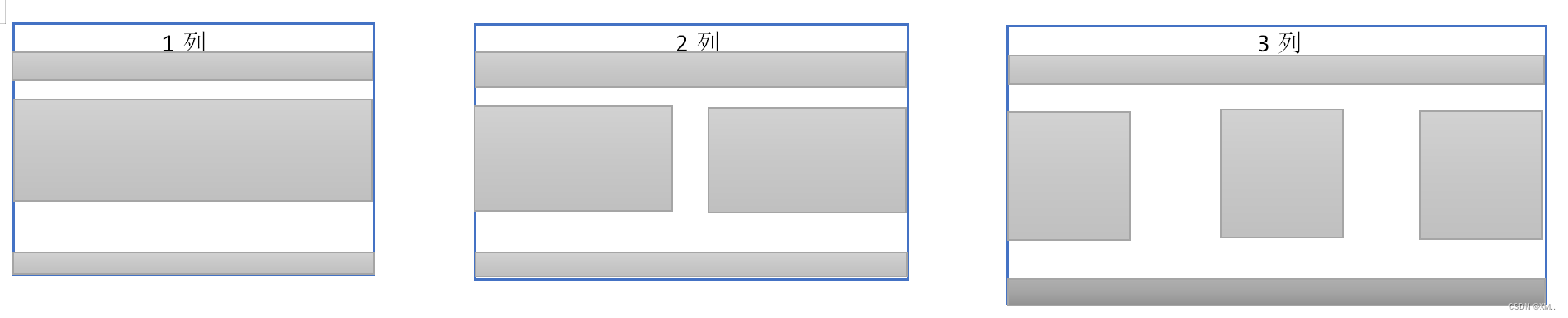
内容区域一般有三种形式:1列:一般用于移动端;2列:一般用于平板设备;3列:一般用于PC桌面设备。
四、响应式布局
1、创建三个相等的列
.column{
float:left;
width:33.33%;
}
2、列后清除浮动
.row:after{
content:"";
display:table;
clear:both; /*清除浮动*/
}
3、响应式布局-小于600px时改为上下布局
@media screen and (max-width:600px) {
.column{
width:100%
}
}
实现效果如下:
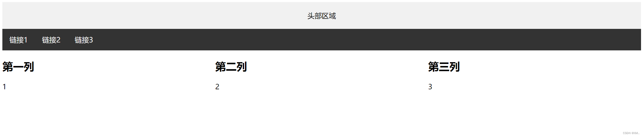
代码如下:
<!DOCTYPE html>
<html>
	<head>
		<title> 13CSS响应式表单与布局-3 </title>
		<style>
			.header {
				background-color: #F1F1F1;
				text-align: center;
				padding: 20px;
			}
			.topnav {
				overflow: hidden;               /*隐藏元素并且还会占用空间*/
				background-color: #333;
			}
			/* 导航链接 */
			.topnav a {
				float: left;
				display: block;               /*变成区块元素*/
				color: #f2f2f2;
				text-align: center;
				padding: 14px 16px;
				text-decoration: none;       /*去除链接下划线*/
			}
			/* 链接 - 修改颜色 */
			.topnav a:hover {
				background-color: #ddd;
				color: black;
			}
			/* 创建三个相等的列 */
			.column {
				float: left;
				width: 33.33%;
			}
			/* 列后清除浮动 */
			.row:after {
				content: "";
				display: table;
				clear: both;
			}
			/* 响应式布局 - 小于 600 px 时改为上下布局 */
			@media screen and (max-width: 600px) {
				.column {
				width: 100%;
				}
			}
		</style>
	</head>
	<body>
		<div class="header">头部区域</div>
		<div class="topnav">
			<a href="#">链接1</a>
			<a href="#">链接2</a>
			<a href="#">链接3</a>
		</div>
		<div class="column">
			<h2>第一列</h2>
			<p>1</p>
		</div>
		<div class="column">
			<h2>第二列</h2>
			<p>2</p>
		</div>
		<div class="column">
			<h2>第三列</h2>
			<p>3</p>
		</div>
	</body>
</html>
本文内容由网友自发贡献,版权归原作者所有,本站不承担相应法律责任。如您发现有涉嫌抄袭侵权的内容,请联系:hwhale#tublm.com(使用前将#替换为@)