一、将代码放到文本中,(直接复制粘贴就行)
<!DOCTYPE html>
<html lang="en">
<head>
<meta charset="UTF-8">
<title>过时书生</title>
<style>
html, body {
height: 100%;
}
body {
margin: 0;
padding: 0;
background: #ffa5a5;
/*
定义body 渐变,向页面。
*/
/*background: linear-gradient(to bottom, #ffa5a5 0%,#ffd3d3 100%);*/
}
.chest {
width: 500px;
height: 500px;
margin: 0 auto;
position: relative;
}
.heart {
position: absolute;
z-index: 2;
background: linear-gradient(-90deg, #F50A45 0%, #d5093c 40%);
animation: beat 0.7s ease 0s infinite normal;
}
.heart.center {
background: linear-gradient(-45deg, #B80734 0%, #d5093c 40%);
}
.heart.top {
z-index: 3;
}
.side {
top: 100px;
width: 220px;
height: 220px;
border-radius: 110px;
}
.center {
width: 210px;
height: 210px;
bottom: 100px;
left: 145px;
transform: rotateZ(225deg);
/*transform: rotate(45deg);*/
}
.left {
left: 62px;
}
.right {
right: 62px;
}
@keyframes beat {
0% {
transform: scale(1) rotate(225deg);
box-shadow:0 0 40px #d5093c;
}
50% {
transform: scale(1.1) rotate(225deg);
box-shadow:0 0 70px #d5093c;
}
100% {
transform: scale(1) rotate(225deg);
box-shadow:0 0 40px #d5093c;
}
}
</style>
</head>
<body>
<div class="chest">
<div class="heart left side top"></div>
<div class="heart center"></div>
<div class="heart right side"></div>
</div>
</body>
</html>
二、将文本保存为html格式
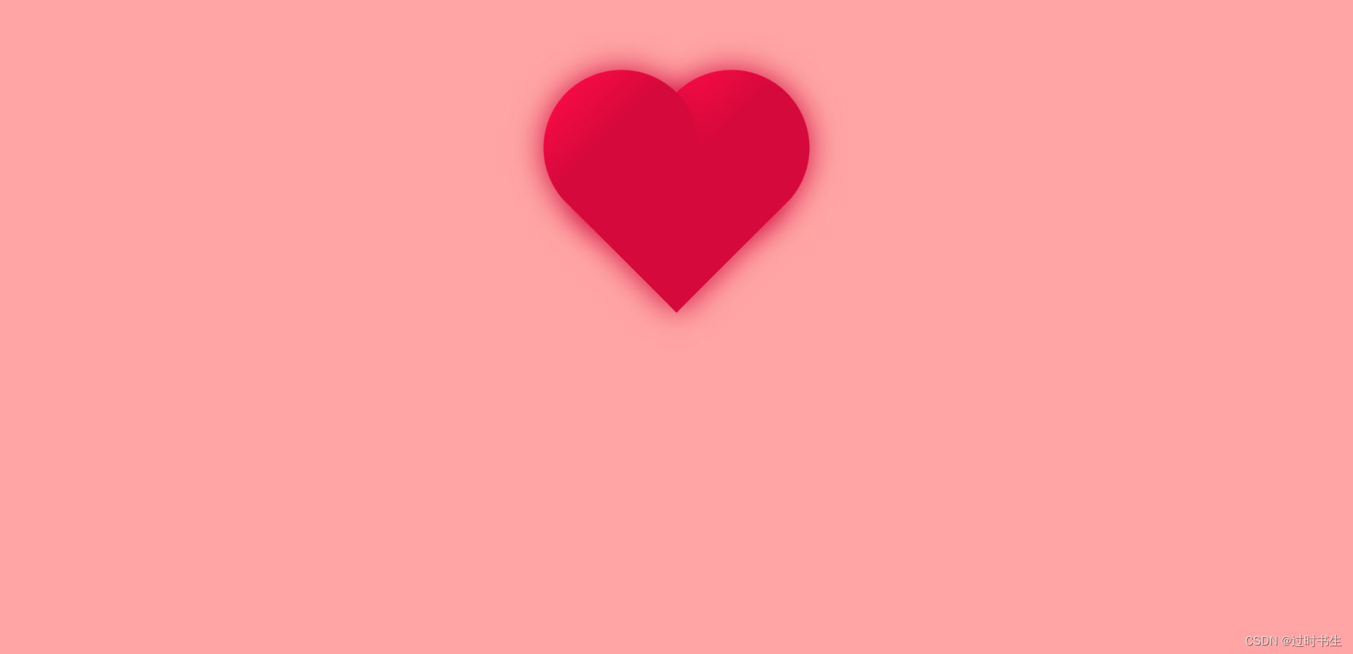
三、使用浏览器打开即可,看效果
本文内容由网友自发贡献,版权归原作者所有,本站不承担相应法律责任。如您发现有涉嫌抄袭侵权的内容,请联系:hwhale#tublm.com(使用前将#替换为@)