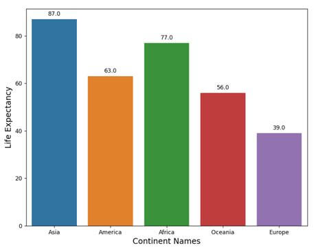
import pandas as pd
import seaborn as sns
import matplotlib.pyplot as plt
continent_data = ["Asia", "America", "Africa", "Oceania", "Europe"]
lifeExpectancy = [87, 63, 77, 56, 39]

dataf = pd.DataFrame({"continent_data":continent_data, "lifeExpectancy":lifeExpectancy})
plt.figure(figsize = (9, 7))
splot = sns.barplot(x = "continent_data", y = "lifeExpectancy", data=dataf)
for g in splot.patches:
    splot.annotate(format(g.get_height(), '.1f'),
                   (g.get_x() + g.get_width() / 2., g.get_height()),
                   ha = 'center', va = 'center',
                   xytext = (0, 9),
                   textcoords = 'offset points')
plt.xlabel("Continent Names", size = 14)
plt.ylabel("Life Expectancy", size = 14)
plt.show()
Output
We can also provide the value within the bars in the barplot. To do this we have to simply set the xytext attribute to (0, -12), which means the y value of the attribute will go downward because of the negative value set for it. In this case, the code will be:
import pandas as pd
import seaborn as sns
import matplotlib.pyplot as plt
continent_data = ["Asia", "America", "Africa", "Oceania", "Europe"]
lifeExpectancy = [87, 63, 77, 56, 39]

dataf = pd.DataFrame({"continent_data":continent_data, "lifeExpectancy":lifeExpectancy})
plt.figure(figsize = (9, 7))
splot = sns.barplot(x = "continent_data", y = "lifeExpectancy", data=dataf)
for g in splot.patches:
    splot.annotate(format(g.get_height(), '.1f'),
                   (g.get_x() + g.get_width() / 2., g.get_height()),
                   ha = 'center', va = 'center',
                   xytext = (0, -13),
                   textcoords = 'offset points')
plt.xlabel("Continent Names", size = 14)
plt.ylabel("Life Expectancy", size = 14)
plt.show()
Output
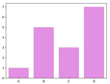
更改条形图的颜色
有多种方法可以更改默认箱线图的颜色。我们可以使用 barplot() 的 color 属性将它们全部更改为新颜色。
import matplotlib.pyplot as plt
import seaborn as sns
x = ['A', 'B', 'C', 'D']
y = [1, 5, 3, 7]
sns.barplot(x, y, color = 'violet')
plt.show()
Output
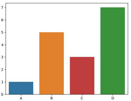
Again we can manually set colors for each bar using the palette parameter of the barplot(). We have to pass the color names within the list as palette values.
import matplotlib.pyplot as plt
import seaborn as sns
x = ['A', 'B', 'C', 'D']
y = [1, 5, 3, 7]
sns.barplot(x, y, color = 'blue', palette = ['tab:blue', 'tab:orange', 'tab:red', 'tab:green'])
plt.show()
Output
Apart from manually providing the color values, we can also use predefined color palettes defined in the Seaborn color palettes. Here is how to use it.
import matplotlib.pyplot as plt
import seaborn as sns
x = ['A', 'B', 'C', 'D']
y = [1, 5, 3, 7]
sns.barplot(x, y, color = 'blue', palette = 'hls')
plt.show()
Output
条件颜色
我们还可以对条形图值或数据设置特定条件,为它们设置不同的颜色或调色板。
以下代码片段展示了如何根据条件通过调色板设置不同的颜色。
import pandas as pd
import seaborn as sns
import matplotlib.pyplot as plt
continent_data = ["Asia", "America", "Africa", "Oceania", "Europe"]
lifeExpectancy = [99, 63, 77, 56, 27]
custom_palette = {}
dataf = pd.DataFrame({"continent_data":continent_data, "lifeExpectancy":lifeExpectancy})
plt.figure(figsize = (9, 7))
for q in lifeExpectancy:
    if q < 30 and q > 50:
        custom_palette[q] = 'Paired'
    elif q < 50 and q > 60:
        custom_palette[q] = 'PRGn'
    elif q < 60 and q > 70:
        custom_palette[q] = 'husl'
    else:
        custom_palette[q] = 'hls'
sns.barplot(x = "continent_data", y = "lifeExpectancy", data=dataf, palette=custom_palette[q])
plt.xlabel("Continent Names", size = 14)
plt.ylabel("Life Expectancy", size = 14)
plt.show()
We can also change the position of the Legend but not using seaborn. For such manipulation, we need to use the Matplotlib.pyplot’s legend() method loc parameter. We can also specify other location values to the loc:
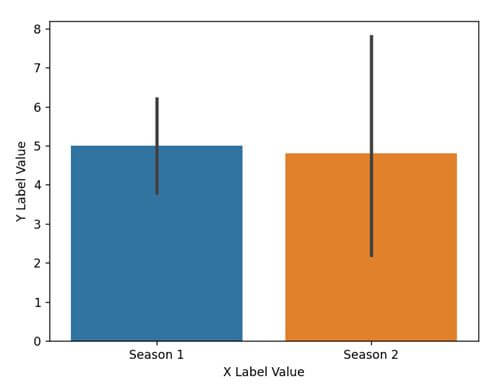
我们经常需要标记 x 轴和 y 轴,以便更好地指示或赋予绘图含义。要在图中设置标签,有两种不同的方法。这些都是: Method 1:使用 set() 方法:第一种方法是使用 set() 方法并将字符串作为标签传递给 xlabel 和 ylabel 参数。这是一个代码片段,展示了我们如何执行此操作。
import pandas as pd
import matplotlib.pyplot as plt
import seaborn as sns
datf = pd.DataFrame({"Season 1": [7, 4, 5, 6, 3],
                 "Season 2" : [1, 2, 8, 4, 9]})
p = sns.barplot(data = datf)
p.set(xlabel="X Label Value", ylabel = "Y Label Value")
plt.show()
Output
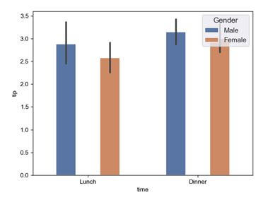
Method 2: Using matplotlib’s xlabel() and ylabel(): Since seaborn runs on top of Matplotlib, we can use the Matplotlib methods to set the labels for the x and y axes. Here is a code snippet showing how can we perform that.
import pylab as plt
import seaborn as sns
tips = sns.load_dataset("tips")
fig, axi = plt.subplots()
sns.set(rc = {'figure.figsize':(12.0,8.5)})
sns.barplot(data = tips, ax = axi, x = "time", y = "tip", hue = "sex")
def width_changer(axi, new_val):
for patch in axi.patches :
cur_width = patch.get_width()
diff = cur_width - new_val
patch.set_width(new_val)
patch.set_x(patch.get_x() + diff * .5)
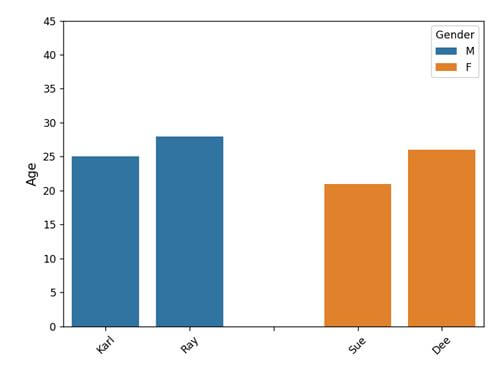
plt.legend(loc = 'upper right', title = 'Gender')
width_changer(axi, .18)
plt.show()
Output
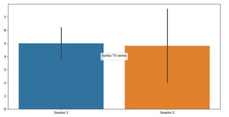
Method 2: matplotlib.pyplot.figure(): We can also use the matplotlib.pyplot.figure() and use the figsize parameter to pass two values as Tuple. The code snippet will look something like this.
import pandas as pd
import matplotlib.pyplot as plt
import seaborn as sns
from matplotlib import rcParams

datf = pd.DataFrame({"Season 1": [7, 4, 5, 6, 3],
                 "Season 2" : [1, 2, 8, 4, 9]})
plt.figure(figsize = (14, 7))
p = sns.barplot(data = datf)
plt.legend(loc = 'center', title = 'Karlos TV series')
plt.show()
Output
Method 3: Using rcParams: We can also use the rcParams, which is a part of the Matplotlib library to control the style and size of the plot. It works similar to the seaborn.set(). Here is a code snippet showing how to use it.
import pandas as pd
import matplotlib.pyplot as plt
import seaborn as sns
from matplotlib import rcParams

datf = pd.DataFrame({"Season 1": [7, 4, 5, 6, 3],
                 "Season 2" : [1, 2, 8, 4, 9]})
rcParams['figure.figsize'] = 14, 7
p = sns.barplot(data = datf)
plt.legend(loc = 'center', title = 'Karlos TV series')
plt.show()
Output
Method 4: matplotlib.pyplot.gcf(): This function helps in getting the instance of the current figure. Along with the gcf() instance, we can use the set_size_inches() method to modify the final size of the seaborn plot. The code snippet will look something like this.
import pylab as plt
import seaborn as sns
tips = sns.load_dataset("tips")
fig, axi = plt.subplots()
sns.barplot(data = tips, ax = axi, x = "time", y = "tip", hue = "sex")
def width_changer(axi, new_val):
    for patch in axi.patches :
        cur_width = patch.get_width()
        diff = cur_width - new_val
        patch.set_width(new_val)
        patch.set_x(patch.get_x() + diff * .5)
plt.gcf().set_size_inches(14, 7)
plt.legend(loc = 'upper right', title = 'Gender')
width_changer(axi, .18)
plt.show()
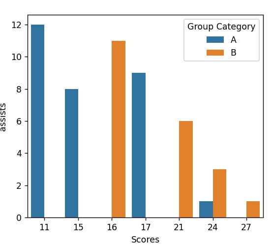
Method 2: Using the set() method: Another way to set the font size for all the fonts associated with the plot is using the set() method of the Seaborn. Here’s how to use it.
import pandas as pd
import matplotlib.pyplot as plt
import seaborn as sns

datf = pd.DataFrame({'dor': ['1/12/2022', '1/30/2022', '2/27/2022', '2/28/2022'],
                   'marketReach': [7, 12, 5, 16],
                   'Brand': ['A', 'A', 'B', 'B']})
sns.set(font_scale = 3)
sns.barplot(x = 'dor', y = 'marketReach', hue = 'Brand', data = datf)
plt.legend(title = 'Brand Name', fontsize=20)
plt.show()
Method 2: using setp() method: The set parameter setp() method also enables us to rotate the x-axis tick-levels. Here is the code snippet on how to use it.