数据可视化就是这样一个领域,大量的库都是用 Python 开发的。Matplotlib 是数据可视化最流行的选择。直方图 、条形图、散点图、线图 等,Matplotlib 还扩展了其功能以提供 3D 绘图模块。
在本教程中,我们将介绍 Python 中 3D 绘图的各个方面。
我们首先在 3D 坐标空间中绘制一个点。然后我们将学习如何自定义绘图,然后我们将继续学习更复杂的绘图,例如 3D 高斯曲面、3D 多边形等。具体来说,我们将讨论以下主题:
在 3D 空间中绘制单个点 让我们首先完成在 Python 中创建 3D 绘图所需的每个步骤,并以在 3D 空间中绘制点为例。
第 1 步:导入库
import matplotlib.pyplot as plt

from mpl_toolkits.mplot3d import Axes3D
第一个是使用 matplotlib 进行绘图的标准导入语句,您也会在 2D 绘图中看到该语句。Axes3D启用 3D 投影需要类。否则,它不会在其他地方使用。
Note 3.2.0 之前的 Matplotlib 版本需要第二次导入。对于 3.2.0 及更高版本,您可以绘制 3D 绘图而无需导入mpl_toolkits.mplot3d.Axes3D.
第 2 步:创建图形和轴
fig = plt.figure(figsize=(4,4))

ax = fig.add_subplot(111, projection='3d')
Output: add_subplot method and specifying the value ‘3d’ to the projection parameter.
请注意,这两个步骤在您使用 Matplotlib 在 Python 中执行的大多数 3D 绘图中很常见。
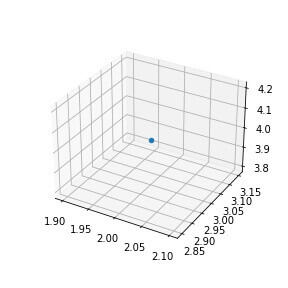
第 3 步:绘制点 创建坐标区对象后,我们可以使用它在 3D 空间中创建我们想要的任何类型的绘图。scatter()方法,并传递该点的三个坐标。
fig = plt.figure(figsize=(4,4))

ax = fig.add_subplot(111, projection='3d')

ax.scatter(2,3,4) # plot the point (2,3,4) on the figure

plt.show()
Output:
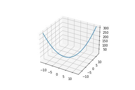
绘制 3D 连续线 现在我们知道如何在 3D 中绘制单个点,我们可以类似地绘制穿过 3D 坐标列表的连续线。
我们将使用plot()方法并传递 3 个数组,每个数组代表线上点的 x、y 和 z 坐标。
import numpy as np

x = np.linspace(−4*np.pi,4*np.pi,50)

y = np.linspace(−4*np.pi,4*np.pi,50)

z = x**2 + y**2

fig = plt.figure()

ax = fig.add_subplot(111, projection='3d')

ax.plot(x,y,z)

plt.show()
Output: np.linspace to generate 50 uniformly distributed points between -4π and +4π. The z coordinate is simply the sum of the squares of the corresponding x and y coordinates.
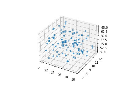
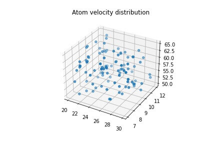
自定义 3D 绘图 让我们在 3D 空间中绘制散点图,并看看如何根据我们的喜好以不同的方式自定义其外观。我们将使用NumPy 随机种子 这样你就可以生成与教程相同的随机数。
np.random.seed(42)

xs = np.random.random(100)*10+20

ys = np.random.random(100)*5+7

zs = np.random.random(100)*15+50

fig = plt.figure()

ax = fig.add_subplot(111, projection='3d')

ax.scatter(xs,ys,zs)

plt.show()
Output:
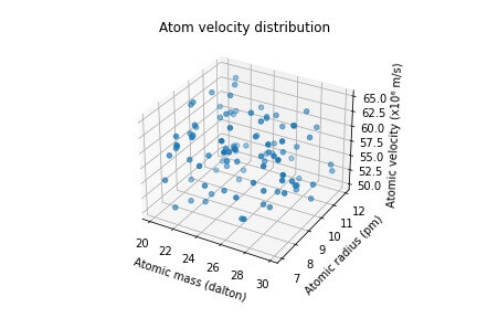
添加标题 我们将调用set_title轴对象的方法向绘图添加标题。
ax.set_title("Atom velocity distribution")

plt.show()
Output: NOTE that I have not added the preceding code (to create the figure and add scatter plot) here, but you should do it.
现在让我们为绘图上的每个轴添加标签。
添加轴标签 我们可以通过调用方法为 3D 图中的每个轴设置标签set_xlabel, set_ylabel and set_zlabel在轴对象上。
ax.set_xlabel("Atomic mass (dalton)")

ax.set_ylabel("Atomic radius (pm)")

ax.set_zlabel("Atomic velocity (x10⁶ m/s)")

plt.show()
Output:
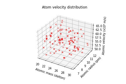
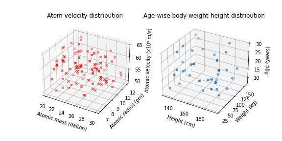
修改标记 正如我们在前面的示例中所看到的,默认情况下,每个点的标记是一个恒定大小的实心蓝色圆圈。
让我们从更改标记的颜色和样式开始
ax.scatter(xs,ys,zs, marker="x", c="red")

plt.show()
Output: marker and c to change the style and color of the individual points
修改轴限制和刻度 默认情况下,根据输入值设置轴上值的范围和间隔。
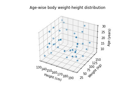
让我们创建另一个代表一组新数据点的散点图,然后修改其轴范围和间隔。
np.random.seed(42)
ages = np.random.randint(low = 8, high = 30, size=35)
heights = np.random.randint(130, 195, 35)
weights = np.random.randint(30, 160, 35)
fig = plt.figure()
ax = fig.add_subplot(111, projection='3d')
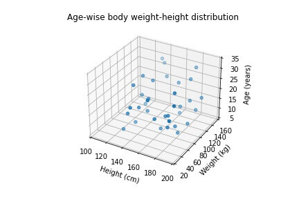
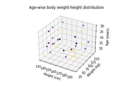
ax.scatter(xs = heights, ys = weights, zs = ages)
ax.set_title("Age-wise body weight-height distribution")
ax.set_xlabel("Height (cm)")
ax.set_ylabel("Weight (kg)")
ax.set_zlabel("Age (years)")
plt.show()
Output:
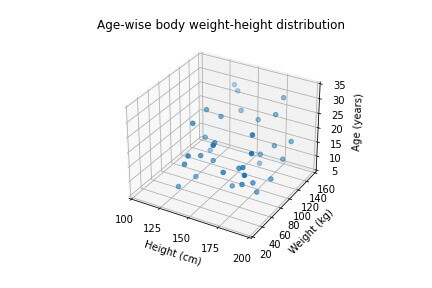
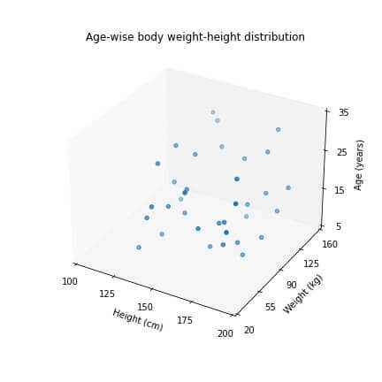
让我们通过调用来修改每个轴上的最小和最大限制set_xlim, set_ylim, and set_zlim方法。
ax.set_xlim(100,200)

ax.set_ylim(20,160)

ax.set_zlim(5,35)

plt.show()
Output:
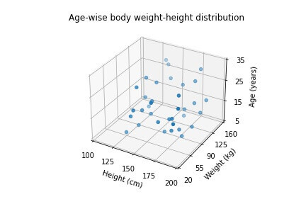
ax.set_xticks([100,125,150,175,200])

plt.show()
Output: set_yticks and set_zticks methods.
ax.set_yticks([20,55,90,125,160])

ax.set_zticks([5,15,25,35])

plt.show()
Output:
更改绘图的大小 如果我们希望绘图比默认大小更大或更小,我们可以在初始化图形时轻松设置绘图的大小 - 使用figsize的参数plt.figure method,set_size_inches图形对象上的方法。
既然我们已经看到了第一种指定绘图大小的方法 早些时候,让我们现在看看第二种方法,即修改现有图的大小。
fig.set_size_inches(6, 6)

plt.show()
Output:
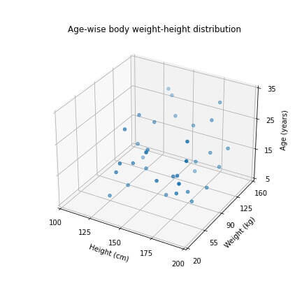
关闭/打开网格线 到目前为止,我们绘制的所有绘图默认都有网格线。grid轴对象的方法,并传递值“False”。
ax.grid(False)

plt.show()
Output:
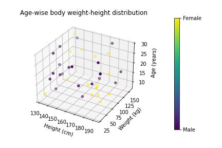
根据类别设置 3D 绘图颜色 让我们假设散点图所代表的个体被进一步分为两个或更多类别。c创建散点图时。
np.random.seed(42)

ages = np.random.randint(low = 8, high = 30, size=35)

heights = np.random.randint(130, 195, 35)

weights = np.random.randint(30, 160, 35)

gender_labels = np.random.choice([0, 1], 35) #0 for male, 1 for female

fig = plt.figure()

ax = fig.add_subplot(111, projection='3d')

ax.scatter(xs = heights, ys = weights, zs = ages, c=gender_labels)

ax.set_title("Age-wise body weight-height distribution")

ax.set_xlabel("Height (cm)")

ax.set_ylabel("Weight (kg)")

ax.set_zlabel("Age (years)")

plt.show()
Output:
我们可以添加一个“颜色条”来解决这个问题。
scat_plot = ax.scatter(xs = heights, ys = weights, zs = ages, c=gender_labels)

cb = plt.colorbar(scat_plot, pad=0.2)

cb.set_ticks([0,1])

cb.set_ticklabels(["Male", "Female"])

plt.show()
Output:
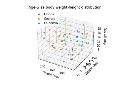
放置传奇 通常,我们想要在同一个图形上绘制多于一组的数据。
例如,假设我们的年龄-身高-体重数据是从美国三个州收集的,即佛罗里达州、佐治亚州和加利福尼亚州。
让我们在 for 循环中创建 3 个图,并每次为它们分配不同的标签。
labels = ["Florida", "Georgia", "California"]

for l in labels:

    ages = np.random.randint(low = 8, high = 20, size=20)

    heights = np.random.randint(130, 195, 20)

    weights = np.random.randint(30, 160, 20)

    ax.scatter(xs = heights, ys = weights, zs = ages, label=l)

ax.set_title("Age-wise body weight-height distribution")

ax.set_xlabel("Height (cm)")

ax.set_ylabel("Weight (kg)")

ax.set_zlabel("Age (years)")

ax.legend(loc="best")

plt.show()
Output:
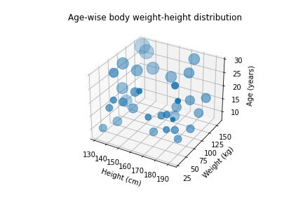
绘制不同大小的标记 在我们到目前为止看到的散点图中,所有点标记的大小都是恒定的。
我们可以通过将自定义值传递给参数来改变标记的大小s的散点图。
在我们的示例中,我们将根据个体的身高和体重计算一个名为“bmi”的新变量,并使个体标记的大小与其 BMI 值成比例。
np.random.seed(42)

ages = np.random.randint(low = 8, high = 30, size=35)

heights = np.random.randint(130, 195, 35)

weights = np.random.randint(30, 160, 35)

bmi = weights/((heights*0.01)**2)

fig = plt.figure()

ax = fig.add_subplot(111, projection='3d')

ax.scatter(xs = heights, ys = weights, zs = ages, s=bmi*5 )

ax.set_title("Age-wise body weight-height distribution")

ax.set_xlabel("Height (cm)")

ax.set_ylabel("Weight (kg)")

ax.set_zlabel("Age (years)")

plt.show()
Output:
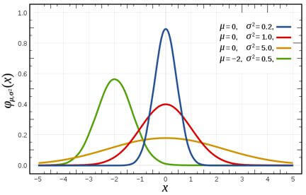
绘制高斯分布 You may be aware of a univariate Gaussian distribution plotted on a 2D plane, popularly known as the ‘bell-shaped curve.’
source: https://en.wikipedia.org/wiki/File:Normal_Distribution_PDF.svg
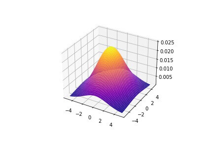
我们还可以使用多元正态分布在 3D 空间中绘制高斯分布。
from scipy.stats import multivariate_normal

X = np.linspace(-5,5,50)

Y = np.linspace(-5,5,50)

X, Y = np.meshgrid(X,Y)

X_mean = 0; Y_mean = 0

X_var = 5; Y_var = 8

pos = np.empty(X.shape+(2,))

pos[:,:,0]=X

pos[:,:,1]=Y

rv = multivariate_normal([X_mean, Y_mean],[[X_var, 0], [0, Y_var]])

fig = plt.figure()

ax = fig.add_subplot(111, projection='3d')

ax.plot_surface(X, Y, rv.pdf(pos), cmap="plasma")

plt.show()
Output: plot_surface method, we can create similar surfaces in a 3D space.
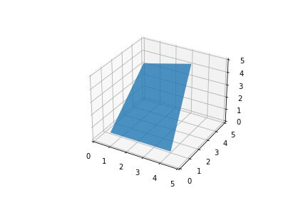
绘制 3D 多边形 我们还可以在 Python 中绘制具有 3 维顶点的多边形。
from mpl_toolkits.mplot3d.art3d import Poly3DCollection

fig = plt.figure()

ax = fig.add_subplot(111, projection='3d')

x = [1, 0, 3, 4]

y = [0, 5, 5, 1]

z = [1, 3, 4, 0]

vertices = [list(zip(x,y,z))]

poly = Poly3DCollection(vertices, alpha=0.8)

ax.add_collection3d(poly)

ax.set_xlim(0,5)

ax.set_ylim(0,5)

ax.set_zlim(0,5)
Output:
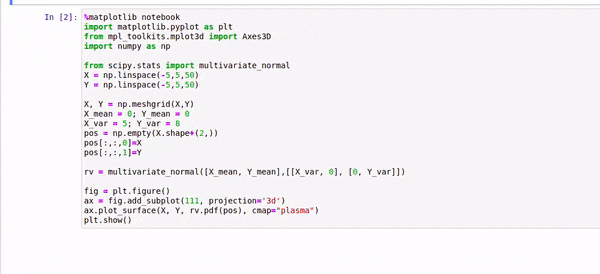
使用鼠标旋转 3D 绘图 要在Jupyter笔记本 ,你应该运行%matplotlib notebook在笔记本的开头。
这使我们能够通过放大和缩小绘图以及沿任意方向旋转它们来与 3D 绘图进行交互。
%matplotlib notebook
import matplotlib.pyplot as plt

from mpl_toolkits.mplot3d import Axes3D

import numpy as np

from scipy.stats import multivariate_normal

X = np.linspace(-5,5,50)

Y = np.linspace(-5,5,50)

X, Y = np.meshgrid(X,Y)

X_mean = 0; Y_mean = 0

X_var = 5; Y_var = 8

pos = np.empty(X.shape+(2,))

pos[:,:,0]=X

pos[:,:,1]=Y

rv = multivariate_normal([X_mean, Y_mean],[[X_var, 0], [0, Y_var]])

fig = plt.figure()

ax = fig.add_subplot(111, projection='3d')

ax.plot_surface(X, Y, rv.pdf(pos), cmap="plasma")

plt.show()
Output:
绘制两个不同的 3D 分布 我们可以在同一个图形中添加两个不同的 3D 绘图fig.add_subplot method.
例如,如果我们将值 223 传递给add_subplot方法中,我们指的是 2×2 网格中的第三个图(考虑行优先排序)。
现在让我们看一个示例,在单个图上绘制两个不同的分布。
#data generation for 1st plot
np.random.seed(42)

xs = np.random.random(100)*10+20

ys = np.random.random(100)*5+7

zs = np.random.random(100)*15+50

#data generation for 2nd plot
np.random.seed(42)

ages = np.random.randint(low = 8, high = 30, size=35)

heights = np.random.randint(130, 195, 35)

weights = np.random.randint(30, 160, 35)

fig = plt.figure(figsize=(8,4))

#First plot
ax = fig.add_subplot(121, projection='3d')

ax.scatter(xs,ys,zs, marker="x", c="red")

ax.set_title("Atom velocity distribution")

ax.set_xlabel("Atomic mass (dalton)")

ax.set_ylabel("Atomic radius (pm)")

ax.set_zlabel("Atomic velocity (x10⁶ m/s)")

#Second plot
ax = fig.add_subplot(122, projection='3d')

ax.scatter(xs = heights, ys = weights, zs = ages)

ax.set_title("Age-wise body weight-height distribution")

ax.set_xlabel("Height (cm)")

ax.set_ylabel("Weight (kg)")

ax.set_zlabel("Age (years)")

plt.show()
Output:
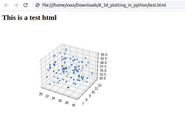
将 Python 3D 绘图输出为 HTML 如果我们想将 3D 绘图嵌入到 HTML 页面中,而不先将其保存为图像文件,img tag
import base64

from io import BytesIO

np.random.seed(42)

xs = np.random.random(100)*10+20

ys = np.random.random(100)*5+7

zs = np.random.random(100)*15+50

fig = plt.figure()

ax = fig.add_subplot(111, projection='3d')

ax.scatter(xs,ys,zs)

#encode the figure
temp = BytesIO()

fig.savefig(temp, format="png")

fig_encode_bs64 = base64.b64encode(temp.getvalue()).decode('utf-8')

html_string = """
<h2>This is a test html</h2>
<img src = 'data:image/png;base64,{}'/>
""".format(fig_encode_bs64)
现在,我们可以将此 HTML 代码字符串写入 HTML 文件,然后可以在浏览器中查看该文件
with open("test.html", "w") as f:

    f.write(html_string)
Output:
结论 在本教程中,我们学习了如何使用 matplotlib 库在 Python 中绘制 3D 绘图。
然后我们学习了在 Python 中自定义 3D 绘图的各种方法,例如向绘图添加标题、图例、轴标签、调整绘图大小、打开/关闭绘图上的网格线、修改轴刻度等。
之后,我们学习了如何在 3D 空间中绘制曲面。我们在 Python 中绘制了高斯分布和 3D 多边形。
然后我们了解了如何与 Jupyter Notebook 中的 Python 3D 绘图进行交互。
最后,我们学习了如何在同一个图形上绘制多个子图,以及如何将图形输出到 HTML 代码中。