数据特征描述:
import pandas as pd

catering_sale = r'H:\school\数据挖掘\实验\实验二\catering_sale.xls'
data = pd.read_excel(catering_sale, index_col=u'日期')  # 字符串前添加u表示Unicode编码
print(data.describe())
print('size ', len(data))
print('median: ', data.median())
                销量
count   200.000000
mean   2755.214700
std     751.029772
min      22.000000
25%    2451.975000
50%    2655.850000
75%    3026.125000
max    9106.440000
size  201
median:  销量    2655.85
dtype: float64
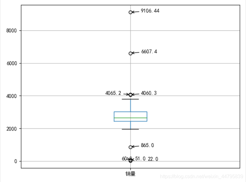
画箱线图

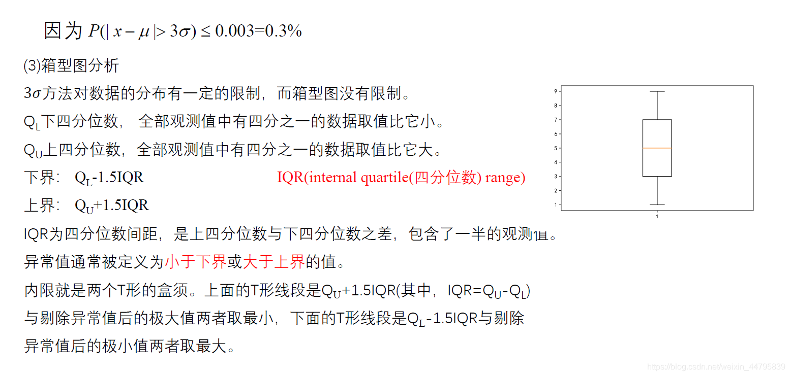
import pandas as pd
import matplotlib.pyplot as plt

plt.rcParams['font.sans-serif'] = ['SimHei', 'KaiTi', 'FangSong']  # 用来正常显示中文标签
plt.rcParams['axes.unicode_minus'] = False  # 用来正常显示负号
catering_sale = 'H:\school\数据挖掘\实验\实验二\catering_sale.xls'
data = pd.read_excel(catering_sale, index_col=u'日期')
plt.figure()  # 建立图像
p = data.boxplot(meanline=True, return_type='dict')  # 画箱线图,直接使用DataFrame的方法
x = p['fliers'][0].get_xdata()  # 'flies'即为异常值的标签
y = p['fliers'][0].get_ydata()
y.sort()  # 从小到大排序,该方法直接改变原对象
for i in range(len(x)):
    if i > 0:
        plt.annotate(y[i], xy=(x[i], y[i]), xytext=(x[i] + 0.05 - 0.8 / (y[i] - y[i - 1]), y[i]),
                     arrowprops=dict(arrowstyle="->"))
    else:
        plt.annotate(y[i], xy=(x[i], y[i]), xytext=(x[i] + 0.08, y[i]))
plt.savefig('D:/1.png', dpi=600)
plt.show()  # 展示箱线图
画分组的频率直方图
import pandas as pd
import numpy as np
import matplotlib.pyplot as plt

catering_sale = 'H:\school\数据挖掘\实验\实验二\catering_fish_congee.xls'  # 餐饮数据
data = pd.read_excel(catering_sale, header=None, names=['date', 'sale'])
bins = [i * 500 for i in range(9)]
# bins = list(range(0, 4001, 500))
labels = ['[0,500)', '[500,1000)', '[1000,1500)', '[1500,2000)',
          '[2000,2500)', '[2500,3000)', '[3000,3500)', '[3500,4000)']
newcolumn = pd.cut(data.sale, bins, labels=labels)
data['sale分层'] = newcolumn
print('data processing over。。。。')
aggResult = data.groupby(by=['sale分层'])['sale'].agg([('sale1', np.size)])
pAggResult = round(aggResult / aggResult.sum(), 2) * 100
plt.figure(figsize=(10, 6))  # 设置图框大小尺寸
pAggResult['sale1'].plot(kind='bar', width=0.8, fontsize=10)  # 绘制频率直方图
plt.rcParams['font.sans-serif'] = ['SimHei']  # 用来显示中文标签
plt.title('季度销售额频率分布直方图', fontsize=20)
plt.xticks(rotation=45)     # x标签添加角度,美观
plt.savefig('d:/2.png', dpi=600)
plt.show()
