大家好,这里是X💚,今天来分享一个3D旋转动画效果,用到的题材为巴啦啦魔仙,对你有帮助的话别忘了点赞、关注和收藏噢💜有任何问题欢迎评论区见🐾
在这里呢,非常建议大家去学习一些前端的框架,当然了也是有了比较结实的前端基础之后,可以去接触一些框架💙💜💛这里呢X也是推荐可以先学一下Bootstrap💨💨好啦,题外话啦
效果图💰
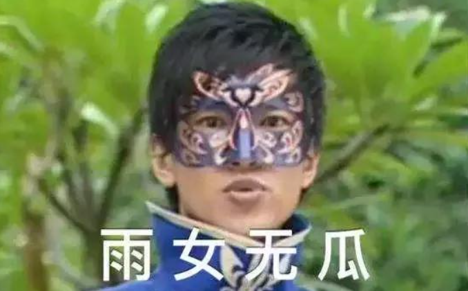
X方向旋转🎠

Y方向旋转🎠

这里只是给大致的样式、大家可以在上面添加很多自己的样式,以下为代码部分🦢
HTML部分
<!DOCTYPE html>
<html>
<head>
<meta charset="UTF-8">
<meta http-equiv="X-UA-Compatible" content="IE=edge,chrome=1">
<meta name="viewport" content="width=device-width, initial-scale=1.0">
<title>魔仙堡之图片3D旋转</title>

<link rel="stylesheet" type="text/css" href="css/bootstrap-grid.min.css" />
<link rel="stylesheet" type="text/css" href="css/style.css">

</head>
<body>
<div class="demo">
	<div class="container">
		<div class="row">
			<div class="col-md-4 col-sm-6">
				<div class="box">
					<div class="box-img">
						<img src="images/5ca3e92518e24ab38c243174bf77c407.jpg" alt="">
					</div>
					<div class="box-content">
						<h4 class="title">魔仙小蓝</h4>
						<p class="description">魔仙堡精灵</p>

					</div>
				</div>
			</div>
			<div class="col-md-4 col-sm-6">
				<div class="box">
					<div class="box-img">
						<img src="images/ef7f341896544b20ba2074a94e879f4b.jpg" alt="">
					</div>
					<div class="box-content">
						<h4 class="title">游乐王子</h4>
						<p class="description">魔仙堡王子</p>

					</div>
				</div>
			</div>

			<div class="col-md-4 col-sm-6">
				<div class="box">
					<div class="box-img">
						<img src="images/a7399afc136d44e5831f508260011fba.jpg" alt="">
					</div>
					<div class="box-content">
						<h4 class="title">魔仙女王</h4>
						<p class="description">魔仙界女王</p>
					</div>
				</div>
			</div>
		</div>
	</div>
</div>

<div style="text-align:center;clear:both;margin-top:80px">
<script src="/gg_bd_ad_720x90.js" type="text/javascript"></script>
<script src="/follow.js" type="text/javascript"></script>
</div>
</body>
</html>
CSS部分
body{
background:url("../images/balala_xiaomoxian-007.png") no-repeat center center fixed;
-webkit-background-size: cover;
-o-background-size: cover;
background-size: cover;
}
.demo{
padding: 60px 0;
}
.box{
position: relative;
perspective: 1000px;
}
.box .box-img{
transform: rotateX(0);
transition: all 0.50s ease-in-out 0s;
}
.box:hover .box-img{
transform: rotateX(-90deg);
}
.box .box-img img{
width: 100%;
height: auto;
}
.box .box-content{
width: 100%;
height: 100%;
position: absolute;
top: 0;
left: 0;
padding: 60px 20px;
text-align: center;
background:rgba(0,0.1,0.3,0.6);
transform: rotateX(90deg);
transition: all 0.50s ease-in-out 0s;
}
.box:hover .box-content{
transform: rotateX(0);
}
.box .title{
font-size: 40px;
color: #fff;
text-transform: uppercase;
}
.box .description{
font-size: 20px;
line-height: 24px;
color: #fff;
}
.box .description:after{
content: "";
width: 80%;
display: block;
border-bottom: 1px solid #fff;
margin: 15px auto;
}
@media only screen and (max-width: 990px) {
.box{ margin-bottom:20px; }
}
@media only screen and (max-width: 479px) {
.box .box-content{ padding: 20px; }
}
这里主要是用到了CSS transform 属性的rotate,这个也就是翻转效果,有三个值可以设定:rotateX rotateY rotateZ,由于这里是图片的平面2D效果,所以如果设置rotateZ的话效果和rotateY是一样的,如果是3D的话,才会去设置rotateZ🐯,关于“翻转效果”我在CSS代码里注明了重点两个标注,大家如果要不同的翻转效果直接去改就行了,包括角度啊、翻转方向等都可以自己设置
在这里X为大家提供了项目的完整代码(包括图片)
链接:https://pan.baidu.com/s/1N0TX7TabSm6utH-VTAp9wA
提取码:6666
就是这个人想白嫖🤳🤳🤳又不点赞、又不关注
本文内容由网友自发贡献,版权归原作者所有,本站不承担相应法律责任。如您发现有涉嫌抄袭侵权的内容,请联系:hwhale#tublm.com(使用前将#替换为@)